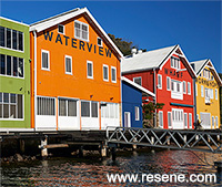
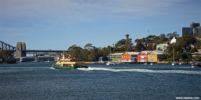
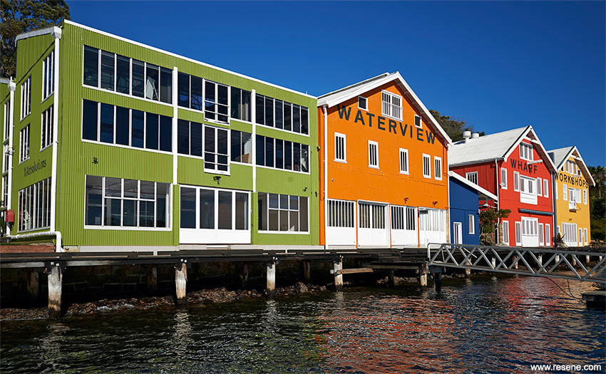
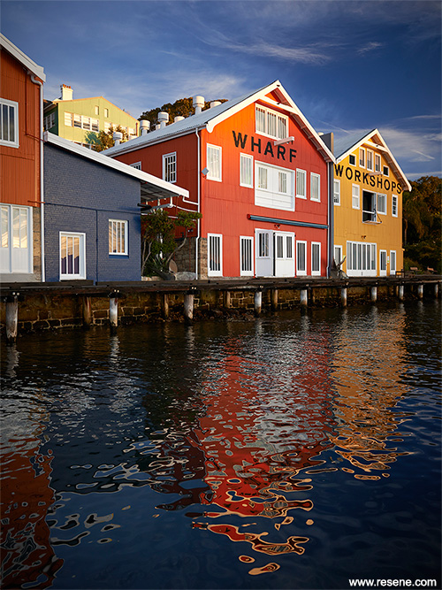
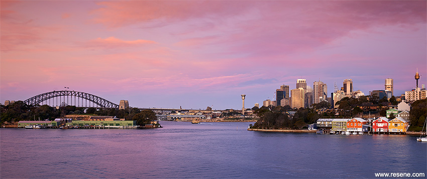
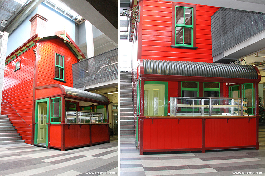
The confident colour palette on the Waterview Wharf Workshops in Sydney has been awarded top honours in the Resene Total Colour Awards for its bold colour choices that have firmly cemented it as a new landmark on Sydney Harbour.
Resene has a long history of colour and today’s colour range of thousands of hues is a far cry from the handful that were available when Resene started over 65 years ago. The Resene Total Colour Awards were launched to encourage and celebrate excellent and creative use of colour; to showcase striking colour palettes and combinations and provide fresh inspiration.
Awards have been given for the best colour use in: Residential Exterior, Residential Interior, Commercial Exterior, Commercial Interior Office, Commercial Interior Public + Retail Space, Display + Product, Education Junior, Education Senior, Neutrals, Heritage, Rising Star Collaborative (student), Rising Star Individual (student) and Lifetime Achievement, with the Colour Master Nightingale Award for the best overall colour use.
Colour Award winners
The Resene Total Colour Master Nightingale Award, named after the Nightingale family who founded and still run Resene today, recognises excellence in colour and paint use, and was awarded to Waterview Wharf Workshops. It also won the Resene Total Colour Commercial Exterior Award.
The judges described this project as simply outstanding. A beautiful juxtaposition of colour, unique and strong.
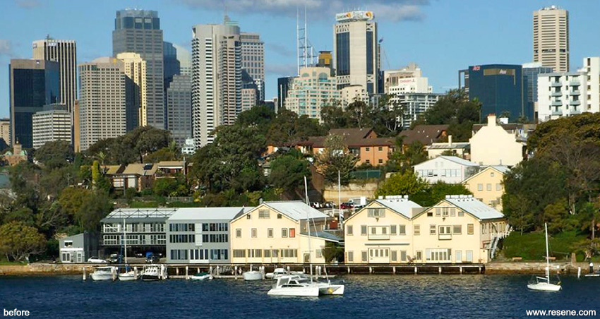
It’s amazing the difference paint can make. From safe, bland, tired and out-dated, this project has used paint to present an exciting exterior through the use of paint colour. Prior to painting, the old warehouses simply blended into the landscape and scarcely rated a second glance; now they are eye-catching and are a new landmark on the harbour. Drawing inspiration from international maritime palettes and undertaking extensive work locally to consult on the colour choices, this colour palette is very carefully thought out and implemented. It has resulted in the absolute transformational nature of the buildings and provides connectivity to its surroundings.
The related colourful palette is used perfectly to highlight the unique forms of the building. Symmetry and connectivity is created with a real play on how to manipulate colour to both bring forward and recede. A perfect example of how to make paint colour work for you.
From anonymous, shabby and ordinary to simply extraordinary, this is a new iconic view on the harbour; you just have to stop and look.
Find out more about this project
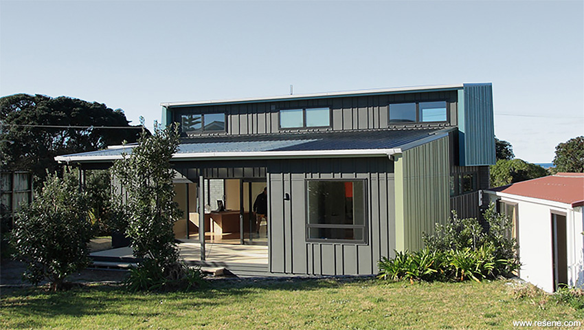
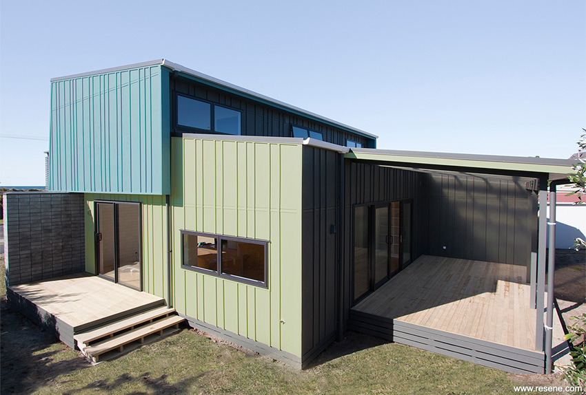
The clever and entirely appropriate coastal influenced colour palette of the Waihi bach by Edwards White Architects Limited won the Resene Total Colour Residential Exterior Award.
Inspired by the vernacular 50s and 60s style, this bach has defining forms and blocks sits on the land with a sense of semi permanence highlighted with a light on the senses colour palette and was a winner with the judges.
The colours are progressively warm with a nod to coastal hues complementing the blockwork and adding vibrancy to the external appearance. The playful paintwork is cleverly used as a cost effective method to distinguish the respective forms and evoke a relaxed atmosphere inherent with the beach ambiance.
Relax… it is holiday time!
Find out more about this project
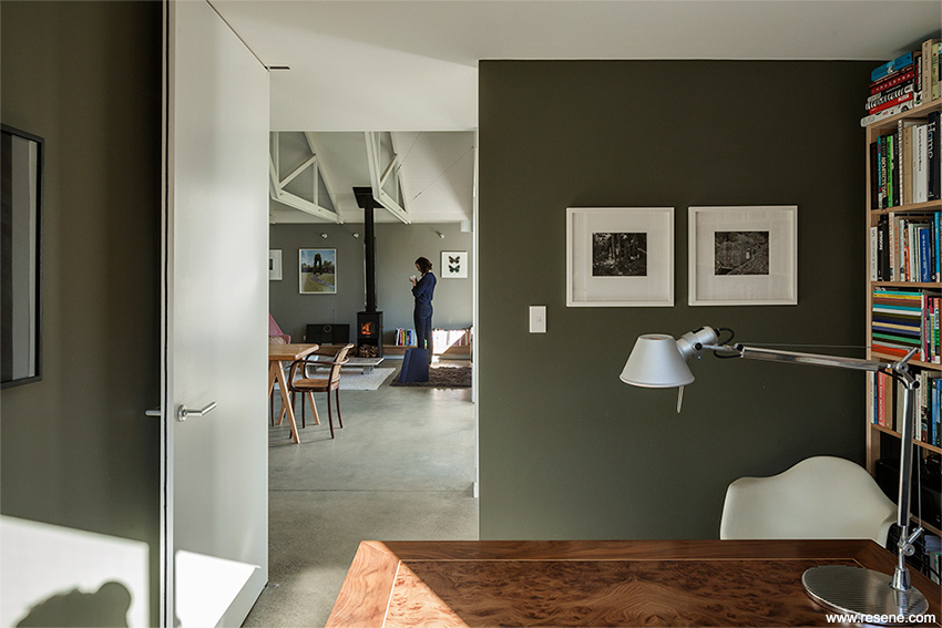
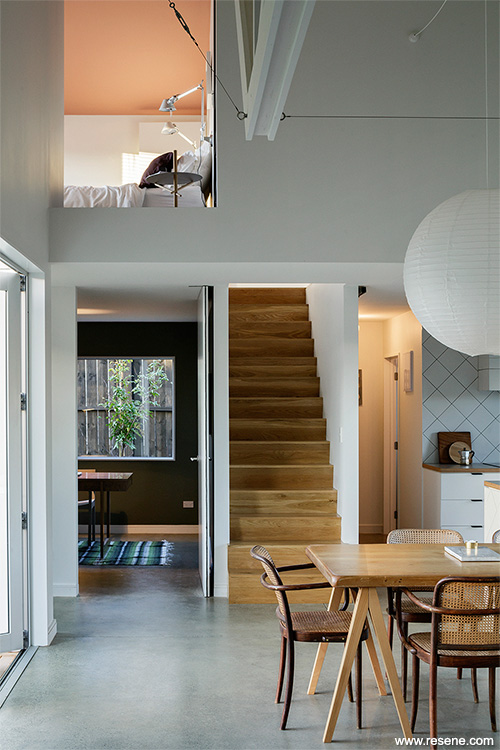
The beautiful contrast of neutrals with confident brave ceiling on this Onehunga Home won Henri Sayes the Resene Total Colour Residential Interior Award.
This home has a lovely integration of colour that delineates and defines spaces and transitions. Subdued and considered, the integration of colour adds an element of surprise. It’s not bright or garish yet it still adds personality to the space.
The colour palette provides rhythm and flows effortlessly from one colour to the next. The warmth of the ceiling colour adds a sense of playfulness to the home.
It’s a very easy to live in colour palette, lively and interesting, modern and fresh.
Find out more about this project
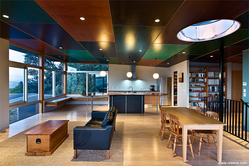
Recreating the flight of the tui in colour blocked ceiling panels, this Tui Home by John Mills Architects was awarded a Resene Total Colour Maestro Residential Interior Award.
Inspired by the tuis that inhabit the surrounding bushscape, the commitment to capturing the colour of nature and bringing it indoors in such a unique way has created an awe-inspiring project. Combining the various colours shows very close attention to detail to ensure each complements all others. Ceilings are often neglected yet this sense of colour is spectacular on the ceiling and simply framed by the subtle use of colour on the walls. Without the colour you would never give the ceiling a second glance. With it, the ceiling is an art form on its own.
An incredibly interesting result on a challenging project.
Find out more about this project
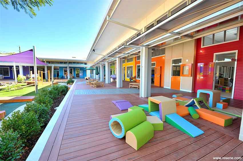
The rainbow hues of the Mother Duck signature childcare centre by Context Architects Limited – was awarded the Resene Total Colour Education Junior Award.
With a delightful playfulness, this colour palette brings a rainbow of colours together wholeheartedly. Values are translated through the use of colour. Colour is used to created attachment, familiarity and a sense of belonging.
The bold, beautiful colours are a unifying feature of the entire design. The colours led the cohesion of the concept and informed many of the other design choices; all made with children in mind.
This is a childcare centre that is coloured to delight parents and children alike.
Find out more about this project
A Resene Total Colour Maestro Education Junior Award was awarded to Piopio Primary School by Van Beek Design for its use of colour to bring new life to old buildings.
Thoughtful and not obvious, this school enjoys a restrained use of colour, a great example of not trying to do too much. The colour palette is a very gentle treatment of an old county school that has grown and integrates new and old so very well. Colours have been chosen to reflect and enhance the traditional details and accents are used for energy and creativity.
A refreshing new look for a much loved school that is the heart of the community.
Find out more about this project
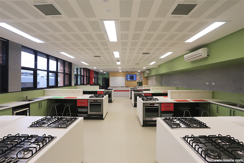
The unexpected colour palette of the Eltham Catholic Ladies College Food Technology and Science Refurbishment by Williams Ross Architects was awarded the Resene Total Colour Education Senior Award.
So strongly architectural the use of colour is sophisticated, surprising and unexpected, drawing you in. Colour is used to bring the outside in. Brights are used in conjunction with a warmer soft palette to complete perfection. Colour has been applied to create a bright, interactive and positive feel giving a sense of an energetic environment for learning.
The clean lines and positioning of colour work well together, for a project that is colourful without being garish and interesting without being overpowering.
A well thought out use of colour.
Find out more about this project
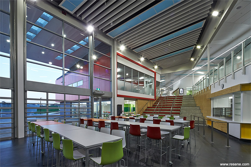
Bold colour choices on Hobsonville Point Secondary School by ASC Architects won the Resene Total Colour Maestro Education Senior Award.
Bold, confident and sophisticated. This colour palette has such a beautiful integration with architecture that elevates schooling to a whole new level.
Colour adds to a welcoming place for student and teachers providing the perfect backdrop to an enjoyable learning environment.
Recessive natural colours along with bold feature colour accents give character to spaces. Colour acts as a relief, is functional and defines spaces, animates and provides visual anchors.
A confident use of colour and design.
Find out more about this project
The Resene Total Colour Commercial Exterior Award was won by Waterview Wharf Workshops who also took out top overall honours with the Resene Total Colour Master Nightingale Award.
Find out more about this project
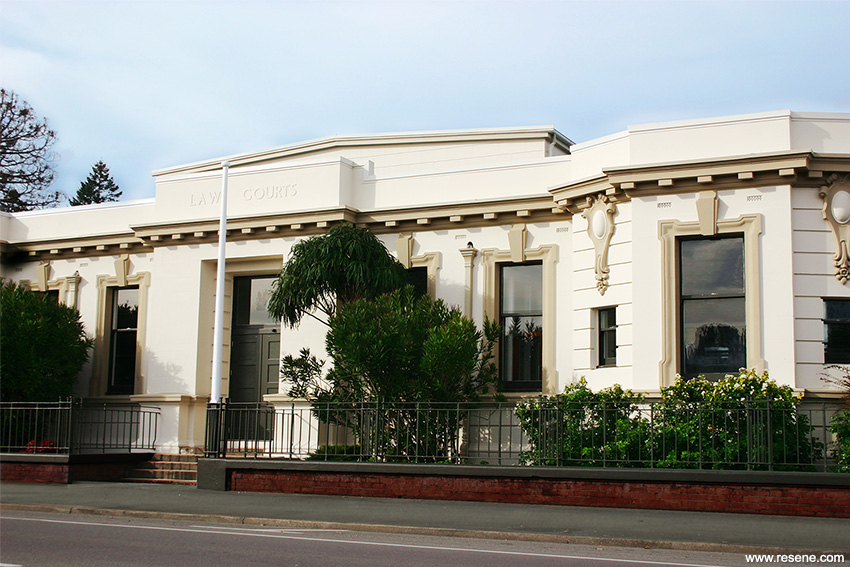
Sympathetic colour tones of the Masterton Courthouse by Stephenson&Turner NZ Ltd won the Resene Total Colour Heritage Award. So gently handled and beautiful, this colour palette is subtle but shows great care to ensure details of the building are highlighted with relief details noted with colour.
It’s an enormous improvement from the dated scheme it has replaced. The new hues reflect the ornate beauty of the building’s past bringing it back to a colour combination more in keeping with its original colourway.
Thorough research and colour application has brought this building back to its past beauty using modern day finishes.
Find out more about this project
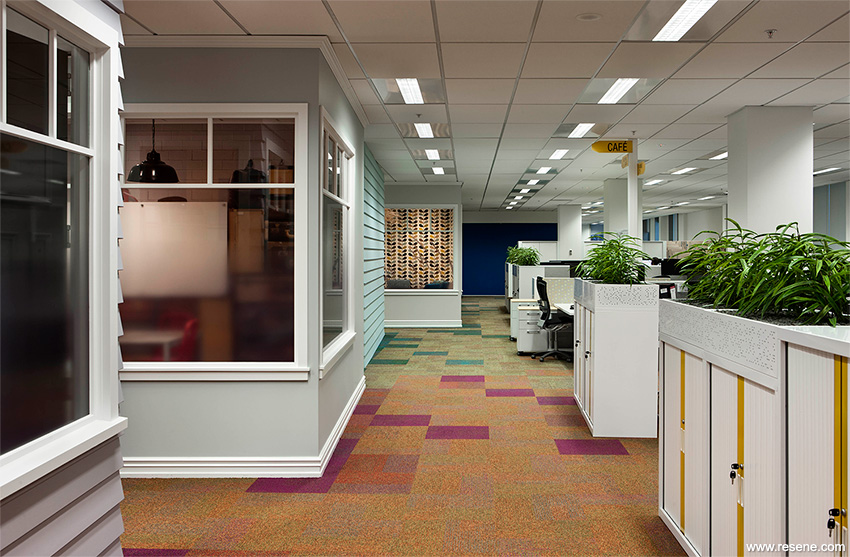
With an extensive colour palette to make each space truly shine on its own, the Lion office by Creative Spaces was awarded the Resene Total Colour Commercial Interior Office Award.
The Lion office is such a complex project with lots of opportunity to use colour. Colours represent themes yet are seamlessly integrated to tell an overall cohesive story.
Colour has easily identified the parts and is synonymous with the places and activities we know so well.
A complete interpretation of the Lion brief, the inspiration and highlighting through the use of colour, brings together a final scheme that works wonderfully well in a single interior.
It’s an office that truly reflects the company that occupies its space.
Find out more about this project
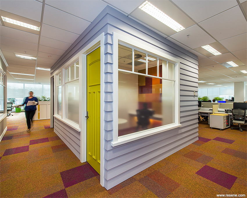
The Inside Out Office shows that a small space doesn’t need to limit colour choices. With a backdrop of black and white, the clever injection of pops of colour on this project by matter won the Resene Total Colour Maestro Commercial Interior Office Award.
A disciplined and effective use of colour against a well resolved backdrop, this office makes the most of colour in a very limited space. Colour is used to such telling effect.
The monochromatic palette on all surfaces provided the perfect canvas to employ bright colour highlights and natural timbers centrally to define specific areas within the open plan office. The positional play of the colours is delightful, just a touch of each colour is enough to achieve the overall effect.
Colour does matter.
Find out more about this project
When the outdoors comes indoors the results can be spectacular. The striking colours and presence of the Moore Wilson’s Sushi House by Human Dynamo Workshop Ltd won the Resene Total Colour Commercial Interior Public + Retail Award.
Fun, lively and innovative. The colours tell a story drawn on history presented in a modern day way in a new twist on the store in store concept. A cold and bustling interior is highlighted with the use of colour, fitting into the building as a new hub feature. A welcoming icon and beacon has been created. It’s intriguing, fun and adds new entertainment, new shopping opportunities and a warm heart to the store.
A fabulous job.
Find out more about this project
It’s easy to attract attention with bold colour, less so with neutrals. Using a palette of neutrals well requires careful selection and placement to ensure an interesting blend of colour without being overpowering or underwhelming.
This careful balancing of hues and the clever use of neutrals as a backdrop on the Kelburn Cable Car Terminus by Bevin Slessor Architects was awarded the Resene Total Colour Neutrals Award.
The images belie the impact.
The cable car is left the hero and complemented perfectly with the appropriate and interesting use of a colour. The colour range reflects the industrial and mechanical nature of the building.
When you have a striking hero, such as the cable car, it would be very easy to detract attention by adding more and more colour. By using complementary hues in an ascending colour strength the palette becomes an interesting backdrop that frames the cable car, while still providing visual interest for those waiting when the cable car is enroute.
A totally appropriate backdrop to that encased within.
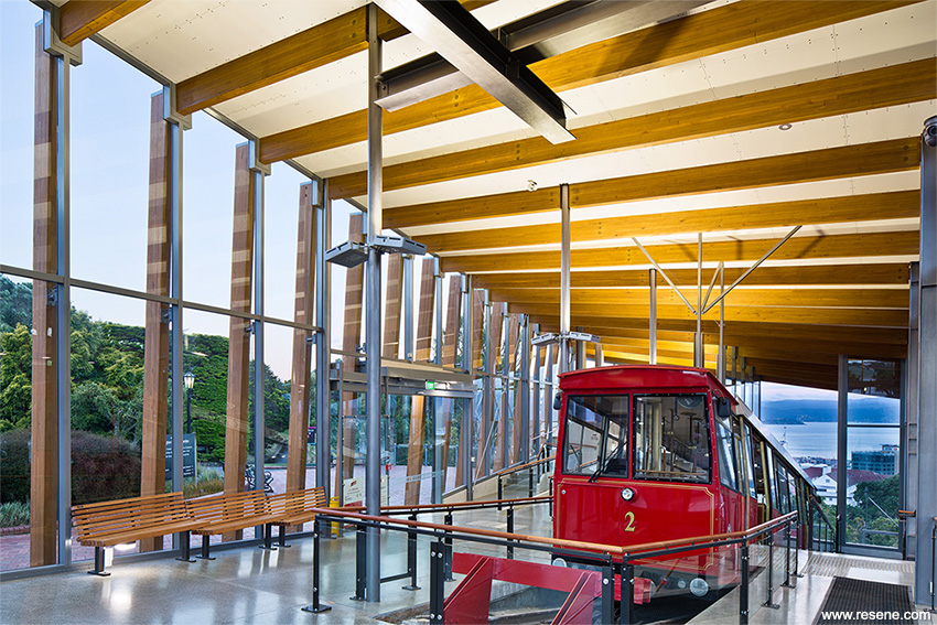
Find out more about this project
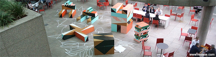
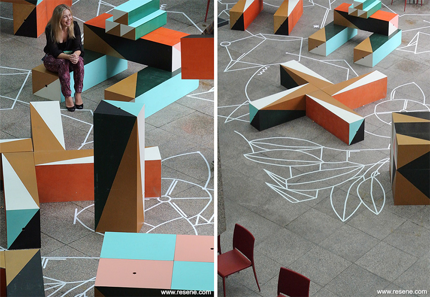
The Building Blocks for Quay Quarter by Lymesmith with their colour palette and colour blocking are irresistible, winning the Resene Total Colour Display + Product Award.
With an activation that invites you to come and play, the colours on these building blocks are a key part of the attraction, inviting attention and involvement.
Interactive and social, this unique yet related palette, is subdued, a fresh direction in using colour to attract attention without just opting for the boldest colours. The colour takes the project forms up a notch, adding another level of interest.
The colour palette demonstrates a strong relationship between the tower and the building blocks themselves with colour combinations cleverly positioned across all faces.
A stand out winner.
Find out more about this project
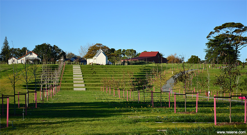
Pops of pink surprise and delight on the ‘The Esplanade' at Auckland Airport by Bespoke Landscape Architects in collaboration with Surface Design Inc, winning the Resene Total Colour Landscape Award.
The Esplanade is home to an unexpected use of colour in a landscape on a scale that provides variety and intrigue.
The use of colour oozes confidence, dressing up an element of a project that is normally left as is. The before and after shows a remarkable transformation from ordinary and necessary into a feature that complements the beauty of nature and also stands alone in its own right. The colour draws your eye further into the project helping you to see and appreciate the full vision beyond the first few plantings.
It’s a piece of art, entirely considered and thought through.
Find out more about this project
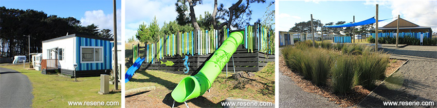
Celebrating the retro caravan in paint colours on the Foxton Beach Motor Camp by Prorata Landscape Architecture won the Resene Total Colour Maestro Landscape Award.
Incorporating themes of ‘Retro’ Caravan Awning patterns and the local seascape this motor camp embraces this theme and perspective incredibly well. It brings together the focus of the location with the natural environment to celebrate both in a colourful lively way to attract and reflect the liveliness of its regular stream of family campers.
The use of colour on this project brings a warm and vibrant feel; without it the landscape could be very bland. Using bold strokes of colour on key elements of the project also provides a quick means of recognisable identification of key camp locations when the camp is abuzz with holiday activity.
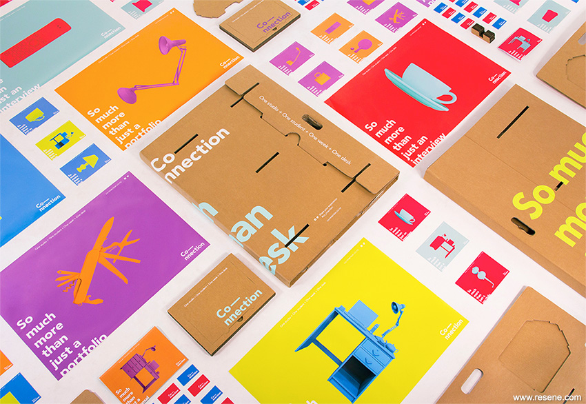
The palette of Co-nnection, by Fraser Callaway & Oliver Ward, is designed to pop and punch winning the Resene Total Colour Rising Star Collaborative Award.
Colour is a key tool when creating a visual language. Impactful with bright personalities, striking yet simplistic, this project focuses on using clean colours that are just full of positive connotations to draw attention to the work.
The combination of colours, both in the planning and execution stages of the project, shows a complete understating of what you’re trying to achieve and how colour can be harnessed to make a great idea soar even higher. The effort and innovation in this project demands high marks. Ambitious and very well put together, the wealth of ideas is inspiring.
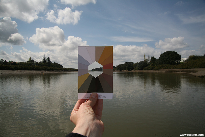
Drawing inspiration from nature the ‘A Coloured Journey’ project by Iris Bosman won the well-deserved Resene Total Colour Rising Star Individual Award.
Inspired by the variety of colours found in the Auckland coastal landscape, this project is subtle and just beautifully put together. Painstaking attention has been paid to getting a true sense of the environment and capturing the beauty of the natural colours using materials found in and on the land.
The delicate colour scheme is completely reflective of the environment bringing together hues that can be used on buildings and homes so they sit well within the natural landscape.
This project demonstrates a fantastic process and clear appreciation of colour through experimentation.
The Resene Total Colour Lifetime Achievement Award recognising a person in the architecture and design industry who has shown dedication to innovative and excellent colour in their work was awarded to Ian Bowman.
Ian is New Zealand’s leading conservation architect and the ‘keeper of the history of buildings’. Delving into historical images and information on old buildings and homes, Ian has been able to use this to provide guidance on appropriate colour schemes to redecorate heritage homes and building long after they have been built, in keeping with their original style and design intention. Many a garishly modern painted colour scheme has been replaced by an aesthetically pleasing colour scheme to bring out the best in our historical buildings.
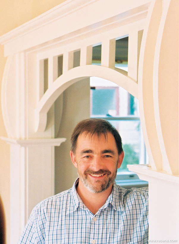
Building conservation is a relatively new field, especially in New Zealand. Ian was the first New Zealander to complete a postgraduate qualification in this field of specialisation. In his architectural practice, based in Wellington and Nelson, he has worked on projects as diverse as the conservation of historical homes, bridges and railway carriages, and the restoration of the St James theatre in Wellington. Ian is also a lecturer at Victoria University’s School of Architecture.
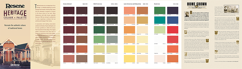
The Resene Heritage colour range was developed in the mid 1990s with Ian’s colour expertise and knowledge of colours that were appropriate to different eras of homes. As we have started to appreciate the history of our built environment, this heritage colour palette and Ian’s guidance notes on use have helped many home decorators embrace and celebrate the history of their home through their colour choices. The chart has been instrumental in helping people choose colours that respect the age of the building they are painting.
Since then Ian has undertaken paint analysis on a great number of buildings which has reinforced that the colours on the chart, based more on academic research than practical discoveries, are accurate and authentic heritage colours.
Through Ian’s work the history of colour use on our homes and buildings has been unlocked for others to use as inspiration for their own colour selections.
![]() Get inspired ! Subscribe
Get inspired ! Subscribe ![]() Get saving ! Apply for a DIY card
Get saving ! Apply for a DIY card
![]()
Can't find what you're looking for? Ask us!
Company profile | Terms | Privacy policy | Quality and environmental policy | Health and safety policy
Colours shown on this website are a representation only. Please refer to the actual paint or product sample. Resene colour charts, testpots and samples are available for ordering online. See measurements/conversions for more details on how electronic colour values are achieved.
What's new | Specifiers | Painters | DIYers | Artists | Kids | Sitemap | Home | TOP ⇧