Wellington
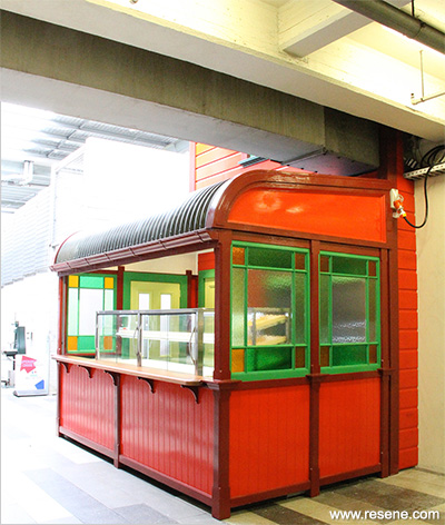
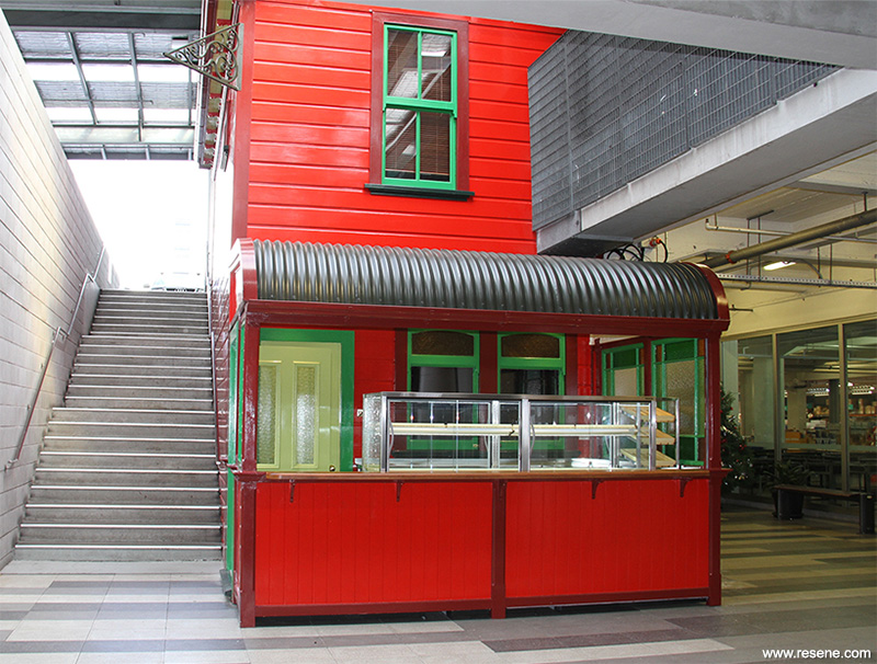
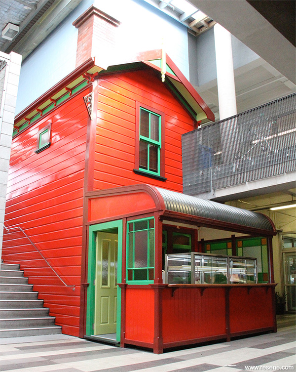
The brief from the client was to create a vending station in the concourse of the Wellington cash and carry multi store; a cottage facade wrapped around two sides of the central lift shaft.

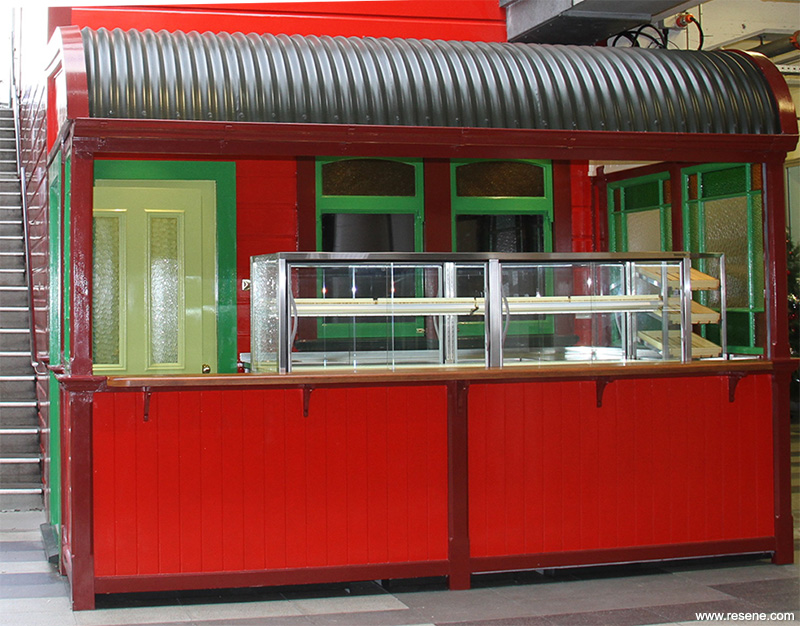
The cottage’s architectural styling and design was to refer to little worker’s cottages that once proliferated around the Te Aro store site. A study of old photographs of these cottages was undertaken, which aided the design process. The design also needed to be functional as a small food shop, one that was appealing and themed, where customers could easily help themselves to sushi from cabinets.
The installation was designed, pre-fabricated and painted in the workshop. It was installed over three nights for least disruption and an element of surprise for customers. Although the cottage looks like wood it is mainly fibreglass, even the window framing. The roof is iron.
Designed in AutoCAD, the CNC router machines used 3D files to mill the moulds for fibreglassing. The designers also used AutoCAD and Resene colour books to design the colour as well as lots of Resene testpots. While developing the colour scheme the team constantly referred to the Resene website to find colours and information.
The coloured glass in the end windows of the veranda were carefully chosen to work well with the Resene paint colour scheme and further portray the Japanese meets Colonial Heritage story.

The starting point for the colour scheme was looking at and photographing the environment the cottage installation was to live in. Centrally placed in the Moore Wilson’s complex, it was very grey. The feel was industrial and prone to a chilly breeze. Three concept colour schemes were first presented:
The Sushi inspired colour scheme was chosen as the favourite. Developing the concept further, a collaboration of Colonial and Japanese was created.

To bring the look together, a mood board was filled with Japanese ceramics, interiors and Kimonos. One red Kimono started to lead the design direction. It helped focus and retain an overall Japanese feel. Adjusting some of the colour choices due to tonal value, the aim was for tonal couples: Resene Monza (clean red) with Resene Japanese Laurel (bright green) and Resene Lonestar (dark red) with Resene Midnight Moss (deep green). Most colours were applied in a high gloss finish for an easy clean and eyecatching surface.

The roof colour Resene Marshland (green black) in Resene Summit Roof was inspired by Nori, the seaweed wrap around sushi. Resene Japanese Laurel was also inspired by seaweed but this time the bright shredded variety. Vermont referred to Resene Avocado (olive green). To simplify the scheme, colours like Resene Koromiko (bright orange) and Resene Clementine Orange (persimmon orange) were removed. The Resene Double Pearl Lusta (warm cream) in the interior was a nice rice inspired colour that matched the scheme. The reds and all these colours were seen in the Kimono design too.
The chimney on the cottage is a paint effect finish to look like sooty bricks. The grey blockwork of the lift shaft that was above the cottage was to be painted a sky colour. Using the Resene Colour Match Online tool, the best match to the envisaged sky blue was Resene Splat (clear blue) in Resene Lumbersider.
One of the aims of the cottage concept was to intrigue, add a bit of fun and entertain Moore Wilson’s customers. This was also a consideration in the design of the colour scheme. Feedback from the client has been that the Sushi chefs are very busy and it feels as if the cottage has always been there. It adds a warm heart to the store complex.
When the outdoors comes indoors the results can be spectacular. The striking colours and presence of the Moore Wilson’s Sushi House by Human Dynamo Workshop Ltd won the Resene Total Colour Commercial Interior Public + Retail Award.
The judges thought this project was “fun, lively and innovative. The colours tell a story drawn on history presented in a modern day way in a new twist on the store in store concept. A cold and bustling interior is highlighted with the use of colour, fitting into the building as a new hub feature. A welcoming icon and beacon has been created. It’s intriguing, fun and adds new entertainment, new shopping opportunities and a warm heart to the store.
A fabulous job.”
Building contractor: Human Dynamo Workshop
Client: Graeme Moore, Moore Wilson's
CNC router operations and fabricator: Andrew den Haan
Colour selection: Sue Dorrington
Fabricator and model maker: Carl Hobman
Installation designer: Dominic Taylor
Interior designer: Dominic Taylor
Out source fibreglassing: Fibreglass Developments Ltd
Project manager: Rob Uivel
Supervised design installation of kitchen fitting and display cabinets: Below Zero
Winner: Resene Total Colour Commercial Interior Public + Retail Award
Project: Resene Total Colour Awards 2014
From the Resene News – issue 1/2015
Resene case studies/awards project gallery
View case studies that have used Resene products including many from our Resene Total Colour Awards. We hope these projects provide inspiration for decorating projects of your own... view projects
Total Colour Award winners:
2023 |
2022 |
2021 |
2020 |
2019 |
2018 |
2017 |
2016 |
2015 |
2014 |
2013 |
2012 |
2011 |
2010 |
Entry info
Latest projects | Project archive | Resene news archive | Colour chart archive