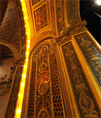
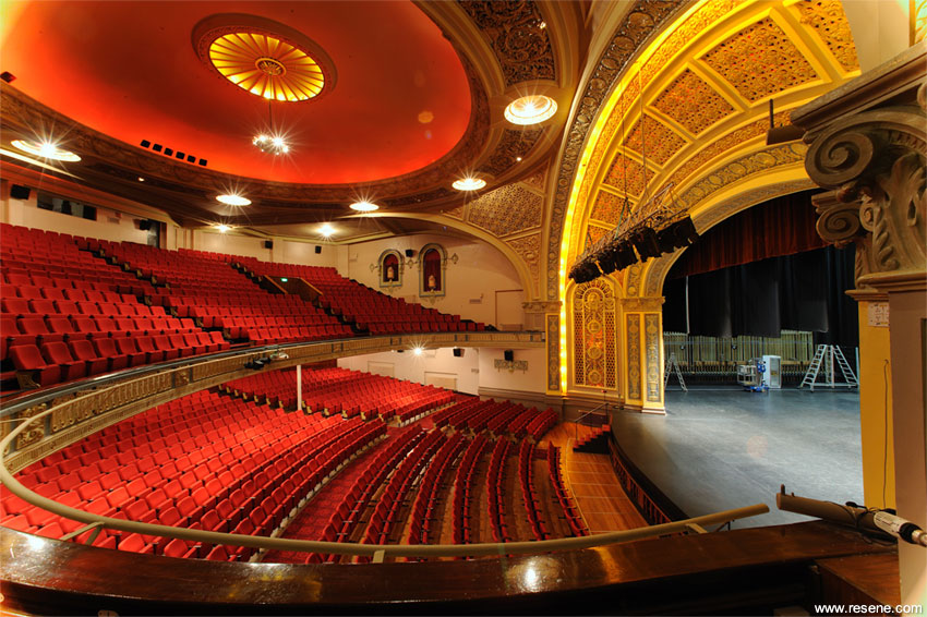
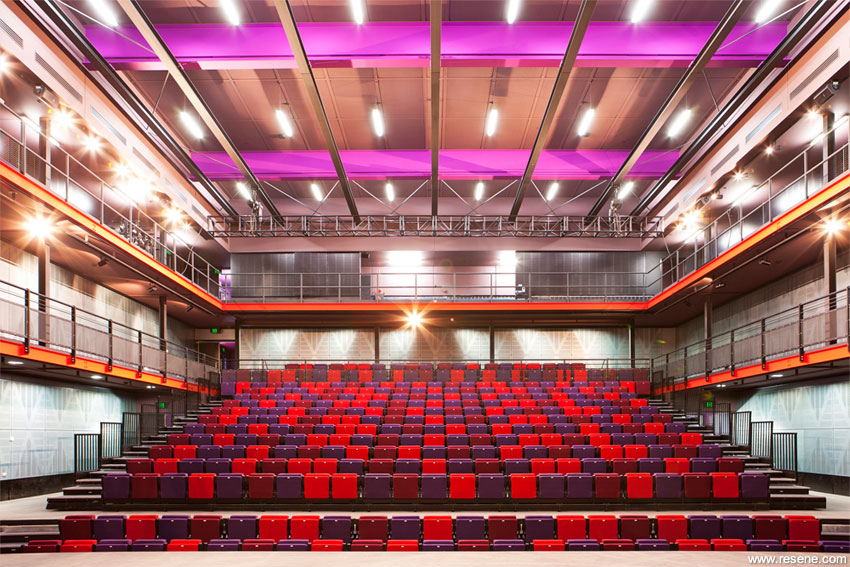
The striking theatrical palette on the Regent Theatre Redevelopment in Dunedin by Oakley Gray Architects has been awarded top honours in the Resene Total Colour Awards for its opulent use of colour.
Resene has a long history of colour with colours like Resene Spanish White and Resene Pearl Lusta created over three decades ago still continuing to be top choices for decorators today. With thousands of colours available, the key is not just choosing the right one but putting it together with complementary colours and accents to bring the colour palette to life. The Resene Total Colour Awards were launched to encourage and celebrate excellent and creative use of colour.
Awards have been given for the best colour use in: Residential Exterior, Residential Interior, Commercial Exterior, Commercial Interior - Office, Commercial Interior – Public + Retail Space, Display + Product, Education, Heritage, Rising Star (student), Lifetime Achievement, with the Colour Master - Nightingale Award for the best overall colour use.
Colour Award winners
Colour Maestro award winners
The Resene Total Colour Master Nightingale Award, named after the Nightingale family who founded and still run Resene today, recognises excellence in colour and paint use, and was awarded to Oakley Gray Architects for the Regent Theatre Redevelopment. They also won the Resene Total Colour Heritage Award.
The judges were excited about this project because it captures the history and role of the building - Victorian excess captured in 1928. It has been supported with a very good start from the architecture, adding a sense of lushness, opulence and theatrical atmosphere through an extensive array of hues.
The colours chosen highlight and embrace the clever use of lighting with complete attention to detail. Starting neutral then adding a sense of surprise when you enter into the spaces. This project simply stands out; it showcases a big night out, celebratory and indulgent.
Exciting, theatrical the judges all thought it was just ‘Wow”.
Find out more about this project
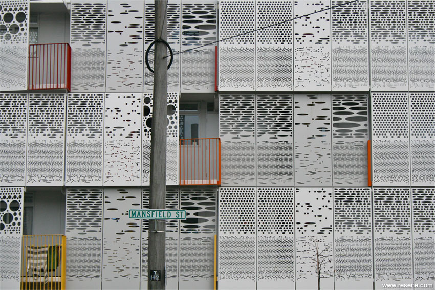
The extensive and well placed colour palette of the Newtown Park Apartments by Studio Pacific Architecture won the Resene Total Colour Residential Exterior Award. This project also won the Resene Total Colour Maestro Nightingale Award.
The judges wholeheartedly agreed that this project was completely delightful. It’s appropriate to the environment with a nice sense of strength, variation and graphical quality. The impact of line and form has been highlighted with colour, another means of identifying spaces. The colour gives solidity to the building and shows the power that colour can add.
The Newtown Park Apartments demonstrate such a great use of colour to create a sense of welcome... you just want to move in. The scheme is communicative in blocks, telling people where to go yet alleviating the monolithic. It identifies itself with a very interesting façade of subdued architectural with a punch of colour. This project stands out as it is a completely sensitive and thoughtful use of colour, with a high level of design skill applied to a familiar form.
Find out more about this project
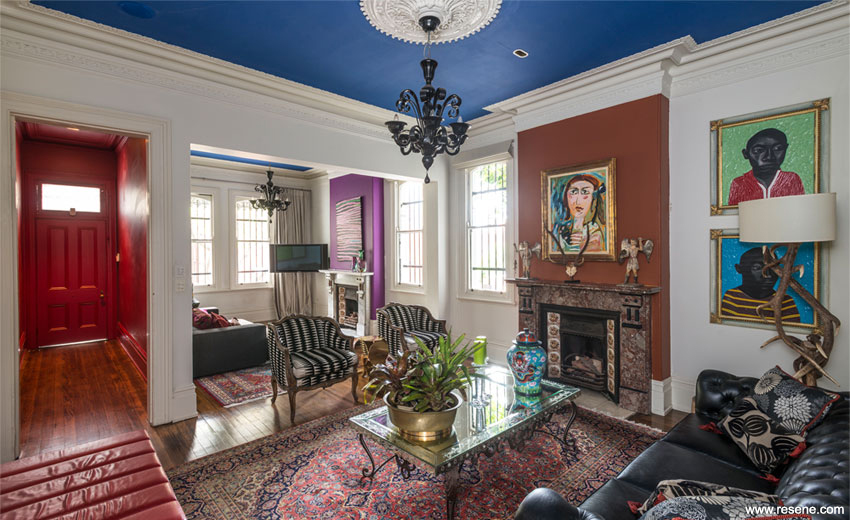
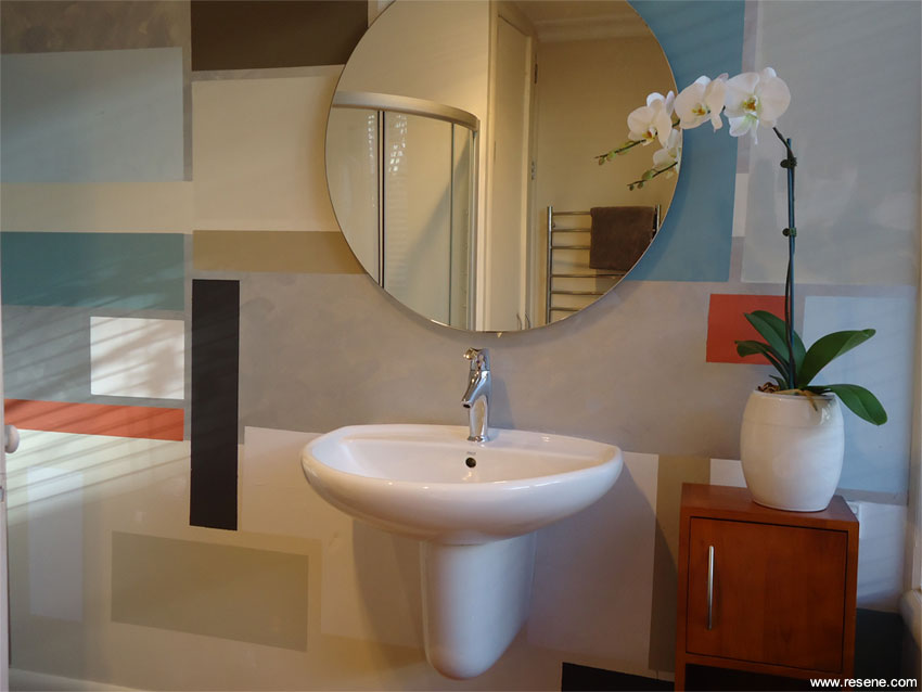
The brave and confident colour selections of this Victorian Terrace by lick light + colour won the Resene Total Colour Residential Interior Award.
This Victorian Terrace exemplifies an atmospheric palette. Careful consideration has been given to the art on the walls. The red is immediately striking and brings you into the home with drama. It sets the scene for the colour that follows. Colours are highlighted by architectural structures.
The entire house has been treated as a work of art – it’s a visual feast. It Inspires and creates a sublime palette, indulgent yet still with elements of surprise. The red hall entrance closes you in and creates a statement and sense of anticipation the moment you arrive.
Find out more about this project
The creative colour blocking of the Arty Art Deco by Eucalyptus Design & Interiors was awarded a Resene Total Colour Residential Interior Colour Creativity Award.
This Arty Art Deco home demonstrates an innovative and contrived approach, incredibly clever. The colour concept was a unique way to decorate the space on a very limited budget. The colours are placed in such a way that the walls become the artwork.
Find out more about this project
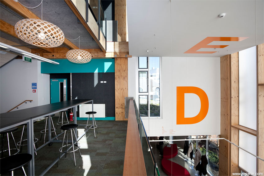
The contrast of punctuations of striking colour against neutral backdrops at Te Ara Hihiko, College of Creative Arts by Athfield Architects Limited was awarded the Resene Total Colour Education Award.
The judges appreciated the way the colour is integrated in the architecture rather than imposed. It has picked up on cellular spaces with colour interventions of perfect selection. The colour simply punctuates the building.
As the colour use is highly focused, the palette and project is highly legible. It’s a very clever use of colour on a complex building.
Find out more about this project
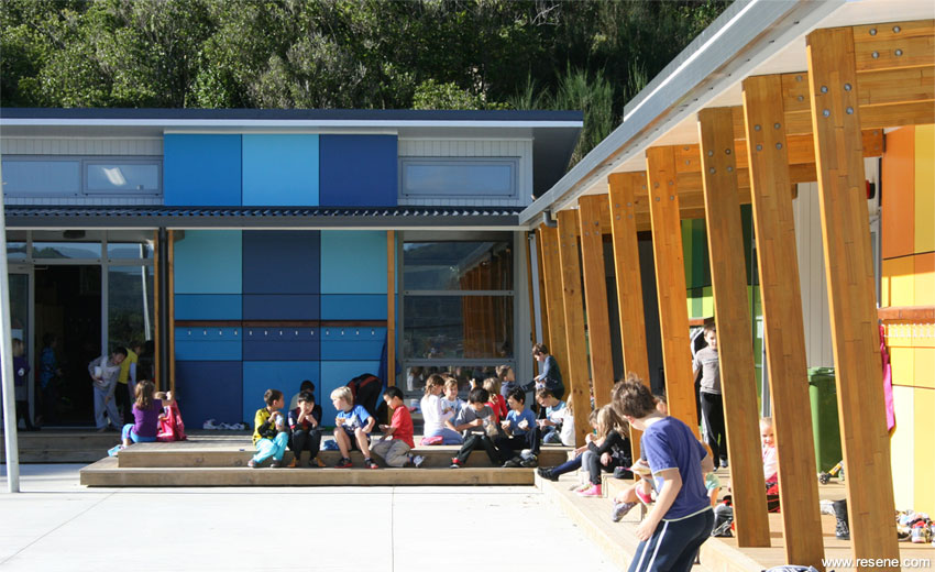
A Resene Total Colour Education Colour Maestro Award was awarded to Papakowhai School - New Four Classroom Block by Vorstermans Architects Ltd, for its playful use of colour to differentiate each block.
The four blocks are identified by the use of colour, but in a sophisticated way using varying strengths of colour complementing each other in each block. The colour communicates and improves wayfinding for students.
The balance of the scheme is kept with the neutrals allowing the coloured blocks to shine, intensified by their geometric pattern. As the colours are north facing they get diffused and lively play in the light.
Find out more about this project
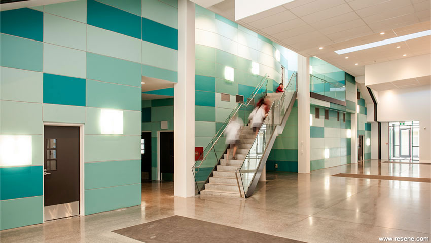
The clever mix of colours of Sacred Heart College Performing Arts Centre by Opus Architecture was also awarded a Resene Total Colour Education Colour Maestro Award.
Colour blocking creates interest as soon as you enter this project with a cool collection of fresh hues decorating the main foyer.
As you move into the auditorium it has a striking sense of warmth, the juxtaposition of colour is entirely appropriate for this project. In this environment you don’t want the colour to be overly powerful, but the colour palette picks up the school colours without being overdone. It’s delightful with a great focus on the space and colours used.
Find out more about this project
The unique use of colour on Site 7 Auckland Airport by Eclipse Architecture won the Resene Total Colour Commercial Exterior Award.
Colour takes on a magical impact as we see colour being used as a language, not just a token wayfinding.
It is nice to see that the colour use isn’t based on a corporate identity, but is focused on clear topography. It is just right. It’s a simple yet very effective way of making a utilitarian building completely interesting through the use of block colour and creative colour stripes.
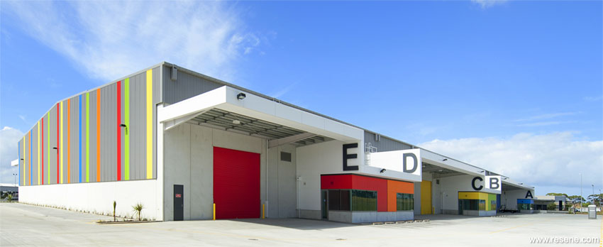
Find out more about this project
The fresh colour highlights on the Flaxmere Park Public Toilets by Citrus Studio Architecture were awarded a Resene Total Colour Commercial Exterior Colour Maestro Award.
The fresh hues against the stark concrete has a lovely freshness about it. The colour palette is made subtle with the backdrop of the trees. It has a cleverness about it.
Normally this would be narrative but it is surprisingly abstract. The cute architecture is highlighted with lively hues that play delightfully together. They have done enough and restrained themselves from overdoing it. Just perfect.
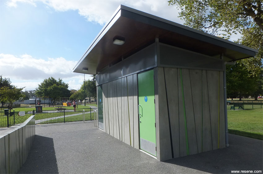
Find out more about this project
The Resene Total Colour Heritage Award was won by Oakley Gray Architects for the Regent Theatre Redevelopment who also took out top overall honours with the Resene Total Colour Master Nightingale Award.
The traditional and sympathetic tonings of Allendale House by Salmond Reed Architects was awarded a Resene Total Colour Heritage Colour Maestro Award.
Incredibly thoughtful, this colour palette is not punchy or overwhelming, it’s just completely appropriate. It has moved the building forward with respect. The respect applied makes you treasure it more as a reflection of times gone by. Neo-Georgian with a Victorian undertone coloured with complete sensitivity for enjoyment today.
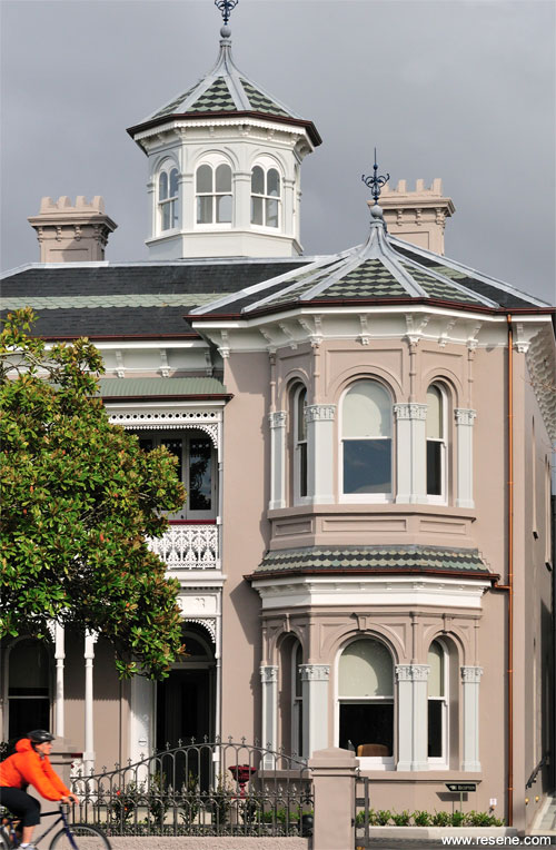
Find out more about this project
The fun and inclusive use on colour from office to public areas on Alpers Dental by Lovelace & Co. was awarded the Resene Total Colour Commercial Interior – Office Award.
Fun fun fun! An outstanding use of colours being used in block form providing another method of communication. Colour has been used to upgrade the architecture. It’s an element of surprise for a dental office with surprising visual tricks.
The spaces have been renovated for the enjoyment of both those that work in the building and the visitors to the building with clear thought on the appropriate use of colour for the task.
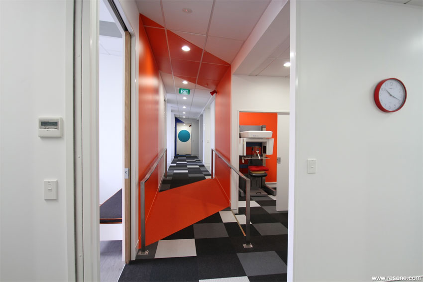
Find out more about this project
Hot hues on The Cube, Wodonga by Williams Ross Architects won the Resene Total Colour Commercial Interior – Public + Retail Award.
Ecclesiastical and fit for cardinals and kings, the colour palette is completely memorable. It’s bold and luminous, vibrant and energetic with a sense of anticipation that something exciting is about to happen.
It’s a great example of getting atmosphere from walls not floors and the palette is a departure from current colour trends yet looks completely modern.
Find out more about this project
The friendly and comforting colours that welcome you into Ronald McDonald House – Wellington by Honour Creative won the Resene Total Colour Commercial Interior – Public + Retail Colour Maestro Award.
An environment like this becomes a home. The eye is drawn to the colour.
The colour palette evokes a sense of security and friendliness. Strong lines create a comforting feel and the colours have a veil of grey, burnt and dirty. It’s a very sensitive use of colour, both in application and use.
Find out more about this project
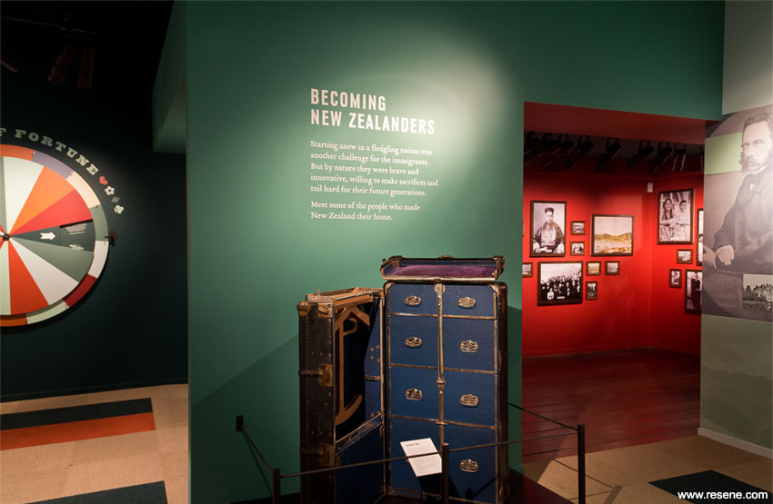
The journey through colour of ‘The Immigrants’ exhibition, Voyager New Zealand National Maritime Museum by The Letter Q was awarded the Resene Total Colour Display + Product Award.
This exhibition shows strong confident use of colour, brave and Innovative. The palette is carefully contemplated for an exceptional end result. Colours integrated in displays are well thought through.
Colour leads the navigation through the display and is woven into the story. The colour palette has a nautical theme without being cliché and is cleverly bound together through the interactive colour wheel.
Find out more about this project
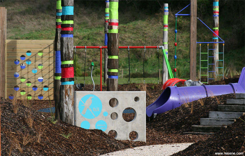
The playful and eye-catching colour that draws you into Hockey Reserve, Nelson by Canopy Landscape Architects was awarded the Resene Total Colour Landscape Award.
The colour scheme is sophisticated and purposefully added rather than relying on pre-coloured propriety objects. The touches of colour across an array of structures brings them together and provides a sense of delight. Everywhere you look there is a touch of colour to be enjoyed.
The totem pole is layered with colour, completely inviting, lively and draws attention and interest to key elements. This is instantly appealing to children. A perfect proportional use of colour.
Find out more about this project
Sal Rogers, who did her studies through UCOL Palmerston North, was awarded the Resene Total Colour Rising Star Award.
Sal’s project ‘Sullivan’s 1920s Bungalow’ was well considered, well integrated and well presented. It centres on good use of an accent colour that adds a sense of rhythm. The completely appropriate use of the accent, offers a sense of excitement. A delightful play on the country man and city woman theme, the added urban feel makes it very appealing.
The Resene Total Colour Lifetime Achievement Award recognising a person in the architecture and design industry who has shown dedication to innovative and excellent colour in their work, was awarded to Nanette Cameron of The Nanette Cameron School of Interior Design.
When Nanette graduated with a degree from Otago University, Interior Design did not exist in New Zealand, even as a concept. Nanette had decided she wanted to work in interior design but, with no formal way to learn all she needed to know, she was diverted into secondary school teaching before heading off on her big OE. Based in England she travelled widely in Europe learning by "osmosis" before returning to New Zealand to join the then only true Design and Furnishing Store, Hurdleys. There were no Interior Design courses available in Australasia so everything had to be learnt on the job through an apprenticeship.
Having caught the interior design bug, it was after her first child was born that Nanette was inveigled into teaching night classes at Tamaki College, where she relished the study involved in developing a successful course in Interior Design. The School grew and expanded, moving into the Community and Cultural Centre in Pakuranga, where for the first time it was officially named as The Nanette Cameron School of Interior Design. The Cultural Centre has since been re-named Te Tuhi, and the Interior Design School remains an important and significant part of the organisation.
Nanette has a deep passion for design and people, and unites the two through her courses. She loves much from the past but gets excited about new "cutting edge" design and architecture. She feels that next to creating a home and family, is the richness that comes from travel, but travel with a purpose or goal. Every year Nanette tries to go to a country or city she has not previously visited: one year it might be the famous Milan Furniture Fair, followed by a visit to a new and challenging Art Gallery or Museum, such as the Guggenheim in Bilboa, Spain. Nanette feels she is lucky in that she has the classes to share her experiences and enrich their future travels. She frequently gets a card from overseas from an appreciative previous student saying how appreciative they are for her "opening their eyes”.
Nanette's most significant work is in the form of her ability to teach and inspire in the way that she does.
Over many many years, Nanette has introduced a steady stream of students to the inner workings of colour and how they can harness the power of colour on their projects, from the smallest residential project to large commercial projects. Through her students Nanette’s interior design principles have touched many buildings all over the world, and especially so in New Zealand. And even more so, they have opened up her students eyes to the endless possibilities of how they can do things differently, whether that be in design, in life or in colour.
![]() Get inspired ! Subscribe
Get inspired ! Subscribe ![]() Get saving ! Apply for a DIY card
Get saving ! Apply for a DIY card
![]()
Can't find what you're looking for? Ask us!
Company profile | Terms | Privacy policy | Quality and environmental policy | Health and safety policy
Colours shown on this website are a representation only. Please refer to the actual paint or product sample. Resene colour charts, testpots and samples are available for ordering online. See measurements/conversions for more details on how electronic colour values are achieved.
What's new | Specifiers | Painters | DIYers | Artists | Kids | Sitemap | Home | TOP ⇧