Mother Duck Childcare
This colourful, progressive building is unique in its use of colour to embody the Mother Duck organisation’s child-first philosophy.
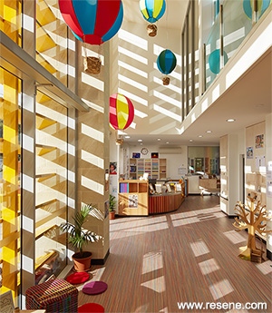
Heralded as one of the best examples of childcare design in the country by Australian Assistant Minister for Education, the Hon. Sussan Ley MP, this signature childcare centre for the Mother Duck childcare group was designed by New Zealand based Context Architects.
This colourful, progressive building is unique in its use of colour to embody the Mother Duck organisation’s child-first philosophy. Located in the bayside Brisbane suburb of Wynnum, the centre cares for up to 130 children in a stunning home-like atmosphere.
The building is pushed to the edges of the site’s boundaries to maximise the space available. Every corner is used to its maximum potential to give the children lots of varied spaces to play, room to move and areas for rest and quiet when needed. The centre is light and transparent within – so you can see what’s happening in every classroom, but is shielded from the street for visual protection.
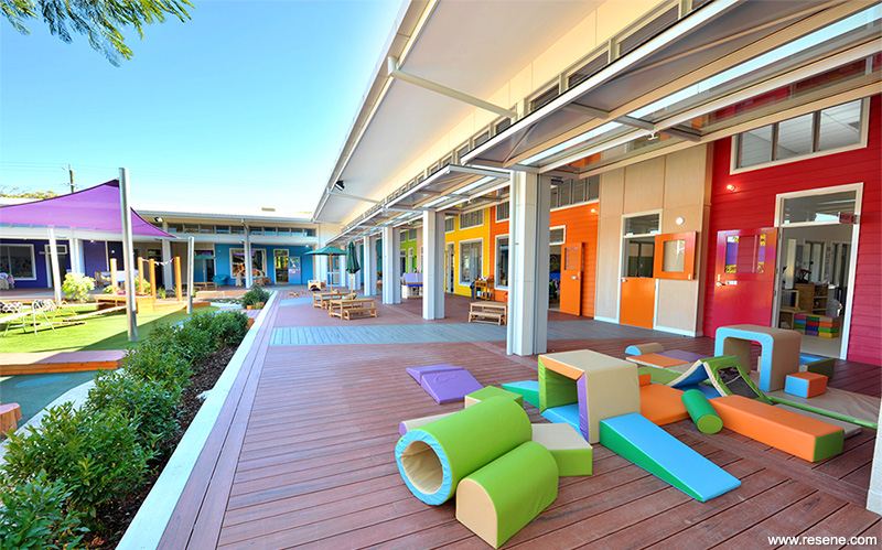
A double-height, light-filled atrium complete with fishtank reception leads to Rainbow Street – an indoor-outdoor street with seven bright, beautiful classrooms painted the colours of the rainbow running along its length. The Resene inspired Rainbow Street is a flexible covered play-space featuring colourful individually themed ‘homes’ complete with letterboxes and streetlamps. It is full of interactive child-height features such as louvres that the children can operate themselves.
Rainbow Street can be fully open to the elements via dramatic and playful fireman doors running the length of the building and around a corner, or sealed safe-and-sound on rainy days but with the benefit of light entering the building through the floor-to-ceiling windows of the doors. Rainbow Street was especially positioned on the south elevation to maximise the light available, which shines onto the Resene painted walls for additional vibrancy. The ‘verandah’ of Rainbow Street then spills out into a magical explorative playground (an ‘Aussie backyard’) with daring spaces for the children to explore and inhabit including a water park and mini-amphitheatre.
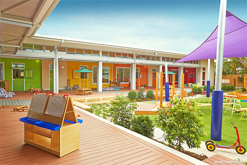
The bold, beautiful colours of Rainbow Street were the unifying feature of the whole design. The Resene colours led the cohesion of the concept and informed many of the other design choices – the outdoor play area, the brightly coloured louvres and the furniture and soft fit-out all took their cue from the colour palette of the paint.
Resene Alabaster (blackened white) is the unifying neutral throughout, joined by a rainbow of feature hues for each area – the nursery and sleep room for infants uses Resene Rock N Roll (pink based red) as its feature colour, the toddler rooms Resene Clockwork Orange (bold orange) and Resene Galliano (sweet yellow), the junior kindy area Resene Limerick (Irish green), the pre-kindy area Resene Aquarius (airy blue), the kindergarten Resene Optimist (turquoise blue) and the classroom Resene Pukeko (rich violet).
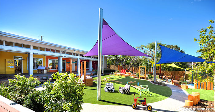
Sussan Ley MP, the Assistant Education Minister who opened the centre said at the opening: “The centre is outstanding. I’ve visited several hundred centres since becoming the Minister for Childcare. This is state-of-the-art. You walk in and get the feeling this is going to be a very special and successful place. You’ve designed an incredible building. And the amount of outdoor space is unique in city childcare.”
One month post-opening the centre was at 80% occupancy.
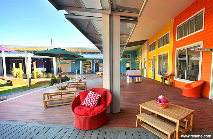
Context Architects were awarded this project because its design enabled the Mother Duck group to realise its commercial objectives, but also because its design put children first. The architects took the values of the childcare organisation and translated them into an ‘Aussie backyard concept.’ The rooms off Rainbow Street represented ‘homes’ with the ‘lounges’ opening out onto a ‘verandah’ and spilling into a rambunctious ‘Aussie backyard’.
With many of the design team parents themselves, they understood the need for attachment, familiarity and a sense of belonging. This was achieved by using familiar home-like materials like weatherboards and batten and sash windows, but predominantly through the brightly painted colours of the ‘homes’ – the seven rooms housing the different age groups (nursery, two toddler rooms, junior kindy, pre-kindy and two kindergarten rooms) each distinguished by a different vivid Resene colour.
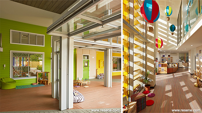
Long before they recognise numbers or letters, children respond to colour – very young babies recognise and respond to colour and are both stimulated and soothed by careful use of colour. For older children learning new words, colours are a useful and common starting point of verbal literacy and long before any of the children can read signs, they can recognise ‘their’ room through whichever strong and distinctive colour it is painted. Using a different bold colour for each room promotes a sense of belonging and recognition, which delivers on the client’s key driver and core value of creating a sense of belonging and safety for the children. The colour palette increases in sophistication and depth to match the age group and the graduated colours of rainbow as you progress along the street.
Resene was specifically selected because of the vibrancy of the paint colours and the reliability of the product; important given the intense and varying demands of the Brisbane climate – intense heat and light and buckets of rain. Rainbow Street needs to be a truly indoor-outdoor room – with the outward facing classroom walls specified to the standard of an external wall. Context knew Resene would perform.
Resene’s responsive representatives were also a consideration – important for a cross-ditch project with the architect in Auckland and the client in Australia. Knowing Resene from the domestic market gave the architects confidence in the product and its performance and knowing exactly how the colours would reproduce for the clients on site was a factor.
The clients loved the colours – they were there from the very beginning of the design process and were much admired by kids and parents at the end.
The judges were excited by the colour palette and awarded this project the Resene Total Colour Junior Education Award: “With a delightful playfulness, this colour palette brings a rainbow of colours together wholeheartedly. Values are translated through the use of colour. Colour is used to create attachment, familiarity and a sense of belonging.
The bold, beautiful colours are a unifying feature of the entire design. The colours led the cohesion of the concept and informed many of the other design choices; all made with children in mind. This is a childcare centre that is coloured to delight parents and children alike.”
Architectural specifier: Stephen Voyle, Context Architects
Building contractor: Armstrong Building
Client: Mother Duck Childcare Centres
Colour selection: Context Architects
Painting contractor: RS Quality Painting
Photography: Jacqui Blanchard Photography and RDW Photography
Winner: Resene Total Colour Junior Education Award
Project: Resene Total Colour Awards 2014
From the Resene News – issue 4/2014
Resene case studies/awards project gallery
View case studies that have used Resene products including many from our Resene Total Colour Awards. We hope these projects provide inspiration for decorating projects of your own... view projects
Total Colour Award winners:
2023 |
2022 |
2021 |
2020 |
2019 |
2018 |
2017 |
2016 |
2015 |
2014 |
2013 |
2012 |
2011 |
2010 |
Entry info
Latest projects | Project archive | Resene news archive | Colour chart archive