Lion office
Lion wanted their office to reflect the values of the company, and encapsulate their brand essence; creating a workplace that provided the optimal environment for collaboration and innovation.
There was a requirement for a menu of workspace options to provide choice of where and how people could work, catering for different work styles and personalities. They wanted a New Zealand flavour, without being kitsch, and lots of colour and talking points.
Lion have a dynamic group of people working with their diverse range of brands. It became essential that the workplace should reflect the diversity of both while still maintaining a highly functional space.
The initial idea was to make it ‘Like Home’, and over time this theme evolved to ‘There’s no place like Home’ which then became ‘There’s no place like Lion’. Theming over the two floors was developed into the North and South Islands bringing together iconic Kiwi places and traditional life experiences that epitomise the company’s products and where these products will be consumed. There are seven different themes: Beaches & Baches, Harbours & Travel, Outdoor Activities, City Laneways & Bars, Vineyards, Sportsfields and Deep South Adventures.
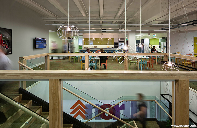
The floor plates of Napier Street are large and deep, so it was essential that the occupants didn’t feel overwhelmed by the scale of the building interior. The spaces are broken down with colour and materials into manageable chunks.
Colours were chosen to best represent the seven different themes, but there was always the challenge that spaces needed to be seamlessly integrated.
Beaches & Baches took inspiration from the sea and sand; fresh blues highlighted with strong yellows and oranges, using Resene Quarter Tea (muted beige), Resene Clockwork Orange (bold orange), Resene Kumutoto (maritime aqua), Resene Retreat (green blue), Resene Fish N Chips (ochre gold), Resene Captain Cook (maritime blue), Resene Half Escape (tint of sky blue), Resene Seeker (cerulean blue) and Resene Fuel Yellow (orange yellow).
Harbours & Travel took inspiration from the rusted wharf and stacks of aging suitcases; soft green and purple highlighted with strong burnt oranges and deep blues, using Resene Morepork (soft lilac grey), Resene Chocolate Fish (rich red brown), Resene True Blue (violet blue), Resene Half Emerge (water vapour green) and Resene Bonfire (autumnal red).
Outdoor Activities took inspiration from the lush New Zealand forest; soft green highlighted by strong fresh green using Resene Miso (yellowed neutral), Resene Koru (verde green), Resene Flourish (pesto lime) and Resene Kombi (gold green).
City Laneways & Bars took inspiration from a foggy Wellington winter day; neutral greys defined with blacks and deep purples, using Resene Chimney Sweep (inky black), Resene Half Tuna (steel grey), Resene Cinder (blue black), Resene Double Tuna (deep grey) and Resene Sea Fog (greyed white).
Vineyards took inspiration from the grape and rich red wine; light neutral and strong reds and purples, using Resene Grapevine (blackberry), Resene Livewire (deep ruby red) and Resene House White (cool offwhite).
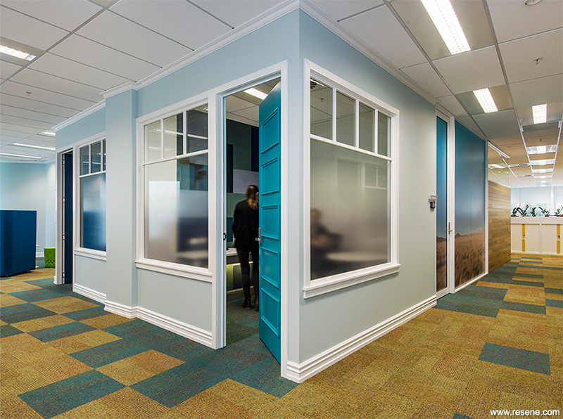
Sportsfields took inspiration from the frosty winter rugby field; icy greens highlighted by strong teals, using Resene Landmark (summer aqua), Resene Green Room (oceanic green) and Resene Carefree (watery green).
Deep South Adventures took inspiration from the snow-capped Southern Alps; light blues highlighted by strong dark blues, using a palette of Resene Wanaka (mineral blue), Resene Billabong (deep blue), Resene Waterfront (astral blue), Resene Seeker and Resene Breeze (aqua mist blue).
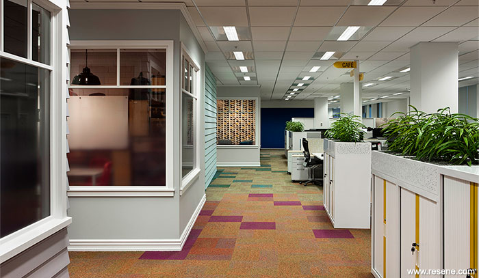
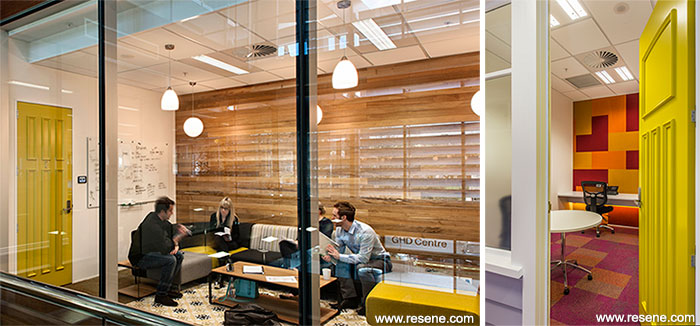
To complete the colour scheme, Resene Crisp Green (mid yellow green) is used outside the reception bathroom, Resene Breakfree (bold red) on the locker storage unit, Resene Tweet (yellow green) on the lounge door and Resene Half Alabaster (blackened white) on general walls, the café ceiling, skirting and architraves.
There are over 30 different colours of paint; the strong hues are generally used on the doors with softer pastels on the walls so the spaces do not compete with each other. It is this, along with the carpet, that guides the user from theme to theme, with natural blended transitions between them.
Cut Collective was engaged to create three pieces of ‘Street Art’ that would add another level of detail to the space and tie the colour palette together.
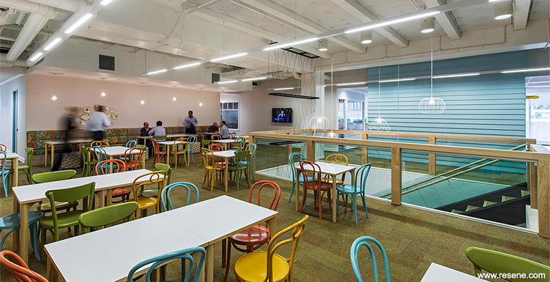
The cafe’s placement next to the main staircase, at the centre of the workplace, ensures its success as a place for coincidental conversation. The large open space of the main café is enhanced by the removal of ceiling panels to expose services and the underside of the floor slab above; a generous sense of height and volume was created by painting this Resene Alabaster. A home kitchen feel is created with the presence of ‘fridge magnet’ graphics, wire lamp pendants and the use of a complementary, homely colour palette. The colourful bentwood café chairs (painted in Resene Sebedee (flamingo orange), Resene Kombi, Resene Fuel Yellow and Resene Kumutoto) tie in beautifully with the custom coloured banquette seating fabrics, highlighted by the dolly light bulbs.
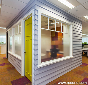
The exterior of the meeting rooms are reproductions of traditional residential building styles, with timber mouldings and windows, and weatherboard cladding, creating a neighbourhood look and feel. All skirting and architraves are painted in Resene Alabaster which brings in a level of consistency among the vast range of wall colours. Soft pastels were used on the weatherboards in keeping with traditional choices, as it is best to have paint with a high light reflective value to preserve the timber in the New Zealand sun.
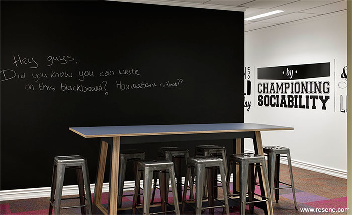
Resene Captain Cook was used on the exterior of the ‘Fish and Chip Shop’. This meeting room is in the Executive area. Resene Blackboard Paint Black was used in the breakout areas and on the locker doors used by the sales team. The sales team are the only team who desk-share. The blackboard areas give them an opportunity to personalise a space within the building.
The clever and confident selection of colour won this project the Resene Total Colour Commercial Interior Office Award. The judges thought: “The Lion office is such a complex project with lots of opportunity to use colour. Colours represent themes yet are seamlessly integrated to tell an overall cohesive story. Colour has easily identified the parts and is synonymous with the places and activities we know so well.
A complete interpretation of the Lion brief, the inspiration and highlighting through the use of colour, brings together a final scheme that works wonderfully well in a single interior. It’s an office that truly reflects the company that occupies its space.”
Architectural specifier: Creative Spaces
Building contractor: Construct Interiors
Client: Lion
Feature wall panels: Muros International Ltd
Interior designer: Creative Spaces
Lighting design: Caldwell & Levesque
Painting contractor: Valco Painting & Decorating ltd
Photographer: Simon Devitt, Bruce Clarke
Street artworks: Cut Collective
Supplier – carpet: Inzide Commercial
Supplier – bentwood chairs: Furniture Lab
Supplier – feature rugs: Designer Rugs
Workstation supplier: Vidak
Winner: Resene Total Colour Commercial Interior Office Award
Project: Resene Total Colour Awards 2014
From the Resene News – issue 4/2014
Resene case studies/awards project gallery
View case studies that have used Resene products including many from our Resene Total Colour Awards. We hope these projects provide inspiration for decorating projects of your own... view projects
Total Colour Award winners:
2023 |
2022 |
2021 |
2020 |
2019 |
2018 |
2017 |
2016 |
2015 |
2014 |
2013 |
2012 |
2011 |
2010 |
Entry info
Latest projects | Project archive | Resene news archive | Colour chart archive