From the Resene decorating blog
We are often asked about colour contrast and how to figure out what is enough of a colour contrast.

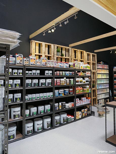
To view more of this project see "DIY Invasion Paint Retail Store and Warehouse."
LRV (Light Reflectance Values) work on a 0-100% scale and are a measure of what the colour looks like. So if you need a contrast of 30% LRV then you would need a colour of say 40 LRV and 70 LRV to give the required colour contrast difference of 30% LRV.
However if you have an LRV change of 30 you could end up with a dark green and a lighter green, which wouldn't necessarily be enough contrast for someone who is colourblind. Ideally as well as a strength difference, you would also use contrasting colours (e.g. yellow with blue), different sheen levels and good lighting to help emphasise the colour contrast.
You can use Resene colour codes to help identify colour differences. e.g. for the Resene colour code B54-058-237, the '54' is the luminance (which is similar in many ways to LRV), the middle part '058' is the saturation and the '237' is the position on the colour wheel. Each of those elements can be used to compare colours to add additional contrast.
LRVs only normally apply to solid colour finishes not stained finishes so if you are comparing stains you would need to visually check there is sufficient contrast. If comparing two surfaces from different suppliers that will be used side by side and need to be contrasting you may need to check how they are measured or do a visual check to ensure they provide sufficient contrast.
In the case of Resene you can view colours by reflectance value in our online colour library – this gives you a quick reference to what colours of various LRV values look like.
Use of contrast colours can help people use and navigate a space. Red is typically associated with signals such as hot (tap), stop (traffic light or stop sign) or an emergency (fire alarm). Green typically means go (traffic light, exit signs). Colours can be used for specific levels in a carpark or floors of a building to make it easier for people to remember which floor they started from. Colour can provide a trail through a building and is often used in hospitals to lead patients and families in the right direction. At night, glow in the dark paints, like Resene FX Nightlight, can provide a contrast against the dark and assist with navigation when normal colours are no longer visible.
Common areas to use contrasts are where adjoining surfaces meet that people have to navigate… think floor meets wall, door frame meets door, contrasts to mark the edges of paths or contrasts on stair edges to help make it easier to see where the levels change.
Beware of overwhelming a space with too many contrasts. If there is too much contrast within a surface and within adjacent surfaces, it can be very tiring for the eyes and the contrasts can start to compete with each other. Ensure you allow at least some areas of uninterrupted same colour space. This will make the contrasts more striking and easier for those using the room to identify. If you’re set on a striking design or pattern, keep it to one area with plain adjacent spaces.
Always consider your lighting, both natural and artificial, when planning your colour and surface finishes. Place lighting throughout a space to avoid over lit areas or areas in shadow and make the most of natural light opportunities for spaces that will be commonly used during the day. Consider contrasting switchplates for lighting so they are easy to see against the wall. At night glow in the dark paint can be used to highlight key areas.
Changing levels, such as going up and down stairs or up and down a sloping path, tend to be associated with higher risk. Ensure colour contrasts are used to help show the changes in level and provide contrasting colour handrails wherever possible to assist with navigating these areas. Marking the stair edge with white or contrasting paint helps reduce the risk of falling. Outside consider using a product such as Resene Non-Skid Deck & Path where the colour can provide a visual contrast and the grit finish can provide each extra friction for foot traffic, especially in wet weather.
As well as using contrasting colours, you can also use lighting and varying gloss levels and textures to help differentiate surfaces. Flat or low sheen walls will contrast more against semi-gloss or gloss doors than against lower sheen finishes. Be careful of using too much lighting as glare can make it harder to see colour contrasts and can tire the eyes.
For many it is easier to see the difference between two different hues – e.g. blue and yellow – than it is to see differences between one colour in two strengths – e.g. light and dark. If you are relying on the same hue in different strengths for contrast, ensure there is sufficient contrast to be easily seen in lower light situations, such as on an overcast day with the lights turned off when people may still be navigating the space without the need for artificial lighting.
Any colour has the ability to be a contrasting colour, when paired up with the right contrast.
Contrasts don’t need to be garish nor just black and white. Look for colours that the main users of the space would naturally enjoy and then contrast with different hues or bolder or lighter colours to provide adequate contrasts that will work for those who need them without resulting in clashing colours for those workers and visitors to the space who may not need to rely on the colour contrasts. Chosen well, colour contrasts should enhance the space for all users.
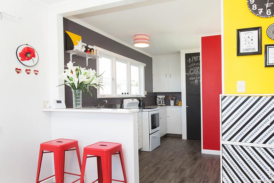
Each wall is a separate colour which helps distinguish which wall is which rather than them appearing to merge into one.
Feature colours: Resene Spotlight, Resene All Black, Resene Bullseye and Resene Black White.
› Project by Yvette Parker.
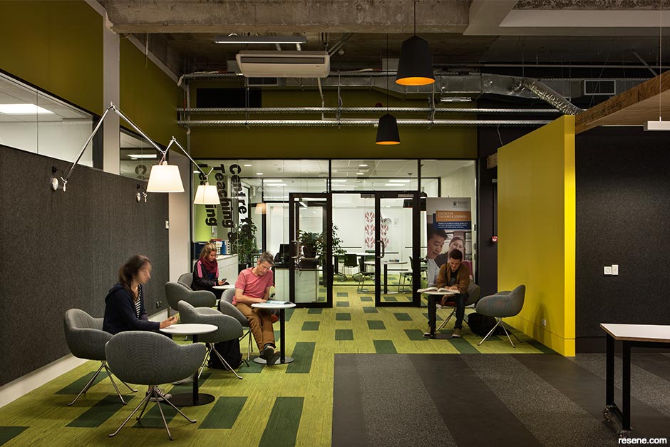
Contrasting colour is used as a wayfinding tool at Massey University.
Featured colours: Resene Wan White, Resene Impromptu, Resene Switched On and Resene Bokara Grey.
› Project by Athfield Architects Ltd.
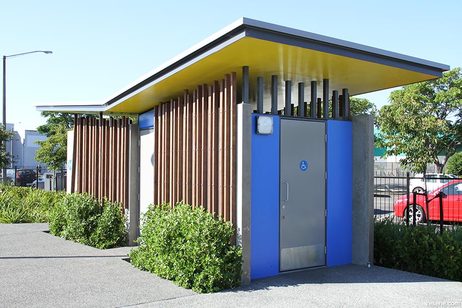
Contrasting colours between the doors and adjacent panels draw attention to the entry area and make it easy to see where the door starts and stops and the adjacent walls begin.
Featured colours: Resene Tory Blue and Resene Gauntlet (COLORSTEEL® Sandstone Grey).
› Project by Citrus Studio Architecture.
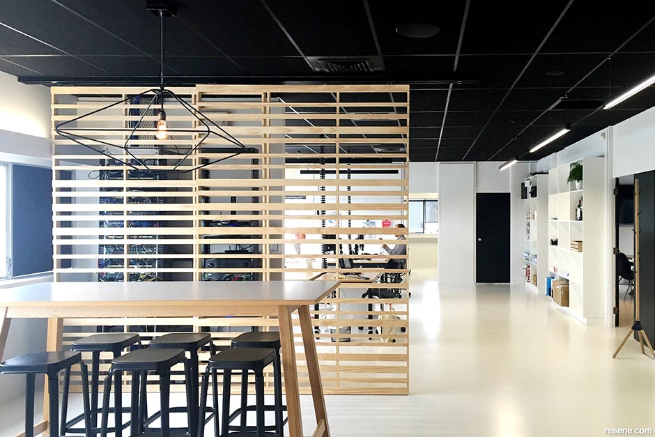
Black contrasts with white. Black doors stand out in a predominantly white office.
Featured colours: Resene Black White and Resene Black.
› Project by Buchan Group.
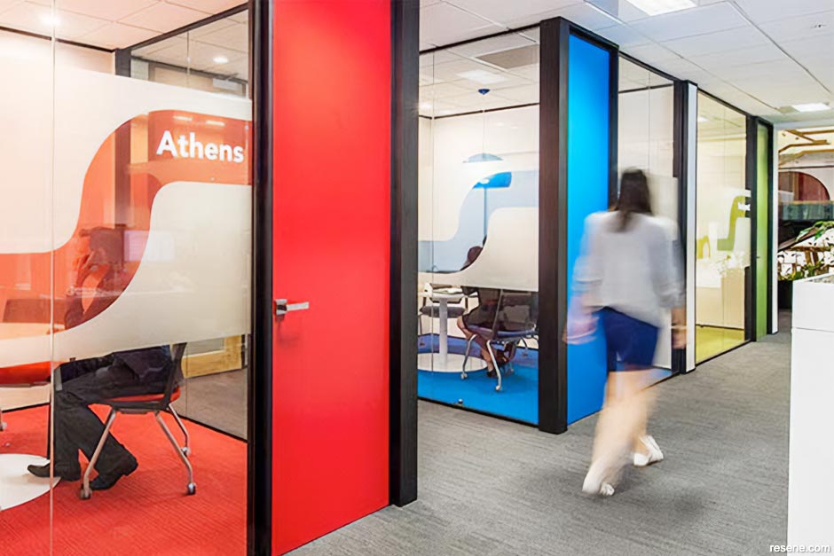
Bold colour is used with white to not only provide contrasts for each meeting space but also contrasts between meeting spaces.
Resene featured colours: Resene Smashing, Resene Optimist, Resene Koru and Resene Alabaster.
› Project by Creative Spaces.
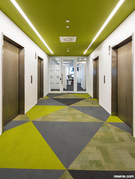
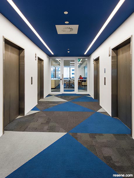
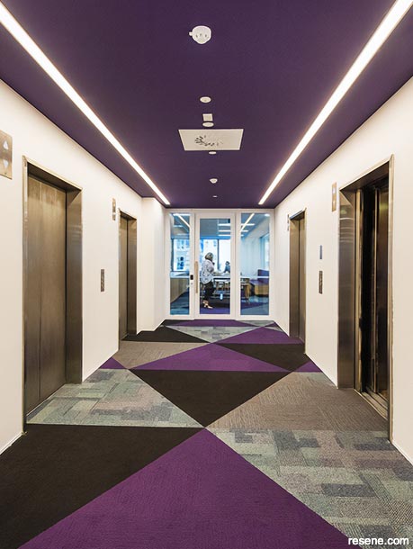
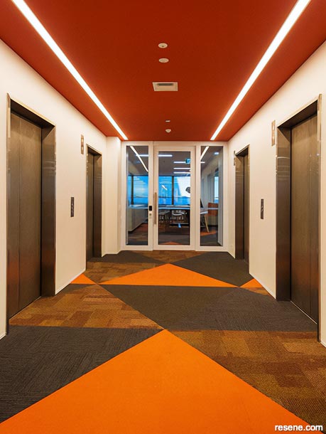
Each floor has its own colour scheme to assist with wayfinding.
Featured colours: Resene Kombi, Resene Limitless, Resene Wicked, Resene Whizz Bang and Resene Alabaster.
› Project by Creative Spaces.
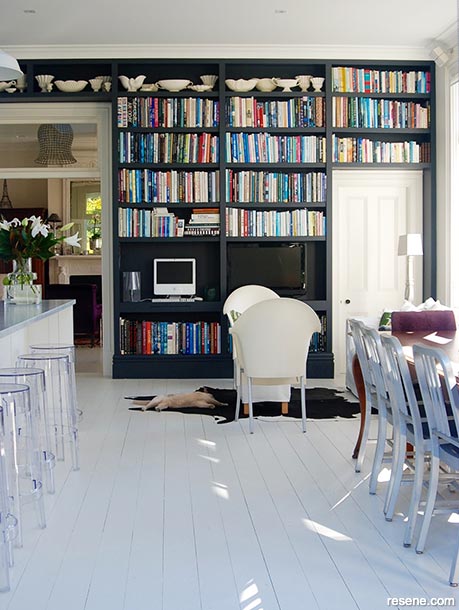
Moving into another room is easy with the doors and door frames white to contrast with the dark feature wall.
Featured colours: Resene Double Tuna and Resene Bianca.
› Project by Bridget Foley Design.
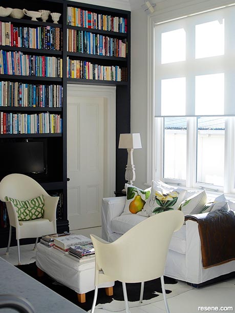
The dark door frame contrasts against the off white walls to make it easy to see and differentiate the door from the walls.
Featured colours: Resene Half Sea Fog and dark door joinery.
Project by Archaus.
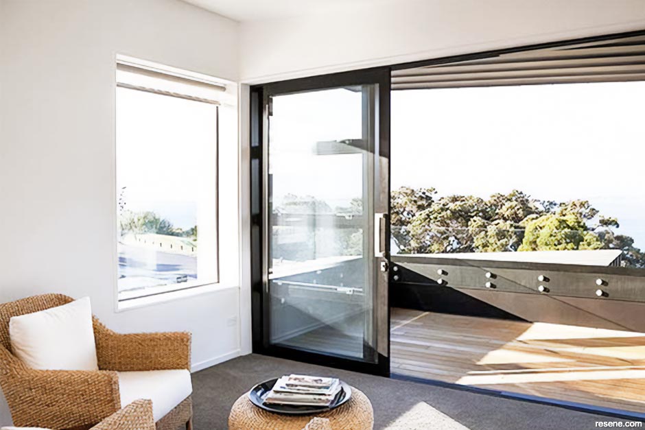
The contrasting shelf stands out against the white walls, while the timber floor also provides contrast to the white walls and the white bath. The black wooden beading also makes it easy to navigate around the room providing a consistent contrast colour to follow.
Featured colours: Resene Rice Cake, Resene Black and timber flooring and shelf.
› Project by Terranova Developments Ltd.
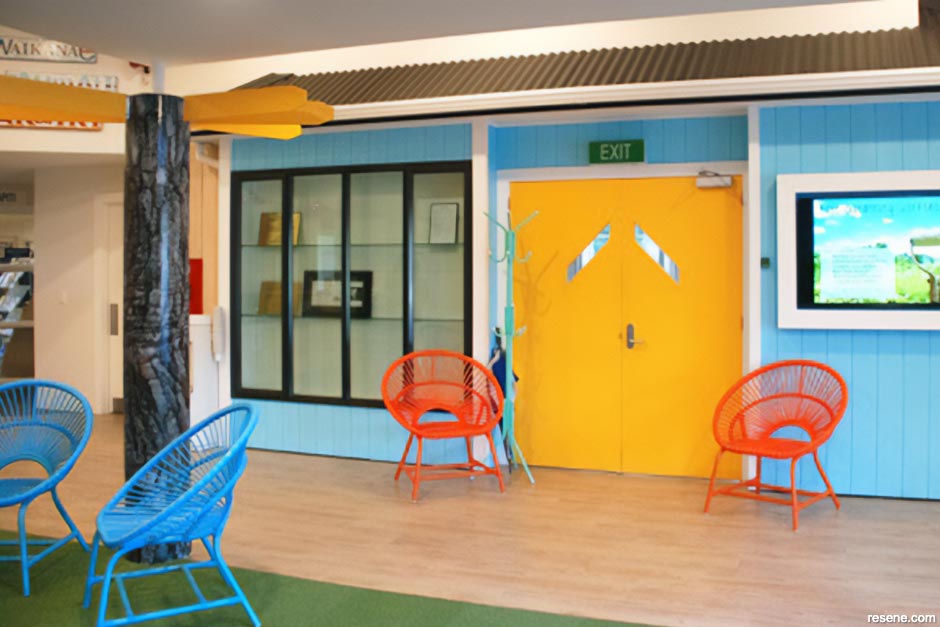
Bold yellow doors are easy to spot against a wall of blue.
Featured colours: Resene Morning Glory and Resene Bright Spark.
Project by Appletree Designs Ltd.
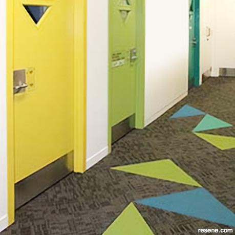
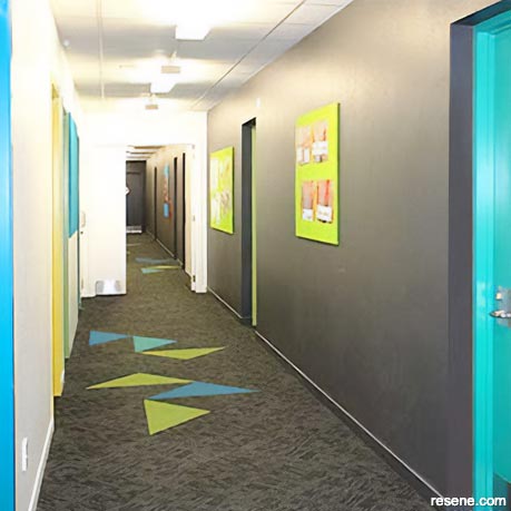
Carefully placed colour contrasts on the floor reinforce the colour contrasts on the walls.
Resene featured colours: Resene Karma, Resene Watercourse, Resene Blue Lagoon, Resene Fuscous Grey and Resene Black White.
› Project by Hayley-Anne Brown.
Red edging on the floor helps delineate between the walls and the floor. Bold accent wall colours help with navigation.
Featured colours: Resene Clockwork Orange, Resene Bahama Blue, Resene Bilbao and Resene Half Black White.
› Project by ASC Architects.

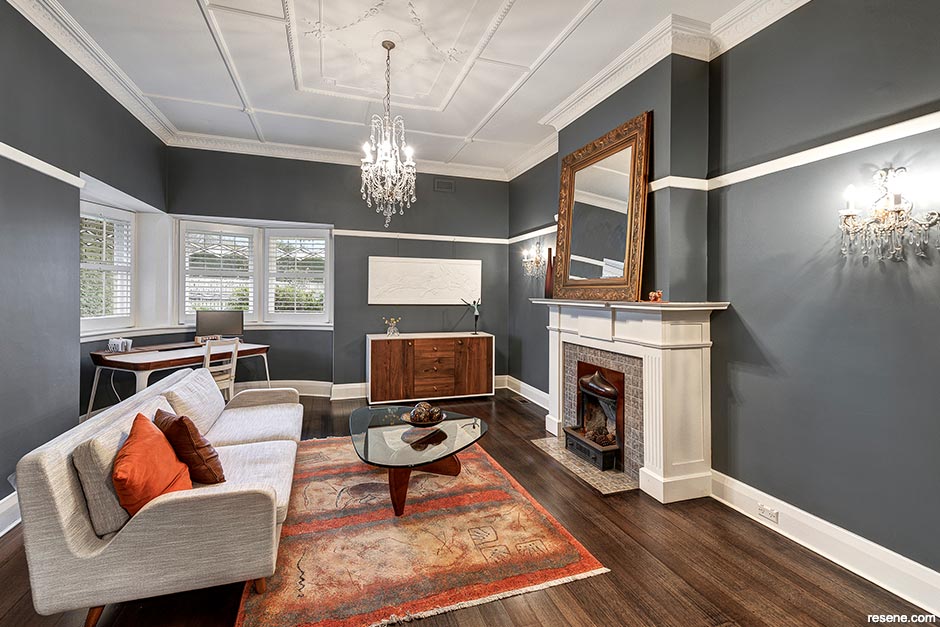
White trims and skirting boards show where the walls meet the floor and highlight the fireplace.
Featured colours: Resene Dark Slate and Resene White.
Project by Lauren McKillop Concepts.
Featured colours: Resene Scrumptious, Resene Crash Hot, Resene Get Reddy, Resene Balloon, Resene Hi Jinx, Resene Rubber Duck, Resene Fizz, Resene Lickety Split, Resene Wham, Resene Salem, Resene Sports Star, Resene Resolution Blue, Resene Deep Koamaru, Resene Clowning Around, Resene Fun Fair and Resene White.
› Project by Tamara Smallbone.

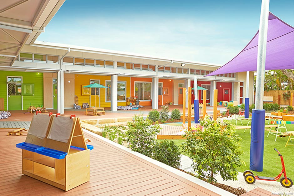
Colour contrasts also work well with children as the colours help them to remember their way around a space by associating each colour with a specific activity or location.
Featured colours: Resene Rock N Roll, Resene Clockwork Orange, Resene Galliano, Resene Limerick and Resene Alabaster.
› Project by Context Architects Limited.
April 10, 2009
Visit your local Resene ColorShop for expert advice and all the products and accessories you need to make the most of your home.
Book a colour consult | Ask a Colour Expert | Ask a Paint Expert
Resene's decorating blog
Paint your home beautiful! Discover the latest decorating trends, tips and colour news.
![]()
Previous «
Bring out the best in your kitchen
![]()
Blog home
View the latest trends, tips and news
![]()
» Next
Decorating in a feminine style