Tower Insurance
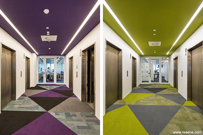
Subtle theming over the five floors developed from the Tower brand.
Previously spread over multiple small floors on Fanshawe Street, Tower decided to consolidate onto five large floors on Queen Street, with the idea of moving customer facing services further up the building, taking full advantage of the views, and partnered with Creative Spaces to design a new fit-out with a strong focus on future flexibility.
Subtle theming over the five floors developed from the Tower brand. It became apparent that 'The Lighthouse' only functioned successfully with the help of support buildings. This tied in nicely with the teams and facilities of each floor.
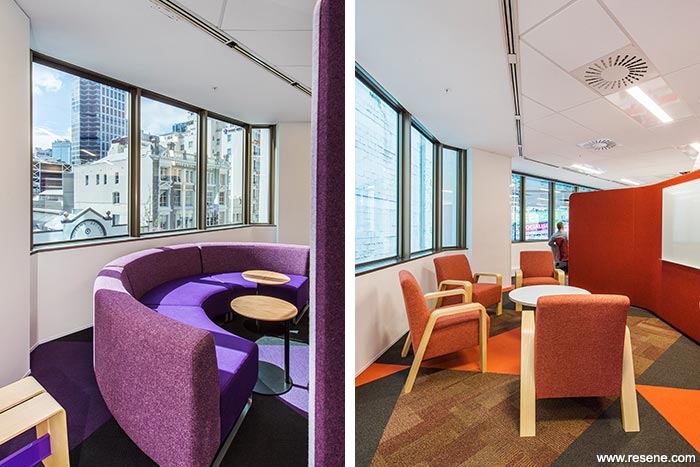
It was important that should the brand change at all, the fit-out would still be relevant. A colour palette was established which assisted with wayfinding and gave each floor its own identity. Interest and depth was created with the use of faceted carpet transitions, a variety of light fittings, finishes and textures.
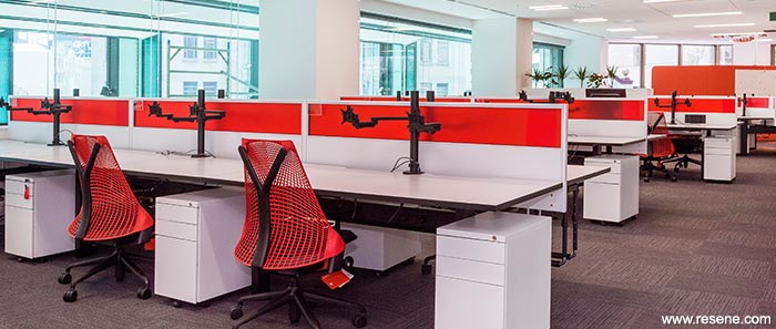
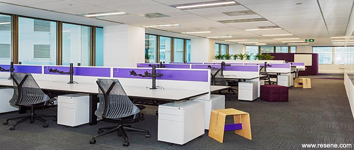
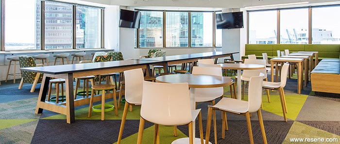
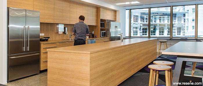
Every person within Tower, from the CEO down, changed into an open plan environment. This was supported by an increased number of quiet rooms, collaboration spaces and bookable meeting rooms. The traditional 'Corner Office' was changed to open collaboration space which the whole organisation could share and enjoy. While the workpoints are currently all allocated to individual employees, the interior is designed so that Tower can transition to flexible shared desk allocation in the future without any change to the fit-out.
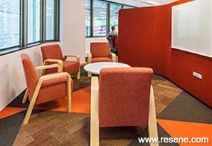
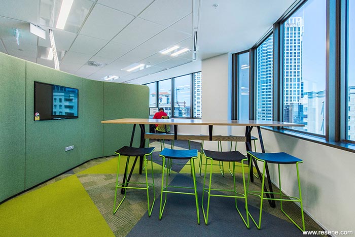
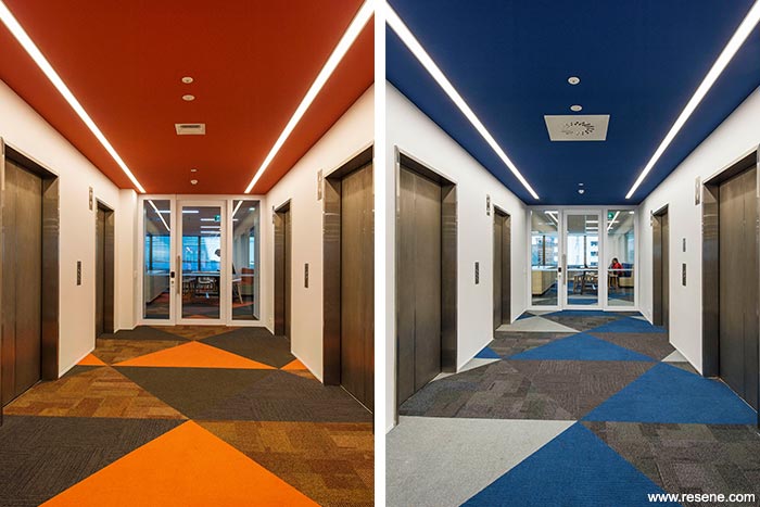
Resene Alabaster (blackened white) was chosen as a fresh neutral base for all floors. This was contrasted with strong bright colours on the ceilings in each lift lobby that reflected the theme of the floor – the Boathouse – blue (Resene Limitless (azurite blue)), The Keeper's House – green (Resene Kombi (mustard brown)), The Signal Building – purple (Resene Wicked (deep indigo)) and The Fuel House – orange (Resene Whizz Bang (bright orange)). By having the colour unexpectedly on the ceiling a strong sense of arrival was achieved. This was reinforced by the faceted carpet that echoed the same colour tones.
In the reception area on Level 14 it was decided to reuse the previous tenant's beautiful travertine tiled floor and oak wall panels. Resene Villa White (smooth yellow white) was chosen to complement these existing finishes and create a warm inviting environment for visitors.
Resene Ship Grey (mid grey) was used as a semi-gloss finish on the internal solid core doors, with Resene Quarter Stonewall (brown earthy neutral) on bathroom doors. Both are robust colours for areas of high use and tied in well with the general carpet finish.
Architectural specifier: Creative Spaces
Building contractor: Argon Construction
Client: Tower Insurance
Joinery: Marks Interiors
Painting contractor: Valco Painters and Decorators
Photographer: Bruce Clarke
Supplier – carpet: Inzide Commercial
Supplier – furniture: IMO
Supplier – screens: IQ Commercial
Supplier – task chairs: Matisse
Supplier – workstations: Vidak
Project: Resene Total Colour Awards 2015
From the Resene News – issue 3/2016
Resene case studies/awards project gallery
View case studies that have used Resene products including many from our Resene Total Colour Awards. We hope these projects provide inspiration for decorating projects of your own... view projects
Total Colour Award winners:
2023 |
2022 |
2021 |
2020 |
2019 |
2018 |
2017 |
2016 |
2015 |
2014 |
2013 |
2012 |
2011 |
2010 |
Entry info
Latest projects | Project archive | Resene news archive | Colour chart archive
![]()
![]() Get inspired ! Subscribe
Get inspired ! Subscribe ![]() Get saving ! Apply for a DIY card
Get saving ! Apply for a DIY card
![]()
Can't find what you're looking for? Ask us!
Company profile | Terms | Privacy policy | Quality and environmental policy | Health and safety policy
Colours shown on this website are a representation only. Please refer to the actual paint or product sample. Resene colour charts, testpots and samples are available for ordering online. See measurements/conversions for more details on how electronic colour values are achieved.
What's new | Specifiers | Painters | DIYers | Artists | Kids | Sitemap | Home | TOP ⇧


