From the Resene colour choices booklet
Science has long recognised that colour affects our behaviour and the way we feel.
After all, it’s the first thing we register and that we use to help assess the things around us, such as whether certain foods, such as blue ones, might be poisonous, for example.
To understand these responses, we need to look at how colour works. Essentially, when the light reflected from coloured objects strikes the retinas in our eyes, the wavelengths are converted into electrical impulses. These pass into the part of the brain that rules our hormones and endocrine system, which are instrumental in regulating our moods. Unconsciously, then, our eyes and bodies constantly adapt to these stimuli, influencing our impulses and perceptions.
While the scientific study of colour is as old as time, the study of colour’s effects on our psyche is only about a century young.
Even until only about two decades ago, the common perception was that, because our response to colour is subjective, it must also be unpredictable. Why, for example, did people respond differently to the same shade? It was leading UK colour psychologist Angela Wright who, by studying colour harmonies and the often unconscious thought processes related to them, developed a means of predicting our responses to colour with remarkable accuracy.
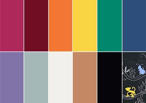
It’s called the Colour Affects System and works on two levels: The psychological properties of each of the 11 basic colours; and the roles that variations in tones, hues and tints can play in achieving a desired psychological effect. A key factor in this, Angela recognised, is that it is not one colour that triggers our responses, but a combination of the millions of colours, hues, tones and tints the human eye can distinguish. For example, a grey sky over a summer cornfield will evoke quite a different emotion than will a grey winter’s sky downtown. Therefore, there are no wrong colours per se, but different colour schemes do prompt different responses.
To apply colour psychology successfully, Angela also recognised the need to match the individual’s personality with the appropriate tonal colour family. There are four of these, each reflecting nature’s patterns, and every shade can be categorised into one of them. Once we have made this connection, she says, we can create colour combinations that will help turn our homes into spaces that reflect and support the personalities of those living there. Even if very different characters live together in one house, the right colour palette can ease tensions and help create harmony.
Personality type: These people are spirited, energetic, motivated, charming and eternally young. They are never dark or heavy, and usually work in people professions, such as the media, entertainment or caregiving. They have a natural affinity for the young and love the outdoors, and are clever, but not interested in heavy academic debate. On the downside, they can be singleminded, do too many things at once and be superficial.
Matching colours: Warm, clear colours, sometimes bright. They need stimulus as well as ease, so their ideal palette will include soft cream, peach or turquoise, as well as brighter scarlets, cobalt or sky blues, and emerald greens and pure yellows. Supporting neutral colours include light camel, French navy and light, warm greys.
Personality type: Cool, calm, collected, gentle and internally motivated. Their humour is subtle and they loathe vulgarity. They enjoy creating order out of chaos and keeping peace, have a great sense of touch and often have an analytical nature. They make good diplomats, artists, musicians and doctors. On the flipside, they can seem aloof and unfriendly.
Matching colours: Cool and subtle; sometimes dark, but never heavy, such as maroon, raspberry, rose pink, grapefruit and sage green. Good neutrals to support them include taupe, dove grey and cool navy.
Personality type: Like summer people, they are externally motivated, but are fiery, intense, strong and possibly flamboyant. They have a rigorous sense of justice and environmental awareness. Careers include ones that dig beneath the surface, such as police officers, psychiatrists and investigative journalists. Physical comfort is a must, which is why they can’t stand flimsy furniture.
Matching colours: The preferred colour palette is off-beat and devoid of pure primary colours. Examples include tomato, burnt orange, olive green, terracotta and aubergine. Supportive neutrals are most shades of brown.
Personality type: Most winter personalities are internally motivated, objective, super-efficient, confident and abhor clutter. They often pursue careers in government, finance, film or theatre, or the medical professions. On the negative side, they can appear elitist, cold and uncaring.
Matching colours: In winter, natural colours are far and few between, hence the winter personality will often wear black all winter and white all summer. The thing is, they can actually pull it off. Colours that work well with black are dramatic hues like jade green, royal purple and lemon yellow. Supportive neutrals are black, white and clerical grey.
▸ To find out what season you are, try out the Resene Colour personality game
▸ Download a PDF of this article
Mostly considered a girly colour, pink has recently become more gender neutral, particularly in dusky, biscuit tones, like Resene Bone. Subtle use of pink can bring warmth and rosiness to a room. Used in moderation, pink is an uplifting colour. But used too much, and it can become sickly... more
Happy, fun, sassy, playful, optimistic and energetic. Orange is such an irrepressibly cheerful colour that it makes most of us smile. Some people are not so keen on its in-yourface exuberance, but orange as an interior colour is very useful, particularly in burnt or terracotta tones, like Resene Fire... more
Resene colour choices booklet
Choose colour with confidence and creativity
![]() Get inspired ! Subscribe
Get inspired ! Subscribe ![]() Get saving ! Apply for a DIY card
Get saving ! Apply for a DIY card
![]()
Can't find what you're looking for? Ask us!
Company profile | Terms | Privacy policy | Quality and environmental policy | Health and safety policy
Colours shown on this website are a representation only. Please refer to the actual paint or product sample. Resene colour charts, testpots and samples are available for ordering online. See measurements/conversions for more details on how electronic colour values are achieved.
What's new | Specifiers | Painters | DIYers | Artists | Kids | Sitemap | Home | TOP ⇧