From the Resene colour choices booklet
Avoid paint paralysis with our handy 8-step colour guide.
Colour is a truly magical property. It can transform an environment, create a style, set a mood and alter perceptions. Colour is very personal and an expression of our creativity.
Resene offers all customers a selection of valuable aids to enable you to choose the right colours for you. And of course, Resene ColorShops and resellers are available to provide helpful and professional advice on colour selection.
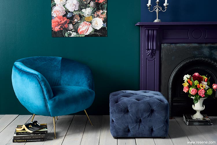
Does a rich, luxe look appeal? Try jewel colours like Resene Altas (green), Resene Zinzan (blue; try Resene Bunting for another option) and Resene Avenger (purple; try Resene Blackcurrant for another option). The floor is Resene Colorwood Greywash, and the art is made of wallpaper – design 358000 from the Resene Wallpaper Collection.
Even if you already know what colours and styles you like, start a file of photos that catch your eye. Don’t over-think it, just collect what appeals. When you have a decent-sized collection, look for common elements. You could also collect photos of things you really dislike to help you avoid those in your new scheme.
Visit your local Resene ColorShop and pick out the cards from the Multi-finish and Whites & Neutrals collections that you’re instinctively drawn to. Together with your collected images, you’ll soon see a pattern emerge. It might be that your choices are all light and casual, or all luxe and moody. You need to love it. There’s no point painting your home in jewel tones if no-one in the family likes jade, ruby or amethyst. The best homes are decorated with the owner’s personality in mind.
Use a grey paint colour viewfinder (get one free from your Resene ColorShop) to isolate colour on the paint chart you are viewing. If you look at all the colours together, the colours will affect one another and you won’t get a true feeling of each individual colour.
Top tip: With all the decorating styles and choices available it’s easy to be overwhelmed and lose direction. A simple but effective way to stay on course is to choose a few words that describe how you want your home to be and feel. Emotive words, like welcoming, decadent or casual. Use five words maximum. Then with every decision and purchase, ask yourself if it fits the words. That way, you won’t end up with ‘orphans’ in your scheme.
Select colours that reflect the mood you are trying to create. For example, if you want to develop a calm atmosphere consider using greens and blues and steer clear of bold high energy reds. If high energy is what you desire, a palette of reds, oranges and yellows will brighten your room and encourage activity.
A starting point can mean a few things. The first is to start with the most limited or most expensive material. So in a kitchen, choose the benchtop first, then the flooring. Finally, choose the Resene paint colour for the cabinetry and walls that best ties together all these elements.
Few of us have the luxury of starting from scratch, so figure out what will be staying – the flooring, the sofa, the kitchen? Or outside, it may be the roof and joinery.
Another kick-starter is to use a favourite painting, wallpaper, curtain fabric or a recently purchased cushion as the starting point for a scheme. You can already see that the colours work together so draw them out and use them on the walls and trims. Note the proportions the colours are used in, and mimic that in your colour scheme. An artwork or fabric is usually seen at a distance so rather than get microscopic about the colours within the piece, stand back for an impression of the colour.
You might use the style of your home or the setting, whether it’s rural, urban or coastal to influence your decorative choices.
Furniture, pictures and ornaments absorb and reflect colour in different ways affecting the final colour you see. It is always best to view colours in a fully furnished room to get a true picture of how the finished scheme will look. If you are forced to develop a colour scheme using an empty room as a base, start by determining how much of the wall surface will be visible after furnishings are added to the room.
Top tip: If you love the colours in a fabric or artwork, load a photo of it into the online Resene Colour Palette Generator and it will suggest some Resene colours for you to help get you started.
When selecting colours consider lighting, what the room is used for, who spends the most time using the room, adjacent room colour schemes, whether you want to change perceptions of the room shape or size, what kind of mood you want to create, and any existing furniture or furnishings that will be part of the finished colour scheme.
If you have already selected other room furnishings, bring samples with you when choosing your paint colour.
You may even wish to follow the fabric pattern to balance the colour palette for the room. There should be some relationship between that and the newly decorated room to provide continuity.
Always keep in mind when developing a colour scheme who will be using the space the most. There is no point using bright orange because it is in fashion if the entire family dislikes the colour. The best homes are decorated with the owner’s personality. Nature lovers may prefer greens and blues to bright reds, while a vibrant owner may prefer bright and bold feature areas that reflect their bubbly personality.
Colour can have a huge impact on how a room feels. Warm up a cool room by painting it in warm colours such as creams and reds. Or cool down a hot room by painting it soothing blues and greens.
If an important feature of your home is a sea view or landscape panorama you may like to bring the colours you see outside into your home’s colour scheme to provide a natural link between the two. If you want to highlight the view, choose a lighter colour palette. If you want to distance the view make your interior colour scheme more contrasting against the exterior.
Paint awkward shapes the same colour as the rest of the room. This will help them to blend in.
Some colours suit some rooms. A bright turquoise feature wall with yellow polka dots may not be appropriate for a living room but it would be a lot of fun in a child’s room. A soft grey could look gorgeous in a modern master bedroom matched with crisp white linen, a textured white duvet and a thick and fluffy rug whereas a soft grey in a tiny, south-facing child’s room matched with a bold and colourful bedspread could leave the soft grey looking cold and weak in contrast.
Top tip: If you like changing your environment, the best idea may be to use a neutral colour scheme and provide accents through replaceable items, such as cushions and flowers. This will enable you to change the mood of the room with a simple change of the accent items.
When you’re using a number of colours together, vary the proportions. Using them in equal proportions will give the room an unsettled feel and make the colours feel far too intense.
Use the 60:30:10 principle – 60 is the main colour (for most of the walls, and perhaps some furniture and a rug), 30 is the secondary colour that supports the main colour (for example, a feature wall, drapes and linens) and 10 is the accent colour (cushions, lamps and accessories; it could also be a bold paint colour used on a splashback).
Most colour schemes are improved by the addition of accents, the final touches that can make a room come to life. Avoid using the same accent colour in too many places or too many accent colours in one room – sometimes subtlety gives the best result.
If you want bold colour, but still want a cohesive look try a tonal recipe made up of ‘related’ colours – those that sit next to each other on the colour wheel. So green, turquoise and blue is a tonal related scheme. Or, varying shades of green from turquoise to leafy yellow-greens.
A more classic approach to a tonal scheme is to use a colour in varying strengths or shades, such as charcoal through to dove grey. Stick to the 60:30:10 rule. Or use colours from the Resene Whites & Neutrals collection where colour families and variants are already chosen for you.
If you’re opting for a neutral colour scheme, choose a colour family and then vary the strength from full to double, and quarter to half strength. This will help to add extra interest to the colour scheme. The Resene Whites & Neutrals collection has up to six strengths of each colour and is an easy way to get started on a neutral colour scheme.
No matter what colours you like, successful colour schemes have one thing in common – balance. Try to use no more than two to three principal colours with touches of other accent colours to lift the scheme. Sometimes it pays to start with a simple scheme of two colours and an accent, then introduce other colours into the room as you gain confidence. If you are a novice decorator you may prefer to keep to one colour type (monochromatic) or select related colours (harmonious) to ensure a balanced scheme.
A good balance of tones is employed in the best colour schemes. If you think of a newspaper clipping, the most interesting pictures are those that have a good balance of light, mid and deep tones. Aim for a balance across the different tones to ensure your scheme is visually interesting.
One of the simplest ways of carrying a theme throughout your home is to use a common colour palette. Choose a selection of colours for the entire home and then use different combinations of those colours in each room. The commonality of the colours will link the entire scheme together.
Top tip: If you’re keen on using a range of colours or have elements that are colourful (like a patterned wallpaper), one way of tying these together is to add a good dose of an ‘achromatic’. That’s black or white, or colours close to them, such as charcoal, pale grey or cream.

Left: A soft tonal scheme has walls painted in Resene Duck Egg Blue and floor in Resene Inside Back with accents in various greens such as Resene Half Evolution and Resene Passport. Right: Blue is perennially popular. The main wall here is Resene Zinzan (try Resene Bunting for another option), the rear wall and sideboard are Resene Biscay (bottom) and Resene Half Dusted Blue. The floor is Resene Chalk Dust (try Resene Half Bianca for another option), the front of the cabinet is Resene Breathless and the coffee table is Resene Bunting.
When choosing colours keep three things in mind:
Colours look different when...
Muted colours are easier to live with but that doesn’t mean everything has to be pale. A deep charcoal blue can add drama but it’s a very easy colour to use and accessorise.
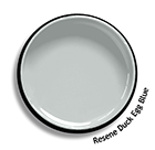
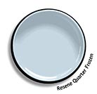
The mistake most of us make is to not go ‘grey’ enough. What you thought was going to be a smoky blue turns out icy blue on your wall. Check the examples below and you’ll see that Resene Duck Egg Blue is quite grey, compared to Resene Quarter Frozen.
Most decorators find pale neutrals or pastels easy to use – colours that have quite a bit of white in them. So instead of grass green, you would have soft sage. Instead of brown, it would be beige. Instead of banana yellow, it would be pale lemon, or muddy it up for a soft ochre. The common element, white, between all these colours means that you can successfully combine any pastels into a colour scheme. The addition of clean white also means that most pastels appear soft and fresh.
Most of us instinctively know that bright colours are more in-your-face and therefore not as relaxing. These might be best limited to small features, such as a feature wall, furniture, artwork, splashback and accessories. Or use intense hues in areas that are occupied for short periods, such as hallways, bathrooms and entrances. Or on your front door.
If you’re introducing a new colour to an existing scheme, it may be affected by other colours already in the room. If your room is full of blue accents, a new off-white will tend to reflect some of the blue tones. Dark blue placed next to white will seem much darker than if it is next to another dark colour.
If you think a colour you are looking at on a Resene colour chart may be too dark for your interior, choose a lighter colour. Colours will look more intense when they are painted onto a large indoor area. How much there is of a colour affects how you see it. When used in large quantities or in a small room, strong colours will appear even stronger and more intense. If in doubt use a shade lighter than your original choice.
When painting outside, the opposite rule applies – if in doubt, choose a darker Resene colour as the sun will make the colour seem lighter.
Surface textures also change the way you perceive colour. Smooth surfaces reflect light and heavily textured surfaces absorb light. The same colour painted in a gloss acrylic paint on a wall will look lighter than the same colour in a heavy woven carpet.
The gloss level of the paint will affect how it looks. Matt surfaces absorb light and will appear darker than glossy reflective surfaces. Dark colours look velvety and rich in a matt finish – try Resene SpaceCote Flat. Light colours and glossy finishes help make a room appear larger, while darker colours, heavier textures and matt finishes help make the room seem cosier.
Resene SpaceCote Low Sheen or Resene Zylone Sheen are normally recommended for walls while Resene Lustacryl gives a good tough, semigloss finish for trims. For more of a gloss contrast you can use Resene Enamacryl on trims.
Like gloss level, the colour paint you use will also show surface defects to varying degrees. Darker colours accentuate surface imperfections, while lighter colours soften the effects of any surface irregularities by absorbing less light. Special paint effects or wallpaper can be used to hide minor surface defects.
If you have painted a wall with paint and find the sheen level is too flat or glossy, you can apply Resene SpaceCote Clear (low sheen)
Check and select colour under the actual lighting conditions of the space to be painted to avoid disappointment. Colours may look different under natural and artificial light. Consider when you use the room the most and select your colour under those lighting conditions.
Colour will also look darker on a ceiling surface than on the wall. Likewise, window walls will appear darker as they don’t receive direct light. White and off-white paint colours are usually the safest as they distort less under various types of light.
Once you have narrowed down your colour choices, use Resene testpots to confirm your scheme – the cost is minimal compared to the time and money you will waste if you have to repaint a wall you don’t like.
Using your Resene testpot apply two coats onto a piece of A2 card, leaving a border around it so the colour isn’t influenced by anything else. When the paint is dry, pin your colour to the wall and view it in daylight and artificial light, moving it around different areas of the room and folding it into the corner of the room for a true feel of the finished effect. Check how it looks in lighter areas as well as shadowy spots. You can also roll the card with the painted surface on the inside, then look down into the tube to get the effect of the colour as it might appear on all of the walls.
For exterior schemes, move the painted card around different walls, checking it in sun and shade
Choosing the colour is only half of the job. You also need to choose the right Resene paint so your colour works well and looks good for many years to come.
Paint is your most versatile medium and may be easily changed when you feel the need for a new look. Once you have decided and applied your colour scheme, make sure you take a note of the colours used for future reference. Resene have developed an interior/ exterior colour scheme page so that you can keep this important information in one handy location. Copies of this colour scheme page are available online.
Never rush into a colour scheme, as you will only regret hasty choices later. Give yourself time to learn about your colour likes and dislikes and develop these into a personalised scheme.
One of the simplest ways of carrying a theme throughout your home is to use a common colour palette. Choose a selection of colours for your entire home and then use different combinations of those colours in each room. The commonality of the colours will link the entire scheme together.
As with everything in life, the more colour schemes you create over your lifetime of decorating, the more confident you will become. And, if worse comes to worse and you just can’t stand your new colour scheme, you can always paint over it!
▸ Download a PDF of this article
Resene colour choices booklet
Choose colour with confidence and creativity
![]() Get inspired ! Subscribe
Get inspired ! Subscribe ![]() Get saving ! Apply for a DIY card
Get saving ! Apply for a DIY card
![]()
Can't find what you're looking for? Ask us!
Company profile | Terms | Privacy policy | Quality and environmental policy | Health and safety policy
Colours shown on this website are a representation only. Please refer to the actual paint or product sample. Resene colour charts, testpots and samples are available for ordering online. See measurements/conversions for more details on how electronic colour values are achieved.
What's new | Specifiers | Painters | DIYers | Artists | Kids | Sitemap | Home | TOP ⇧