From the Resene colour choices booklet
Use of contrast colours can help people use and navigate a space.
Red is typically associated with signals such as hot (tap), stop (traffic light or stop sign) or an emergency (fire alarm). Green typically means go (traffic light, exit signs).
Colours can be used for specific levels in a carpark or floors of a building to make it easier for people to remember which floor they started from. Colour can provide a trail through a building and is often used in hospitals to lead patients and families in the right direction. At night, glow-in-the dark paints, like Resene FX Nightlight, can provide a contrast against the dark and assist with navigation when normal colours are no longer visible.

Feature wall in Resene Smitten with remaining walls in Resene Alabaster.
Common areas to use contrasts are where adjoining surfaces meet that people have to navigate... think floor meets wall, door frame meets door, contrasts to mark the edges of paths or contrasts on stair edges to help make it easier to see where the levels change.
Beware of overwhelming a space with too many contrasts. If there is too much contrast within a surface and within adjacent surfaces, it can be very tiring for the eyes and the contrasts can start to compete with each other. Ensure you allow at least some areas of uninterrupted same colour space. This will make the contrasts more striking and easier for those using the room to identify. If you're set on a striking design or pattern, keep it to one area with plain adjacent spaces.
Always consider your lighting, both natural and artificial, when planning your colour and surface finishes. Place lighting throughout a space to avoid over-lit areas or areas in shadow and make the most of natural light opportunities for spaces that will be commonly used during the day. Consider contrasting switchplates for lighting so they are easy to see against the wall. At night glow-in-the-dark paint can be used to highlight key areas.
Changing levels, such as going up and down stairs or up and down a sloping path, tend to be associated with higher risk. Ensure colour contrasts are used to help show the changes in level and provide contrasting colour handrails wherever possible to assist with navigating these areas. Marking the stair edge with white or contrasting paint helps reduce the risk of falling. Outside consider using a product such as Resene Non-Skid Deck & Path where the colour can provide a visual contrast and the grit finish can provide extra friction for foot traffic, especially in wet weather.
As well as using contrasting colours, you can also use lighting and varying gloss levels and textures to help differentiate surfaces. Flat or low sheen walls will contrast more against semi-gloss or gloss doors than against lower sheen finishes. Be careful of using too much lighting as glare can make it harder to see colour contrasts and can tire the eyes.
For many it is easier to see the difference between two different hues – e.g. blue and yellow – than it is to see differences between one colour in two strengths – e.g. light and dark. If you are relying on the same hue in different strengths for contrast, ensure there is sufficient contrast to be easily seen in lower light situations, such as on an overcast day with the lights turned off when people may still be navigating the space without the need for artificial lighting. Any colour has the ability to be a contrasting colour, when paired up with the right contrast.
Contrasts don't need to be garish nor just black and white. Look for colours that the main users of the space would naturally enjoy and then contrast with different hues or bolder or lighter colours to provide adequate contrasts that will work for those who need them without resulting in clashing colours for those workers and visitors to the space who may not need to rely on the colour contrasts. Chosen well, colour contrasts should enhance the space for all users.
LRV (Light Reflectance Value) works on a 0-100% scale and are a measure of what the colour looks like. So if you need a contrast of 30% LRV then you need to choose two colours that have a LRV difference of +30% LRV, such as one colour with 40% LRV and one with 70% LRV to give the required colour contrast difference of 30% LRV.
However if you have an LRV change of 30 you could end up with a dark green and a lighter green, which wouldn't necessarily be enough contrast for someone who is colourblind. Ideally as well as a strength difference, you would also use contrasting colours (e.g. yellow with blue), different sheen levels and good lighting to help emphasise the colour contrast.
You can use Resene colour codes to help identify colour differences. e.g. for the Resene colour code B54-058-237, the ‘54' is the luminance (which is similar in many ways to LRV), the middle part ‘058' is the saturation and the ‘237' is the position on the colour wheel. Each of those elements can be used to compare colours to add additional contrast.
LRVs only normally apply to solid colour finishes not stained finishes so if you are comparing stains you would need to visually check there is sufficient contrast. If comparing two surfaces from different suppliers that will be used side by side and need to be contrasting you may need to check how they are measured or do a visual check to ensure they provide sufficient contrast.
In the case of Resene you can view the reflectance value for each colour in our online colour library, this gives you a quick reference to what colours of various LRV values look like.
Colour blindness, or colour deficiency as the experts like to call it, is a condition in which certain colours cannot be distinguished and is most commonly due to an inherited condition. It is caused by a malfunction of the retina which converts light energy into electrical energy that is then transmitted to the brain.
The conversion of light is accomplished by two types of photo-receptor cells in the eye's retina: rods and cones. The cones are responsible for colour vision. Each contains visual pigments sensitive to wavelengths of light – red, green and blue.
Most people can match all colours of the spectrum by mixtures of only these three fundamental colour sensitivities. The huge variety of colours we perceive comes from the cone cells response to different compositions of wavelengths of light. Defects in colour vision occur when one of the three cone cell colour coding structures fails to function properly. One of the visual pigments may be present and functioning abnormally. Or it may be absent altogether.
The cones with the blue are almost always normal, so blue deficiencies are very rare. It's the red/green spectrum that's usually affected by the colour channels.
The condition is far more prevalent in men than women, with only 0.4 percent of European females being colour deficient. That's because the condition is linked to the X chromosome. Women have two X's. If women have one good X, then there's no problem. Because men only have one X, they are more likely to get the colour deficiency.
For most people with colour blindness, it can be frustrating and occasionally dangerous, depending on the severity of the condition. Traffic lights are not so bad because colour blind people get to know the position of the colours. But sometimes caution lights – when there is just one light that could be red or green – can cause a problem.
Several tests are available for colour blindness. The most common is the Ishihara test, featuring circles of dots appearing randomised in colour and size. Within the pattern are dots which form a number or a shape that is visible to those with normal colour vision. If someone is not colour deficient, the colours of the dots are clearly different. The test doesn't rank severity, however.
Until recently it was thought that if you were colour blind, you were stuck with it for life. However a professor who worked with Dr Ishihara, the Japanese man who created the original test for colour blindness, has developed his work further. After many years of study he has come up with a new lens that can help significantly. The lens works by separating the peak absorbencies of the cones, taking out the light in the middle. There's a tint in the lens which absorbs some light but a mirror coat reflects targeted rays of light. It refines the different light allowed through.
Thanks to optometrist Molly Whittington.
The most common test for colour blindness is the Ishihara test. Within these patterns are dots which form a number visible to those with normal colour vision. Can you see them?
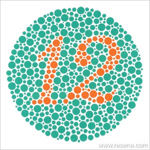
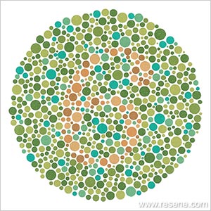
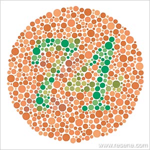
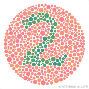
Clockwise from top left you should see 12, 6, 2 and 74.
▸ Download a PDF of this article
Resene colour choices booklet
Choose colour with confidence and creativity
![]() Get inspired ! Subscribe
Get inspired ! Subscribe ![]() Get saving ! Apply for a DIY card
Get saving ! Apply for a DIY card
![]()
Can't find what you're looking for? Ask us!
Company profile | Terms | Privacy policy | Quality and environmental policy | Health and safety policy
Colours shown on this website are a representation only. Please refer to the actual paint or product sample. Resene colour charts, testpots and samples are available for ordering online. See measurements/conversions for more details on how electronic colour values are achieved.
What's new | Specifiers | Painters | DIYers | Artists | Kids | Sitemap | Home | TOP ⇧


