We get used to seeing fashion trends come and go with the seasons – its fitted jeans this year, and loose the next – but with our homes, the process of change and fashion is a gentler transition.
Trends often reflect the times in which we live. When the world seems a mad, bad place or we feel sensory overload from our busy bright lives, we seek safe, nurturing spaces at home. Or if the world seems an exciting smorgasbord of new places to discover, we bring home the colours and flavours of our travels.
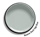
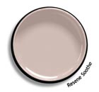
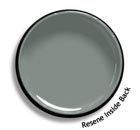
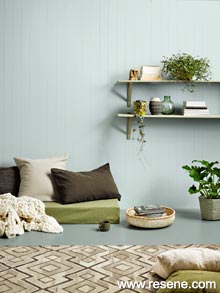
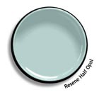
Seek sanctuary with hushed tones.
Soft and simple, these sanctuary colours are a hushed environment to retreat to and embark on mindful living. They create a safe environment to retreat to, so we can recharge our emotional and physical batteries after being constantly bombarded by technology, social media and fast-paced graphics.
This is the Scandi look of recent years, but in a slightly stronger way. The colours are still soft but where there might have been just pale grey and cool white, there are now a range of soft muddied pastels. Weathered, aged surfaces echo of times gone by and feed our souls with nostalgia.
Possessions are restricted to only those we love, which are purposeful and which are beautiful as we shift our clutter online and into the cloud.
Try these paint colours: Resene Duck Egg Blue, Resene Soothe and Resene Inside Back.

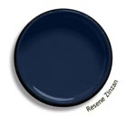
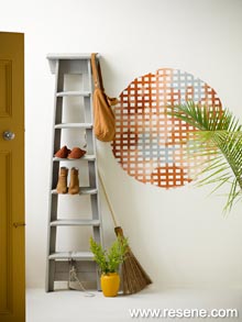
Let colour be the cue for space definition.
As we seek a life of multiple purpose, our spaces and possessions need to do the same. A living space includes a study, a dining area and a reading nook. A bedroom morphs into living or study. Or becomes a retreat in which to watch streamed media.
Colour defines space in new ways. It visually anchors a desk top or bed to the wall, makes a dining space distinctive, or defines an entry.
Half-painted walls, two feature walls not one, a tone change of colour… it’s all possible with paint.
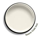
Try paint colour contrasts with Resene Zinzan and Resene Chalk Dust.
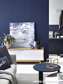
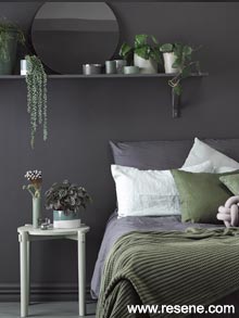
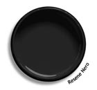
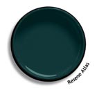
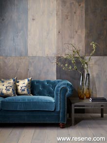
Retreat to your safe haven with dark tones.
Deep light-absorbing colours offer cave-like cocoons to hide in when the world gets too scary. Creating places of introspection and security, these deep charcoals, moody blues and dense greens ground us but also inject a sense of daring at using such bold tones. It’s safe but not predictable. These colours are soulful and intimate yet bring a hint of drama.
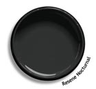
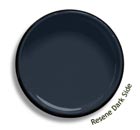
Try deep grey, blue and black paint colours, such as Resene Nocturnal, Resene Dark Side and Resene Nero.
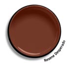
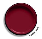
Travel the world… at home.
Seeking cultural connection and a change in routine from the hum-drum of everyday life, this look is all about escapism. Even if we can’t physically roam, our minds certainly can, gathering up the casual vibes of far-flung places as we dream of adventure.
Cultural touch points and nomadic sensibilities are reflected in ethnic prints, artisan crafts, tropical motifs and indigenous art as well as spicy colours, spring greens, plummy browns and sea blues. It’s off-beat and bohemian, certainly not matchy matchy.
Try these paint colours: Resene Desperado, Resene Salsa or cooler Resene Half Opal.
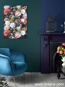
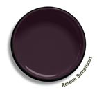
Indulge in rich gem-like shades.
Face the world with confidence and energy by indulging in bold, rich tones. Inspired by gem stones and borrowing their glamorous appeal, there is amethyst, sapphire, emerald, ruby and more. Pair them with burnished metals for an edgy luxe glamour, or less-than-perfect antiques for a shabby chic vibe.
These saturated colours echo with heritage and tradition to help us make sense of an increasingly digital world.
Embellishment is on the way back, as a rebellion to overly earnest, monkish interiors.
Try jewel inspired paint colours such as Resene Atlas and Resene Sumptuous.
Discover your creative side; personalise your interiors.
As we rebel against a culture of mass-production, we yearn for personalised spaces that have meaning. We want to connect with our environment, to be hands-on and say “I did it my way.”
Now we can turn decorating into a personal journey of self-expression – painting a pattern on a wall, upcycling old furniture, painting pots, knitting a throw, crafting a cushion. We’re rediscovering our creative sides.
The pace of change and bombardment of trends has helped (not hindered) this flowering of individual expression. The confusion of ideas makes us stop and think about what we really want and love.
Paint effects are coming back, but using more freehand and relaxed techniques. Try combining your favourite Resene testpot colour with Resene Paint Effects Medium and a little imagination.
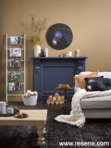
Ground yourself in this hurly burly world.
As we look for authenticity in a world where we feel pressured into quickly casting off one trend in favour of another, we are choosing to wrap ourselves in grounded tones, soothing textural finishes and earthy greens. We are creating simplified interiors with a more rustic, homely feel. They feel honest and true.
Deep golds, rusty browns and soothing terracotta, are layered up with texture, timber, plants and artisan products. Tactile fabrics like chunky handmade knits, woven lampshades, baskets and knobbly rugs soothe us while we take the journey back to nature.
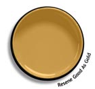
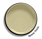
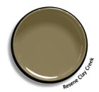
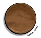
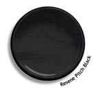
Try these paint colours: Resene Good As Gold, Resene Thistle or Resene Clay Creek. Or enhance timber with wood stains in Resene Natural or Resene Pitch Black.
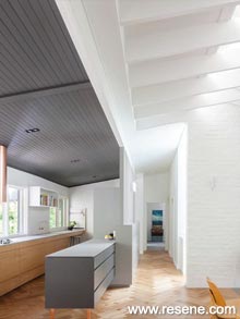
The need for versatility in a shared world.
Not all tastes are created equal. Not everyone likes the same style but in an increasingly shared world, we need to find common ground. The easiness and versatility of neutral colours is the answer. Let each member of the household add their own touches against a neutral and forgiving palette. It’s freedom for all.
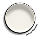
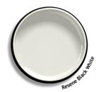
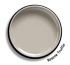
Try these neutral paint colours: Resene Alabaster, Resene Black White and Resene Truffle.
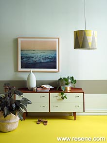
Juiced up interiors with shots of citrus.
Rejuvenating and invigorating, the colours of the fruit bowl are being splashed around our homes. These strong tones also tap into a trend inspired by electro digital colours – intense, high octane colours that come at us in advertising and over the wi-fi waves.
While we’ll be seeing accents of lemon and ochre everywhere, we will also be flirting with fun shades of orange, tangerine and lime. These colours have a zesty appeal that can be used in any room, from the kitchen to the kid’s bedrooms.
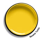
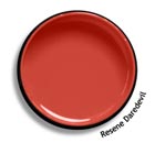
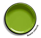
Try these citrus paint colours: Resene Turbo, Resene Daredevil and Resene Limerick.
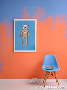
Make a statement with surprise elements.
Why have what everyone else has? Do you yearn for a little spice in your life, a little sizzle in your scheme? Be a bit subversive. Delight and surprise yourself and your visitors with an unexpected use of colour, a splash of bright or bold here and there, or a graphic over-the-top wallpaper.
Make a statement, be unique. Go on, you know you want to.
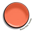
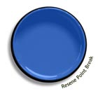
Look for complementary colours – orange with blue, green meets red – such as Resene Ruby Tuesday and Resene Point Break.
› View more ideas in the Habitat plus – decorating and colour trends booklets: 2021 | 2020 | 2019 | 2018 |
› View 2017 trends
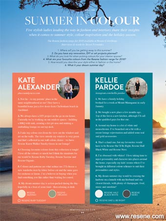
Summer in colour
Five stylish ladies leading the way in fashion and interiors share their insights when it comes to summer style, colour inspiration and the holiday season... more
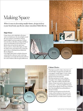
Making space
When it comes to decorating smaller homes, design trickery is your best friend, says Resene colour consultant Nikki Morris.... more
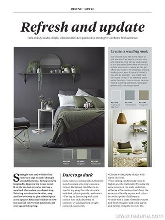
Refresh and update
Spring is here and with it often comes an urge to make changes around the home. Perhaps you’re inspired to improve the house to put it on the market or you’re craving a new look that makes your heart sing. Painting your interior is a fast, easy and low-cost way to give a dated space a real update. Read on for ideas on how you can fall in love with your home all over again this spring... more
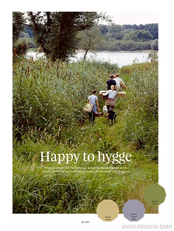
Happy to hygge
There’s a reason why the Danish are among the happiest people on the planet. Lift your spirits this winter by bringing a little ‘hygge’ into your home... more
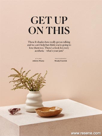
Get up on this
These It shades have really got us talking and we can’t help but think you’re going to love them too. There’s a look for every aesthetic – what’s your jam? Homestyle magazine shows how to use on trend colours in your home… more
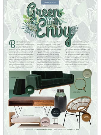
Green with envy
Bring the outside in this summer with a calming array of nature inspired colours. Natural influences have been creeping back into the decor sphere, but unlike previous iterations of the trend, this sleek, modern look is based around hues - with just a few interesting textures which can harmoniously co-exist. The palette is rich in deep greens, greys and browns, with occasional hints of a very soft blush pink or a warm beige. The trend is a sophisticated one... more
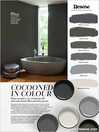
Coccooned in colour
Deep light-absorbing colours offer cave-like cocoons to hide in when the world gets too scary. Creating places of introspection and security, deep Resene charcoals, moody blues and dense greens ground us but also inject a sense of daring at using such bold tones. It’s safe but not predictable... more
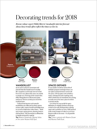
Decorating trends for 2018
Resene colour expert Nikki Morris’ invaluable interior forecast shows how trends often reflect the times we live in.... more
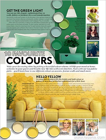
A celebration of colour with Mindfood magazine
Articles include: get the green light, hello yellow, blue for you, purple power, lovely lavender, a red letter shade, orange glow, good as gold, the white is right, tickled pink... more
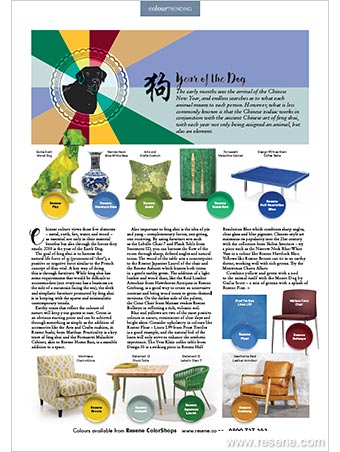
Colour Trending - Year of the Dog
The early months sees the arrival of the Chinese New Year, and endless searches as to what each animal means to each person. However, what is less commonly known is that the Chinese zodiac works in conjunction with the ancient Chinese art of feng shui, with each year not only being assigned an animal, but also... more
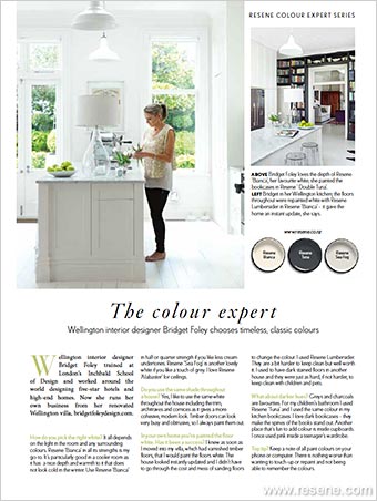
Resene Colour Expert Series
Wellington interior designer Bridget Foley chooses timeless, classic colours. Bridget Foley trained at London’s Inchbald School of Design and worked around the world designing five-star hotels and high-end homes. Now she runs her own business from her renovated Wellington villa... more
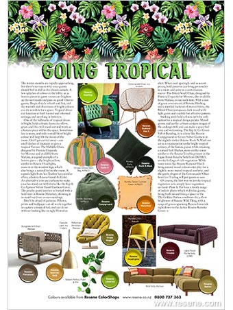
Going tropical
The winter months are rapidly approaching, but there’s no reason why your guests should feel as dull as the clouds outside. A few splashes of colour in the lobby or as feature pieces in guest rooms can brighten up the surrounds and pass on good vibes to guests. Tropical style is fresh and fun, and the warmth and cheeriness of bright colours can do wonders for a space.... more
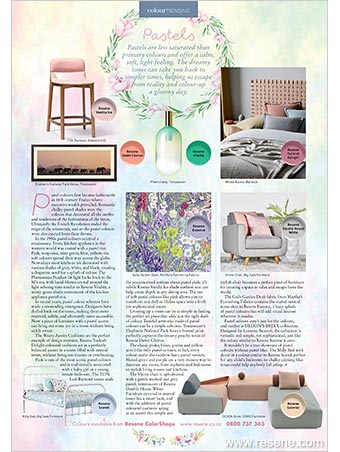
Pastels
Pastels are less saturated than primary colours and offer a calm, soft, light feeling. The dreamy tones can take you back to
simpler times, helping us escape from reality and colour-up a gloomy day... more
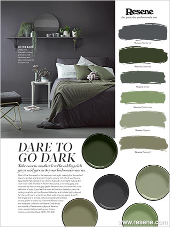
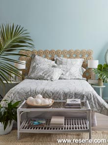
Dare to go dark
Take cosy to another level by adding rich greys and greens to your bedroom's canvas. Most of the time spent in the bedroom is at night, making this the perfect place to go dark and dramatic. To get a velvety rich effect, use Resene SpaceCote Flat instead of low sheen. It absorbs more light, making the room look richer. Painted in Resene Nocturnal, a rich deep grey, and anchored by floors in the grey-green Resene Viktor, this bedroom is the definition of cosy... more
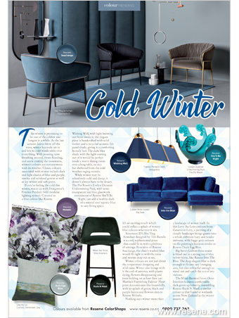
Cold winter
This winter is promising to be one of the coldest and longest in a while. As the last autumn leaves blow off the trees, winter has truly set in and lets its cold winds settle over everything. With pouring rains thrashing around, rivers flooding, and snow coating the mountains, winter’s colours are synonymous with its weather. Classic colours associated with winter include dark and light shades of blue and purple, murky and subdued greens as well as icy whites and soft greys... more
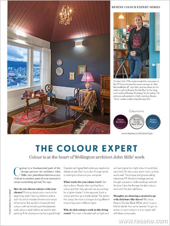
The colour expert - John Mills
Colour is a fundamental part of the design process for architect John Mills (see johmillsarchitects.co.nz). “Colour is another part of your arsenal to create something special,” he says... more

A taste of the trends with Metro magazine
If there's one thing you can be sure of, trends never stand still. We asked the experts to give us a taste of what's trending for 2018... more
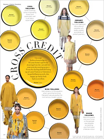
Cross Credit
It’s all about yellow, with this handy look at favourite yellows from Fashion Quarterly... more
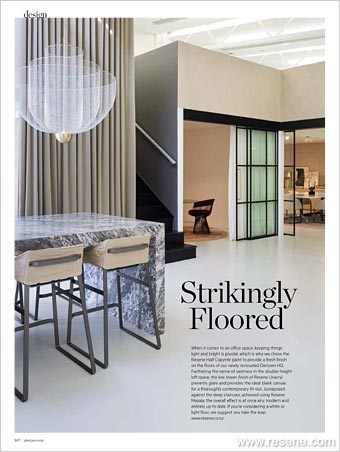
Strikingly floored
When it comes to an office space, keeping things light and bright is pivotal. Be inspired by Denizen’s new flooring... more
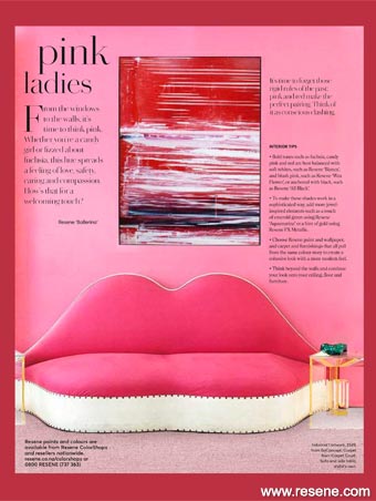
Pink ladies
From the windows to the walls, it’s time to think pink. Whether you’re a candy girl or fizzed about fuchsia, this hue spreads
a feeling of love, safety, caring and compassion. How’s that for a welcoming touch? Get pink inspired with this spread from Simply You Living... more
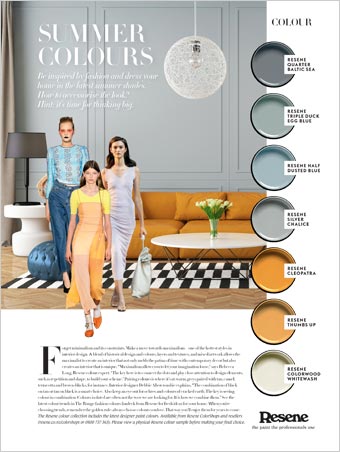
Summer colours
Be inspired by fashion and dress your home in the latest Resene summer shades with Mindfood. How to accessorise the look? Hint: it’s time for thinking big... more
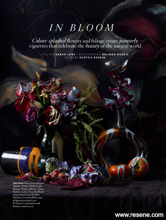
In bloom
Add a splash of colour with flowers and paint with this inspiration from NZ House & Garden magazine... more
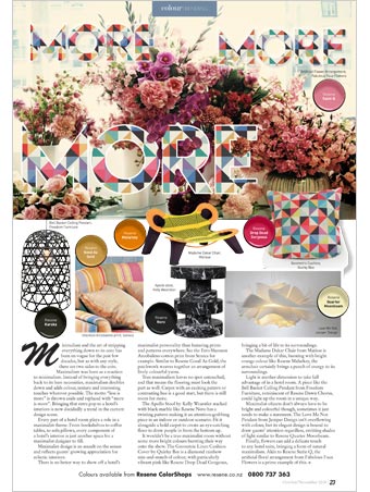
More more more
Maximalism was born as a reaction to minimalism. Instead of bringing everything back to its bare necessities, maximalism doubles down and adds colour, texture and interesting touches wherever possible. ... more
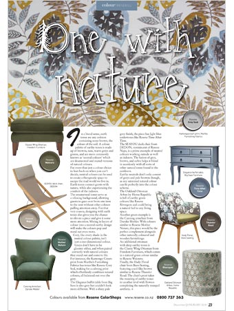
One with nature
In a literal sense, earth tones are any colours containing some brown, the colour of the soil. A colour palette of earthy tones is made up of browns, tans, warm greys and greens, and are more commonly known as ‘neutral colours’ which are desaturated and muted versions of natural colours... more
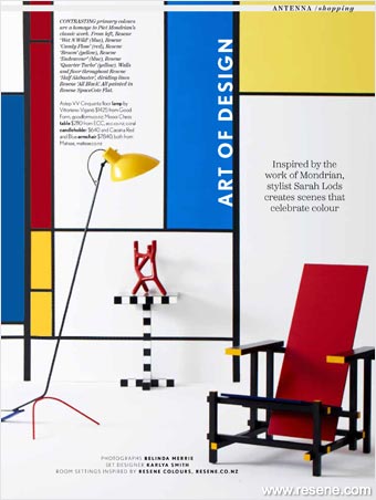
Art of design
Inspired by the work of Mondrian, stylist Sarah Lods creates scenes that celebrate colour ... more
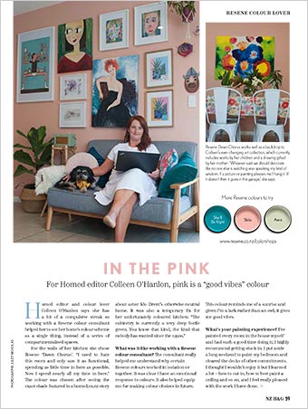
In the pink
For Homed editor Colleen O’Hanlon, pink is a “good vibes” colour. This colour reminds me of a sunrise and given I’m a lark rather than an owl, it gives me good vibes... more
![]() Get inspired ! Subscribe
Get inspired ! Subscribe ![]() Get saving ! Apply for a DIY card
Get saving ! Apply for a DIY card
![]()
Can't find what you're looking for? Ask us!
Company profile | Terms | Privacy policy | Quality and environmental policy | Health and safety policy
Colours shown on this website are a representation only. Please refer to the actual paint or product sample. Resene colour charts, testpots and samples are available for ordering online. See measurements/conversions for more details on how electronic colour values are achieved.
What's new | Specifiers | Painters | DIYers | Artists | Kids | Sitemap | Home | TOP ⇧