Resene have introduced ColourWise newsletters to educate our staff about colours and colour combinations. The inaugural issue of this newsletter was so popular that staff wanted copies to pass onto customers, so to make the newsletters accessible to all copies are now available for viewing in ColorShops or you can open and read pdf copies (you'll need a copy of Acrobat Reader to read the files so if you don't have this software you will need to download it.)
Resene ColourWise newsletters |
|||||
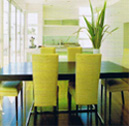 |
2000 - 2010 colours and style |
||||
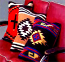 |
Mexican style, design and colour |
||||
 |
African style, design and colour Exploring the continent’s vastness, Africa reveals the excitement of colour, pattern, art and culture. Distinctive motifs, rich earth tones, as well as the spiritual connections, combine to reflect the diverse societies who have lived off the land for more than 5,000 years. As the world grows increasingly complicated we become more drawn to linking back to traditional ways of life, simplicity, nature, symbolism. As well as the primitive and tribal arts, the African landscape itself influences design and architecture... more |
||||
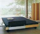 |
Scandinavian style and colour Scandinavian architecture Scandinavian design is best described as well-ordered simplicity. Rectangular shaped buildings with open-plan interiors, natural timber floors and ceilings, large smart-glass windows, ergonomic and ecological. Inspiration may have originally come from the Finnish Tupa and Swedish Stuga (open plan farmhouses and little red barns) but the modernist movement at the end of the 1930s was probably the biggest influence on this design... more |
||||
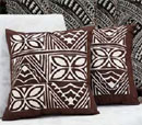 |
South Pacific design and colour Colours for South Pacific design are drawn from the natural environment and cultures of the native people who settled in these islands. The people in the three regions were originally agriculturists, growing breadfruit, bananas, coconuts, yams and taros – many villages were self sufficient and the family was considered their basic political and social units... more |
||||
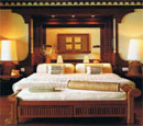 |
Asian design and colour Early Asian architecture illustrates how the buildings were made from whatever the earth had to offer – mud, clay, straw, wood or stone – evolving organically to meet practical needs, social aspirations and religious beliefs. Modern buildings incorporate uncluttered living and technology, to satisfy sensual human needs through the continued use of natural construction materials and organic forms... more |
||||
 |
Spanish style, design and colour Spanish design is best described as a ‘Rustic Mediterranean Style’. Homes and buildings are influenced in the south of Spain by the Mediterranean coastline and often have whitewashed walls, tiled flat roof and a central courtyard. In the wetter, northern region there is a strong Celtic influence with thick stone walls, pitched roof and arched walkways to give protection against cold and rain. The ‘country weekend’ has led to many city-dwellers buying up modest country houses... more |
||||
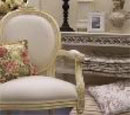 |
French design and colour The distinctive style known as French Provencal takes its name from the region of Provence in the south of France and has become more widely interpreted as the French Provincial style. The secret of its success is the combining of furniture, furnishings and accessories from previous centuries with those of today. This style can be applied to a simple country home, a grand city residence or a modern townhouse. However it looks its best… more |
||||
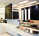 |
Healthcare facilities For many people the word ‘hospital’ conjures up thoughts of drab, institutional buildings. However this is not the case today as designers strive to create healthcare facilities and buildings that uplift the spirits of patients and staff. We are moving away from the sterile, clinical environments and healthcare interiors today are ‘softened’ with colour and warmth to make them more welcoming and ‘homely’... more |
||||
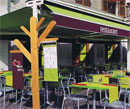 |
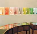
Hospitality design The humble beginnings of the restaurant trade was a simple meal to feed a weary traveller. Man on horseback stopping off overnight after a day’s riding across country. Today’s restaurants feed appetite and soul, they are designed to excite, inspire and satisfy taste on every level, not just food. The design and décor is just as important as the food and beverage. It may be edgy and modern, simple and traditional, or theatrical and entertaining... more |
||||
 |
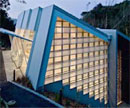
Retail design As retailers strive to find new and exciting ways to promote and sell their products in an aggressive global marketplace, designers are challenged to understand consumer behaviour as well as the changing building technologies. The cultural and social issues of the shopper impact on how products are branded and presented to buyers. The way we dress or the way we furnish our homes, the food we eat, books we read or music we listen to, right down to the cars we drive and phones we use - all point to the people we are, as far as social status is concerned... more |
||||
 |
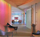
Learning centres Every community has existing educational assets - land, buildings, teachers and administrators. We need to define the vision for the nation’s education system and creatively plan to link the two together. Lifelong education will be a key fact for everyone in the future. While there is no one way to teach or learn, there are many techniques to enable students to learn faster, better and smarter. An open-minded search for new ideas is essential to future education... more |
||||
 |
Offices and workstations The office needs to be designed so that numerous functions can be accommodated within the area. It is a space for interpersonal exchange, efficiency and productivity. Often the company’s corporate identity is translated into the interior space, but it must be an aesthetically pleasing environment to work in. We are not suggesting having red walls or furniture just because the company logo is red - this may result in a very unsettled or stressed-out team of workers... more |
||||
 |
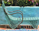
Storage solutions Great storage is one way to put your home and your life in order. Clutter and chaos in your living spaces cause anxiety and disharmony, sometimes even at a subconscious level. When we have everything in its allocated space we feel in control of our home and in control of our life - we know what we own and where to find it. With well designed storage systems in your home, your possessions will be under your control and not creating unwanted mess. This does not mean that you have to hide all your treasures away; they can have a special place to be on display and enjoyed... more |
||||
 |
Outdoor living Our backyards have always been important to us, and when planning these spaces we need to decide what sort of atmosphere we want to create, just as we would with an interior room. Should the garden reflect the style of the indoors, such as formal or casual, minimal or busy? Does it need to look good and be on view all year around, or just during the spring/summer months when more time is spent outdoors... more |
||||
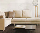 |
Living rooms The space where a family relax together, or entertain friends, is sometimes considered the hub of the home. Many homes today have more than one living area - one as a relaxed centre for family interaction and another for entertainment, such as hosting visitors, watching television/movies or listening to music. Relaxation is the key to a successful living area, and there are many ways to achieve a stylish space that can be used comfortably on a day-to-day basis... more |
||||
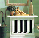 |
Entrances, hallways and staircases The main entrance to the home is often a key element of how the home appears to others; first impressions are important. The door marks the boundary between the exterior and interior and is also an important design consideration in itself. A heavy timber door suggests a solid and secure building structure. However in an entrance lobby without windows a partially glazed door will allow more light into the space... more |
||||
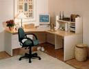 |
Home office/study The home office needs to be designed so that all functions can be accommodated within the space. Its location is important so it could be advantageous to position it to be easily accessed from the front entrance if it is a home based business. This allows clients or company representatives convenient access, and you can retain privacy in more personal areas of the home. If it is a family office/study it may be better positioned near the kitchen or living room, or within a bedroom or rumpus room if it is mainly being used for students to do their homework... more |
||||
 |
Bedrooms for kids Paint should be lead-free and non-toxic (refer to the Resene brochure on the eco-friendly way to paint your child’s bedroom) and avoid sharp edges that could injure a child if they fell against it. Use safety glass in low-level windows and doors, and fit windows with safety catches so children cannot climb/fall out of the window. Never position a chair or bed under a window, and ensure chairs are stable and sturdy if climbed on... more |
||||
 |
Bedrooms The bedroom is a space where you can escape for solitude and privacy. It is the room where you can lock yourself away from the rest of the house and take time out from busy family life. It is a place you can surround yourself with things that give you pleasure, it is the most personal place and should be wonderfully comfortable, and the master bedroom is usually the ‘love nest’ so needs to be secure... more |
||||
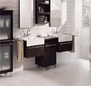 |
Bathrooms The bathroom is often a challenging space to design so that all functions can be accommodated within the area. Its location is crucial, so it can be money well spent to position it so that is can be easily accessed from the bedrooms it services, and a guest toilet and hand basin is needed to service living areas within the home. When planning to renovate a bathroom, in consultation with your designer or plumber who knows local building and water regulations, you must consider the layout of existing water pipes, sewage outlets and air exhaust ducts... more |
||||
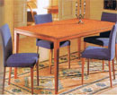 |
Dining spaces The space where a family eats is often the heart of the home where many activities other than consuming food take place, such as socialising and communicating, doing office work or homework, art and crafts, playing cards or board games. Seating should be comfortable to encourage this diverse range of gatherings and activities and the atmosphere relaxed so that people can linger over a meal. Nobody will want to sit longer than necessary on an uncomfortable chair or in bright and intrusive lighting conditions. Understanding what makes an eating space work is important to the success of that room and to the home as a whole... more |
||||
 |
Kitchens Planning is one of the most important tasks for this busy space in a family home. Often both partners within the household work and share kitchen duties at breakfast and dinner time. Older children make their own snacks after school or extended family share in the food preparation. Therefore it is important to ensure the kitchen plan is practical and safe so that people can move around and access appliances and cabinetry without injury or stress. Professional kitchen designers are trained to design kitchens to accommodate the work centres and traffic flow. But here are some tips for you to consider when thinking about how you want your kitchen space to function... more |
||||
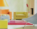 |
The feel of colour How do colours make us feel? We know that they can affect our emotions – is there a link between colours and mental states? Can colours stimulate us by acting directly on some aspect of our bodies or brains? While colour symbols may differ between cultures we see a great deal of colour meanings are recognised around the world so it would appear some colour responses are universal. Walk into a home decorated by a property developer and you will probably find the walls painted white, cream, beige or grey. It is easy to resort to colour minimalism rather than take a risk and we often have a tendency to choose colours based on prejudice and convention rather than how they will work together...more |
||||
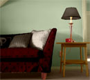 |
Colour your room Embarking on a decorating project can be rather daunting, where does one start? Colour sets the mood and style of a room and gives it personality. It affects the impact the room has on people and the way they feel and behave within it. So here are some practical steps to work through so that you get the best results and take some of the stress out of the decisions you will need to make. A very good starting point is to make a list of the things you are keeping in the room, and the things you are changing. What parts of the room are to be changed... more |
||||
| 2000 - 2005 style The new millennium… excitement and anticipation. As this milestone approached people from around the world were planning celebrations to welcome in the new millennium, and a big focus was on New Zealand being the first country to see the light on the 1st January 2000. At the same time there were businesses worrying about bugs in their computers, and Y2K posters being distributed to warn people to prepare for restricted supplies of water and electricity, and the possibility that eftpos machines may not provide cash on demand... more |
|||||
| 1990s style The 1990s arrived with a resounding thump - the world economy had taken a big slump and it was time for a reality check. A new ecologically-aware consumer arose as everyone became concerned about saving the rainforests, fuel consumption, green building materials and recycled goods. Less became more - apartment living, minimal architecture, unadorned interiors, simple easy-wear fashion, smaller cars, mini phones and laptop computers. Minimalism became a strong influence at the end of the 1990s evidenced by Zen style homewares and an obsession with black and neutral fashion clothing - dressing down became the norm... more |
|||||
| 1980s style In the earlier part of the 1980s woody and natural colours were seen in offices and homes. Comforting colours of brown, olive, rust and gold were warm and safe, a contrast with what was happening in the later part of the 1970s when the world was rebelling against law and order. Nurturing natural colours from autumn leaves and golden sunshine with warm cork were popular. Pale apricot or peach was an extremely popular colour during the decade. It is believed to nurture and soothe and was selected to combat the stress people felt with the faster pace of life and fear of the new communication and computer technology in the workplace. ...more |
|||||
| 1970s style The oil crisis resulted in restrictions on petrol and 'car less days' were introduced in New Zealand. One day a week you were not allowed to use your vehicle to save on fuel consumption. There were power cuts in Britain and the economic crisis led to three day working weeks. People became interested in 'saving the planet' and Greenpeace was active. The colours of cars were also popular in fashion and interiors Avocado green was frequently seen in 1970s bathroomware, textiles, wallpaper and motor cars. Recreate the look with Resene Highball, Resene Crail, Resene Ming and Resene Dynamite... more |
|||||
| 1960s style The swinging sixties were an exciting, revolutionary and turbulent time of great social and technological change. Psychedelic colours and designs were seen in fashion, furnishings, advertising and graphics. New materials provided fashion and interior designers new opportunities in colour and form, from the lycra mini-skirt to the first seamless plastic chair. New dyes brought a range of brightly coloured cottons and synthetics to mass markets for both furnishing and clothing... more |
|||||
 |
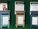
1950s style Credit cards and clothes - the 1950s was a period of renewal and optimism when post war austerity was replaced with a consumer boom. With great leaps in manufacturing and scientific discoveries, and the lift of rationing, consumerism grew rapidly, and people craved for colour and modernity. Television and jet travel opened up new horizons. War research benefited fashion and design, new synthetic materials were 'modern' and desired by all. New wash and wear fabrics enabled everyone to wear white and pastel colours. New materials such as plastic laminates, fibreglass and latex foam literally shaped the 1950s. Magic words were Nylon, Crimplene (polyester), Orlon (acrylic), PVC, Melamine and Vinyl... more |
||||
 |
1940s style Make do and mend, lend a hand on the land - rationing during and after the war. Amid the uncertainty of war, New Zealand celebrated its centenary at Waitangi in February 1940. The war took its toll on the availability of products, and people coped with economical food recipes and home dressmaking. Textiles were controlled and used for army and airforce uniforms, only leftovers were available for garments. With so many men joining the armed forces many women took up their factory jobs to produce clothing, equipment and vehicles for the war in the Pacific... more |
||||
 |
Art
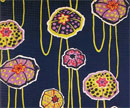
Deco style Styles don’t just happen, they are usually developed as a response to what is happening in our world - Wars, famines, inventions, industry, medicine, theatre, arts, royalty, sports, communications, fashion, textiles, architecture, print, transport. The art deco period is loosely defined as the period between the two world wars, and it encompasses a variety of design styles from early 1920s to late 1930s. The conventional designers decorated every surface with stylised fruit and flower motifs, while the revolutionary designers turned to the aesthetics of machinery and uncluttered design... more |
||||
 |
Aqua This is a colour we could not live without. Uplifting and serene, energetic and enlightening. It has many names – aqua, teal, turquoise and ming. A refreshing scheme always includes the clear, energetic blue-green, which has the calming effect of blue with the warm touch of yellow. These aqua colours imply bathrooms, bedrooms, patios and pools. Blue-green is considered to be one of the most healing colours, providing protection from germs and infection... more |
||||
 |
Black Black is often associated with darkness, which may make it difficult for many people to use in living spaces. Black has many depths and shades that may be used to throw other colours and finishes into relief, such as glossy black and chestnut brown, chalky black and warm white. Black paint is probably best used in these sorts of combinations in interiors rather than en mass. Many colour-infused blacks are available in the Resene range of paints and multi-layered effects may be achieved by adding glazes and special effects, such as Resene Pearl Shimmer and Resene Pixie Dust over black... more |
||||
 |
Blue Ask a crowd of people which is their favourite colour, and more than half will say blue. Blue is soothing and fresh, being the colour of two vital elements for living – air and water. It is timeless and universal. In New Zealand we see the coast on a regular basis (or a lake or river) and the air is never too polluted for us to see the sky every day. Imagine what it would be like to live without seeing these two expanses of blue for weeks on end. This duo of essential elements makes us feel peaceful and relaxed. The colour of inner life... more |
||||
 |
Brown Brown is an all-embracing term to describe a range of fascinating colours – from purple- tinged taupe, to neutral biscuit and beige, and through to the deepest chocolate and richest coffee shade. Many of these browns are a very familiar part of the natural landscape and play an evocative part in home décor. From wooden floorboards, doors and furniture to woven natural fibres, wallcoverings and textiles. Dark and light brown provide a neutral setting for a large range of colours and patterns. Being a colour of Mother Nature, it is often used in art and design to allude to natural forms. It is the chosen palette of many cultural arts and crafts, and in graphic design earthy colours are effectively used in projects that deal with ecology and the environment...more |
||||
 |
Green Green, in its many shades from nature, injects vitality into a space, and is a colour most people feel comfortable to be within. Because green is nearly always present in our everyday lives, we intuitively feel a sense of well-being when we see green - it signifies life and restores energy, and gives one a sense of rejuvenation. Green is a colour associated with peace... more |
||||
 |
Grey The greys in between black and white are neutral, quite timeless, and suit any interior or exterior building style. Grey is used to soften the contrast between black and white, and it also quietens strong colours in a space with a gentle neutralising effect. Referring back to the Resene Multi-Finish Colour Chart Grey Palette, Resene Shark, Resene Tuna, Resene Shuttle Grey, Resene Grey Chateau and Resene Iron are all neutral greys, that is. they are not tinted with red or blue or any other colour. Looking in the Resene The Range greys are infused with other colours. When you use the grey vinyl isolator you will note that most greys in The Range collections are slightly coloured that gives them their own characteristics... more |
||||
 |
Orange Orange being a mix of primary colours red and yellow depends on the actual tones of these colours i.e. bright red plus bright yellow produce a clear orange, and warm reds make an earthy terracotta tone. Because these two primaries are so strong in themselves, in a decorative context orange must be used with care. Although it has been used in various periods e.g. bright neon orange in the 1960s, orange has not been widely chosen as an interior colour until more recently with the advancement of paint techniques that enable it to be used as a life-enhancing colour to bring light and warmth into rooms and evoke feelings of mellow warmth and pleasure... more |
||||
 |
Pink Like fashion, colour tends to move in cycles and what is happening in the world has a large impact on what colours we need to have around us, what 'feels' right whether it be relaxing or stimulating, calming or invigorating. It is really a matter of balance we seek. Looking at the Resene The Range 2005 there is a variety of pinks which over the decades may have been associated with various memories. This may present challenges for some consumers, but be assured pink has a history and a place in design, and is often seen alongside red after a warfare to counteract the military uniforms that dominate during the war years. Pink is rising in popularity, in fashion and interiors around the world, and it will be with us for a year or two yet... more |
||||
 |
Purple Purple, or violet as it is referred to on the colour wheel, has been associated with power for many centuries. It is a colour that is authoritative, strong and courageous. It brings to mind the plush velvet cloaks of nobility, gold embroidered silks and taffetas. Blue violet is the darkest hue on the colour wheel and combines well with metallic gold, yellow-orange or fresh lemon hues. Regal colour schemes imply ancient wealth, sometimes with a slight Eastern flavour, such as in precious carpets, textiles and paintings. Blue-violet is the colour of the finest sapphires and there is a gem like quality to this colour that adds richness to wherever it is applied... more |
||||
 |
Red Red is often associated with love - we link red hearts and red roses with Valentines Day, the traditional symbol of love. Red is a very powerful colour and it evokes strong feelings. In using powerful colours it is always important to remember that red is a stimulating colour; while it increases passion it may be difficult sleep in a red bedroom for instance. A tint or tone of a powerful red may be a more appropriate and a less demanding choice. A powerful red can be used in an analogous colour scheme with red-violet and orange- red, and although still very lively the related colours will tone down the primary red... more |
||||
 |
White White is the colour of peace and innocence, of calm and comfort, simplicity and cleanliness. It radiates clarity, purity and newness. It is tranquil and soothing. Artists have painted on white canvas for years, and homeowners and designers use white as a foil for other colours, which allows brilliant shades to really sing, and throws subdued colours into sharp relief. It is also used as an accent colour to give crisp detail, adding light to a dark colour scheme, or bringing serenity to a colourful one. There are many different shades of white, warm whites and cool whites, and Resene are aware of the importance of these subtle differences and produce whites tinted with a number of colours... more |
||||
 |
Yellow The colour yellow is the mind colour, a vibrating mental stimulant. It is elevating and inspiring, optimistic and cheerful. It brings a welcoming warmth into cold rooms lacking in sunlight, and is usually considered an advancing colour, which means it comes out towards you. People with a great passion for yellow are usually playful characters with a sense of humour. They love to laugh and make others laugh, and they advocate relaxing and having fun. Their life purpose is to help lighten up life and heal the energy of the planet. They are always on the go, enjoy physically active sports and are also creative and artistic... more |
||||
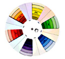 |
The colour wheel Sir Isaac Newton created the first colour wheel hundreds of years ago by splitting white sunlight into red, orange, yellow, green, cyan, and blue, then connected the ends of the colour spectrum together to demonstrate natural colour progression. A century later Johann Wolfgang Goethe studied the psychological effect of colours and discovered that some colours gave a feeling of warmth and others a feeling of coolness. Using these results he created a colour wheel based on the psychological effect of each colour with one side being the plus side of red, orange and yellow and the other side being the minus side of green, violet and blue... more |
||||