Art Deco home
They wanted a sense of art around them and to really feel they were in an Art Deco home without it being a mere reproduction of the era or Baz Luhrmann overkill.
When a client comes to you saying “I want colour and artistic expression throughout my house in a way no-one else has” as an Interior Designer you not only say “We can do that!” you also jump for joy, clap your hands together and resist the urge to hug them. These types of project are unfortunately quite rare.
This client presented an almost blank canvas in their Art Deco home which was in a very bland condition, painted a ‘dirty cream’ on what seemed every surface. The home needed a kitchen and bathroom renovation along with an exciting new interior colour scheme. The existing furnishings were an eclectic mix of original 60s pink velvet, upcycled pieces and family heirlooms which all needed to be incorporated.
Art was important to the young couple who had started to collect contemporary pieces and didn’t want to put cheap prints on the walls while amassing their desired collection. They wanted a sense of art around them and to really feel they were in an Art Deco home without it being a mere reproduction of the era or Baz Luhrmann overkill.
The floor plan was quite typically Art Deco featuring a gorgeous curved window wall in the living room
flanked by the original scalloped fireplace and mantle. There was a great flow between living and dining rooms but the tiny enclosed kitchen definitely needed its wall ripped down to create more space, light and laughter for friends watching their own Masterchef in action.
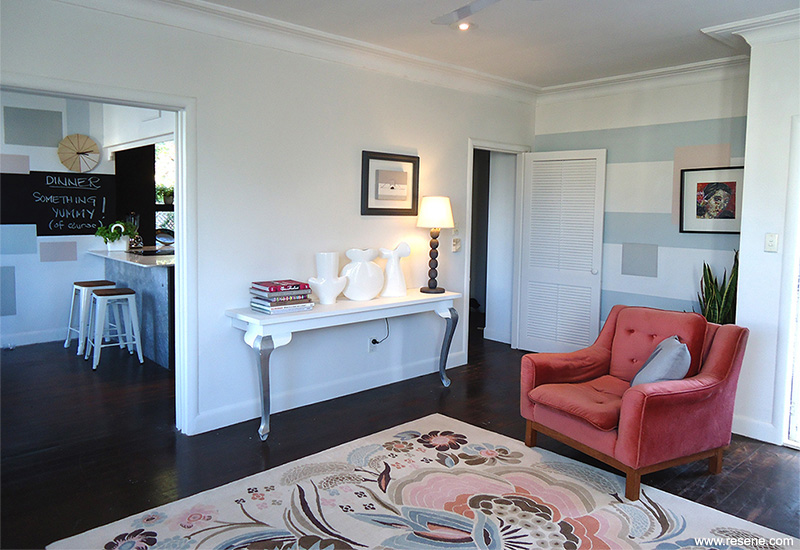
The idea was to inject a sense of quirky elegance into the tired old lady and give her a modern edge. The kitchen began as the starting point and is literally the heart of the house, as it is perfectly centralised.
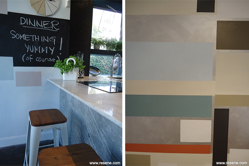
The kitchen would remain neutral in colouring but by using charcoal against stark white, a sense of drama would be created. Large colour blocking in the kitchen gives a contemporary edge. A dark charcoal, full wall pantry is mirror imaged by a full wall of black Italian Mosaics. David Trubridge boards were upcycled on the kitchen bench front creating a local artistic reference painted metallic silver to appear like sheets of textural metal sculpture.
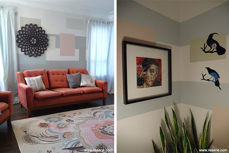
Creating a sense of art was achieved throughout the house by actually treating the walls as canvases.
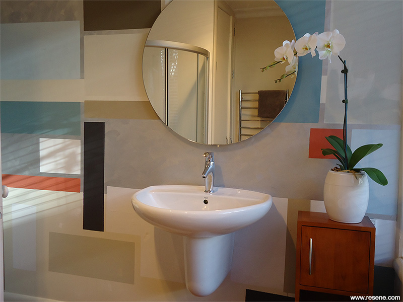
Inspired by Art Deco glass work and furniture shapes, a simple masking tape method was used to create bold blocks of various Resene colours. The painted geometric design wraps across the walls from room to room interrupted by bare walls of Resene Black White (grey white) which enables the design to breathe and not overcrowd the house. The charcoal in the kitchen is stretched out into horizontal bands in one direction as an entertaining dinner party blackboard, and bold striping in the entrance and fireplace.
Working on this Art Deco house it was important to acknowledge tradition while mixing in the contemporary. The first point of colour inspiration was the Art Deco palette itself, elegant pastels highlighted with sombre dark shades. To avoid the project looking historically repetitious the colours also needed to be current and innovative.
The Karen Walker Resene colours were perfect to depict the hills and shores. Resene Periglacial Blue (icy blue), Resene Ecru White (green beige) and Resene Foggy Grey (watery grey) were combined with Resene Wafer (pink biscuit) and Resene Celeste (light grey green). In the dining room Resene Linen (green edged neutral), Resene Surrender (silver grey) and Resene Silver Aluminium (silver metallic) make an appearance. Resene Fuscous Grey (charcoal grey) was used as the base neutral to ground the more whimsical pastels and give that Art Deco sense of drama.
The blackboard wall stretching from kitchen to dining is finished in Resene Blackboard Paint Black. The kitchen and entry share Resene Fuscous Grey, which is teamed with Resene Soapstone (warm neutral) in the entrance.
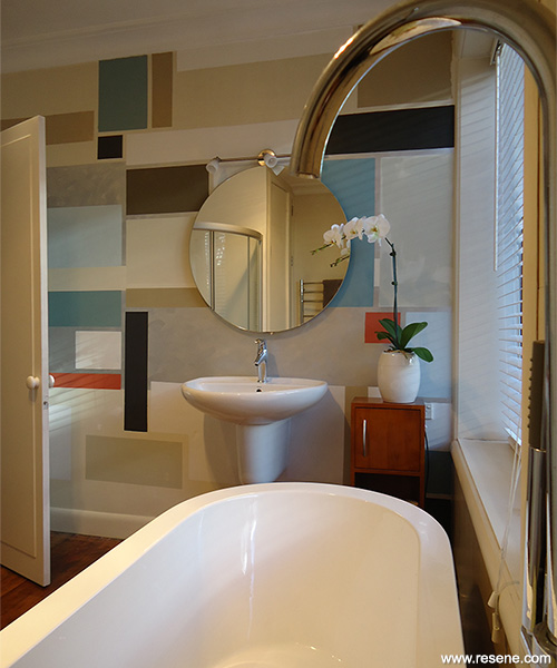
The geometric design continues into the bathroom introducing new colours and increasing the intensity of pattern. The bathroom tonal combination is earthier and more intense with Resene SpaceCote Low Sheen tinted to Resene Fuscous Grey, Resene Half Sisal (soft beige), Resene Triple Sisal (greened ochre), Resene Sandspit Brown (neutral beige), Resene Sandstone (taupe brown), Resene Escape (pale blue), Resene Cutty Sark (blue green) and Resene Hot August (orange toned red), with a strong metallic silver accent.
The geometrical designs in an array of colours were devised to provide the ultimate wow factor within a very tight budget.
This project won a Resene Total Colour Interior Colour Creativity Award and the judges commented: “This project demonstrates an innovative and contrived approach, incredibly clever. The colour concept was a unique way to decorate the space on a very limited budget. The colours are placed in such a way that the walls become the artwork.”
Building contractor: Gordon Gammie Construction Ltd
Cabinet maker: Richard Squire Designs
Interior designer: Kelly Gammie
Supplier – bathroom fittings: Mico Design
Winner: Resene Total Colour Interior Colour Creativity Award
Project: Resene Total Colour Awards 2013
From the Resene News – issue 1/2014
Resene case studies/awards project gallery
View case studies that have used Resene products including many from our Resene Total Colour Awards. We hope these projects provide inspiration for decorating projects of your own... view projects
Total Colour Award winners:
2023 |
2022 |
2021 |
2020 |
2019 |
2018 |
2017 |
2016 |
2015 |
2014 |
2013 |
2012 |
2011 |
2010 |
Entry info
Latest projects | Project archive | Resene news archive | Colour chart archive