Churton Park
It seeks to be focussed on learning rather than teaching, flexibility, environmental quality and opportunities for indoor and outdoor learning in a myriad of configurations.

As the first new school in Wellington in over two decades, this is a radical departure from the school environments we are used to; one which is grounded in current education thinking and research into design for schools for the 21st century.
It seeks to be focussed on learning rather than teaching, flexibility, environmental quality and opportunities for indoor and outdoor learning in a myriad of configurations. The design of both teaching and learning spaces and circulation considers flexibility and learning focus as primary objectives.

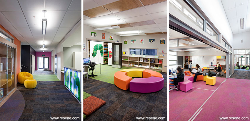
Large sliding glazed doors allow one space to become three for smaller group activities, floorcoverings identify each learning common by colour and corridor spaces are active learning areas containing wash up sinks and cooking resources.
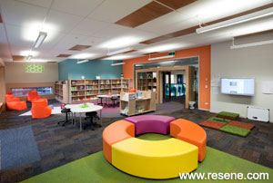
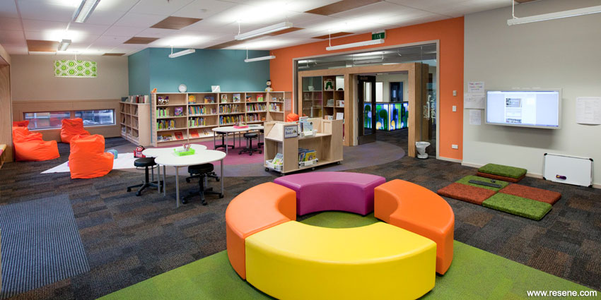
The interiors are designed around fun, engaging bright colours and focussed at a child height leading to coloured floors, furniture and joinery offset against a neutral palette (Resene Double White Pointer, Resene Tapa and a custom made Resene Special Amesbury Mere) and a dark carpet while introducing texture wherever possible in the noticeboard and strandboard wall linings. Each learning common (flexible learning space) is named its respective flooring colours in different languages, representing the various cultures within the school and surrounding suburb. The bright paint colours take their cues from the vibrant carpets referencing the multicoloured flecks within the carpet tiles. In the reception area paint colours are used as markers and wayfinding coloured door surrounds leading to the different hubs within the school. Resene Sassy leads to the Mawhero Gulabi & Kikorangi Bleu classes (Block A) while Resene Smitten leads to the Kowhai Lanu Samasama, Kakariki Midori and Karaka Chengse classes (Block B). Resene created special colours (Resene Amesbury Karaka Chengse and Resene Amesbury Kikorangi Bleu) to be used in conjunction with the selected Interface carpet tiles.

The library is a child focussed space, using age appropriate graphics like Eric Carle’s ‘The Very Hungry Caterpillar’, coloured feature walls (Resene Amesbury Karaka Chengse and Resene Amesbury Kikorangi Bleu) and carpets creating fun shapes on the floor.
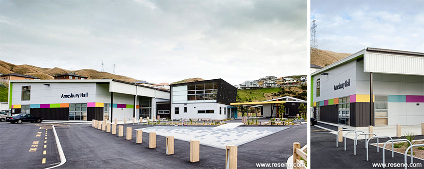
The exterior pulls the inside classroom environments to the outside with splashes of colour surrounding the school buildings against a backdrop of charcoal brown (Resene Special Amesbury Mere), Resene Catch 22 on steelwork and a neutral grey (Resene Triple Concrete) chameleon colour, which seemingly changes tone as the feature colours (Resene Smitten, Resene Amesbury Kikorangi Blue, Resene Sassy, Resene Limerick and Resene Amesbury Karaka Chengse) change. The trim colours were chosen to match the available roofing and powdercoat colours (Resene Ironsand and Resene Titania). All the colours appear in the band surrounding the interior and exterior of the community hall.
Colour and technology is at the forefront of the fun and vibrancy of this new school.

Architectural Specifier: McKenzie Higham Architecture
Building Contractor: Maycroft Construction Ltd
Colour Selection: Macaela Ward and Jeff Brickell
Painting Contractor: MRC Contracting – Martin Coutts
Photographer: Kate Whitley
Other Key Contributors: Graphic Designers: Forty Five Design
Winner: Resene Education Colour Maestro Award Winner
Project: Resene Total Colour Awards 2012
Resene case studies/awards project gallery
View case studies that have used Resene products including many from our Resene Total Colour Awards. We hope these projects provide inspiration for decorating projects of your own... view projects
Total Colour Award winners:
2023 |
2022 |
2021 |
2020 |
2019 |
2018 |
2017 |
2016 |
2015 |
2014 |
2013 |
2012 |
2011 |
2010 |
Entry info
Latest projects | Project archive | Resene news archive | Colour chart archive