The Hawke's Bay Opera House, recently rebranded Toitoi – Hawke's Bay Arts & Events Centre, is an exceptionally significant heritage building, one of the last surviving theatres in New Zealand designed by renowned theatre architect Henry Eli White.
The building has been described as "one of the earliest buildings designed in New Zealand using the Spanish Mission style… the lavish Art Nouveau interior… being probably the largest and most complete example of its type in New Zealand." (Heritage New Zealand).
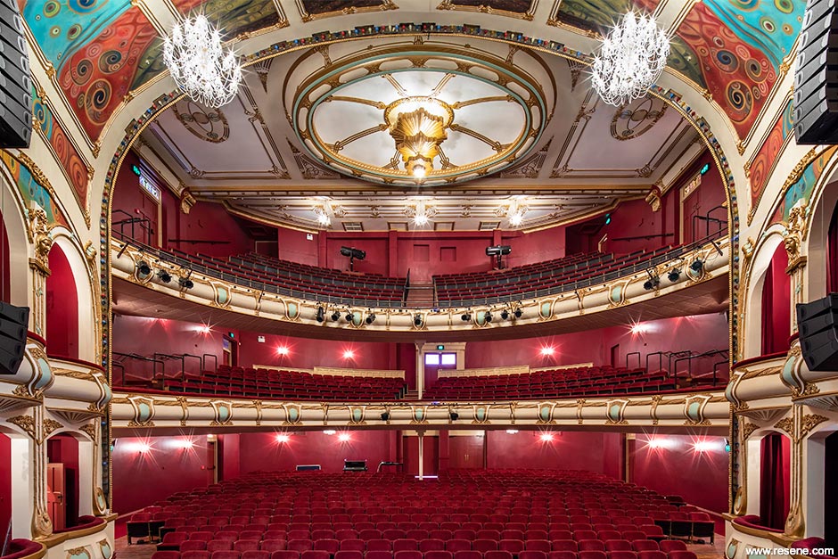
The building was opened in October 1915 as the Hastings Municipal Theatre. The exterior was composed in the Spanish Mission Style of architecture, a picturesque symmetrical arrangement, complete with tiled roofs and pale coloured rendered walls, deep set openings and turrets flanking either side of the principal Hastings Street façade. The interiors presented a richly ornamented Art Nouveau style, with pressed metal ceilings and plaster work featuring flowing tendrils, classical heraldic cartouches and ribbon mouldings.
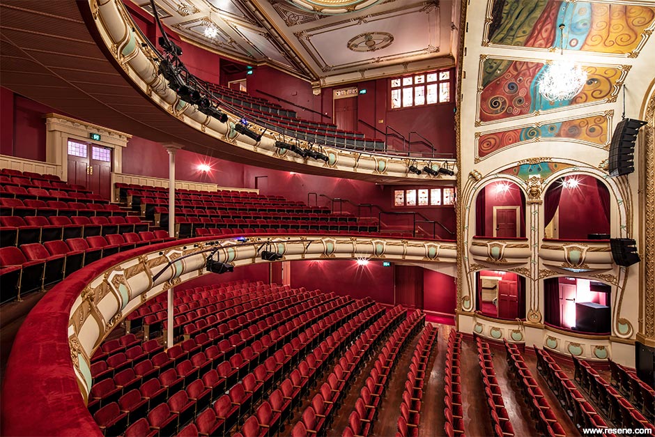
The building sustained extensive damage during the 1931 Hawke's Bay Earthquake and was substantially reconstructed thereafter. It underwent various alterations from 1939-1957 before seeing a sequence of major restoration works during the late 90s and early 2000s. Work carried out in the 2000s involved the painting of the auditorium ceiling by artist Tina-Rae Carter, which included the composition of frescos on the walls and ceiling panels. The works were completed in 2006 and the building reopened as the Hawke's Bay Opera House.
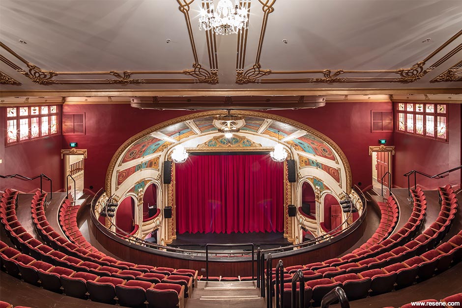
By 2014, the building was closed once more after a seismic assessment found it failed to meet the required 34 per cent threshold of the National Building Standard and was therefore deemed earthquake prone.
Following an outpouring of public support, Hastings District Council announced ambitious plans to strengthen and refurbish the building well beyond the required 34 per cent and in 2017, DPA Architects were commissioned to make this a reality.
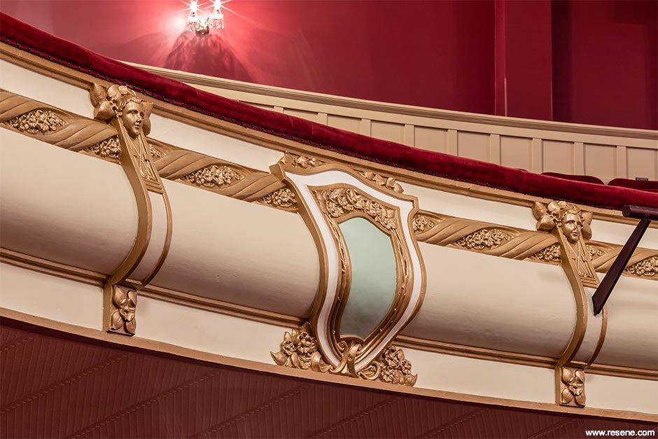
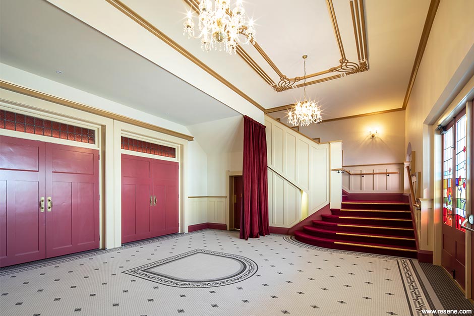
Aside from the meticulous demands of structurally strengthening a heritage building of outstanding significance, it was envisaged that new toilet facilities be designed and all spaces within the theatre be re-decorated as part of the upgrade. DPA Architects set about introducing a new colour scheme to the auditorium, foyer and toilet spaces, sourced entirely through the Resene product range, and complemented with a careful selection of fabrics, wallpapers and floor coverings.
In depth investigations and research were conducted into earlier colour schemes, based on historical documents and imagery. A new scheme was introduced based on known earlier influences, yet conscientious of more recent architectural contributions.
Undoubtedly the most significant space within the Hawke's Bay Opera House is the main auditorium of uninterrupted sight lines and excellent acoustics. Assessed as having exceptional heritage values, the significant fabric that makes up the auditorium includes the proscenium arch, the central columns, pressed metal ceiling panels and intricate plaster ornamentation to walls and ceilings.
Photographs taken immediately after the 1931 earthquake show that the auditorium at the time was painted in a light colour which appeared to cover all surfaces, including the decorative motifs and ornate detailing.
1992 renovations saw the introduction of a pink colour scheme and gold detailing on the floral motifs. A teal stage curtain with deep red seats and private box curtains furthered the bright array of colours, which at the time, were a direct response to the general feeling that the space was uninspiring and underwhelming.
The second wave of renovations from 2002-2006 saw the redecoration of the auditorium and the installation of Tina Carter's ceiling mural. Detailing of the Art Nouveau motif above the proscenium arch represented the four colours and themes of the Opera house – community, dance, music and drama.
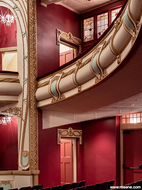
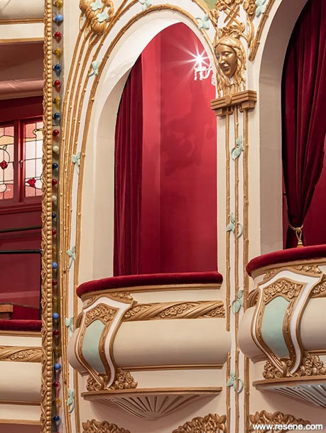
During works carried out by DPA Architects in 2018-2019, the lath and plaster ceiling was found to be in particularly poor condition due to ongoing water damage from leaks in the roof above. While the original intention was to retain Carter's mural within the oval, the deteriorated condition of the ceiling necessitated much of its replacement and so plans commenced that were tailored around returning the auditorium ceiling to an earlier, lighter colour scheme, while salvaging the most significant portions of Carter's mural.
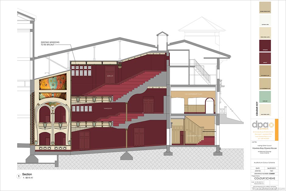
The decorative peacock motifs which adorn the proscenium arch, originally inspired by the ornate nature of the Austrian secession architectural movement, were retained in their gold colours, to reflect the lavishness that architect Henry Eli White envisioned when the theatre was first built. A subtle touch of colour in Resene Gum Leaf, complimenting the 2004 mural, was introduced in small areas to the ceiling and balconies, offsetting the lighter tones of Resene Triple Pearl Lusta, Resene Pearl Lusta, Resene Half Pearl Lusta, Resene Spanish White and Resene Canterbury Clay.
To heighten the experience of the space as a world class performing arts centre, a dramatic colour scheme was introduced to create a sense of anticipation and drama, infusing the audience with a sense of awe-inspiring opulence. Rich reds of Resene Vanquish and Resene Merlot were applied to the walls and doors of the auditorium, which combined with the plush red seating, created an atmosphere of depth and luxury, traditional staples of theatre design.
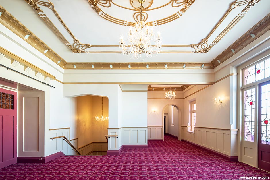
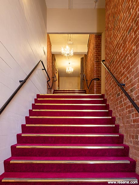
In contrast to the auditorium, while providing a complementary transition into the main space, foyers were transformed from what were formerly dark and seemingly cloistered spaces, to a lighter palette of creams and neutral tones including shades of Resene Canterbury Clay and Resene Eighth Pearl Lusta. The first-floor foyer was anchored with carpets in rich reds and finished with lavish gold plasterwork, with notes of Resene Gum Leaf providing a prelude to the adjoining auditorium.
The toilets were redesigned to include a selection of floor coverings based on an enlarged version of the original floor tiles to the ground floor entry foyer. Rimu skirting was painted in Resene Carnaby Tan from the Resene Heritage colour range, with the finish carried through the doors and timber trims of the cubicles. Ceilings were finished in half strength Resene Gum Leaf and walls in Resene Quarter Canterbury Clay, allowing for a sense of continuity between the toilets, foyers and auditorium. Newly inserted steel bracing to the staircase above the toilets on the western side were left exposed, contrasted against sections of Resene Alabaster and featuring a glimpse into the degree of intervention to have taken place.
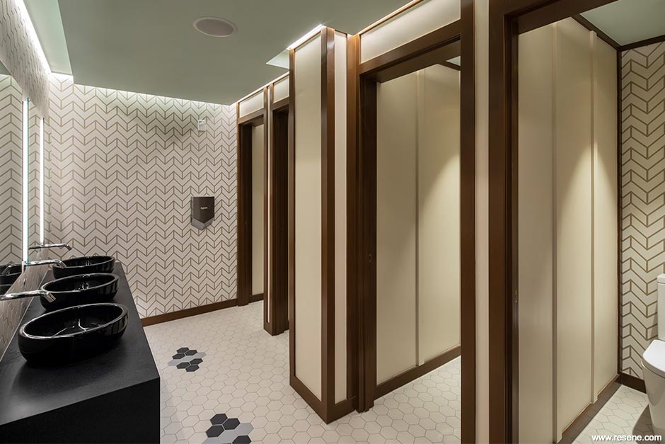
The new colour scheme to the toilets, combined with selected wallpaper, bench seating fabric and hexagonal wall tiles, provided a refreshed and contemporary feel with historic overtones.
Resene SpaceCote Low Sheen was used throughout with Resene SpaceCote Flat Kitchen & Bathroom in wet areas and Resene Lustacryl semi-gloss waterborne enamel on trims, joinery and high wear and tear stairwell areas.
A lath and plaster ceiling is traditionally formed by laying wet plaster over timber laths that are left with gaps between them. The plaster is applied over the laths with sufficient force to push some plaster between the laths, which then acts as a key to stop the plaster falling. In the case of the Opera House, the plaster had cracked, the keys weakened and broken, and significant fabric was at risk of damage. As a plaster ceiling can be up to 20mm thick and weigh anything up to 53 kilograms per square metre, an area of falling plaster has the potential to cause injury and worse.
The decision was made to partially replace the plaster and return the auditorium ceiling to an earlier, lighter colour scheme, while retaining some of Carter's mural and interweaving the new colour scheme in a way that harnessed and complemented the established aesthetic values of the space. Other significant challenges involved the structural upgrades and construction of new concrete shear walls and diaphragms throughout. Strengthening works required substantial sections of significant fabric, such as plaster finishes and timber dado panelling, to be temporarily removed before being carefully restored and refinished to conceal concrete shear walls beneath. Within circulation spaces such as stairwells, new concrete shear walls were left in their off-form state, displaying the textures of the boards in which they were formed, to match the historic methods of construction implemented in the building.
This project won the Resene Total Colour Master Nightingale Colour Maestro Award and the Resene Total Colour Heritage Commercial Award. The judges said "this project raises the bar for public space amenities with its combination of colour and design. The hero hue and leaf motif are a careful balance of being bold enough to be a wayfinding device at distance while still being at one with the wider park surrounds. So well designed, well coloured and simply gorgeous."
Architectural specifier: DPA Architects
Building and painting contractor: Gemco Construction
Client: Hastings District Council
Photographer: Sarah Rowlands
Winner: Resene Total Colour Master Nightingale Colour Maestro Award and the Resene Total Colour Heritage Commercial Award
Project: Resene Total Colour Awards 2020
Resene case studies/awards project gallery
View case studies that have used Resene products including many from our Resene Total Colour Awards. We hope these projects provide inspiration for decorating projects of your own... view projects
Total Colour Award winners:
2023 |
2022 |
2021 |
2020 |
2019 |
2018 |
2017 |
2016 |
2015 |
2014 |
2013 |
2012 |
2011 |
2010 |
Entry info
Latest projects | Project archive | Resene news archive | Colour chart archive