From the Resene decorating blog
Feeling blue? Blame it on the colour of your workplace. Just as colour in our home environments can affect our emotions, studies have shown that the colour on our office walls can have a significant impact on our productivity and wellbeing.

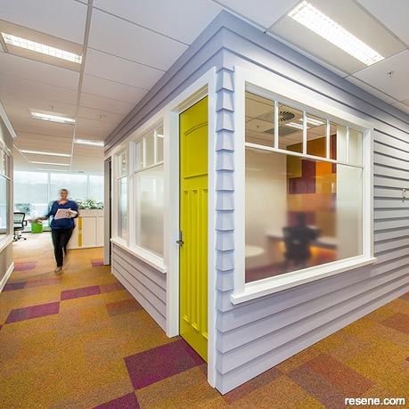
To view more of this project see "Lion Office."
Visual ergonomics – the art of colour and light placement – is a science in itself. Paint your walls blue and it contributes to a calming atmosphere. Paint them yellow or orange and the occupants may feel warm and happy. However, too much blue in the office and staff productivity may slow down or even provoke feelings of sadness. Too much yellow can over-stimulate the eyes and cause eyestrain, and feelings of anxiety in some. An abundance of orange often creates more of a social, talkative environment – which may suit some tasks but not others. Small amounts of red can stimulate and excite employees, but overdoing it may result in anger or aggression.
“Office and work spaces should have a comfortable undertone, with a dash of colour for stimulation and increased productivity,” says Resene colour consultant Nikki Morris.
“Our working spaces should have a comfortable vibe so we willingly want to work in them without feeling like it’s a chore to do our work.”

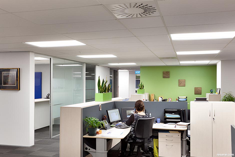
To view more of this project see "Crombie Lockwood."
Colour in the workplace or home office should be chosen with the end result in mind – matching your wall colour to your job. Since both blue and green can lower heart rates and reduce anxiety, these colours are a good choice for many situations. Green is also the easiest colour on the eye and has been shown to reduce eyestrain; green on the walls may help employees who stare at computer screens all day to relax their eyes. Exposure to both green and blue has been shown to stimulate concentration (a good choice for study areas) as well as enhance performance on tasks that require generating new ideas.
Are you an accountant? Consider choosing blue. Researchers found it helpful for those concentrating on numbers. But a scientist, engineer or writer will benefit from blue walls as well. In fact, blue was found to be the clear winner out of all colours for helping brain function.
Red, too, has been shown to optimise performance on tasks involving attention to detail, but it’s also useful for employees doing physical work where strength and stimulus is required. It may work well for employees who are negotiators or salespeople too. But red is not a particularly comfortable colour – it’s best used as an accent. It’s often used in canteens and restaurants to move people along.
Yellow is a good stimulant for designers as it enhances clarity and precision. It can also stimulate people’s adventurous side, which is useful for creative sorts.
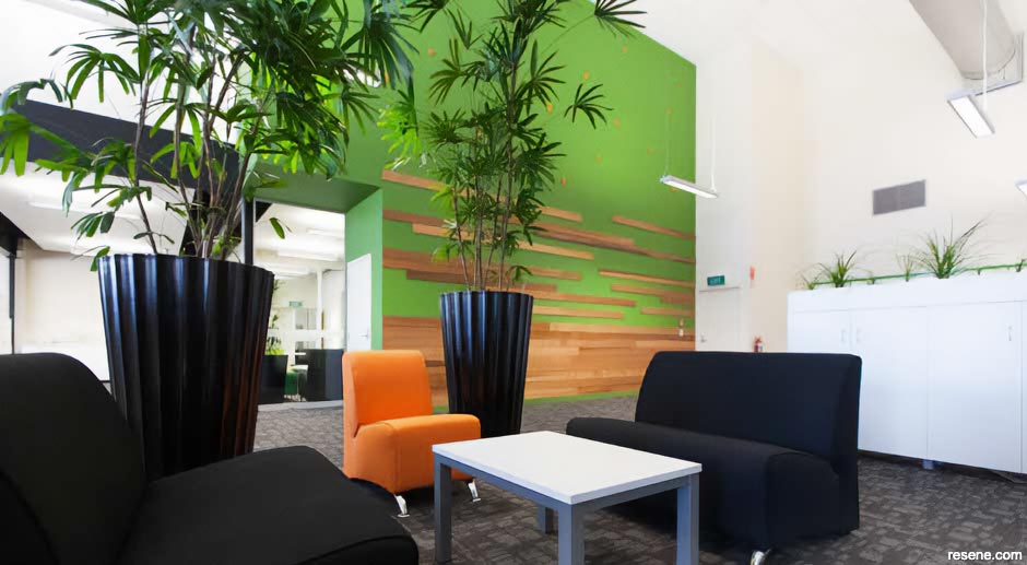
Keep in mind though that just one colour in a room may not cut it. In nature we are surrounded by many different colours which provides a balance between calm and stimulation. An all-green room, for example, may make people too complacent or laid back. Other accent colours will create a balanced environment.
But don’t overdo it. A rainbow of colours may simply confuse employees on a subconscious level and make the room seem busy. This can contribute to employees feeling as though their tasks are more complex and demanding.
“It’s generally the way colour is placed that is the main difference,” says Nikki. In commercial office spaces we usually have more space to play with but at the same time more people’s opinions to factor in, so it can be common to find neutral walls. Strategically placed painted blackboard walls and fun-coloured pillars or office doors in various shades help to encourage motivation and communication.”

To view more of this project see "ARANZ Geo."
A light grey or chalky white as the main wall colour might be ideal, with accents of invigorating colours such as yellow, orange or blue used in intelligent ways, says Nikki.
Think Resene Black White or Resene Ragamuffin for your neutral with possible accents of Resene Wild Thing, Resene Juicy or Resene Half Kumutoto.
The sheen of your paint should also be considered.
Glossy paints have a higher sheen, which can stimulate higher energy. Choose according to the task required.
Residential and commercial office colour schemes don’t need to be poles apart in terms of colour use either, says Nikki. Unfortunately, our home offices are often the last room in the house that gets our attention, especially if a bedroom or backroom doubles as your office. It’s important from a psychological perspective to create a distinction from our home environment and our work environment.

To view more of this project see "Lion Office."
“In our personal home offices we should consider looking at having something different to the remainder of the home, to define the space as a working room or office,” says Nikki. “If you can, choose a room within your home that receives good natural light – it helps keep the mind focused and alert. We can have fun in this room with a variety of options – it does not need to be dull or boring.”
Nikki suggests experimenting with vibrant, energising colours and paints that have double functions:
Have fun in your office environment, opting for a balance of different colours that both soothe and stimulate. An all-white area can be bland and uninspiring. One with colour accents can be visually energising and promote calm, creativity and cooperation. Choosing the right colour scheme for your office is one of the simplest ways you can enhance your performance.
September 10, 2014
Visit your local Resene ColorShop for expert advice and all the products and accessories you need to make the most of your home.
Book a colour consult | Ask a Colour Expert | Ask a Paint Expert
Resene's decorating blog
Paint your home beautiful! Discover the latest decorating trends, tips and colour news.
![]()
Previous «
Masculine style
![]()
Blog home
View the latest trends, tips and news
![]()
» Next
Choosing the right curtains for your home