Glo Apartments
Colour choices required a sensitive approach to be tasteful and uncontroversial but that would also evoke interest by being on trend with a bold statement.

Glo Apartments are situated in the funky and gentrified inner city Sydney suburb of Erskineville, a rapidly growing area with close proximity to the Sydney CBD that provides a vibrant village atmosphere. A tree lined street scape and lush surrounding gardens are a drawcard for residents known for its eclectic, alternative and creative community.
The original drab and underwhelming colour palette of Glo Apartments had faded and dated; a revamp and makeover was needed to bring it into the new millennium. Original colours of faded milk chocolates and varying shades of murky browns had deteriorated to a tired and crack ridden structure that was crying out for an injection of colour and life.
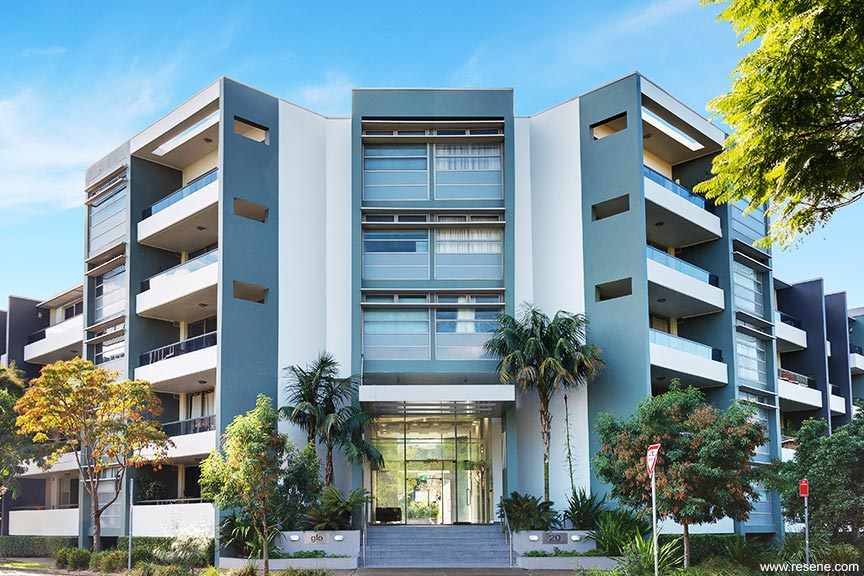
The strong lines of the architectural foundation included large blade and boundary walls, which were a perfect canvas to carry bold statements of feature colours paired with a soft clean white. There were many challenges on a project of this size that encompassed 91 individual units set over an expanse of communal garden areas. An initial challenge was investigating and understanding the play of light and light refraction on the large and overwhelming blade dividing walls throughout the day. These large walls encompass the resident’s balconies and outdoor living spaces. Whichever colour choice was made would also become part of their internal living scheme especially on the balcony areas.
Colour choices required a sensitive approach to be tasteful and uncontroversial but that would also evoke interest by being on trend with a bold statement.
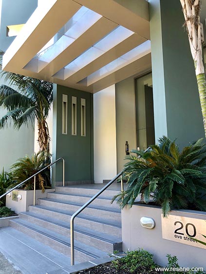
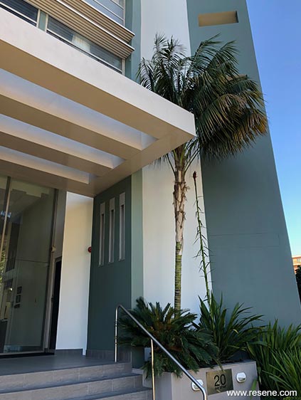
Colours of the surrounding luscious green landscaped gardens that embrace Glo Apartments were a key inspiration for the colour scheme. The colour scheme needed to allow the buildings to sit comfortably within the landscape yet stand out in areas with pops of bold strong accents harmonious to the established gardens and foliage.
The greatest challenge came from a very determined executive committee member who had a passion and love of bright yellows. The brief was to facilitate a youthful and energetic scheme and work with the old fashioned opinion that only yellow colours would produce this outcome.
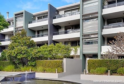
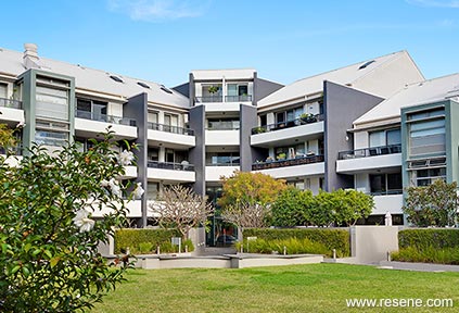
Working with this challenge, yellows were trialled on the exterior facades but proved far too bright and obvious and soon got voted out of the short list. The yellows were substituted with a rich intense green and dark charcoal to provide energy that would sit well next to the landscaped gardens.
There are also a number of varying architectural features, which made it difficult to work out the most effective and coherent colour placement for the external façade, and a number of varying light conditions, depending on where the various parts of the building were situated. The Resene palette was chosen for its beautiful rich intensity and Resene CoolColour technology for the darker colours to reduce stress on the paint film and substrate and provide less heat absorption. This enabled darker colour choices to be approved. The final palette included Resene White Pointer (stark off-white), Resene Fuscous Grey (charcoal grey), Resene Viktor (grey green) on feature entry walls and Resene Half Sandstone (dense beige) on garden beds and the water feature.
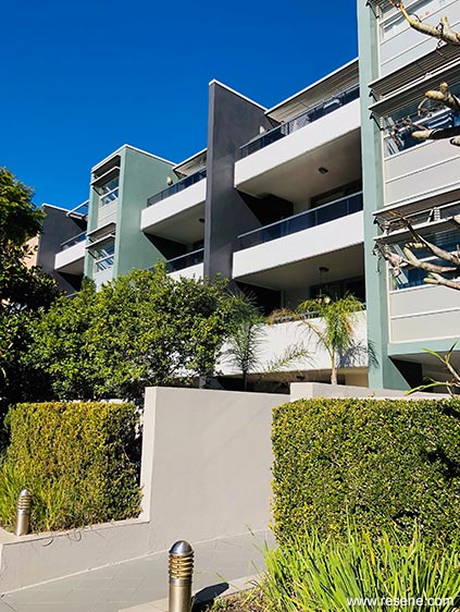
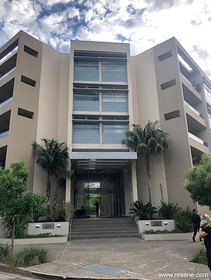
The apartments were coated in Resene X-200 weathertight membrane coating chosen for its low sheen finish and high build film thickness. This aided in encapsulating a tired and deteriorated render to improve its longevity and durability in an inner city area prone to high amounts of street pollution.
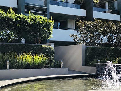
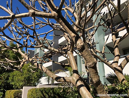
This project won the Resene Total Colour Residential Exterior Colour Maestro Award. The judges said “from bland to beautiful, a palette of neutrals and softened hues has brought a sense of home to this project. The new palette adds personality and freshness with colours carefully juxtaposed to bring out the best in each and add interest to the design. With lush establishing planting, this palette works with the landscape, not competes with it. Colour makes this home complete.”
Client: Wellman Strata
Colour selection: Nadine Donazzan
Painting contractor: Robertson’s Painting and Decorating
Photographer: Jorge Taconelli
Winner: Resene Total Colour Residential Exterior Colour Maestro Award
Project: Resene Total Colour Awards 2019
From the Resene News – issue 1/20
Resene case studies/awards project gallery
View case studies that have used Resene products including many from our Resene Total Colour Awards. We hope these projects provide inspiration for decorating projects of your own... view projects
Total Colour Award winners:
2023 |
2022 |
2021 |
2020 |
2019 |
2018 |
2017 |
2016 |
2015 |
2014 |
2013 |
2012 |
2011 |
2010 |
Entry info
Latest projects | Project archive | Resene news archive | Colour chart archive