Vauxhall Café Milford
The client’s brief called for a design that would not alter the physical structure of the existing space, but would completely change the aesthetic through the use of colour in a cost effective way.

Vauxhall Café Milford is the sister café of popular Vauxhall Café Devonport. The client’s brief called for a design that would not alter the physical structure of the existing space, but would completely change the aesthetic through the use of colour in a cost effective way. Mall management also wanted to attract a more youthful clientele.
One of the important considerations was to make a statement and stand out from a distance.

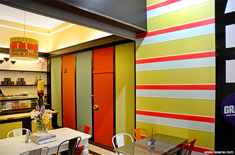
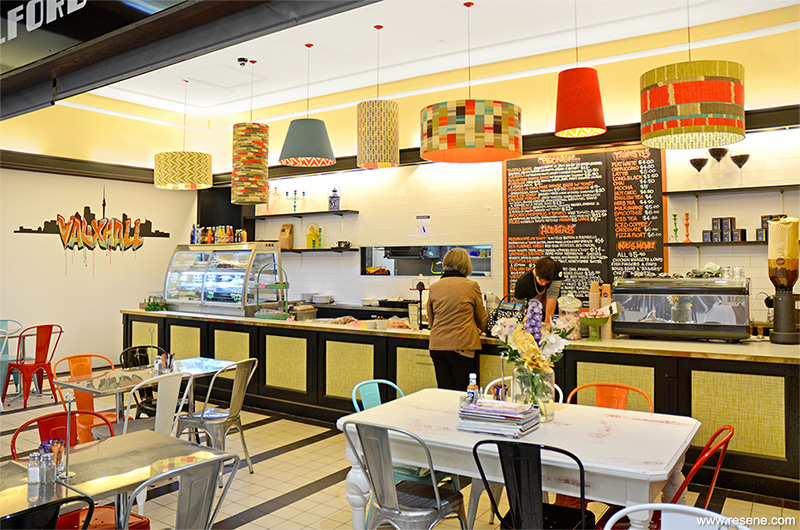
A panelled wall was painted in a collection of strong bold colours to attract the eye and to be used as a backdrop for blackboard comments to be written by customers onto the Resene SpaceCote Flat Black surface. The mural incorporated the name ‘Vauxhall’ in retro graffiti style imagery, inspired by the original Vauxhall Café in Devonport, and pulled all the paint colours together that were used on the panelled wall.
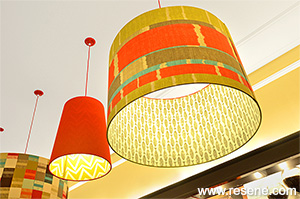
Wallpaper was also installed onto recessed panels along the front face of the servery counter, and the menu board painted to align with the colour theme. The fabric and wallpaper selection provided a base for the Resene paint colour selection. From there, the paint shades that were specified in this colour palette were chosen specifically for a number of reasons.

Firstly, that the palette referenced the retro past, colours such as the Resene Hawaiian Tan (pumpkin orange) and Resene Avocado (olive green) were often seen in this era. The colours also needed to be bold enough in their chroma to be seen from a distance to attract attention. All the colours chosen had strength and were intense enough to make a statement. Lastly, colours were chosen for their influence on our physical response to them. Orange stimulates the mind and aids conversation; it also aids digestion. Red stimulates the appetite. Given that a café needs to be a place of socialisation with the enjoyment of food, Resene Hawaiian Tan and Resene Well Read (hazy fruity red) were important colour selections to have in the palette.
The selection of blues and greens – Resene Bluegrass (mid toned green) and Resene Undercover (juniper green) – even though they were from the cooler side of the colour wheel still needed to contain enough warmth, so that they would enhance a welcoming feeling in the space. Ambiguous blues and greens created a peaceful space within the energetic environment.

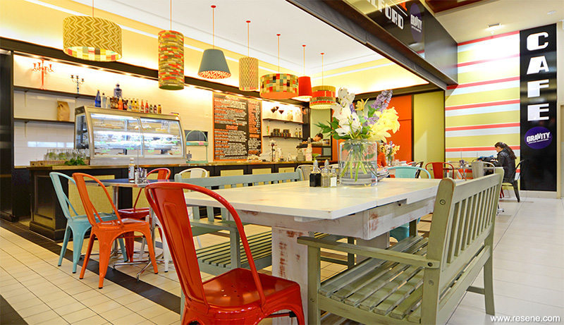
There were three large wooden tables that harked back to an older era; these were painted in a selection of the colours, and then overpainted in Resene Alabaster (blackened white) and rubbed back to allow a distressed chipped look of colour to emerge through. These were finished in Resene Multishield+ clear glaze to protect the paint effect finish. Bench seats were also painted to fit and a selection of brightly coloured metal chairs and décor items were strategically placed to complete the theme.
With a very short timeframe for design and sourcing materials, the outcome has been a kaleidoscope of colour, pattern and energy that attracts the eye and makes a strong bold statement.
Interior designer: Amanda Neill, Designworx
Painting contractor: Steven King
Photographer: First Light Photography
Project: Resene Total Colour Awards 2013
From the Resene News – issue 3/2014
Resene case studies/awards project gallery
View case studies that have used Resene products including many from our Resene Total Colour Awards. We hope these projects provide inspiration for decorating projects of your own... view projects
Total Colour Award winners:
2023 |
2022 |
2021 |
2020 |
2019 |
2018 |
2017 |
2016 |
2015 |
2014 |
2013 |
2012 |
2011 |
2010 |
Entry info
Latest projects | Project archive | Resene news archive | Colour chart archive