Northshore Brisbane
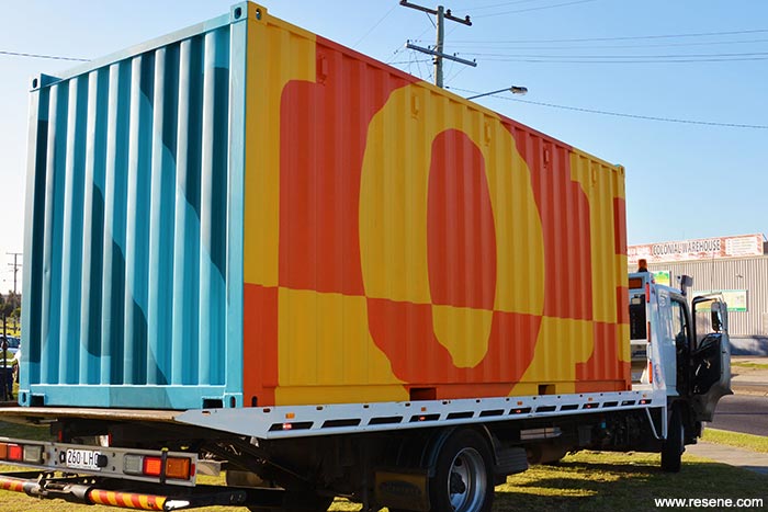
In order to visually claim the entire site, Dotdash branded a centrally located set of warehouses with a bold colour palette that referenced the pre-existing Northshore identity.
As an initiative of Economic Development Queensland, Northshore is a major regeneration of a large pocket of deteriorated urban land on the Brisbane River. Comprising of riverside ports, storage and industrial facilities, it will be transformed into a new master-planned suburb to be completed over the next 20 years.
Sites are now being offered for sale and redevelopment, and are starting to become branded by a variety of property developers as they commence work. In effect, this branding breaks up the cohesion of the whole site into individual parcels.
Cirque du Soleil, one of Northshore's main attractions, attracted large crowds of people to the site during its recent season – this was seen as an opportunity to promote the Northshore brand.
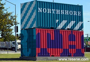
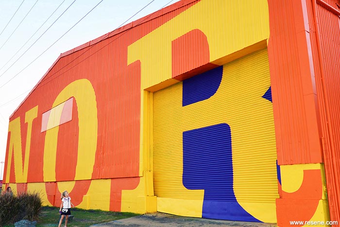
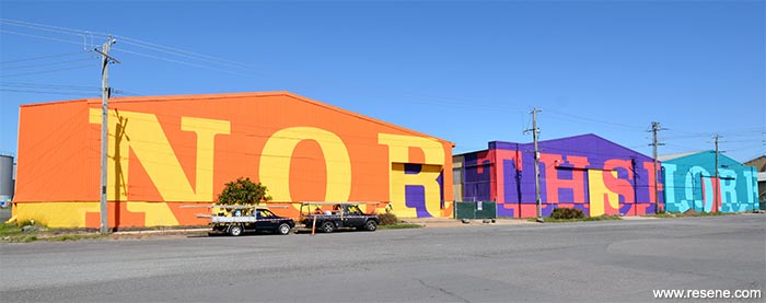
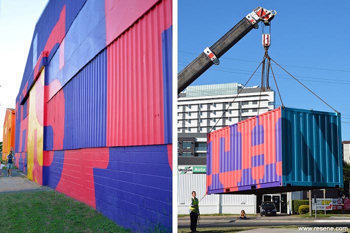
In order to visually claim the entire site, Dotdash branded a centrally located set of warehouses with a bold colour palette that referenced the pre-existing Northshore identity.
Completed in one week, the warehouses embody the character of the existing site while announcing a vision for the new. Reclaimed shipping containers were also branded in the same fashion and placed at major entry locations across the site.

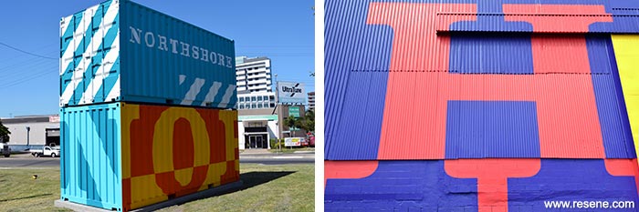
The primary aim of the strategy was to establish and enhance a sense of Northshore as a precinct, and to expand and strengthen the presence of the brand on the site through signage and reclaimed objects and structures.
A radiant colour palette was selected to strengthen the visual presence of the site's existing brand colours. Resene colours were chosen based on their high chroma value to create optimum contrast with the surrounding environment. Both warm and cool analogous Resene colour palettes were used, with direct complementary colours introduced to accentuate contrast throughout using Resene Trinidad (zesty orange), Resene Knock Out (bold cherry pink), Resene Pukeko (rich violet), Resene Supernova (bold yellow), Resene Pelorous (porpoise blue) and Resene Blue Lagoon (crisp blue green).
The palettes aimed to increase brand visibility in the environment and create a more contemporary and celebratory feel. These colours were also adapted to create bold supporting graphic devices which are applied to various forms across the site.
Inspiration for the visual language and colour palette was taken from the site's maritime history and current industrial state; the vibrant colour palette creates a juxtaposition against the site's harsh industrial setting.
The brand presence established through the painting of the site's landmark warehouses and shipping containers informed a new visual language which has been extended across various forms of advertising material throughout the Northshore Precinct.
Client: Economic Development Queensland
Colour selection: Dotdash
Painting contractor: Skreenkraft
Project: Resene Total Colour Awards 2015
From the Resene News – issue 3/2016
Resene case studies/awards project gallery
View case studies that have used Resene products including many from our Resene Total Colour Awards. We hope these projects provide inspiration for decorating projects of your own... view projects
Total Colour Award winners:
2023 |
2022 |
2021 |
2020 |
2019 |
2018 |
2017 |
2016 |
2015 |
2014 |
2013 |
2012 |
2011 |
2010 |
Entry info
Latest projects | Project archive | Resene news archive | Colour chart archive
![]()
![]() Get inspired ! Subscribe
Get inspired ! Subscribe ![]() Get saving ! Apply for a DIY card
Get saving ! Apply for a DIY card
![]()
Can't find what you're looking for? Ask us!
Company profile | Terms | Privacy policy | Quality and environmental policy | Health and safety policy
Colours shown on this website are a representation only. Please refer to the actual paint or product sample. Resene colour charts, testpots and samples are available for ordering online. See measurements/conversions for more details on how electronic colour values are achieved.
What's new | Specifiers | Painters | DIYers | Artists | Kids | Sitemap | Home | TOP ⇧


