Newtown Park housing
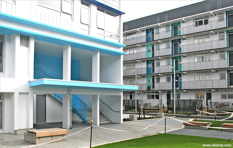
Colour is used in a considered way throughout the project as a way of encouraging building identity, highlighting key building elements and spaces and to provide a sense of joy and lightness to what would otherwise be a heavy collection of buildings.
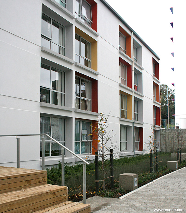
Originally constructed from 1967 on the site of an old tram depot, the Wellington City Council housing at Newtown Park consists of three large towers and two lower blocks containing 205 housing units on an 8,700 square metre site. The brief for the project was to give new life to the buildings and their surrounding landscape by addressing seismic and code compliance issues and increasing amenity to residents by improving the quality of exterior and interior spaces. This included giving the buildings identity and integrating them into the surrounding site and suburb and upgrading units to a modern standard of living, including creating new family units.
The site and landscape surrounding each of the buildings has been remodelled from what used to be predominantly carparking into a series of distinct community spaces that provide amenity to tenants. The site is stitched back into the surrounding Newtown suburb by breaking down the main street frontage with a series of private and community yards that directly relate to the buildings. The buildings’ main entries are clearly defined with light and colour. A series of new internal community spaces focus out into a new exterior community courtyard, which provides a recreation space for scooters, bikes, ball sports and playing.
Colour is used in a considered way throughout the project as a way of encouraging building identity, highlighting key building elements and spaces and to provide a sense of joy and lightness to what would otherwise be a heavy collection of buildings. A neutral ‘concrete’ base in a number of tones, accompanied by coloured highlights is used to make each of the buildings sing.
Five different colourways were applied to each of the buildings as highlights – green, green-blue, blue, purple and orange-red.
Block A features lime and clean greens with Resene Lickety Split (fluoro green), Resene Christi (chromatic green), Resene Sulu (summer yellow green), Resene Japanese Laurel (bright green) and Resene Mantis (bright green). Block B harnesses jewel greens and turquoise with Resene Niagara (peacock green), Resene Observatory (bright peacock green), Resene Guru (turquoise blue), Resene Riptide (aqua blue) and Resene Kitsch (retro teal). Block C is bold with strong orange, red and yellow with Resene Whizz Bang (bright orange), Resene Hazard (chestnut orange), Resene Dynamite (blue red), Resene Equator (mustard yellow) and Resene Flame Red (bright red). Block D focuses on blues with Resene Curious Blue (sky blue), Resene Governor Bay (violet blue), Resene Torea Bay (seaside blue), Resene Malibu (surf blue) and Resene Havelock Blue (summer blue), and Block E is warm with purple inspired hues of Resene Sassy (bold magenta), Resene Lavender (soft violet), Resene Chetwode Blue (mid purple blue), Resene Blue Bell (deep purple) and Resene Troubadour (rich mauve).
On the outside of the buildings, colours are used to celebrate the strength of the existing modernist architectural features, such as the slender horizontal inter-storey concrete aprons on the towers, or the punched-out living room windows in the low blocks. Colour is also used to highlight exterior balconies and terraces as focus points for residents’ interaction.
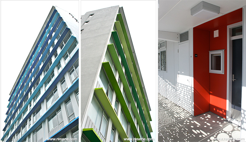
In the interior, colour is used to activate and provide warmth to spaces intended for residents to occupy together. Colour highlights each of the building entry lobbies, brightens up the stair spaces through vibrant steel balustrades, warms up drying terraces and balconies, signifies the entry to a home by brightening up the unit’s entry alcove, and provides a soft wash to the lighting recess in each of the internal corridors.
A choice of three different colourways (neutral, red or blue) adds identity to the interior of each apartment. This includes the refurbishment of the existing Rimu kitchen joinery with new paint colours to suit.
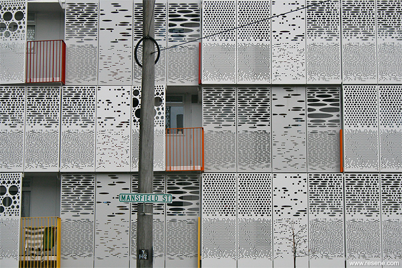
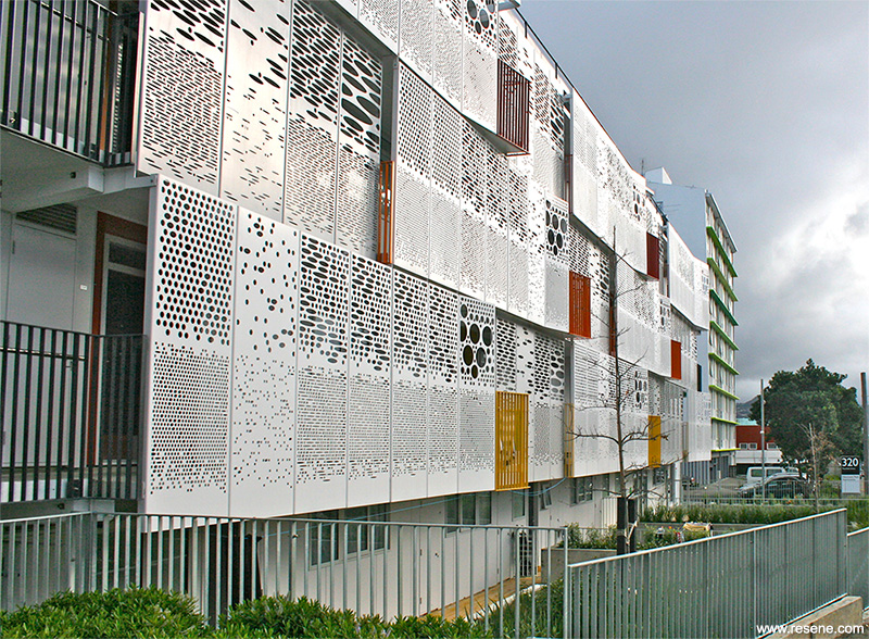
The perforated screen panels that make up the Mansfield Street elevation of Block C were prefabricated and painted off site using a robust combination of zinc arc spray, Resene Armourcote and Resene Uracryl. The screen panels are part of a new façade strategy for Block C, which is designed to turn the old back of the building into the new front of the building by injecting colour, texture and depth into the building’s façade. The façade creates a filter between the inside of the building and the street, providing increased privacy, security and shelter for tenants to access their front doors. The façade provides varying levels of natural light and views within the corridors and apartments behind, by changing the size, shape and frequency of holes within the panels. Screen panels may ‘open up’ where they are in front of windows or next to balconies, and also become more solid when they are in front of an apartment’s entry door.
In order to provide a cost effective design, as much existing built fabric was retained as possible. This offered a significant challenge in ensuring that finishes were of a high level of quality throughout. This included repairing existing broadwall plaster, plasterboard and wallpapered walls of varying conditions. Careful, site specific specification with a focus on surface preparation was required.
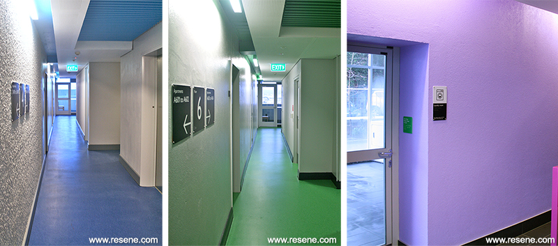
The exterior is predominantly finished in Resene Lumbersider low sheen waterborne paint with Resene Sonyx 101 on fibre cement and Resene Lustacryl semi-gloss waterborne enamel on refurbished timber windows. Resene X-200 weathertight membrane is used on concrete aprons and window openings with Resene Enamacryl gloss waterborne enamel on exterior timber doors. Site and landscape exposed concrete is finished in Resene Uracryl GraffitiShield to protect against graffiti and timber fences are finished in Resene Waterborne Woodsman woodstain tinted to Resene Pitch Black (tar black). Inside concrete floors are finished in Resene Aquapoxy and ceilings in Resene Ceiling Paint.
The colour palette across the whole project is underpinned with two families of Resene grey neutrals used inside and out – Resene Triple, Double and Half Concrete and Resene Eighth, Quarter, Double and full strength Tuna.
The extensive colour palette used judiciously across this project won it the Resene Total Colour Residential Exterior Award 2013 and the Resene Total Colour Nightingale Maestro Award 2013. The judges thought “this project demonstrates such a great use of colour to create a sense of welcome... you just want to move in. The scheme is communicative in blocks, telling people where to go yet alleviating the monolithic. It identifies itself with a very interesting façade of subdued architecture with a punch of colour. This project stands out as it is a completely sensitive and thoughtful use of colour, with a high level of design skill applied to a familiar form.”
Architectural Specifier: Studio Pacific Architecture
Acoustic Engineer: Marshall Day
Building Contractor: Hawkins Construction
Client: Wellington City Council
Façade Engineer: Aurecon
Geotechnical Engineer: Tonkin + Taylor
Interior Designer and Colour Selection: Studio Pacific Architecture
Landscape Architecture: Isthmus Group
Painting Contractor: Metropolitan Painters & JPB Painting Contractors
Photographer: Studio Pacific Architecture, Neil Price, Wellington City Council
Winner:
Resene Total Colour Residential Exterior Award 2013 and the Resene Total Colour Nightingale Maestro Award 2013
Project: Resene Total Colour Awards 2013
From the Resene News – issue 4/2013
Resene case studies/awards project gallery
View case studies that have used Resene products including many from our Resene Total Colour Awards. We hope these projects provide inspiration for decorating projects of your own... view projects
Total Colour Award winners:
2023 |
2022 |
2021 |
2020 |
2019 |
2018 |
2017 |
2016 |
2015 |
2014 |
2013 |
2012 |
2011 |
2010 |
Entry info
Latest projects | Project archive | Resene news archive | Colour chart archive