Insight Eyecare
Insight wanted their customers to feel at home when they came into the store.
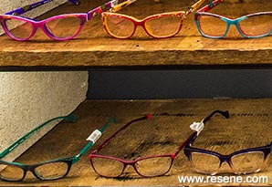
The brief for Insight Eyecare was to create an optometrist retail concept that would be different to any other optometrist offering in the market. Specifically it needed to be warm, inviting, feel handcrafted, with a hint of industrial charm. Insight wanted their customers to feel at home when they came into the store. The main focus of the store was to be on the products, not the eye testing services.
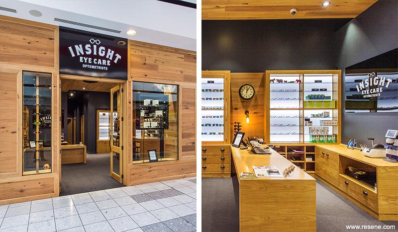
A strong component of the material selection is the use of oak in the shopfront, joinery and bulkhead. The intention was to create a space that appeals to a customer’s senses and emotions, so the natural fragrance of timber naturally helps put customers at ease.
Industrial detailing was followed through in the use of antique bronze hardware on all the joinery, inspired by handcrafted ironmongery. The entry doors are fitted with handmade cast iron pull handles that appeal to the senses in their rough texture and one of a kind craftsmanship.
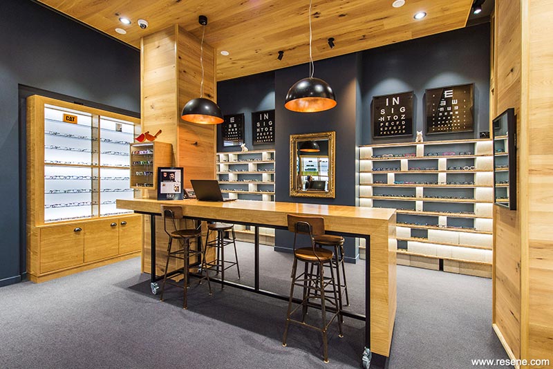
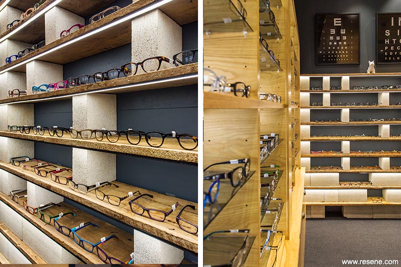
The cinder block feature wall introduces concrete as an industrial material. Added texture is brought into the design by the use of reclaimed weatherboard shelves from a local salvage yard. Custom designed aged eye test charts draw reference to Insight being optometrists first and foremost.
The cabinetry has smoked grey glass shelves to complement the smoky wall colour. Creativity was extended to the concrete block glasses feature display wall where rows of concrete blocks sandwich together reclaimed weatherboard shelves salvaged from a local salvage yard. The timber shelving uses reclaimed wood from the old Les Mills building in Hamilton. This was a deliberate choice to re-use some local history in this store as a talking point and tie in the ‘old’ with the ‘new’. The traditional gold leaf mirror marries the concept of using hard industrial materials with a more feminine and softer design feature.
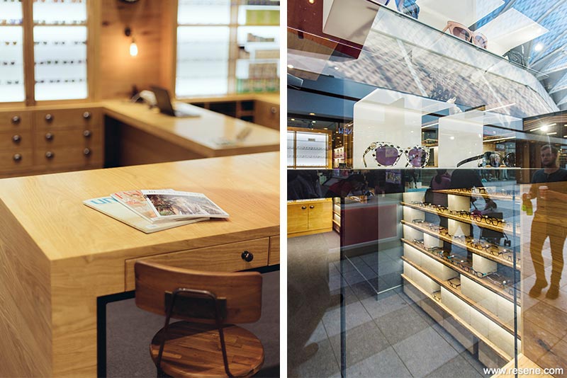
Customers often feel self-conscious when trying on frames as they are considered a strong part of a person’s identity. Creating private areas where customers are not in open sightline to passers-by in the mall has helped customers feel more relaxed.
Typically women browse through shops while their husbands or partners trail behind. A leaner and bar stools was introduced. Customers tend to gravitate to the leaner. It’s a comfortable height to stand or sit and chat to staff. It’s successfully become the social hub of the store. Creating these various zones within the space allows people to have different types of experiences – one on one consultation, lounge soft seating and leaner casual discussion.
One of the main features of the concept is the Resene New Denim Blue (charcoal blue) walls, which give the feel of an industrial colour palette. The tone is rich and velvety and complements the oak timber joinery and bulkhead perfectly.
The recessed ceiling is painted in Resene Gravel (dark grey) to accentuate the ceiling height. The colour is more of a warm grey tone, which works well with the overall material palette. It has proved a great alternative to painting the ceiling black, which can feel quite oppressive and close in the space.
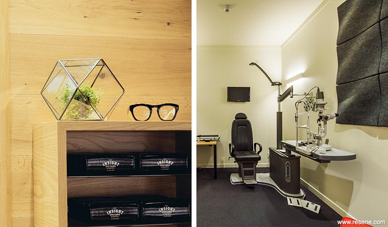
Resene Thorndon Cream (understated neutral) and Resene Double Thorndon Cream (antique white) are used as neutral complementary colours in areas such as the consulting rooms, pre-screening rooms and staff kitchen, where the spaces need to feel lighter and brighter. The warm yellow undertone ties in well with the oak joinery and other paint colours.
All the general walls were finished in Resene Lumbersider for its tough finish and Environmental Choice approval.
Acoustically there were major challenges with containing the noise generated by the mechanical system directly overhead the consulting rooms, while needing to allow for access for servicing. The ceilings were designed to be structural and with a high acoustic rating to assist with sound absorption. An inter-tenancy cavity wall was built and internal walls are of a high acoustic rating.
In a testament to the project team, this fit-out was completed in just 4.5 weeks including all services and cabinetry.
This project won the Resene Total Colour Commercial Interior Retail Colour Maestro Award. The judges thought: "Strong colour works well with the strength of the timber for a clinical yet comfortable and relaxing feel. The confidence of the colour and materials palette brings with it a sense of reassurance and trust with the dark and light combination providing a balance of light and depth. The timber provides a raw sense of honesty. Solid colour blocks are used with restraint drawing your eyes into the product showcases.
The palette gives an impression of a softened industrial colour palette, rich, velvety and welcoming."
Architectural specifier: Nicole Hamer-Nel, Ignite Architects – Interiors
Building contractor: Ice Interiors
Client: Insight Eyecare
Joinery and cabinet making: Gartshore Group Takapuna
Photographer: Bruce Clarke, Naomi Jorge
Winner: Resene Total Colour Commercial Interior Retail Colour Maestro Award
Project: Resene Total Colour Awards 2015
From the Resene News – issue 1/2016
Resene case studies/awards project gallery
View case studies that have used Resene products including many from our Resene Total Colour Awards. We hope these projects provide inspiration for decorating projects of your own... view projects
Total Colour Award winners:
2023 |
2022 |
2021 |
2020 |
2019 |
2018 |
2017 |
2016 |
2015 |
2014 |
2013 |
2012 |
2011 |
2010 |
Entry info
Latest projects | Project archive | Resene news archive | Colour chart archive