Corianders
The colours were chosen to create a vivacious interior that reflected the magnetic Indian culture.
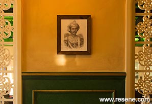
Keen to open a flagship restaurant and bar, Corianders’ owner Amar Singh found the perfect location in a north facing new build in a growing hospitality area in Christchurch City. The influence behind the design was the early 1900s during the British Empire of India. The merging of the Indian influence mixed with elements of a traditional British domestic interior laid the foundations of the design.
The colours were chosen to create a vivacious interior that reflected the magnetic Indian culture. With a clear definition between dining spaces it was decided that two colour palettes were to be used.
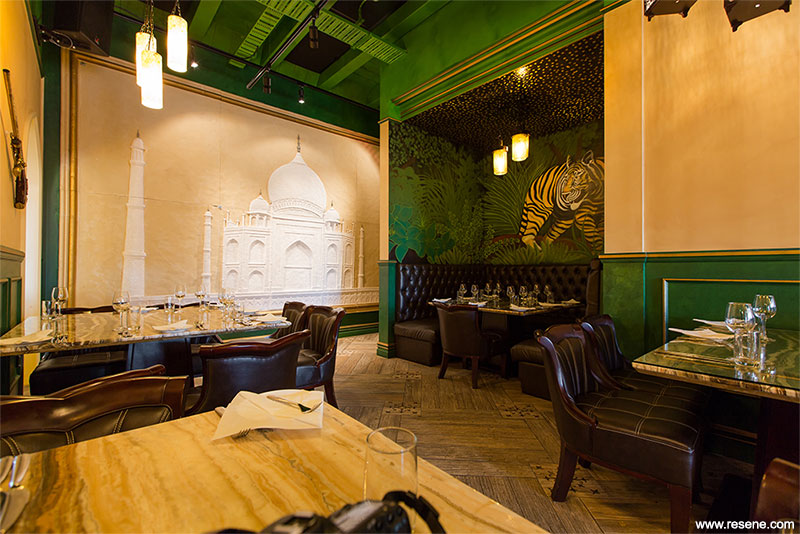
In the bar and casual dining area, a bold Resene Limerick (Irish green) and Resene Haystack (bleached ochre) were used to colour the walls. Resene Gold (gold metallic) was overlaid onto the panelling using a paint effects technique to allude to the gilded artefacts of the past, while Resene Limerick was used again on the ceiling to tie together the other finishes, which included pressed tin panels, timber and large painted artworks.
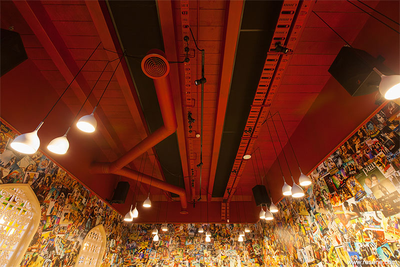
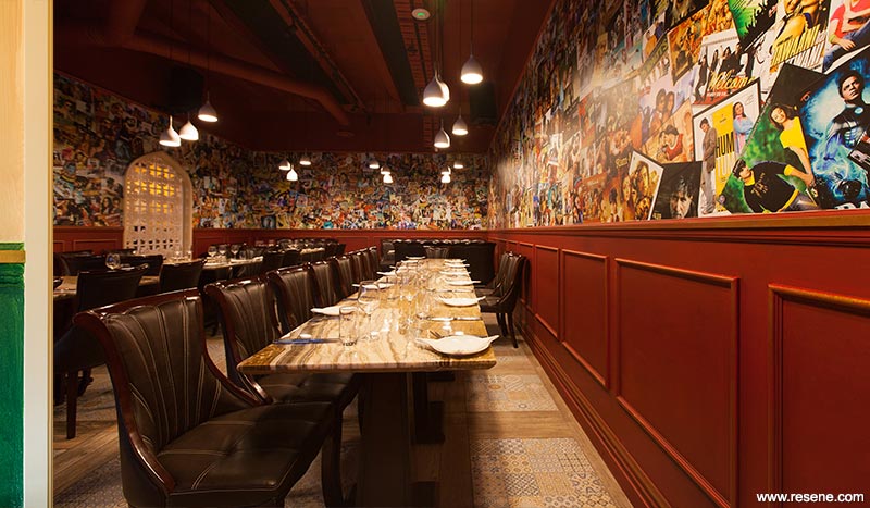
Vibrant, Indian spices were the inspiration for the colours used in the adjacent restaurant area predominately used as a private dining room. Resene Red Berry (vivid red) was carried onto the ceiling and was perfectly complemented by the wallpaper below the paint effect. The wallpaper added a sense of youth and fun to the private dining area and colourful hand painting lined the walls in the booth areas.
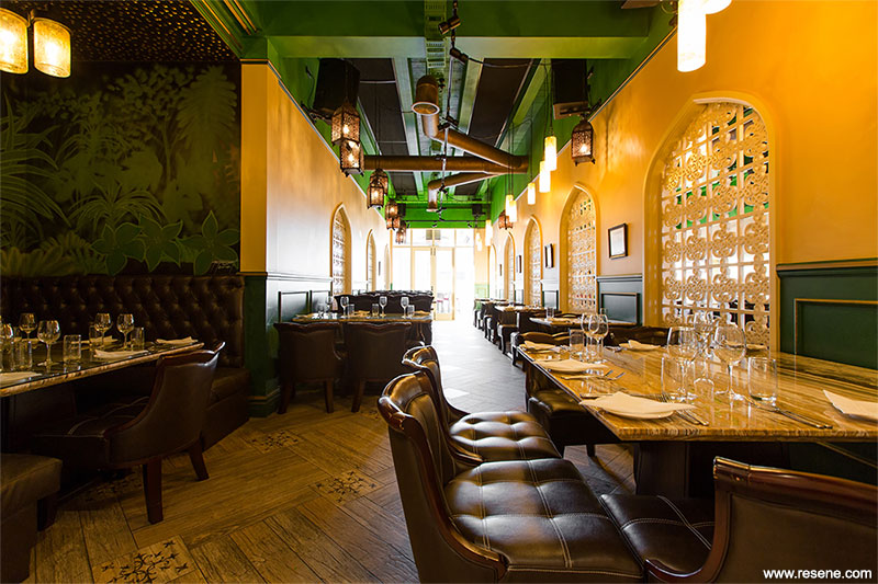
Even the toilets got their serving of colour with a sense of India brought in with Resene Astronaut (deep blue) complemented with wall mirrors and patterned tiles. The entire scheme was brought together with additional textures and patterns to complement the colour scheme. Arched decorative screens helped to separate the dining spaces.
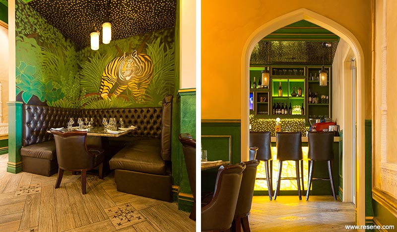
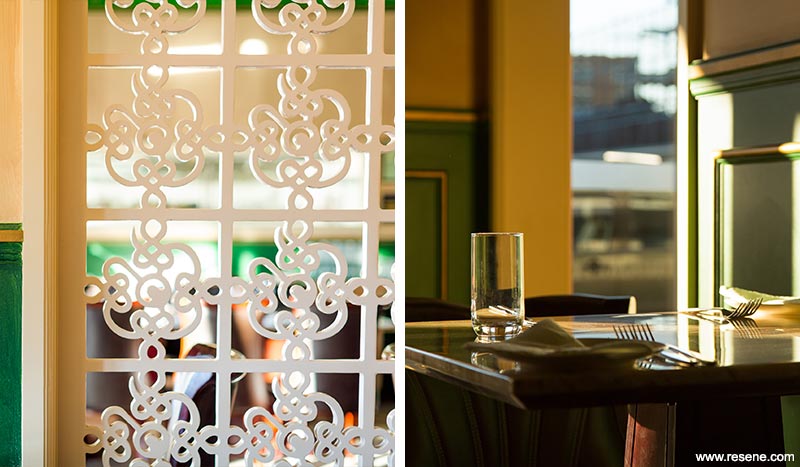
Corianders won the Resene Total Colour Public + Retail Space Award and the judges thought: “A courageous use of colour, this project meets the brief so well. It’s filled with jewelled sari colours that define different areas and create a vivacious interior that showcases the magnetism of Indian culture. Colour is powerfully used but is not over the top. It’s classic British Empire India meets Bollywood. Vibrant Indian spice colours are perfectly complemented by the furnishings. It’s a chance to enjoy the taste of India through the use of colour. A feast for the eyes.”
Architectural specifier: Element 17 Ltd
Client: Amar Singh
Interior designer: Steve Rosling and Nancy Train, Element 17 Ltd
Painting contractor: Gerrard Diver
Photographer: Dave Richards
Winner: Resene Total Colour Public + Retail Space Award
Project: Resene Total Colour Awards 2015
From the Resene News – issue 4/2015
Resene case studies/awards project gallery
View case studies that have used Resene products including many from our Resene Total Colour Awards. We hope these projects provide inspiration for decorating projects of your own... view projects
Total Colour Award winners:
2023 |
2022 |
2021 |
2020 |
2019 |
2018 |
2017 |
2016 |
2015 |
2014 |
2013 |
2012 |
2011 |
2010 |
Entry info
Latest projects | Project archive | Resene news archive | Colour chart archive
Order online now:
Testpots |
Paints |
Primers and Sealers |
Stains |
Clears |
Accessories
![]() Get inspired ! Subscribe
Get inspired ! Subscribe ![]() Get saving ! Apply for a DIY card
Get saving ! Apply for a DIY card
Can't find what you're looking for? Ask us!
Company profile | Terms | Privacy policy | Quality and environmental policy | Health and safety policy
Colours shown on this website are a representation only. Please refer to the actual paint or product sample. Resene colour charts, testpots and samples are available for ordering online. See measurements/conversions for more details on how electronic colour values are achieved.
What's new | Specifiers | Painters | DIYers | Artists | Kids | Sitemap | Home | TOP ⇧


