Alpers Dental
The design team worked with the metaphor for ‘challenging preconceptions’, which led to playing with shapes and colours using a practice called ‘anamorphosis’.
Alpers Dental as a brand challenges preconceived ideas about dental health. They come at things from a fresh perspective so when it was time to create a fresh, vibrant space for their new premises it needed to reflect who they were. The design team worked with the metaphor for ‘challenging preconceptions’, which led to playing with shapes and colours using a practice called ‘anamorphosis’. The aim was to throw away the old conventions of dental practices (think pastel colours) and provide Alpers Dental with a space that reflected their brand aesthetics and qualities of innovation, excellence and fun.
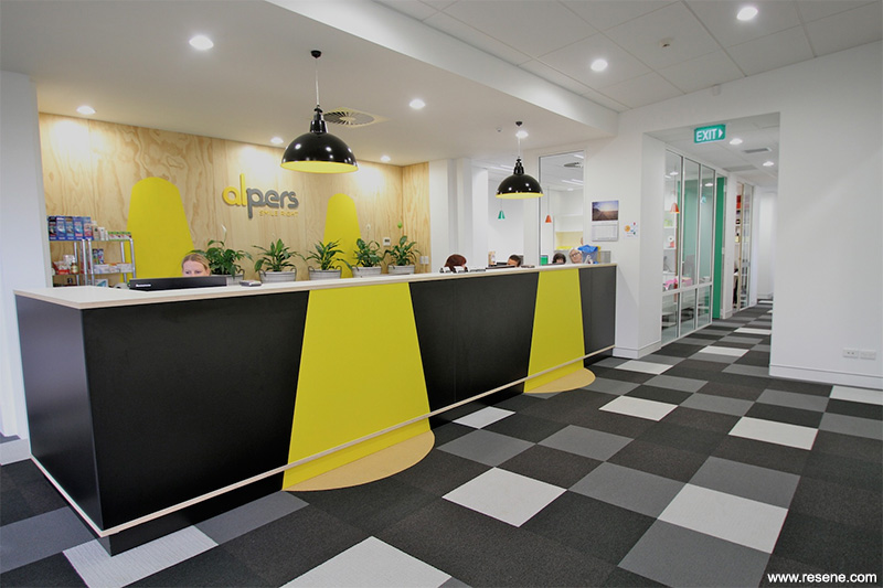
While the spaces needed to be fun and appeal to the many children and younger patients seen, it also needed to be a sophisticated space that could translate to patients of all ages.
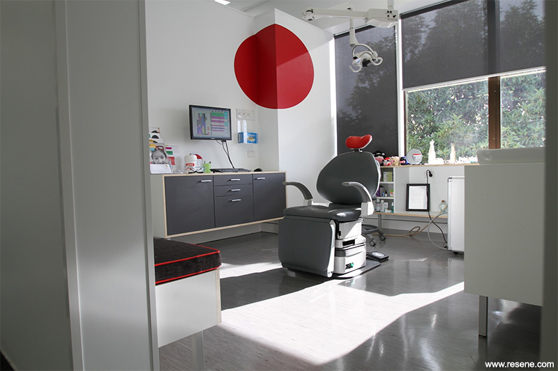
Shapes and forms were created out of bold colours and applied to surfaces within the practice. As you walk past each shape your perception changes; the shapes and forms themselves change.
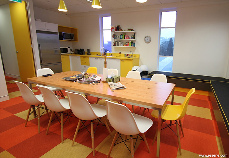
The fun isn’t just limited to the patients’ experience either. The ideas are carried through into the offices and staffroom, using colour and shape to bring fun but still deliver functionality.
Colour was the driving process behind the concept and developed design. At concept stage as a fun twist the colour palette was matched to selected dental paraphernalia seen on site – small paddles in a fun range of different bright colours that are used to tighten braces.
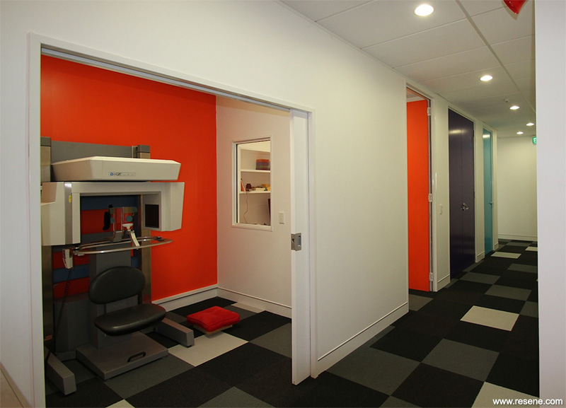
Resene played an integral part in the colour process – the paddle colours were matched to colours from the Resene Multifinish collection. From there all colours were then specified – Resene Pukeko (rich violet), Resene Salem (turquoise green), Resene Bright Spark (hot yellow), Resene Monza (clean red), Resene Pelorous (porpoise blue) and Resene Half Alabaster (blackened white) on general walls. Vinyl wall applications and complete flooring and upholstery fabrics were all driven by the original Resene colours.
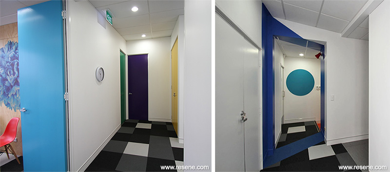
Keen to create a feature in the hallway that would help to break up the space and add a splash of colour, Resene Grenadier (bold orange red) is used in the x-ray room then extends onto a geometric shape wrapping around the hallway.
The doors to all of the offices and consulting rooms have been painted Resene colours and bind the entire project together.

This project won a Resene Total Colour Commercial Interior Office Award. The judges thought the project was: “Fun fun fun! An outstanding use of colours being used in block form providing another method of communication. Colour has been used to upgrade the architecture. It’s an element of surprise for a dental office with surprising visual tricks. The spaces have been renovated for the enjoyment of both those that work in the building and the visitors to the building with clear thought on the appropriate use of colour for the task.”
Architectural specifier: Brown Day Somerford Wrack
Building contractor: Cunninghams Construction
Graphic design: Anna Wilcock
Interior designer: Rachael Lovelace and Topaz Brownlie
Painting contractor: Mid Coating
Photographer: Topaz Brownlie
Vinyl application: Vaughan Small, Karbon
Winner: Resene Total Colour Commercial Interior Office Award
Project: Resene Total Colour Awards 2013
From the Resene News – issue 1/2014
Resene case studies/awards project gallery
View case studies that have used Resene products including many from our Resene Total Colour Awards. We hope these projects provide inspiration for decorating projects of your own... view projects
Total Colour Award winners:
2023 |
2022 |
2021 |
2020 |
2019 |
2018 |
2017 |
2016 |
2015 |
2014 |
2013 |
2012 |
2011 |
2010 |
Entry info
Latest projects | Project archive | Resene news archive | Colour chart archive