Victoria University Business School: Rutherford House Redevelopment
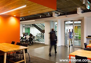
This project establishes a palette of materials, textures and colours that reference land and local flora.
The Pipitea Campus of Victoria University Wellington comprises The Law School, housed in the old Government Buildings, and the Business School, which has until recently been split between the Rutherford House building and part of the neighbouring Railway Station building.
The Business School is one of the leading Business Schools in New Zealand, and with the Railway Station building lease coming up for review, Victoria took the opportunity to consolidate the Business School under one roof within the Rutherford House site in an enlarged and upgraded facility. As well as provision of improved learning facilities commensurate with the function and profile of the School, another critical part of the project is to establish and strengthen a vital and active student hub for the combined Pipitea Campus in this part of the city. This includes improving the quantity and quality of spaces and facilities supporting social informal learning and interaction, as well as the potential for raising the profile of the campus and engagement with the city.
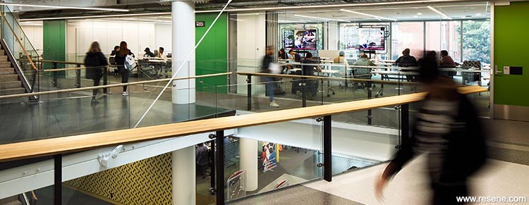
The design response demonstrates strong acknowledgement of this historically and physically significant site, recognising a need to be multi-layered in terms of responsibility, function and identity, both locally and globally. Not just a place of learning and research, the School becomes a focal point for engagement with adjacent business and government communities. To this end the design approach is holistic, integrated and subtle, engaging with place and culture through form and iconography; materials, texture and colour; art, wayfinding, branding. he extended hub space and elevated new annex structure provide improved visual and physical permeability to edges, acknowledging that the most meaningful expression of purpose, identity and values will be through the activities and interactions of people.
The architecture for the Ground and Mezzanine spaces focuses on maintaining an openness between solid objects. Built components draw on the sense of a continuing urban landscape with surfaces, textures, colours. This project establishes a palette of materials, textures and colours that reference land and local flora.
This historical landscape has particular significance to Tangatawhenua in relation to water’s edge identity, use and activity. Abstract patterns applied to the Frit Glazing on the Annex façade and the custom carpet tile pattern at Ground and Mezzanine levels are reminiscent of the Pacific, sails, dappled light; reflections of the water are a reminder of the historic context sea edge ‘trading post’ position in the city.
Pattern occurs at different scales within the building fit-out in flooring and screening elements, as there is a sense of the ‘open’ space of the hub traversing from its Parliamentary landscape grounded base through to the historic water’s edge elevation.
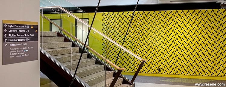
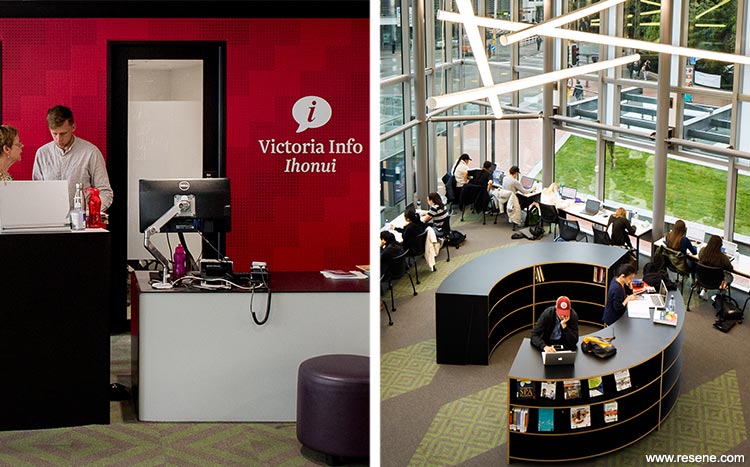
Colour is used to denote a variety of functions within the interior hub environment. Applied vinyl wall graphics overlaid onto Resene SpaceCote Low Sheen Fast Lane (primary red) creates a recognisable Victoria brand to support the Vic Ihonui, self service centre. Similarly, Resene Karma (green yellow) on the Library Workplace Pod walls defines the library entrance. Resene Beatnik (peacock blue) is a deeper tone that leads students into the Mauri Ora Health Centre. These colour cues are balanced with the overall landscape palette, an analogous colour scheme traversing deep navy, multiple greens through to earthy and citrus yellows, including Resene West Coast (murky mustard green), Resene Wimbledon (lawn green), Resene Area 51 (fresh green), Resene Como (soft green) and Resene Wasabi (dull lime green).

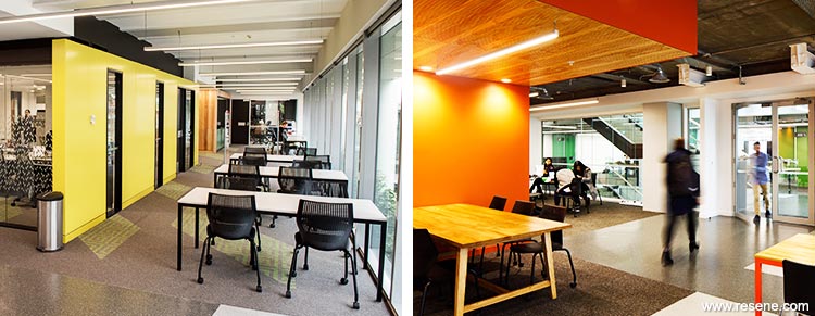
This project won the Resene Total Colour Education Award.
The judges said: “colour interweaves its way through this project, linked back to a purpose of locale. It’s a sensitive use of colour that befits an historical precinct and supports the strong purposeful architecture. The palette invites you in and encourages you to explore and spend time enjoying the spaces. As you move around there are new colour features and areas to discover. It’s a sense that you are gently unwrapping the layers of the building as you experience more of the space. A textbook use of colour.”
Architectural specifier: Athfield Architects Ltd
Building contractor: L T McGuinness Ltd
Client: Victoria University of Wellington
Interior designer: Sophie Vial, Athfield Architects Ltd
Painting contractor: Paul Reddish Painters
Photographer: Jason Mann, Gerry Keating, Victoria University
Signage: Scott Cowan, Visual Designer, Maven Consulting
Winner: Resene Total Colour Education Award
Project: Resene Total Colour Awards 2017
From the Resene News – issue 3/2018
Resene case studies/awards project gallery
View case studies that have used Resene products including many from our Resene Total Colour Awards. We hope these projects provide inspiration for decorating projects of your own... view projects
Total Colour Award winners:
2023 |
2022 |
2021 |
2020 |
2019 |
2018 |
2017 |
2016 |
2015 |
2014 |
2013 |
2012 |
2011 |
2010 |
Entry info
Latest projects | Project archive | Resene news archive | Colour chart archive