Elysium
Over 40 businesses and individuals supported the project, providing financial and in-kind contributions with $70,000 of funds raised paid to local suppliers...
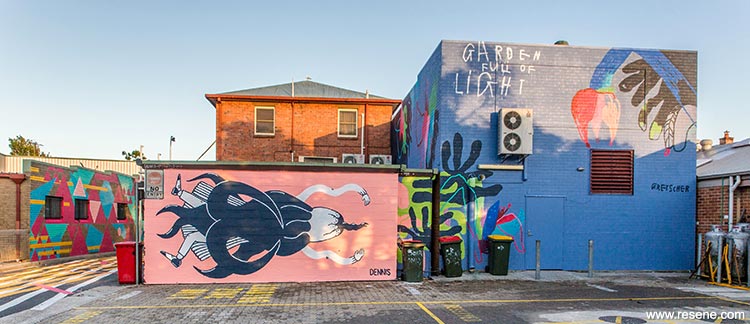
Lateen Lane is an important thoroughfare for the flow of services and back of house operations for numerous businesses in the heart of Byron Bay. In addition, it is a public thoroughfare. Pedestrians, drive-through customers, and tourists use the lane to access the bottle shops, supermarket, shops, cafes and accommodation. Parking, garbage bins and loading docks all contribute to the character and importance of the lane as a hardworking service spine in the town centre.
While the lane was clearly ripe for a makeover, the realisation of the Elysium vision required approvals and signoff from multiple business owners, for artworks and interventions on their buildings that were largely unsolicited! Added to that, the negotiations around traffic management during the two-week installation period were especially difficult. A significant cost to the project was in traffic management and night works.
Elysium was planned over 12 months and was delivered by local art design professionals, Jane Fullerton and Rebecca Townsend. Both volunteered their time to this large scale project and raised $80,000 through local business and philanthropists to cover supplier and material costs.
Over 40 businesses and individuals supported the project, providing financial and in-kind contributions with $70,000 of funds raised paid to local suppliers. Curators, project managers, engineers, builders, electricians and artists and artist volunteers donated an estimated $125,000 of in-kind support.

The Elysium concept is successful not just because of the quality and cohesion of the overall artistic vision, but because it demonstrates that it is both possible and desirable for urban infrastructure and service lanes to contribute positively to a town centre. It demonstrates that you don’t need an ocean view to get a great view of Byron Bay.
Lymesmith designed the Elysium colour palette to:
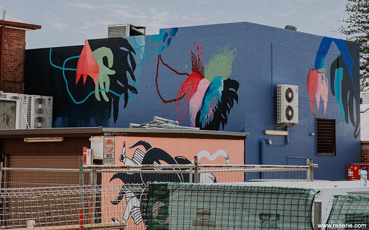
A palette of neutral colours – Resene White, Resene Waikawa Grey (chalky grey blue), Resene Indian Ink (blackened blue) and Resene Black was chosen for backgrounds and broad wall areas to create cohesion and harmony between the 10 different buildings along the lane.
These were joined by complementary contrasts; a mouth-watering collection of gorgeous saturated colours, Resene Tory Blue (cheeky blue), Resene Pelorous (porpoise blue), Resene Riptide (aqua blue), Resene Niagara (peacock green), Resene Howzat (bold spearmint green), Resene Half Turbo (sunshine yellow), Resene Buttercup (bold yellow orange), Resene Flamingo (hot pink), Resene Mona Lisa (orange red), Resene Drop Dead Gorgeous (bold pink), Resene Bombshell (striking red) and Resene Burgundy (rust red blend), allowing for eye catching contrasts and harmonies to be created by individual artists.
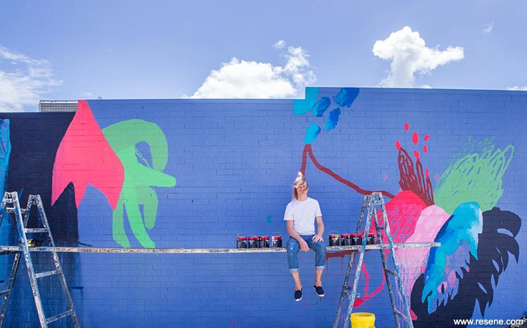
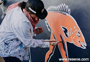
Each artist had to use the colours provided, meaning that they were to minimise colour mixing and keep the Resene colours as pure as possible while remaining true to their individual styles of painting. They did not have to use all the colours; each artist made their own selections and was also involved in refining the colour palette through workshops held during the design process.
Creating harmony between all the disparate parts of the lane was a key goal for Elysium. This is quite a different approach to most street art, where the various artworks often compete with each other, and with the buildings themselves. The Elysium project colour palette, while used uniquely by each artist, gives a harmonious and collective feel to the whole project.
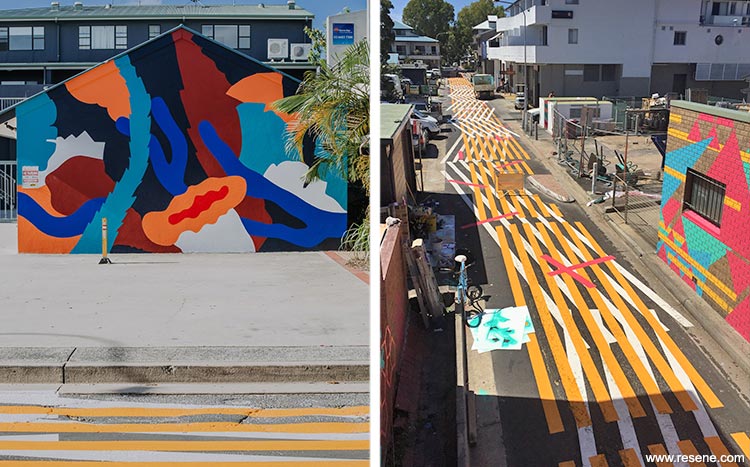
For example, the roadway artwork ‘The Runnel’ uses only three colours from the Elysium colour palette: white (Resene White), yellow (Resene Buttercup) and hot pink (Resene Drop Dead Gorgeous). Most important are the safety yellow and white markings, which form a bold, eye-catching graphic. The colour choice works both overtly and subliminally. The use of universally known road markings and colours for the road painting is a deliberate and serious choice for this artwork, which harnesses the innate ability of colour to send powerful messages, to draw connections, and to alert us to danger.
Resene Lumbersider was chosen for its lightfastness, vibrant colour range and exterior durability.
Colour selection: Lymesmith
Landscape designer: Fullerton Creative
Project curators: Creative Road + Fullerton Creative
Project manager: Marisa Snow
Photographers: Calle Artist Marshall, Selina Miles, Tao Jones
Artists: Lymesmith, Kellie O’Dempsey, Danny Gretscher, Andrew Dennis, Christina Waterson, Colleen Da Rosa, Harley Graham and Max Beaur
Project: Resene Total Colour Awards 2017
From the Resene News – issue 3/2018
Resene case studies/awards project gallery
View case studies that have used Resene products including many from our Resene Total Colour Awards. We hope these projects provide inspiration for decorating projects of your own... view projects
Total Colour Award winners:
2023 |
2022 |
2021 |
2020 |
2019 |
2018 |
2017 |
2016 |
2015 |
2014 |
2013 |
2012 |
2011 |
2010 |
Entry info
Latest projects | Project archive | Resene news archive | Colour chart archive