Whitestone City
A key objective of Design Federation was to work within a New Vintage space, taking colours and design cues from the past and then interpreting them in a modern, fresh way
Tourism Waitaki, the Ministry of Business and Innovation (MBIE) and the Oamaru Whitestone Civic Trust (OWCT) recognised that the history of North Otago is a unique national story and together contributed financially towards the development of the Whitestone City heritage project.
Design Federation were engaged as the head designer and project management team to bring together the heritage and stories of North Otago into a live interactive experience based in the Victorian precinct in Oamaru.
The brief was to utilise a variety of new media and traditional exhibition displays to produce an experience where the visitor was completely immersed in the experience. High participation and original, innovative experiences were paramount.
Based in an old grain store the key interior design consideration was working within a challenging built environment with over 120 year old Oamaru stone walls, a 10 metre high stud and a mix of rough concrete flooring.
Research and development of this project was immense, working closely with the North Otago Museum and Archives to ensure the project spoke of clear storylines of the region. Once planning was complete, implementation took just over nine months to achieve.
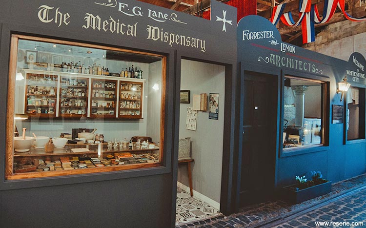
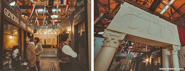
Visitors arrive at Whitestone City to character hosts at an immigration counter where they receive their passport to the experience. Past the Oamaru stone façade, they enter a full streetscape of a General Store, Barber, Chemist and Architect’s office. There is a paper boy hologram that welcomes visitors to the experience spoken in Victorian language. A model of the Criterion hotel created by a local craftsman, includes a layered multimedia projection that shows a day in the life with Victorians moving within the building and outside.
Following the streetscape, visitors enter the dressing experience area where a theatre was built to show how to dress like a Victorian from the drawers up. The theatre is surrounded by catwalks of original Victorian and Edwardian garments and hats and over 100 portraits from the Early Settlers Association of North Otago.
Visitors then enter the games and pastimes area which includes a world first – a penny farthing carousel. The carousel was designed and built in liaison with local engineers and artists and provides the centrepiece of the experience. Other games include croquet, skittles, marbles, quoits, and a historic children’s mock farmyard table.
Working with a local collector, there is a broad agricultural display that includes a faux farm shed with projections on a 3D map of the different maps throughout the decades.
Oamaru was famed for its bars, banks and brothels so the visitor is then taken into a space behind red velvet curtains that has a mock bar clouded in a smoke effect with historic bar games including bagatelle and a movie screening of the history of the area.
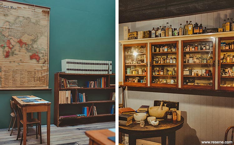
The next area is a school room where visitors are taught like they would have been in Victorian times including dunce cap, cane and a strict lesson from the character hosts.
Finally the visitor is able to don Victorian clothes and walk into a parlour for high tea and etiquette lessons.
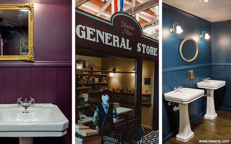
When developing the colour palette the first consideration was the historical knowledge of the time, the colours that were used during the Victorian and Edwardian periods specifically in the North Otago region. Historic homesteads and buildings throughout the region were visited where original paint colours were still shown, spaces were discussed with local historians and the OWCT liaison.
Alongside the research it was determined that the overall colour palette would be strong, bold, moody and all encompassing. Ensuring that every space had its own character to take the visitor on a journey, from the more working class scenes right through to the upper class parlour space, colour was a defining design element.
A key objective of Design Federation was to work within a New Vintage space, taking colours and design cues from the past and then interpreting them in a modern, fresh way. A majority of the colours chosen came from the latest Resene The Range fashion collection, colours that while fashionable also spoke of times past.
New entry and exit vestibules were designed and made, undercoated in Resene Quick Dry waterborne primer undercoat then painted Resene Lustacryl Half Spanish White (complex neutral) to complement the Oamaru stone exterior and original exterior mid tone green store doors.
At the immigration counter, an original boat is displayed as if docked. The seascape in the harbour in Oamaru prompted the choice of Resene Walk-on flooring paint in Resene Barometer (deep blue) as the paint colour beneath the boat.
The streetscape gave the opportunity to be more creative with the colour palette; each shop had an original look but needed to complement the rest of the buildings. The shop exteriors were finished in Resene Mission Brown (rich traditional brown), Resene Dark Side (midnight blue), Resene Seaweed (bitter brown) and Resene Quarter Bokara Grey (warm ashen grey) all painted in Resene SpaceCote Low Sheen as they were still housed inside.

The original floor was over 100 year old concrete. A local artist was engaged to paint cobblestones directly onto the concrete using Resene Foundry (shadowy charcoal) and Resene Triple Rakaia (stony grey beige) to produce a realistic effect.
Each shop provides a unique colour experience. The General Store floor was painted in Resene Walk-on Wolverine (browned taupe), with walls in Resene SpaceCote Low Sheen Triple Canterbury Clay (clay ochre). These complemented the vast range of historical store items and timber shelving.
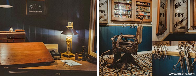
The architect’s office that has a projection was painted in Resene SpaceCote Low Sheen Dark Side inside and out to ensure the visitors focus on the multimedia display. Resene Dark Side also complemented the dark timber desk and display elements.
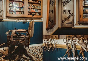
The exterior of the Barber’s shop was painted in Resene SpaceCote Low Sheen Seaweed. A combination of complementary colours in Resene Barometer, Resene Triple Canterbury Clay and Resene Chalk Dust (lime stone white) highlight the barber’s implements and accessories. Tongue and groove is finished in Resene Barometer, with Resene Quarter Truffle (taupe) on the wall and Resene Triple Canterbury Clay decorating the rail.
On entering the dressing experience a large hat display is painted in hardwearing Resene Lustacryl Ringo (earthy beetroot) to keep it looking good, as this is a key feature leading to the next stage. The fashion catwalks are painted in Resene Lustacryl Chalk Dust to enhance the garments on them.
A local artist painted the wall mural showing the variety of Victorian dress through the years, using Resene Barometer as the backdrop colour, framed in Resene Harvest Gold (yellow orange) and a variety of Resene colours in the mural.
The centrepiece of the attraction, the penny farthing carousel, was designed with local artist Donna Demente who provided the graphics around the top. Resene Walk-on Foundry was used for the floor colour and Resene Lustacryl Reflection (pastel blue) as the carousel skirt colour to complement the artwork above.
Within the agriculture section a faux farm shed was built to house a projection of the variety of historical maps of the greater region. The timber within the shed was stained with Resene Colorwood Bark and finished in clear Resene Aquaclear to ensure it resonated with the look of the time.
To bring darkness and intrigue to the bar and brothel space painted wall hung pressed tin was prepped with Resene Vinyl Etch before topcoating in Resene Lusta-Glo Nero (blue black), the colour repeated on the bar.
The school room interior featured a rough concrete floor, painted by a local artist to look like floorboards. This paint feature was done with Resene Walk-on in Resene Wolverine, Resene Castaway and Resene Triple Canterbury Clay. It is a stand out feature in the space; the artistry and paint colours blend well together to create a realistic floor. Walls were painted in complementary Resene SpaceCote Low Sheen Rivergum (grey green).
A key aspect of the facility design was creating realistic looking traditional Victorian bathrooms for the visitors. The bathroom exterior is Resene Scoria (copper red brown) and the lobby Resene Half Spanish White. The intention was to utilise daring, deep tones to relate directly to the Victorian brief as well as provide a bold impact. For the female bathrooms deep purple Resene SpaceCote Low Sheen Sumptuous (deep purple) is used on both walls and tongue and groove panelling. In the male bathrooms Resene SpaceCote Low Sheen Atlas (hazy forest green) sets the scene. Combined with gold gilt mirrors, leather and velvet furniture and traditional artworks the bathrooms certainly make a bold colourful impact.
In the parlour a second hand mantelpiece was attached to the wall rejuvenated with Resene Timber and Furniture Gel in Resene Jarrah Tree (warm red brown) to bring it back to life. The retail space was painted in Resene SpaceCote Low Sheen Green Meets Blue (soft grey green) and features a range of wooden display units that work seamlessly with the colour chosen.
The complete colour palette includes 25 different Resene colours to create a coordinated, bold scheme that enhances the overall experience.
This project was designed within a very challenging built environment. All internal displays, entrance and exit doors, bathrooms and stages had to be built from scratch. The most positive aspect of the project was the community focus, liaising and working with a variety of groups and individuals throughout the region with items, displays and artworks. This project became North Otago’s; the buy in from the community ensured its success.
Whitestone City by Design Federation was awarded the Resene Total Colour Commercial Interior Public + Retail Award. The judges said: “an extensive palette of colours is carefully wrapped into this project to celebrate antiquity and support the story telling of history. Visitors are led on a journey of experiences, meandering through a look back in time with something to discover around each corner and interactive activities to enjoy. The colour palette brings a richness to the exhibition that couldn’t have been achieved with duller antique shades.
With such a wide colour range, it would be easy for the elements to compete, but instead they all come together supporting each other, gently evolving as you move through.
Moody, intriguing and a perfect melding of history and colour.”
Architectural specifier: Bruce Parker and Ian Perry
Building contractor: Breen Construction
Client: Tourism Waitaki
Client – Operations Manager: Wendy Simpson, Tourism Waitaki
Interior designer: Annabel Berry, Design Federation
Painting contractor: Colourpalace, Century Painting
Other key contributor – stylist: Meghan Nockels, Design Federation
Other key contributor – graphic designer: Kate O’Connell, Design Federation
Photographer: Rachel Wybrow Photography
Winner: Resene Total Colour Commercial Interior Public + Retail Award
Project: Resene Total Colour Awards 2017
From the Resene News – issue 1/2018
Resene case studies/awards project gallery
View case studies that have used Resene products including many from our Resene Total Colour Awards. We hope these projects provide inspiration for decorating projects of your own... view projects
Total Colour Award winners:
2023 |
2022 |
2021 |
2020 |
2019 |
2018 |
2017 |
2016 |
2015 |
2014 |
2013 |
2012 |
2011 |
2010 |
Entry info
Latest projects | Project archive | Resene news archive | Colour chart archive