From habitat magazine - issue 37, feature home
A new build has a splash of old-world charm thanks to an interior designer's colourful touches.
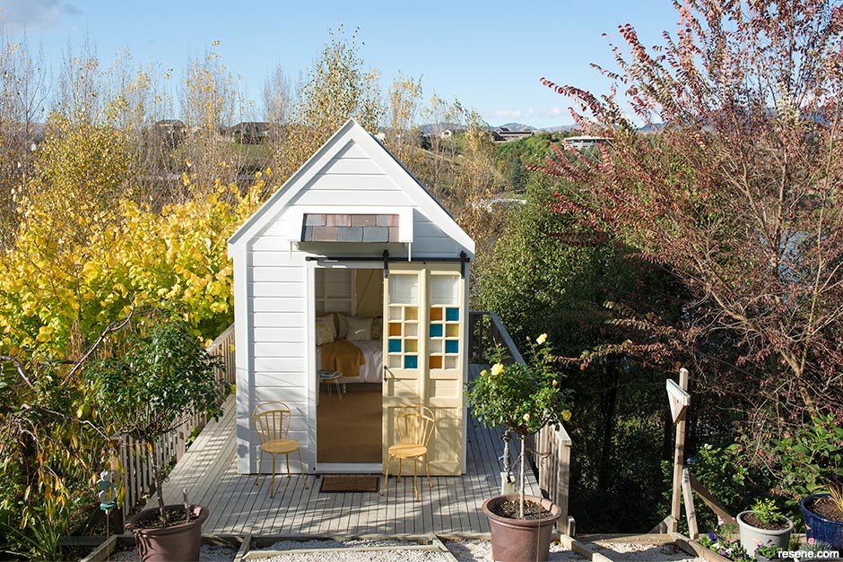
When David and Kirsty Wraight built their 1910s-style Marlborough villa overlooking an artificial lake, they felt the steep slope needed pathways. Since pathways need destinations, they made a summerhouse.
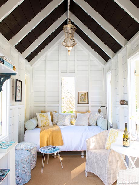
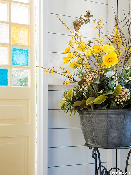
With its jaunty, shingled peak roof, different-coloured glass panes salvaged from a glazier’s workshop and a balcony among the upper poplar branches, the summerhouse is like an illustration from a children’s book. It’s a perfect place for guests to relax or watch the wildlife on the nearby lake.
Inside, upcycled furniture and walls painted in Resene Quarter Rice Cake provide a light, restful space. The steeply pitched ceiling is chapellike and stained in Resene Colorwood English Walnut, a bold nut brown. “The pine timber had quite a lot of colouration, and the treatment of the timber had made it quite pink,” says Kirsty. “I think if we’d gone with something paler, we wouldn’t have the effect we wanted.”
Resene Sandwisp, a pale corn-husk yellow, adorns the door and shutters. The summerhouse’s exterior is Resene Hi-Glo gloss tinted to Resene Half Rice Cake.
The main house, a classic-style villa, sets the sophisticated mood of the property. Called Willow’s Green, the home overlooks the roses, hydrangeas and azaleas to be enjoyed by guests at the Garden Marlborough festival. They may assume the house is a restored homestead, but it’s just five years old. Through their business, David Wraight Cottages, David and Kirsty have been creating classic-style homes for 20 years, presenting vintage charm with the light and year-round comfort of modern homes.
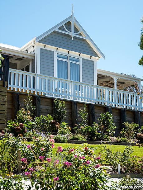
But even if a house differs in style from its neighbours, it must fit in. “Communities look best when their houses blend aesthetically with each other,” David says. Kirsty chose Resene Kensington Grey for Willow’s Green’s exterior walls to complement the neighbouring homes. “I wanted a true grey, not a blue-grey or lavender grey that would throw another colour,” she says. Paints often look different in different lighting as they pick up nuances of the colour.
All the exterior paint is Resene Hi-Glo waterborne gloss. “It is so durable,” says David. “It will last longer in the sunlight and is easier to clean.”
David, a qualified builder, oversees the construction of the houses and transportable homes produced by David Wraight Cottages; Kirsty is the interior decorator and has won a Resene Colour Home Award for this home. “I’ve always been interested in homes,” she says. “Even as a kid, I would often rearrange my bedroom. I love playing; I love persevering. I follow a lot of designers such as designers and personalities Sarah Richardson and Lisa Holt. I tend to stay away from the ones that are straight influencers and what’s trending now. I like to learn about the history of design.”
She says many villas started as relatively square boxes and gradually acquired a lean-to and other additions. The kitchen was always out the back, and toilets were outside. But now, kitchens have become the centre of the home, and there are strong trends with kitchens and bathrooms.
Historically, there was far less choice in paint colours. Dark colours such as burgundy, dark blue and emerald were more commonly used in bigger homes – the colours required more dyes, which were expensive and usually only affordable by the wealthy. Kirsty appreciates the variety of Resene colours she could choose from for her villa.
She says it’s easy to select complementary colours, but to successfully bring them together, the perfect white or off-white is crucial.
Kirsty often uses Resene A4 drawdown paint swatches (A4 colour samples) to assess a colour for a space. “Especially when I’m picking off-whites. I’ll take it outside, hold it up against the exterior, and then inside, to see what colours it’s throwing. Because sometimes I’ll think it’s a bit mushroom or a bit green, which might not be what I’m after.”
She wanted Willow’s Green to be “restful, not too bold. I like a little bit of French inspiration and a little bit of the Hamptons – a lot of white, soft greys, panelling, but even though the house is big, I wanted it to feel cosy.”
To maintain a cohesive flow through the house, Kirsty used Resene Quarter Rice Cake on all decorative features, such as the bolection-moulded skirting boards and cornices, dado rails, wall panels and ceilings.
The walls in the main living area are painted in Resene Emerge with panels in Resene Quarter Rice Cake. “I didn’t want a blue-blue, but I didn’t want green either,” Kirsty says. All the paints were applied by local painter David Price. The kitchen joinery, architraves and interior doors are painted with Resene Lustacryl semi-gloss waterborne enamel for easy cleaning.
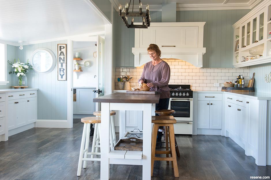
Like many restored homes, the kitchen and pantry have tongue-and-groove-style ceilings. Kirsty loves the pantry as a place to prepare meals and clean up without disrupting guests.
She originally painted the cabinetry in Resene Blackjack but found the dark colour hard to keep clean, so she had it repainted in Resene Quarter Rice Cake. The laundry is still in Resene Blackjack. “Which I love,” Kirsty says.
About those walls and ceilings: they are MDF, either plain or with a tongue-and-groove effect.
“I got into it 20 years ago,” David says. “We have had great success with MDF linings in houses that have come through the earthquakes. It’s only 9mm, but it’s thermally extremely efficient.” He covers the joins with battens.
David and Kirsty have run their home as a B&B in the past and will again when business and travel restrictions allow. In the guest lounge, a French-style chandelier provides fitting illumination for walls painted in Resene Blanc.
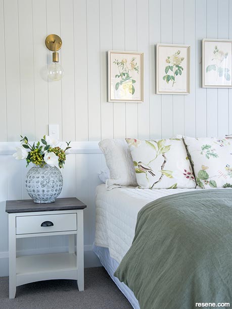
The hallway, also in Resene Blanc, leads to three guest bedrooms. The south-east room is in Resene Linen, with panels below the dado rail in Resene Quarter Rice Cake, paired with plain bedlinen, floral cushions and curtains. This room opens to the deck. “We live out here in the summer because it is out of the northwester and shady in the heat.”
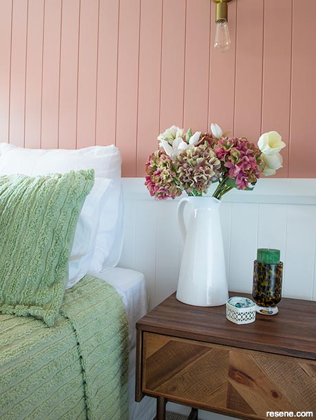
The lower third of the walls in the middle guest room also feature Resene Quarter Rice Cake and, above the dado rail, Resene Brandy Rose, a smoky pink that may have intimidated less experienced designers. “I was just looking through the Resene palettes one day,” says Kirsty, “and I thought, ‘Oh, that’s interesting’.”
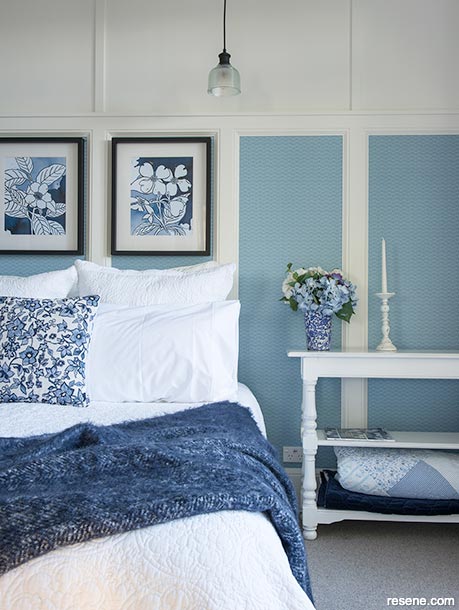
Kirsty wanted to try wallpaper panels for something different in the third guest room. The blue and white embossed design, Resene Wallpaper Collection E375052, is teamed with blue butterfly curtains.
Kirsty’s choice of Resene colours perfectly complements the classic charm of Willow’s Green, creating a smooth flow throughout the house. “I don’t follow trends for the sake of following trends,” Kirsty says. “In interior decorating, it’s so important to be yourself.”
Accessory dwelling units (ADUs) are small, self-contained living units, such as sleep-outs or granny flats, usually on the same lot as the main house. With houses in short supply, ADUs are gaining popularity as homeowners look for options for growing families or as additional income as an Airbnb. Regulations and consents for ADUs may vary from council to council, so check local guidelines before finalising your plans.
As an interior designer and project manager for David Wraight Cottages, Kirsty works with colour full-time, so what is her process for choosing combos? It changes every time, she says.
“Often, I will find a colour I like, and I’ll think, ‘What can I do with this?’ and then I pick a fabric and flooring and light fittings and then look at the white or off-white to work with it.
“With a spec house at work I go through the Resene fandeck, and there might be a colour I’ve never used before. I’ll read the blurb on the back of the fandeck, but I may even choose the colour of the aluminium joinery next and then pick other colours.”
Every Resene colour is coded with a letter, which denotes the base colour. Numbers also indicate where the hue sits on the colour wheel. They start with reds at 0, moving through oranges and yellows to greens around 180 and on through blues and purples. For example, a white with code 020 will have red undertones; the undertones determine how it relates to other colours in the room.
“I don’t think I’m that good at colours,” David says, “but what I’ve learned with Kirsty is the hardest colour to pick is white. It’s relatively easy to pick nice colours, but if you don’t match the white or off-white to go with it, it doesn’t work.”
Choose the right Resene colours and paints for the job.
Resene Hi-Glo is a waterborne gloss for exteriors, which creates a sheen ideal for highlighting architectural features. This versatile paint is also ideal for primed timber, cementitious and galvanised steel surfaces and is available in a Resene CoolColour formula. For a lower sheen alternative for exteriors, try Resene Sonyx 101 semi-gloss or Resene Lumbersider low sheen.
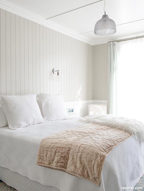
Resene Lustacryl is a waterborne semigloss ideal for trims and joinery and areas where painters once would have used solventborne paints. The wipeable surface makes it easy to clean and ideal for areas such as kickboards, panelling or wainscoting. The room above is Resene Truffle with Resene Quarter Rice Cake below the dado and on the ceiling.
To enhance the natural beauty and wood grain of interior timber, use Resene Colorwood wood stain. This easy-to-apply stain enhances the colour of the timber and can be used on flooring, walls, furniture, or in Kirsty and David’s case, the ceiling of their summerhouse. Protect timber stained with Resene Colorwood using Resene Aquaclear or Resene Qristal ClearFloor (on flooring).

country charm meets industrial style
Designer Shane George suggests this alternative scheme:

Shane George
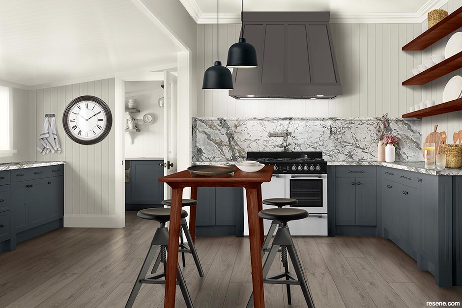
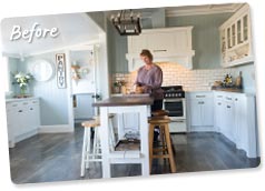
This design is a fusion of French country and industrial loft styles. This kitchen features several grey tones with Resene Colorwood Smokey Ash on the flooring, Resene Half Grey Friars on the cabinetry, Resene Triple Black White on the tongue-and-groove walls and the silver veins of the honed marble benchtop. The industrial loft vibe comes through in the Resene FX Metallic Blast Grey 2 on the industrial clock and rangehood as well as the pendant lights from Unison Work Spaces and stools from ECC Lighting. I have changed the island to a teak kitchen table stained in Resene Colorwood Teak to match the shelves in the kitchen and pantry. This table doubles as a workspace and casual eating area. The result is a warm and inviting working and living space with strong rich tones that create impact and drama.
email shane@shanegeorgedesign.co.nz web www.shanegeorgedesign.co.nz
Top tip for a unique soft feel, smooth finish that is highly resistant to unsightly fingerprints and other marks. The soft touch finish is optimised for stain resistance and toughness to help cabinet doors and furniture stay looking fresh and clean for longer. Resene AquaLAQ Soft Touch is ideal for use on ‘push to open’ cabinet doors and drawers, as well as large surfaces.
a modern kitchen with a rustic touch
Designer Wendie Cantwell of Mastercraft Kitchens suggests this alternative scheme:

Wendie Cantwell
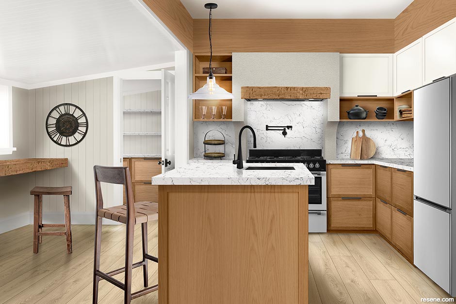
I reimagined this space with warm colour tones and natural textures that complement the architectural style of the home. Rustic elements such as the lower cupboards and pelmet finished in Resene Colorwood Bask and the reclaimed timber slab in the seating area are contrasted with modern white elements such as the upper wall cabinets in Resene AquaLAQ in Resene Alabaster and the Caesarstone ‘White Attica’ benchtop and splashback. Matte black cabinet handles and tapware from Archant add further contemporary touches to the space. The kitchen layout is functional with a ‘working triangle’ between the island oven and fridge. The builtin timber bench on the left functions as both a casual dining area as well as a handy study space.
email wendie@cantwelljoinery.co.nz web www.mastercraft.co.nz

Top tip Resene SpaceCote Kitchen & Bathroom contains anti-bacterial silver and MoulDefender for extra protection in wet areas such as kitchen spaces. Use on kitchen walls and complement with the ceiling in Resene SpaceCote Flat Kitchen & Bathroom and trims in Resene Lustacryl Kitchen & Bathroom.
Design: David Wraight Cottages
Words: Rebecca Hayter
Images: Juliet Nicholas
Search habitat magazine stories
Printed copies of habitat highlights are available from late March 2024 at Resene ColorShops and resellers, while stocks last. You can view back issues of habitat magazine online.
Specifiers:
If you have an idea, project or story that you think would suit habitat, we’d love to hear from you. Please drop us an email with your details and include photos if submitting a project.
Sign up for a DIY card and Save! Australia | New Zealand