From habitat plus - decorating and colour trends 2023
Twelve stylists' share their colour loves...
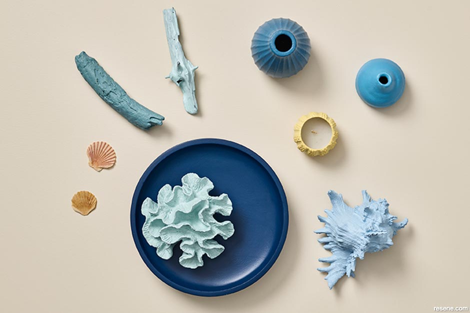
The best colour palette for your space is one that you connect with on an emotional level, because no matter what trends are popular, a room filled with colours that remind you of happy moments will always look and feel good. For me, a combo of blues and peachy orange tones like Resene Moondance, Resene Solitaire, Resene Morning Haze, Resene Dream Big, Resene New Day, Resene Lakeside and Resene Ocean Waves reflects the sun, sand and sea and reminds me of days sitting on the beach, feeling all salty and watching the sunset. Even if the popularity of these on-trend hues fades a few years from now, they will still be the perfect accent palette for redecorating my bach as my love of the ocean will never fall out fashion. Try them layered over a base in a crisp white like Resene Sea Fog for an authentic beachside look.


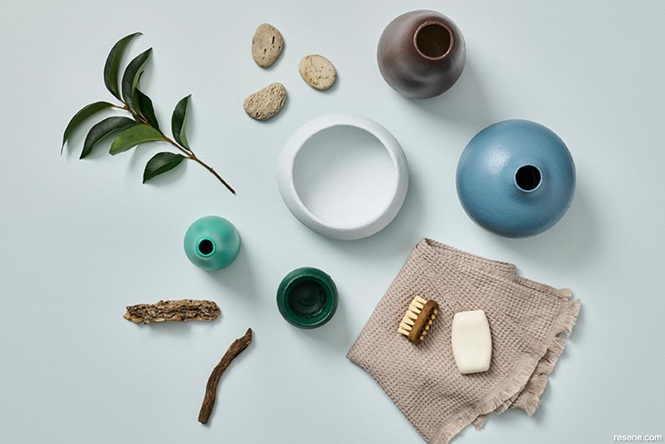
Taking inspiration from nature and noting some standout hues while tramping in beautiful Abel Tasman and Queen Charlotte Sound recently I’m looking skyward to tones like Resene Ted alongside Resene Rebel and winding into earthier Resene Rolling Hills. I would love to use the darker colours on an exterior while Resene Ted makes a superb colour for kitchen cabinetry or for bedroom walls accented with Resene Aoraki. I also love Resene Boundless as a bold contrast colour for a statement piece of furniture.


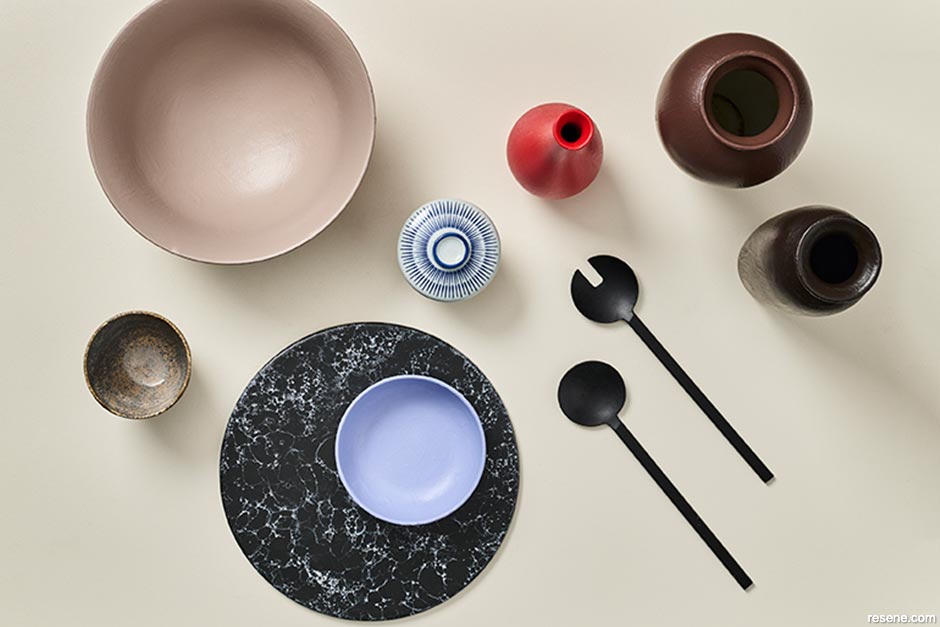
I am loving the deliciously warm browns from Resene’s latest fashion range – especially Resene Otter, Resene Rebel and Resene Dark Chocolate. Resene Heliotrope also reminds me of holidays in Greece while Resene Meringue has a subtle grown-up vibe to it. I would use them all together in a lounge, bedroom or anywhere you want a soft and relaxing palette that doesn’t feel overly matchy. I could stop there, but I'm also having a love affair with red right now – which has been steadily finding its way into my wardrobe and onto my bookshelf. Replace Resene Rebel and Resene Dark Chocolate with a touch of vibrant but not overpowering Resene Roadster and you have a chill palette with a fun twist.
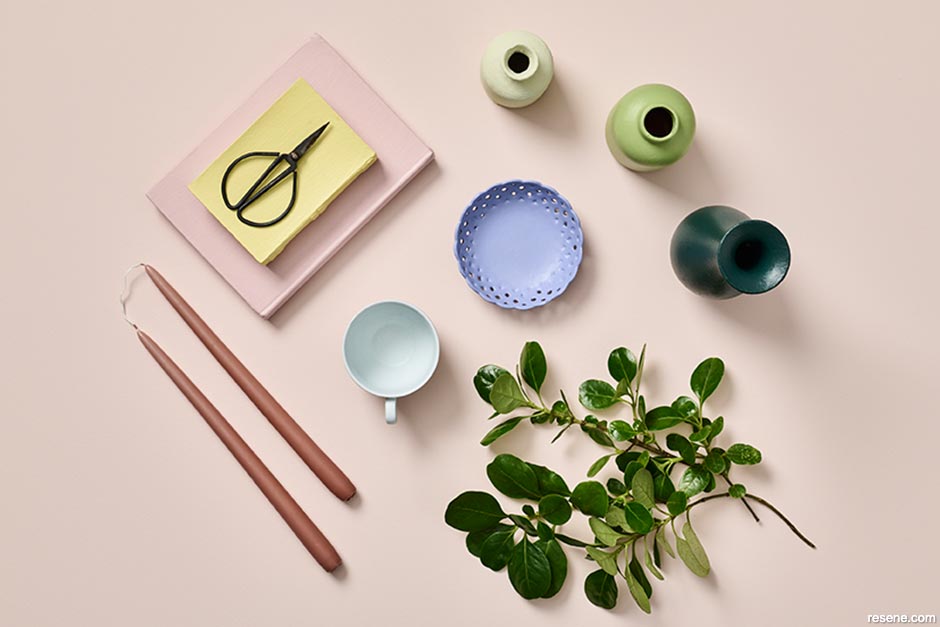
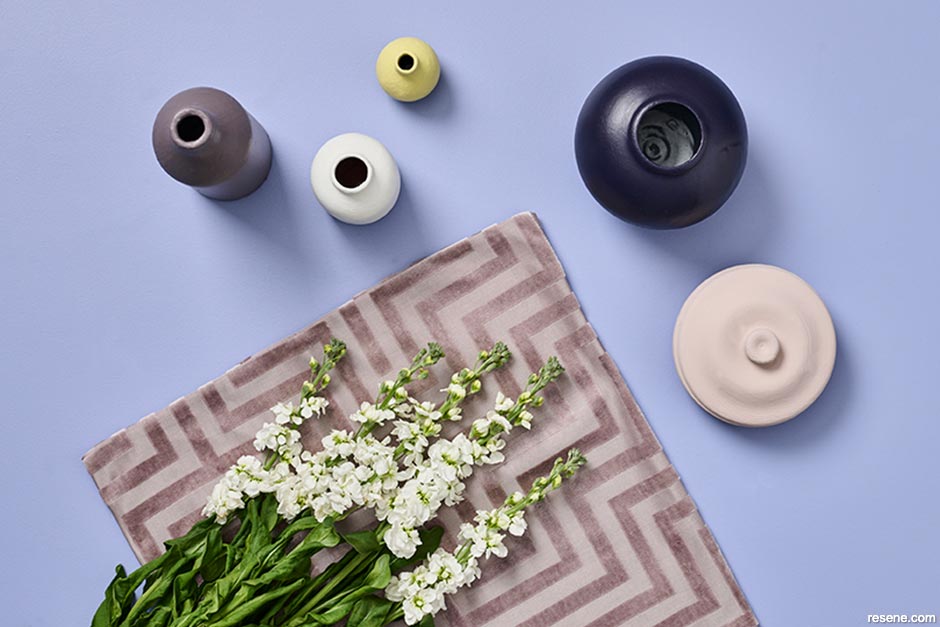
Soft and dusty with a touch of pastoral whimsy, this colour palette embodies true romance. Think of barely-there colours such as Resene Inspire, Resene Timeless and Resene Springtime as an alternative to whites and neutrals, ideal as a wall colour in dreamy bedrooms and chilled out lounges. These soothing colours evoke feelings of relaxation and rejuvenation. Pair with enchanting violets like Resene Heliotrope, bound to add a sprinkle of girlish charm to any space and add bursts of sweetness with lemon curd yellow Resene Illuminate, romantic pink Resene Valentine and creamy green Resene Smashed Avocado. Resene Top Notch is the finishing touch to round off this palette.


My favourite colours in the latest Resene The Range fashion collection are the softened, mellower alternatives to primary colours. The subtly purple tinge in Resene Heliotrope, the muddied yet not sickly yellow of Resene Illuminate and Resene Black Doris – my new go-to off black purple – deep and rich with soft edges. I would use the three of these in a room with plenty of natural light and well-defined edges, like a bathroom or kitchen. I also love the selection of mushroom taupes and blushes for the way these nature-inspired tones can quiet a brighter palette. I’d use Resene Soul Searcher and Resene Tenor as accent hues in places where I would usually use a bright red.


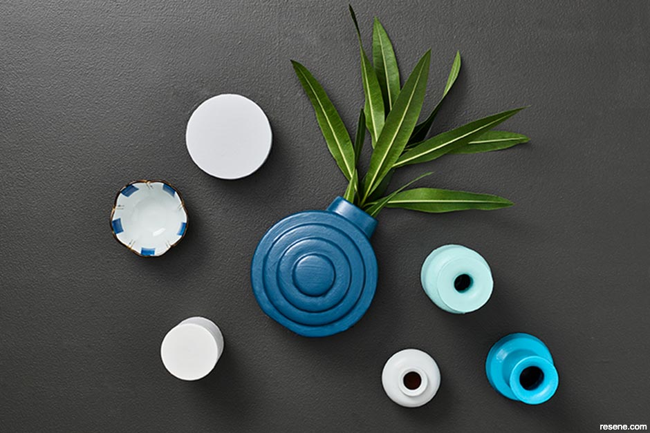
I’m really embracing the dark side of Resene’s latest fashion colours and I’m finding myself drawn to the newest near blacks. Resene Night Magic, Resene Invincible and Resene Black Sand are so much more dimensional and interesting than your traditional basic blacks and they’re easy to use in pared back spaces accompanied with soft whites like Resene Sea Fog. But they would also look really exciting with a mix of turquoise and teals like Resene Now Or Never, Resene Epic, Resene Time Traveller or Resene Freewheeling. I’m also excited to use these hues next to soft whites like Resene Half Thorndon Cream and Resene White Pointer to create a coastal ‘staycation’ vibe supported with indoor palms, whitewashed cane furniture and pale timber flooring in Resene Colorwood Whitewash.


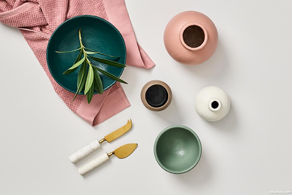
I love that a quick coat of paint can instantly change the look and feel of a space, and it’s something I do in my own home any time I want to mix things up. My current favourites are Resene Welcome, which is a sophisticated yet edgy grey that makes a room feel like it's cloaked in velvet. If you're not ready to paint an entire room in this intense shade, it’s a gorgeous choice for kitchen cabinetry supported with white marble, brass and timber accents – you can thank me later! I also adore the warm rosy terracotta tones of Resene Summer Rose. This dusky hue is reminiscent of an opulent Tuscan villa and is ideal for a dining space or intimate living room. It's warm and inviting, stylish and elegant – especially when teamed with copper or gold metallic accents, icy pinks and brick red tones. Resene Kinship is a refreshing change from white. I describe it as a calm soft greige, but it’s definitely not boring. Its gentle warmth adds interest and femininity to a space. Pair it with natural greenery, mustard tones and petal pinks for a chic living space.


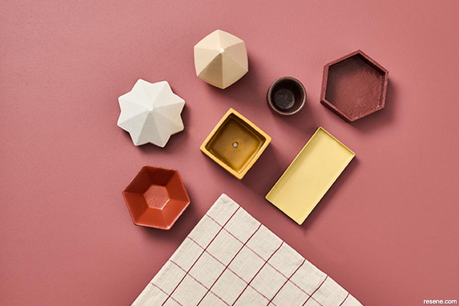
With the ongoing trend of neutral interiors, Resene Athena is a winner paired with soft creamy bouclé furnishings, light wood and rattan. This creamy warm white feels soft and buttery to look at, and it brings an interior freshness without the starkness of a cooler white. I imagine it with soft sheer linen curtains wafting in the breeze on a warm summer’s day. I love it with Resene Scoria, a brick red with soul that conjures up memories of travelling in Italy and Mexico, a classic like Resene Pioneer Red and a dusky pink like Resene Savour for a room that feels like a little Italian café on the Amalfi coast. Just as the name describes, Resene Salted Caramel looks good enough to eat. Warm and complex, it is a great backdrop to softer shades like Resene Meringue, Resene Athena and Resene See The Light in an office paired with lighter furniture and soft furnishings of white, mustard velvets, peach and apricot. If you prefer warm tones, this is a great choice.


I’m only a few eager months away from moving into a new (to me) home and I simply can’t wait to get stuck in to painting it. After spending four years in a rental surrounded with white walls that I wasn’t allowed to change, there is nothing that my interior designer heart is looking forward to more than enveloping my space in soothing colours. It’s complex and blue-tinged greens like Resene Forty Six, Resene Unite and Resene Morning Haze that I’m currently craving most. I’ll look to accent these with a low-key mushroom taupe and a blush suede brown like Resene Otter and Resene Courtyard in the master bedroom. But in the main living areas, I’d use bolder peachy oranges like Resene Dawn Glow and Resene Tuscany to complement the warm undertones in my collection of teak and walnut mid-century furniture and bridge the modernity of the updated kitchen with the home’s early 20th century period details. In places where white is needed for balance, I’d opt for the subtly green edged Resene White Noise over a truer white to soften it.
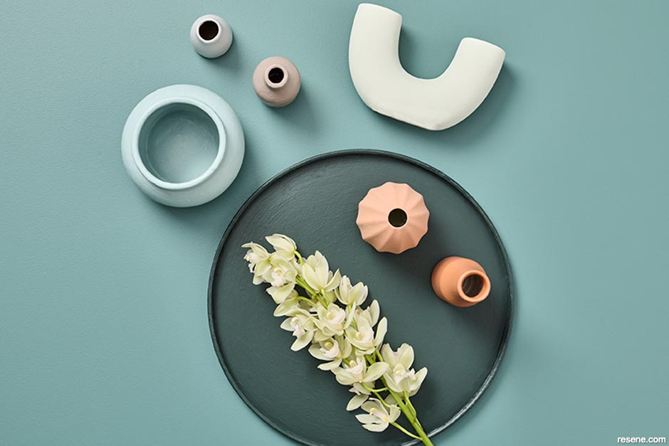
I love the beachy, summery feel that a combination of Resene Timeless, Resene Contented, Resene Infused, Resene New Day and Resene Comfortably Numb evoke. They work well as a team, complement each other beautifully and create a harmonious story throughout a home. The mid-range blue green of Resene Infused is just the right hue to create an intimate living area fading out to the lighter variations like Resene New Day for the kitchen and dining. Soft and soothing Resene Comfortably Numb and Resene Contented are perfect bedroom colours, and pairing them with a cream like Resene Creme De La Creme makes for a really beautiful bathroom combination.
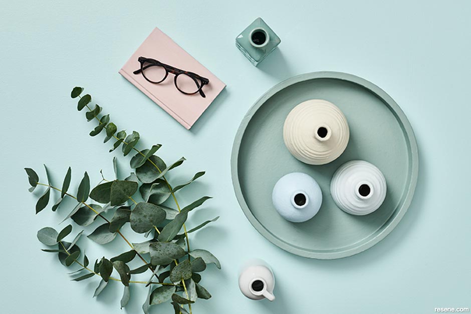


I find myself delving deeply into nostalgia and exploring the colours of days past, reminiscent of spending long days exploring the cliffs of Pouto, eating tuatua fritters off Crown Lynn plates and dipping tuangi in cider vinegar. I am also forever trying to bring the outside in, and colours like Resene Off The Grid and Resene Rewilding can do just that in a way that feels fresh, grassy and light. They look incredible in a bathroom or kitchen paired with handmade tiles, blonde timbers and beautiful woven towels. Resene Rebel feeds into that love for chocolate browns we’re seeing take over in fashion, which it is also making its way across interiors. This colour is ideal for creating cosy corners and lush nooks and bringing a new sense of depth by layering it with walnut furniture, ceramics and dried floral arrangements bringing you early 2000s chic. Using softer notes like Resene Amaranth and Resene Contour for a bedroom is an easy way to bring soft, earthy warmth into your sleepy haven. But you also can’t go past tried and true favourites when it comes to whites – as Resene Alabaster is unparalleled when you need a crisp, fresh and bright white while Resene Merino is effective for bringing fleecy warmth and softness to any room.
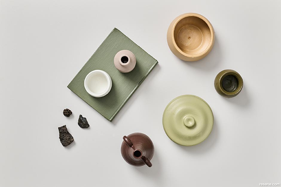
I’m loving the bold colours that are returning to homes and if you’d like to add a little zest in your home why not opt for a citrus hue? I know first-hand the pick-me-up qualities of citrus colours. Resene Clockwork Orange plays a starring role in my own mid-century home and I love the way oranges like Resene Tuscany and Resene Liquid Gold imbue a sense of optimism and a touch of European flair. Of course, citrus comes in many flavours and there’s many other juicy options aside from orange. Refreshing limes include Resene Aloe Vera, Resene Wellywood and Resene Illuminate, or why not toast to la dolce vita with a little limoncello with Resene Creme De La Crème, Resene Light Fantastic and Resene I Dare You. Cin cin!


Search Habitat articles
If you have an idea, project or story that you think would suit Habitat plus, we’d love to hear from you. Please drop us an email with your details and include photos if submitting a project.
Habitat plus are not mailed directly. They are available free from Resene ColorShops and resellers while stocks last and available for viewing online.