From Habitat plus - decorating and colour trends 2021
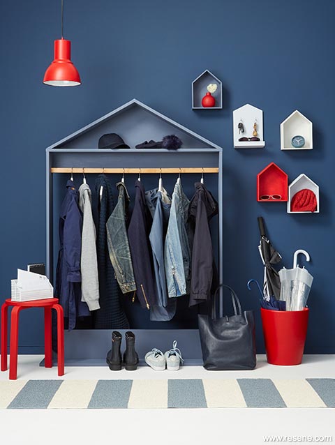
One of our all-time favourite classic colours has been making a huge buzz: blue.
Evocative of the sea and the sky, the colour blue brings together the deepest depths of the ocean with the lightness of the seventh cloud. It stands for integrity, power, tranquillity and health and is considered as beneficial to the mind and body.
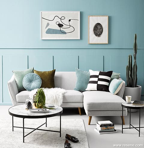
Blue is one of those hues that always seems to be relevant, and its wide range of appealing hues offer so much diversity, which makes it easy to keep finding fresh and exciting alternatives to the shades of years past. Like many other trending colours, today’s popular blues are dusty in nature – like a sky just before dusk or a favourite pair of well-loved denim jeans. This move toward desaturated shades has been slowly occurring across the spectrum over the past few years, in large part driven by the desire to return our homes to calming, restful spaces.
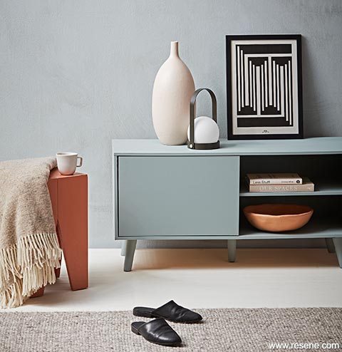
![]() Trend: textured walls, see "minimalist mediterranean"
Trend: textured walls, see "minimalist mediterranean"
Since Pantone announced Classic Blue as its top colour pick, dark, moody blues with hints of cobalt have been very much on trend globally. Looking ahead we are heading into a lighter and airier direction moving forward in our part of the world.
In lives full of busyness and interruptions, light blue helps us filter out the noise and focus on what truly matters. Light blue brings a sense of calm and stability we all desperately crave. It promotes healing and understanding and helps us switch to a more mindful mindset.
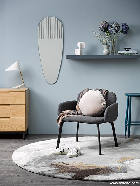
Popular blues have also taken on green undertones, with Resene Green Meets Blue, Resene Dark Slate and Resene Jurassic being among the most covetable variations. Try them with stone greys like Resene Pale Slate, sharp yellow whites like Resene Rice Cake or soft grey greens like Resene Aspiring. For a pop of interest, bring in small accents of bitter orange, rich ochre or peridot green such as Resene Mai Tai, Resene Pirate Gold or Resene Flourish to finish the look.
Top tip: Continue your chosen light blue from your walls onto your ceiling to soften the room edges for a more cocooning space.
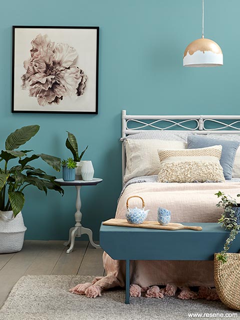
A restful space that is as minimal and toned down as it could be. Pared down to the unfussy essentials, this relaxing-looking bedroom seems to embody the principle of wellness right to its core. A Nordic blue green, Resene Juniper is a shade that falls firmly in the category of hues that evoke a sense of serenity. Used on this bedroom’s walls, it pairs perfectly with the timber floor finished in Resene Colorwood Mid Greywash, a headboard in Resene Dover White, a bench in Resene Balderdash and a pendant lamp in Resene Double Sea Fog with a ‘gold leaf effect’ created using Resene Rose Gold metallic paint. The bedside table and woven basket (housing the large plant) are painted in Resene Double Sea Fog, the vases are painted in Resene Balderdash (left) and Resene Double Sea Fog (right) and the small ombre plant pot is in Resene Celeste (top), Resene Terrain (middle) and Resene Cobblestone (bottom). Rug and cushions from Me & My Trend, bedlinen from Society of Wanderers, throw from Kip & Co.
Top tip: For the ultimate timeless combination, pair crisp Resene White with your favourite Resene blue.
Note: When choosing sheen levels for weathered or deepened blues, look to flat and low sheen finishes to enhance the weathered beauty of your blues.

Search Habitat articles
If you have an idea, project or story that you think would suit Habitat plus, we’d love to hear from you. Please drop us an email with your details and include photos if submitting a project.
Habitat plus are not mailed directly. They are available free from Resene ColorShops and resellers while stocks last and available for viewing online.