From the Resene decorating blog
It seems there’s no escape from the 80s, the era when greed was good and the hair was even better – or bigger. An epic decade, it heralded a raft of brave new styles – the glitzy glitter of glam rock music; cool as ice Miami Vice interiors; big, over-the-top window treatments; loud and proud electro hues of lycra and much, much more.

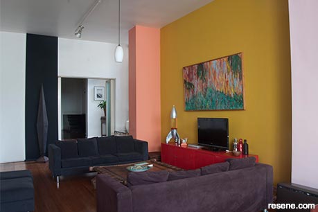
Stripes of Resene Honeysuckle, a canary yellow reminiscent of the 80s, lights up the Resene Alabaster walls of this contemporary lounge. Accents like Resene Princess (on the lamp), Resene Away We Go (on the plant pot), and Resene Yes Please (on the right-hand peg stool) add to the energy of the space without overwhelming. Project by Kate Alexander, image by Bryce Carleton.
Though the economic times that inspired the trends have changed, an 80s revival of bold colours, geometrics, ethnic patterns, house plants, brass and shiny things have crept back into our homes. Many are craving playfulness and excitement to counter the cool, calm, natural and white palettes that have endured for so long.
Whether you go for the full-on bold effect or reference it in more subtle ways with accents, shapes, patterns and fabrics – there is a lot to draw on.
Pantone® chose Living Coral for the colour of 2019, which is not far from the peachy pastel hue so popular in the early 1980s, says colour enthusiast Becky Lee of Becky Lee Interiors.
“The pastels of the early 80s are definitely strong now. But they have been updated with more muddy tones this time which goes better with shades of greys that are so popular. Soft pastel green, like Resene Aura, and peachy coral, like Resene Just Dance, are very reminiscent of the 80s.”
Today’s pastels are a bit more sophisticated. It’s not the mint green, we’re seeing. It’s more sage, like Resene Peace. And it’s not a baby blue. It’s a bit of a dusty blue, like Resene Raindance. You’re seeing that dustiness with the pinks and oranges too, where people are looking to colours like Resene Shilo and Resene Shabby Chic, or Resene Clockwork Orange and Resene Twisted Sister.
That classic Miami Vice look is also getting an update – a bit more sleek and modern. You can achieve the updated look with lots of white overlaid with shots of teal or pink colour accents, says Resene colour consultant Brooke Calvert. “Then, add in big freestanding mirrors – everywhere, and without frames.”
The late 80s heralded a move towards the deeper jewel tones, says Becky.
“As design trends go, the 80s were so rich and layered. A lot of jewel tones came along later, like the indigos. There’s a lovely hue called Resene Resolution Blue which is a colour we could work with in our homes today. It depends on the part of the 80s you want to reference. Deeper greens like Resene Xanadu is a real standout with lots of depth and it suits the New Zealand environment.”
The high point of the era for Becky was the post-Modern Memphis movement started by Ettore Sottsass with its intense clashing primary colours, blocky shapes, angular geometrics and loud patterns.
“It’s just such a distinctive look that emerged. There were only about 300 pieces there were produced so it’s incredible that something with such a limited production has stood the test of time,” she says.
Andrew Parr, director of SJB Interiors Melbourne agrees, Sottsass and the Memphis movement is one of the most influential interior trends at the moment. “Sottsass was all about colour, texture and pattern; he was famous for his Dalmatian prints and black and white as well.”
Some original designs are still available to purchase, but lots of young designers are riffing on Memphis designs, updating the look using the patterns and shapes. Memphis geometrics are popping up all over the place with accessories and textures embracing the trend for bold shapes.
To create the look, Andrew suggests applying similar black and white effects as wall finishes. “If you look at the primary block colours, the intense yellow, the pink and green – obviously those colours are going to give clues on how to block a room in this manner. Very simple blocks are layered. Break it down into those geometric forms.”
There was also an Art Deco revival in the 1980s. “It was about angular shapes with a glam edge,” says Becky. “Think lacquered furniture, shiny chrome and brass and round glass table tops. They can look very cool because you can really see the upholstery fabrics on the chairs under a glass table,” says Becky.
And let’s not forget the electropop neons. “Neon artworks were really big in the 80s and that’s come back with a proliferation of Instagram friendly neon signs popping up all over the city in the restaurant and bar scene. It’s a cool comeback that can work in our homes too.”
You don’t have to go the full-on bold effect, says Brooke. “Consider half and half walls with just the bottom half painted in a bold colour or try a diagonal. That’s very on trend. Try painting the door jambs in Resene Eye Candy, Resene Adrenalin or Resene Sebedee.
“If you’re not totally committed, create a pop with just hints of colour in a piece of furniture, a table or a shelving unit. Perhaps tie it in with the classic 80s flame stitch fabric on cushions or a floor rug.”
Tumbling greenery is also breathing fresh air into our homes again making them healthier and creating a sense of warmth. “That back to nature thing doesn’t look as if it’s about to go away,” says Brooke.
“Jungle prints and Monstera plants are all over large cushions, wallpapers and artworks these days. Resene Wallpaper Collection’s Vivid and Ashford Tropics ranges feature lots of palm fronds and bold banana leaves that you could use to great effect in an entry or hallway; maybe in the guest bathroom or a separate sitting area to create an exotic jungle oasis. Draw the colours out from the wallpaper to introduce a pop of brightness in colourful painted pots in macramé hanging baskets overflowing with plants, spilling from ceilings.”
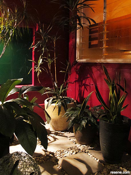
Terry Hogg’s interior courtyard
Big in the 80s with its bold primary toned hues and graphic shapes, 60s pop art is again making a statement. Andy Warhol, Roy Lichenstein and 1960s images of Twiggy are hot favourites. Track them down on Instagram sites or create your own custom art with freehand paint effects such as colour blocking, says Brooke.
And while copper and rose gold metallics married beautifully with the blush pinks of 2018, there has been a move towards brass. Not the shiny brass of the 1980s, more of a softer burnished antique brass.
But the metal of the moment, counters Andrew Parr is chrome. “Brass is still hanging in there. But polished chrome is going to be the next big thing.”
It’s about recreating the glam and the shine of the 80s, he says. For those looking to make bold contrasts, play with metallic paint, wallpaper or tiles.
“You could even replace the legs of sofas with shiny chrome legs,” says Brooke.
And don’t forget lighting. Track lighting is having another moment, she says. “Incorporate directional tracks in slimline black for a modern look along a white hallway to highlight artwork.”
The 80s was a crazy decade. Love it or hate it, the look continues to be influential. These days, it offers a fantastic opportunity to be inspired by the huge sense of adventure to bring some eclectic vibrancy into your home and above all to have some fun.
Colour and lighting consultant Terry Hogg has been living and working in this apartment for over 13 years. Initially a late 1920‘s Art Deco style, it was once a restaurant that also serviced the short-term rentals above that has undergone numerous renovations since. “The space is extremely conducive as a creative working and living environment,” says Terry.
The interior colours used in the apartment are Resene Quarter Pearl Lusta, Resene Nero, Resene Decadence, Resene Zomp, Resene Taffeta, Resene Sweet As, Resene Wazzup, Resene Japonica and Resene Rendezvous.
“They’re are what I call a 1980s gelati palette; Miami meets Mexico. I love using tones that clash or vibrate off each other making the colours sing. An example is the use of Resene Japonica with Resene Wazzup and Resene Sweet As. When it comes to colour, I don't believe in rules, or whats ‘in’. I’m only interested in what works.”


April 14, 2019
Visit your local Resene ColorShop for expert advice and all the products and accessories you need to make the most of your home.
Book a colour consult | Ask a Colour Expert | Ask a Paint Expert
Resene's decorating blog
Paint your home beautiful! Discover the latest decorating trends, tips and colour news.
![]()
Previous «
Which colour for which room?
![]()
Blog home
View the latest trends, tips and news
![]()
» Next
Embrace the darkness
![]() Get inspired ! Subscribe
Get inspired ! Subscribe ![]() Get saving ! Apply for a DIY card
Get saving ! Apply for a DIY card
![]()
Can't find what you're looking for? Ask us!
Company profile | Terms | Privacy policy | Quality and environmental policy | Health and safety policy
Colours shown on this website are a representation only. Please refer to the actual paint or product sample. Resene colour charts, testpots and samples are available for ordering online. See measurements/conversions for more details on how electronic colour values are achieved.
What's new | Specifiers | Painters | DIYers | Artists | Kids | Sitemap | Home | TOP ⇧


