From the Resene decorating blog
The bold geometric abstraction style of early 20th century Dutch artist Piet Mondrian has struck such a chord with modern sensibilities, that it has been integrated into many unexpected areas of our lives.
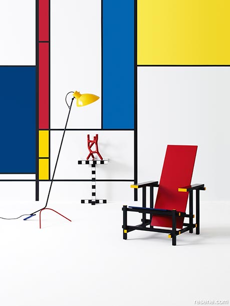
Contrasting primary colours reflect the classic Mondrian style in, from left, Resene Half Alabaster (top, and on floor), Resene Wet N Wild (darker blue), Resene Candy Floss (red), Resene Broom (deeper yellow), Resene Endeavour (brighter blue), Resene Quarter Turbo (lighter yellow). The grid lines are Resene All Black.
Mondrian’s famous palette of bright primary blue, red and yellow with crisp white against black grid lines can be found in everything from furniture, towels and tiles to clothes, crockery and even shoes. It can also be a stunning way to paint and style a room.
The trick, if you’re using a Mondrian-style pattern across a wall, or even a whole room, is to keep the rest of the space as uncluttered as possible, and to keep your furnishings to the same palette, or at least to bold, saturated shades in blocks of colour, rather than adding another of clashing pattern or design.
For the classic look try a mix of blues in Resene Wet N Wild and Resene Endeavour, red in Resene Candy Floss, yellows in Resene Broom and Resene Quarter Turbo. The classic true black of Resene All Black works well on the grid frame.
Keeping floors and ceilings neutral also focuses all attention on the dramatic colours of your wall design, and prevents the space looking too busy. Try Resene Half Alabaster, a slightly blackened white which will really make the primaries pop, used both on the floor and ceiling as well as in the design itself.
Of course, the bright pop art colours of a classic Mondrian piece won’t be for everyone and may not suit every room, but that doesn’t mean you should abandon the idea completely. The key word in Mondrian’s famous style is ‘abstraction’.
That means, essentially, there are no rules, aside from keeping inside those dark grid lines. But how much white you use, how big the grid shapes are, how you configure your grid and the colours you use are up to you.
There’s also no hard and fast rule as to how many colours you use. If you’re going for a contrasting look, like the classic primaries, keep it to three colours plus black and white. But if you’re going for different saturations of the same or complementary colours you could use five or six different shades as well as the dark and light accents.
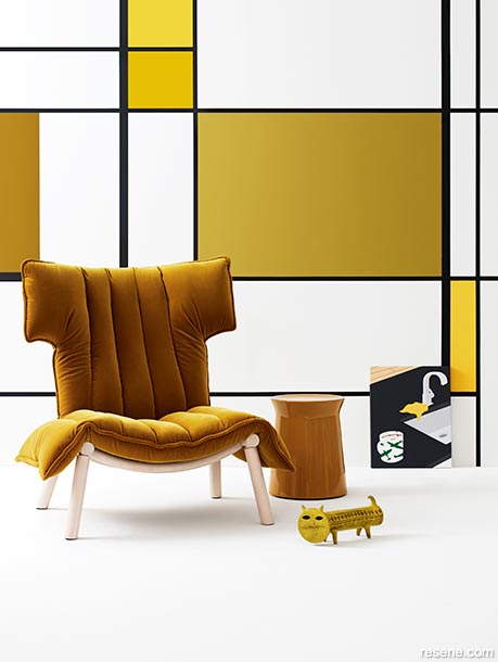
Use a tonal scheme instead with gold and ochre shades such as, from left, Resene Stinger, Resene Half Alabaster (also on floor), Resene Ipanema (top), Resene Funk, Resene Lemon Ginger, Resene Galliano. Grid in Resene All Black.
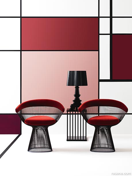
Go for a glamourous interpretation with deep burgundy accents softened with pink. From bottom left Resene Blackberry, Resene Half Alabaster (also on the floor), Resene Soothe, Resene Merlot and Resene Persian Red.
There’s no hard and fast rule that says you have to stick to blues, yellows and reds to embrace Mondrian’s style. You can, instead, take Mondrian’s geometric grid form and adapt it to your own colour scheme.
It’s no different to choosing any other colour scheme for your room. Think about keeping to a palette of all-warm or all-cool shades, and aim for a collection of colours that when they’re put together, they make each other better. Opt for shades that complement each other rather than detract or compete with each other.
Experiment with Resene testpots or Resene A4 drawdown paint swatches to see how the colours play off each other, try different dark borders in Resene Charcoal or even Resene Aubergine, rather than straight black and use warmer whites to soften the whole effect.
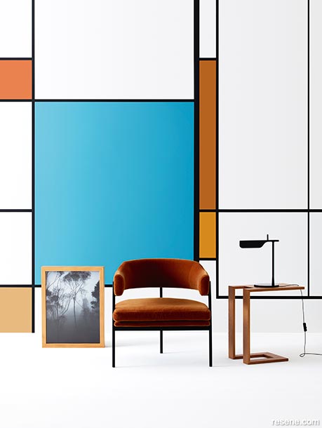
Turquoise and terracotta echo the classic complementary scheme of blue/orange. From left, Resene Tuscany (top), Resene Gold Coast, Resene Hippie Blue, Resene Rusty Nail (top right), Resene Hot Toddy. The white and floor is Resene Half Alabaster.
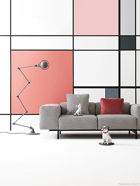
Mondrian-style designs don’t need to be all about brights. Softer tones can add interest and architecture to a space without knocking you out. Here Resene Coral Tree (left) and Resene Paper Doll add warmth to Resene Half Gull Grey (top right), Resene Mako (right, centre) and Resene Regent Grey. The white and floor is Resene Half Alabaster.
If you love the concept of the primary colours but aren’t convinced the boldness of classic Mondrian is for you, or your room, you could consider softer, subtler shades from the same palette.
For example, you could try a more pastel blue like Resene Anakiwa, with Resene Moonbeam yellow and the pinkier red of Resene Vibe. Try a slightly flaxen Resene Half Gin Fizz for your neutral.
Some other colour combinations to try in Mondrian’s abstract geometric grid style are:
Styling by Sarah Lods Set
Design by Karlya Smith Images by Belinda Merrie
Images courtesy of NZ House & Garden


October 15, 2018
Visit your local Resene ColorShop for expert advice and all the products and accessories you need to make the most of your home.
Book a colour consult | Ask a Colour Expert | Ask a Paint Expert
Resene's decorating blog
Paint your home beautiful! Discover the latest decorating trends, tips and colour news.
![]()
Previous «
Kids outdoor projects and ideas
![]()
Blog home
View the latest trends, tips and news
![]()
» Next
Renovating with kids