From the Resene decorating blog
For many years now, the go-to whites of the decorating world have been clean, cool and dense. These ‘cool’ white paints have just enough black in them to create a soft misty feel that provides a serene backdrop for many interior styles.
For the past decade or so, the list of Top 20 paint colours sold by Resene has been dominated by cool whites like Resene Alabaster and Resene Black White – the latter colour was, in fact, formulated 35 years ago.
Now, that’s changing.
Whites are becoming warmer. As with any colour fashion, the type of white we like to use in our homes is cyclical. Back in the day, Resene Spanish White and Resene Pearl Lusta where the most used whites. They were and still are creamy, comforting and very versatile.
Many of the fashion colours this year suit being matched to warm whites. Muted pastels, dusky darks, peaches, rich browns and soft greens are all well supported by creamier, fleecy whites used in trims, ceilings and as a home’s main neutral.
It may be that these whites are more the colour of pale oatmeal or cooked noodles in look rather than less-subtle heavy yellow-creams, but they are definitely warm, not cool.
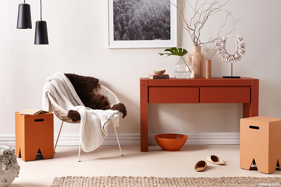
Warm whites look superb with some texture, and rich terracotta accessories. Here Resene Wallpaper Collection Anaglypta 2011 (design RD3360) is painted in Resene Albescent White and paired with a floor in Resene Double Biscotti. The sideboard is painted in Resene Desperado with peg stools in Resene Rumour Has It (left) and Resene Entourage (right). Styling by Gem Adams, image by Wendy Fenwick.
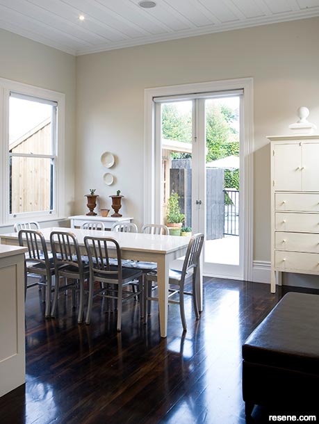
Resene Ecru White is a warm, mutable white used in the dining room of this home. The trims are in Resene Black White. Image by Mark Heaslip.
Whatever the style of white, why is it such a mainstay of our home decorating?
White is a timeless colour that allows you to change out your furniture and accessories to ring in the fashion changes. White is an elegant colour, and gives a sense of refinement. It’s a relaxing colour, which can help reduce visual busy-ness. There is also a distinct geographical preference for warm versus cool whites. In warmer, northern areas of the country, grey whites are popular. But in cooler, southern climes, warm yellower whites are more commonly used.
Whites used within a scheme are best used as one temperature or another, not a mix of cool and warm.
Faced with an array of white paints, it can be difficult to determine which is cool and which is warm.
Resene make it easier by including a colour code on their palette cards, printed in underneath a paint swatch in the right-hand corner. If the code starts with Y, that means yellow, therefore warm. If it starts with N, that stands for neutral, and therefore cool. G means green, which indicates an interesting white: green is made up of blue (cool) and yellow (warm) so these whites are high mutable, changing in character depending on the light and situation.
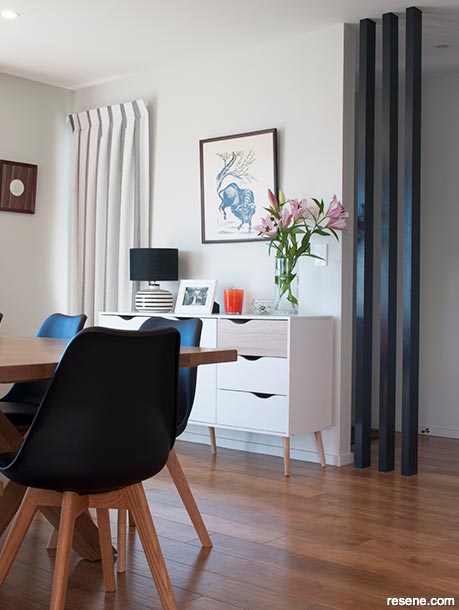
The warm fleecy white of Resene Double Merino walls is a good backdrop for more colourful furnishings. The feature posts are in Resene Foundry.
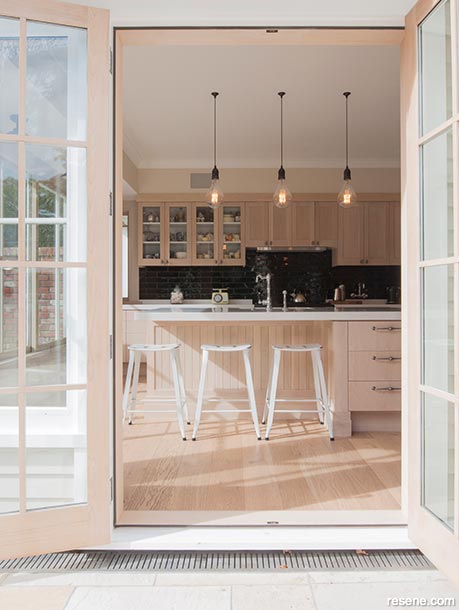
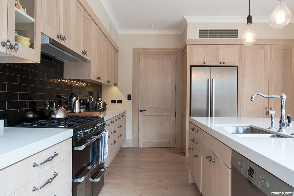
Oak kitchen cabinets finished in Resene Colorwood Whitewash are complemented by warm white walls in Resene Spanish White and trims in Resene Quarter Villa White. Image by Juliet Nicholas.
Some paint colours cross from one base to another depending on their strength, for example, Resene Half Pearl Lusta’s code starts with a Y but Resene Quarter Pearl Lusta starts with a G. The science of paint is intriguing.
Resene has the perfect tool to help with the search for the right white. The Resene Whites & Neutrals collection is home to a host of whites as well as darker neutral colours – greys, beiges and blacks. It’s made up of 28 palette cards, with 12 individual colours on each card, often organised into colour ‘families’ or varying strengths of the one colour. Some of the colours have up to six strength variations, which can help build a tonal colour scheme.
Crossover whites to try – with a green-base these whites can go cool or warm, depending on the situation.
More than any other colour, whites and off-whites are influenced by other elements in the room. If you have off-white walls and a lot of green accessories, expect your walls to take on a green look. Use a strong blue rug or furniture, and your walls will pick up on the blues.
Different parts of the room also reflect light differently. An off-white used under a window will look darker than the same colour used on the opposite wall. An off-white used on the ceiling will look much darker than the same colour on the wall because there is less light reflected. Use a half or quarter strength of your wall colour on your ceiling to ensure the two are well balanced.
The subtle undertones of off-whites combined with your lighting and furnishings can make the colour seem very different to the colour chip, even though they are the identical colour. This is because the lighting, the amount of the colour and colour reflections from the furnishings can make your eyes view the colour differently.
June 28, 2018
Visit your local Resene ColorShop for expert advice and all the products and accessories you need to make the most of your home.
Book a colour consult | Ask a Colour Expert | Ask a Paint Expert
Resene's decorating blog
Paint your home beautiful! Discover the latest decorating trends, tips and colour news.
![]()
Previous «
Cosy up the Colour
![]()
Blog home
View the latest trends, tips and news
![]()
» Next
Colours that make you smile
![]() Get inspired ! Subscribe
Get inspired ! Subscribe ![]() Get saving ! Apply for a DIY card
Get saving ! Apply for a DIY card
![]()
Can't find what you're looking for? Ask us!
Company profile | Terms | Privacy policy | Quality and environmental policy | Health and safety policy
Colours shown on this website are a representation only. Please refer to the actual paint or product sample. Resene colour charts, testpots and samples are available for ordering online. See measurements/conversions for more details on how electronic colour values are achieved.
What's new | Specifiers | Painters | DIYers | Artists | Kids | Sitemap | Home | TOP ⇧