From the Resene decorating blog
Learn how to avoid or fix common home decorating mistakes with the help of Resene.
Sometimes your finished, renovated or redecorated space just doesn’t quite match the vision you’ve had in your head. Maybe something’s just ‘off’ about the finished look but you just can’t quite put your finger on what.
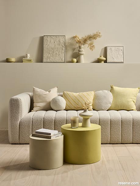
Layering tonal colours can lend a room depth if you want to keep your colour palette neutral.
These walls are painted in Resene Meringue with floor finished in Resene Colorwood Breathe Easy. Large table in Resene Illuminate, small table in Resene Coconut Cream, large DIY artwork in Resene Creme De La Creme, small artwork in Resene Double Spanish White, coffee table case in Resene Meringue and wooden bowl in Resene Yuma. Couch from Nood, cream linen cushion from The Warehouse, ball cushion from Adairs, striped cushion from Freedom, round cushion from Mocka. Project by Vanessa Nouwens, image by Bryce Carleton.
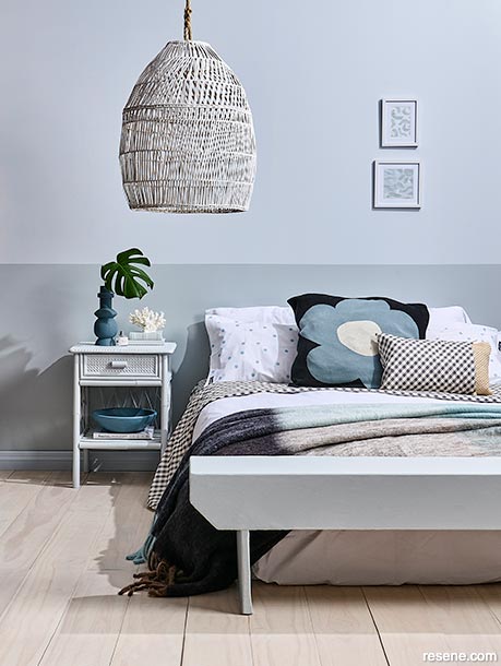
A darker lower wall can help give the impression of higher ceilings and an airier room.
This lower wall is painted in Resene Duck Egg Blue with upper wall in Resene Breathless. Skirting board in Resene Breathless, floor in Resene Colorwood Breathe Easy, lightshade in Resene Colorwood Whitewash, bedside table in Resene Half Duck Egg Blue and bench seat in Resene Duck Egg Blue. Bedlinen, throw and flower cushion from Small Acorns. Project by Annick Larkin, image by Bryce Carleton.
Here’s some common oversights or mistakes home decorators make that can throw off your finished look, with tips from Resene on how to avoid or fix them.
Like any good decorating task, the best way to get the outcome you want is to do plenty of planning first.
Resene Colour Expert Rebecca Long says one of the best ways to ensure a satisfying end result for your project is first to define your style, or the overall theme you want. The simplest way to do that, she says, is to start saving images of rooms, colours and pieces that inspire you.
“This will guide your design choices and will ensure a cohesive look. Once you have saved a few images take a step back and note the similarities between the images. Chances are your desired style will form quite quickly.”
Rebecca also suggests adding personal aspects to your desired look.
“Add personal touches. The best schemes are created with your personality and will transform your house into a home.”
These personal touches can also help bring cohesion to the finished look; sometimes the theme to your finished room can be simply the things you love!
It’s a good idea to put some thought into what your room is, or will be, used for and plan the layout so it works for those uses.
“Arrange furniture and other elements in a way that promotes easy movement and functionality and take into account factors like natural light and views when arranging the layout,” Rebecca says.
Things to consider as you plan your layout include:
All of these things can impact your sense of comfort and satisfaction in the finished space. Most rooms in family homes will have multiple uses through the day so it’s important to consider all of those uses in planning your finished design.
“If you need the room to be multi-purpose, introduce a colour that can be used both night and day,” Rebecca says.
“A dusty, raw terracotta such as Resene Tuscany can bring you energy during the day when paired with bright morning sun, and comfort at night when paired with dimmed accent lighting.
“Resene Time Traveller on the other hand will add depth to a cosy night in but may not give you enough energy during a summer’s day.”
Scale is another important consideration in how your finished space looks and feels. It comes into play when choosing elements for your interior space like patterned wallpaper and wall art as well as ‘hero’ feature pieces of furniture or decor.
For example, putting a huge oak dining table into a small, modern living or dining area will throw off the look. The space will seem crowded and feel much smaller than it already is. The same is true for other items like shelving units, couches or even televisions.
Consider how much ‘white’ or blank space is left in a room around your furniture. Your room can feel small and a bit claustrophobic if every bit of wall has something on it or against it. Leave some surfaces uncovered and some walls unadorned with art or mirrors.
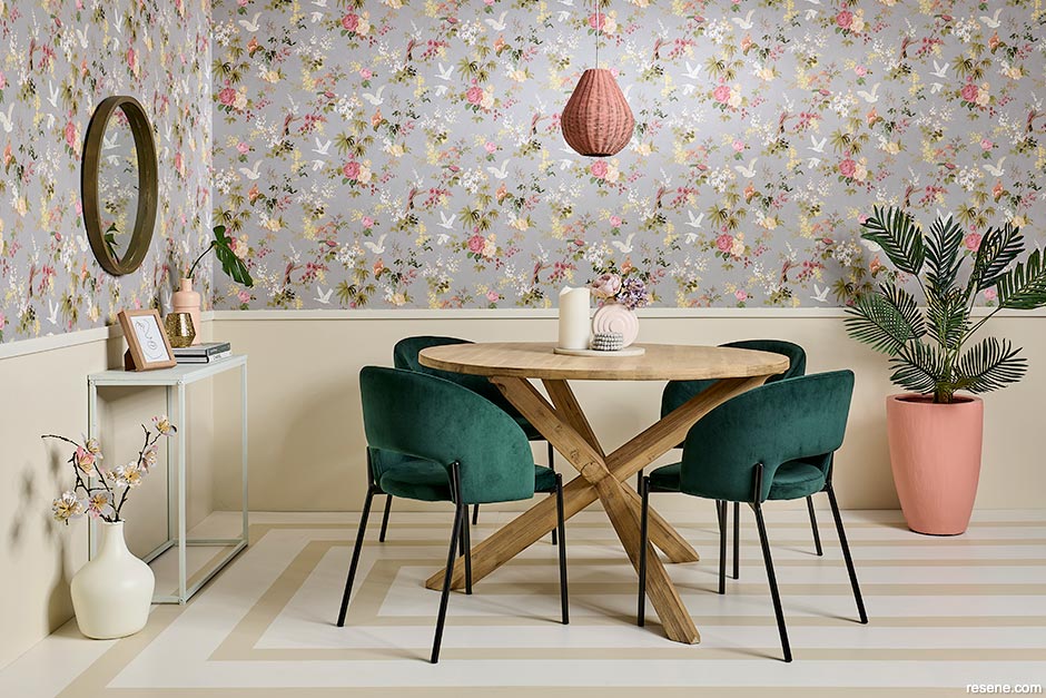
When it comes to choosing a wallpaper pattern, however, going for a larger scale, open-style repeating pattern like Resene Wallpaper Collection 291406 can work better on blank stretches of wall as they’ll add depth and a sense of space.
If you have a space that is feeling too cavernous or too claustrophobic, you can use Resene paint colours to create optical illusions that will bring things back into scale.
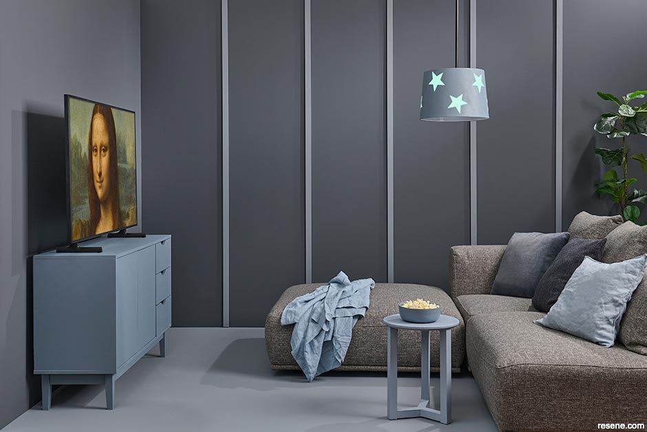
To make large rooms feel cosier use a dark colour on all the walls, but avoid going all the way to the ceiling. Paint the top section of the walls and the ceiling in the same contrasting colour. Try a shade like fresh on-trend green like Resene Wabi Sabi. Then paint the top section of the walls and the ceiling in the same contrasting colour such as Resene Rice Cake. You can also create the same effect with a more neutral palette by using Resene Perfect Taupe on the walls and Resene Half Thorndon Cream up high.
To lower an over-high ceiling, paint your lower walls a lighter shade like Resene Soapstone and paint the ceiling and upper section of the wall in a dark shade like Resene Nero.
How high you make the change in colour will depend on the dimensions of your room, and what you’re trying to achieve but a good place to start is to go just above the tops of your doors.
To shorten a long, narrow room, paint the long walls in a lighter colour like Resene Creme De La Creme, and the end walls in a darker colour like Resene Funk to make the room feel shorter.
To add a sense of width to a room, paint the floor and ceiling in the same or similar darker colour, then make the walls a lighter shade. Try something bold like a ceiling and floor in charcoal Resene Tao Grey with walls in fresh Resene White Pointer, or go more minimalist by using different colour intensities of Resene Thorndon Cream, triple strength on the floor and ceiling, and quarter strength on the walls.
Other ways to play with room proportion are with vertical stripes or battens for an added sense of height and horizontal lines to play with width and depth.
One of the most common sources of frustration or concern in a room design is how colours are working together.
To start with Rebecca suggests selecting a colour scheme that complements your style, taste, and the desired mood that you’re wanting to create.
“The best colour schemes are chosen with your personality in mind. Do you have a particular piece of furniture, artwork, or accent piece that you love and want to highlight? Are you currently making the most of it within your space?
“A striking painting, for example, can be elevated by pulling out one of the colours in the painting and painting it on the wall behind.”
To get it right, the most important thing to do is test your colours before you commit, she says. “Both natural and artificial lighting can significantly impact how a colour appears. It’s important that you view and understand your colour in multiple lights before to ensure you make an informed decision.”
To do this, paint a series of A2 cards with your Resene testpots, leaving a 2cm wide border around the edge. This will help the colours appear true, rather than being affected by your current wall colour. Make sure to test your cards against furniture, carpet, curtains and other key decor features at different times of the day.
The other trap with colour, that can leave your room feeling flat and disappointing, is to play it too safe and opt only for ‘safe’ shades like beige neutrals. A white-on-white or all-neutral palette can look extremely chic and elegant but rather than just one colour everywhere, look at using different strengths of that colour or a range of tonally similar neutrals.
For example, Resene Spanish White comes in eighth, quarter, half, double and triple strengths which could be layered together for a look with depth and complexity. Or if you like soft blush beiges such as Resene Wafer, layer it with Resene Blanched Pink and Resene Albescent White.
Overall, how your finished room feels will be unique to you, based on what you like and what you are aiming for. One of the reasons paint is such a useful decorating tool is that it is easy and inexpensive to change if something doesn’t feel right.


July 30, 2023
Have a chat to your local Resene Colour Consultants instore for advice on the colour combinations that will work best for you, and what you are trying to achieve, or book a colour consultation.
Book a colour consult | Ask a Colour Expert | Ask a Paint Expert
Resene's decorating blog
Paint your home beautiful! Discover the latest decorating trends, tips and colour news.
![]()
Previous «
Damage control
![]()
Blog home
View the latest trends, tips and news
![]()
» Next
Minimalism without austerity
![]() Get inspired ! Subscribe
Get inspired ! Subscribe ![]() Get saving ! Apply for a DIY card
Get saving ! Apply for a DIY card
![]()
Can't find what you're looking for? Ask us!
Company profile | Terms | Privacy policy | Quality and environmental policy | Health and safety policy
Colours shown on this website are a representation only. Please refer to the actual paint or product sample. Resene colour charts, testpots and samples are available for ordering online. See measurements/conversions for more details on how electronic colour values are achieved.
What's new | Specifiers | Painters | DIYers | Artists | Kids | Sitemap | Home | TOP ⇧