From the Resene decorating blog
Green. Is it any wonder we love using it in our interiors? It has strong associations with nature, the environment and new growth. Soft greens are soothing and tranquil. Deep greens are warm and luxurious.
Pick a mood and you’ll find a shade of green to suit. It also sits at the centre of the colour spectrum, so represents balance – and means it goes well with a lot of other shades. This makes it a universally popular colour for home decorating, and green shades are continually among some of the most popular colours for Resene customers.

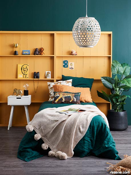
Bluey greens and soft gold are a softer, modern spin on the classic green and yellow combination.
Wall painted in Resene Palm Green, contrasting bookshelf bedhead in Resene Noosa, bedside lamp in Resene Nero and side drawer and pendant lamp in Resene Quarter Sisal. Duvet and pillowcases from Adairs, brass tiger from Nood, tiger covers and raffia cushion cover (on floor) from H&M Home, bamboo pendant light (painted in Resene Lustacryl in Resene Quarter Sisal from Bed Bath & Beyond, postcard set from Father Rabbit, book, toys and paperweight from Little Whimsy, planter, faux palm, floor runner, hanging fern from Freedom, chair and stool from Williams Road, animals and round art canvas from Look Sharp, flooring from Carpet Court. Project by Vanessa Nouwens, image by Wendy Fenwick.

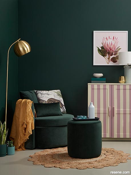
Pink and cream stripes add a nostalgic but fresh note to this deep green backdrop.
Walls painted in Resene Palm Green, floor in Resene Greige, cabinet in Resene Double Spanish White with stripes in Resene Vintage, large plant pot in Resene Palm Green, small pot in Resene Cutty Sark, tabletop lamp in Resene Midwinter Mist, low bowl in Resene Bubble White and coffee table vase in Resene Blue Smoke. Chair, cushion and ottoman from Contempa, lamp from Freedom, candle from Illumina. Project by Annick Larkin, image by Bryce Carleton.
Our use of the colour has evolved over the decades from the avocado greens of the ’60s, the muddy greens of the ’70s, through the grass and neon greens of the ’80s, the grungy khakis of the ’90s, the lime greens of the 2000s, the pastels of the 2010s, up to now where forest and sage greens are leading the way – but matched with a little bit of everything that has gone before.
One of the colour combinations of the moment is pink and green – which might seem unexpected until you think about a beautiful bunch of pink toned flowers atop with their green stalks and leaves. Suddenly it seems like the most natural pairing in the world.
Try bright shades of both, like Resene Chateau Green and Resene Carissma, for a candy stripe effect that is lively and fun for a kid’s bedroom. Calm it all down with trim in a fresh neutral like Resene Rice Cake.
For something a little more luxurious and mature, opt for deep greens like Resene Palm Green with dusky sunset pinks such as Resene Blossom or Resene Viola. These work particularly well with lush fabrics such as velvets or satin. Finish with deeper creamy neutrals such as Resene Tea or Resene Parchment and add touches of bling in copper or rose gold.
In a room dominated by ever-popular ethereal blush shades such as Resene Pot Pourri, accents of deep sage such as Resene Yucca will bring it back down to earth.
For a more dreamy combination, perhaps in a bathroom, go pastel on pastel with Resene Summer Green and Resene Provincial Pink, matched with a crisp white such as Resene Black White.
For something ultra-modern and stylish opt for a cloudy pink such as Resene Pale Rose paired with an olive-toned khaki such as Resene Fiji Green.
There is a shade of pink to suit every shade of green!

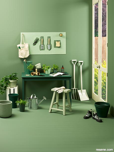
A green hideaway for green fingers.
Walls and floor painted in Resene Rivergum, table in Resene Palm Green, stool in Resene Bud, doors in Resene Black White, pegboard in Resene Nourish with tools outlined in Resene Rivergum, pots painted in Resene Nourish, Resene Bud, Resene Palm Green, Resene Rivergum, Resene Secrets, Resene Peace, Resene Middle Earth, Resene Paddock, Resene Mangrove, Resene Spanish Green and Resene Celtic and crate in Resene Rice Cake. Boots, Fern Garden tools and growing kit from Bed Bath & Beyond, spade and fork from The Warehouse, lotion, candle and bag from The Aromatherapy Company. Project by Vanessa Nouwens, image by Mel Jenkins.

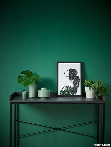
White and pale greens add drama to this already dramatic combination.
Wall painted in Resene Mother Nature, desk in Resene Noir, vases in Resene Peace and plant pot in Resene Silver Chalice. Artwork by Linn Wold from Popmotif, vase from Shut The Front Door, carafe and glasses from Allium. Project by Vanessa Nouwens, image by Melanie Jenkins.
Shades of green are part of many classic colour combinations. Some of its most famous dance partners are red, yellow, gold, white, black, and, of course, other tonal shades of green.
The fun part is finding ways to express those traditional colour partnerships in new ways that make the most of today’s on-trend shades.
For example try Resene Smoky Green with a deep mustard yellow like Resene Hacienda, add some black highlights in Resene All Black and a cream neutral like Resene Half Spanish White.
A vibrant spin on green and red is to try Resene Conifer with the deep drama of Resene Volcano. And a warm, modern version of green and white is to go dark and creamy with Resene Middle Earth and Resene Bubble White.
For an updated Scandi look, stain your timber surfaces with the grey-green of Resene Colorwood Crowshead and layer with painted tones like Resene Spanish Green, trimmed in the crisp white of Resene Alabaster.
Greens, particularly darker shades, also work well with metallics, but aim for a lived-in look – slightly tarnished brass, gold with a flat finish or gun-metal silvers. To flip the idea on its head try Resene Gunmetal with accessories in pops of bright green metallic Resene Go Go Go.
If you want to think outside the box, green is an excellent colour to play with because it’s such an easy-to-love shade, it makes more unexpected colour combinations easier to accept.
Blue and green are often followed by the phrase “should never be seen” but tweak the combination slightly to a navy blue like Resene Prussian Blue with a minty tone such as Resene Green Apple and you have a winner.
A quirky spin on green and pink is a forest shade like Resene Cardin Green with a soft lilac such as Resene Maverick. Another one to experiment with is a dark mossy green such as Resene Verdun Green with a rich purple like Resene Plum or Resene Violent Violet.
The rule to keep in mind if you’re wanting to mix and match colours in unexpected ways, is that the end result should make all the colours look better; they should all be enhancing the overall space – rather than competing for attention.
Resene Colour Match Online is excellent at helping you work out what goes with what or ask a Resene Colour Expert at your local Resene ColorShop.
Resene has many green-toned neutrals in its range that are extremely popular as a wall colour or as trim to make other shades pop.
These shades such as Resene Secrets, Resene Kangaroo and Resene Ash are great building blocks from which to start layering graduated tonal greens such as Resene Flax, Resene Paddock, Resene Rivergum and Resene Forest Green which will bring out the base green notes in your neutral.
These neutrals also provide a good balance for other bold shades such as dark blue Resene Avalanche, dark red Resene Persian Red and khaki Resene Kokoda.
May 23, 2021
Visit your local Resene ColorShop for expert advice and all the products and accessories you need to make the most of your home.
Book a colour consult | Ask a Colour Expert | Ask a Paint Expert
Resene's decorating blog
Paint your home beautiful! Discover the latest decorating trends, tips and colour news.
![]()
Previous «
Design a talking point – create eye-catching video backgrounds
![]()
Blog home
View the latest trends, tips and news
![]()
» Next
Use colour to create space