From BlackWhite magazine - issue 05, gold standard
Years of meticulous renewal return the Hastings Municipal Building to its original majesty – and then some.
Undertaking a significant refurbishment of a heritage building is often far more difficult than building new, but the preservation of such historic gems is a worthy and noble pursuit. When the dust has cleared and the doors have been flung open once again to welcome the community back within a beloved building’s walls, there are few more gratifying experiences for a project team.
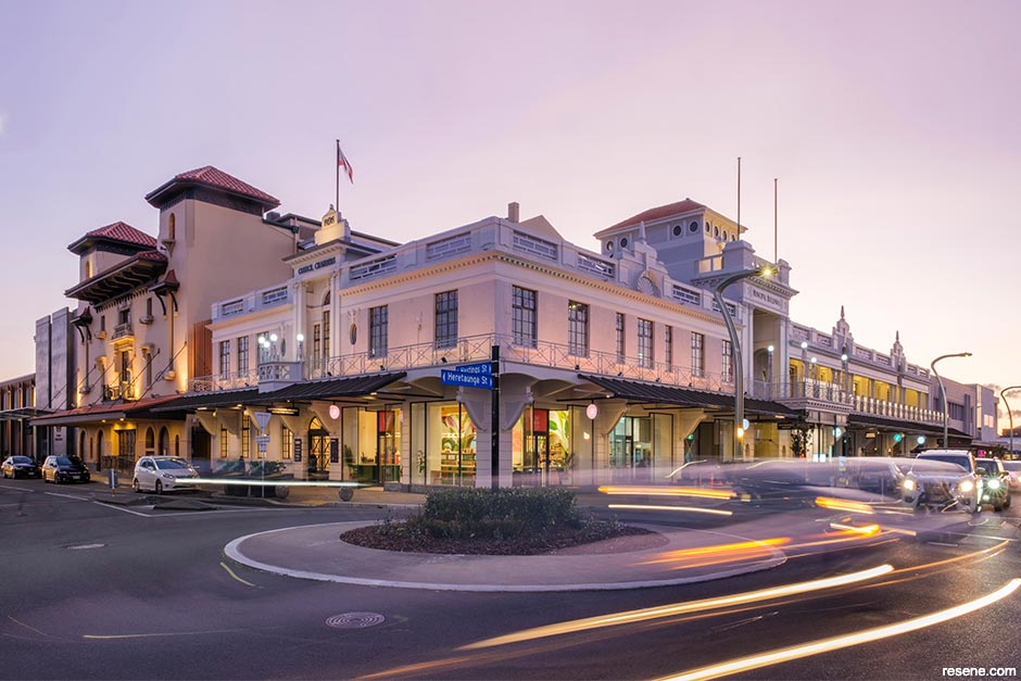
The Municipal Building is one of Hastings’ most cherished buildings. Constructed in 1916 adjacent to the Municipal Theatre to provide new premises for the Hastings Borough Council, it originally included council chambers and offices, a ballroom-style assembly hall and ground-level retail shops. Following a design competition, architect Albert Garnett’s submission was selected for its distinctive balconies, tower, entries, verandas and shop fronts. Since opening more than a century ago, the Edwardian Free Classical style building has been a prominent landmark and played an enduring role in the civic and community life of the city.
In 2014, the Municipal Building was closed until important seismic upgrading and redevelopment could be undertaken, which commenced in 2018. While the Category 1 heritage listed structure had survived the 1931 Napier earthquake and been subsequently repaired, considerable efforts were needed to ensure this treasure would continue to stand strong for many decades to come. The project was also the final piece of the Toitoi – Hawke’s Bay Arts & Events Centre puzzle, which included the earthquake-strengthening and refurbishment of the Opera House and redevelopment of the former plaza to create a new multi-use space, Functions on Hastings – an eight-year-long endeavour, all in.
While seismic upgrading was important for ensuring the safety and soundness of the building, returning its exterior and interior designs to their former grandeur went hand-in-hand with the structural works. Guided by research and site investigations, Matthews & Matthews Architects were charged with the monumental job of architectural specification, interior design and colour selection both inside and out – and they were fastidious in selecting hues that would be true to the building’s original character.
“The colours used for the exterior and interior focused on the heritage values of the original design and were based on evidence of early colours, reflecting the same placement of tone as well as the generally light rendered finishes and materials originally used,” explains Jane Matthews of Matthews & Matthews Architects. “Historic photos show that the original exterior colour scheme was crisp with a light colour to the rendered pilasters, cornices and parapet. An article in the Hastings Standard printed on 12 April 1917 noted ‘the elevations have been delicately treated with a wash of sulphate and hydrated lime in two colours.’ Resene helped us to identify a range of exterior and interior colours that suited the historic materials and details throughout the project, including Resene Triple Merino, Resene Eighth Friar Greystone, Resene Grey Friars, Resene Black White, Resene Rakaia and Resene Half Putty.”
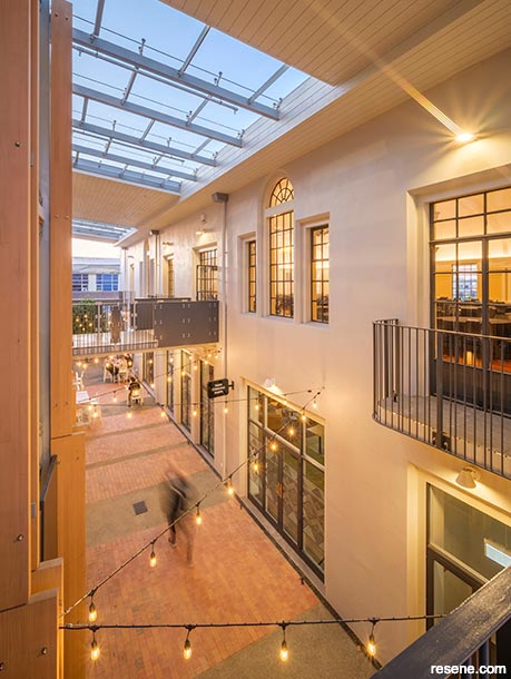
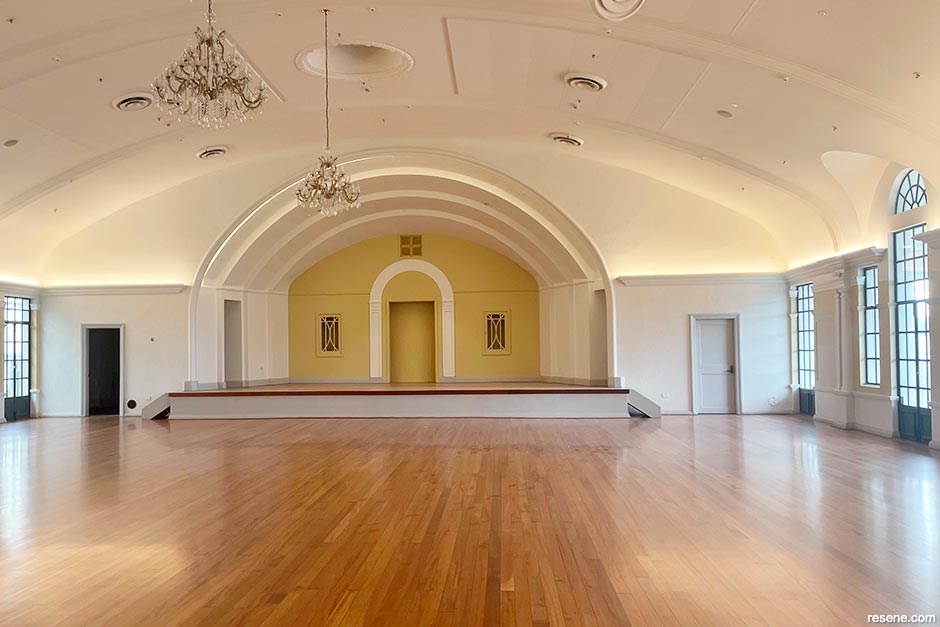
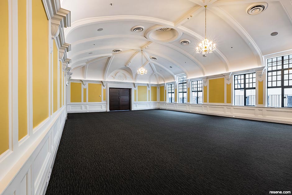
Jane says that recovering original qualities of natural light through reinstated windows, light wells and connection to the laneway was also integral to the project. “The interior of the Hastings Municipal Building was originally light and airy, with white ceilings and walls and varnished timber joinery and trims. Interior colours were investigated on-site through scrape backs and with reference to written descriptions and available historic photos. Early colours evident in the Shakespeare Room and Assembly Ballroom involved soft natural colours, including pale ochre and pale terracotta. Our approach was to reflect the early appearance of the building with some adaptation – taking into account changes over time. Consideration was also given to the relationship of proposed exterior colours to the adjacent historic Opera House and the surrounding Central Character Precinct.”
Minimising the effects of the structural strengthening on the heritage qualities of the building was another a key part of the project. “In such a highly decorative and ornamental building, this was a complex and challenging design process,” says Jane. “New structural elements were carefully designed to minimise the removal of original heritage fabric. Strengthening works have been concealed or designed and detailed to meld with the original building, maintaining the quality of the heritage spaces. Historic fabric and detailing throughout the building have been retained as original or reinstated where needed.”
The team was unquestionably successful in this pursuit, and some have commented that the building might be even better now than the day it opened in 1917. “We love the lightness that the colour palette has recovered – particularly at street level – where the original shopfronts with recessed entries have been reinstated. The beautiful green Middle Earth tiles are also a very close match to those originally used at the base of the shopfronts,” adds Jane.
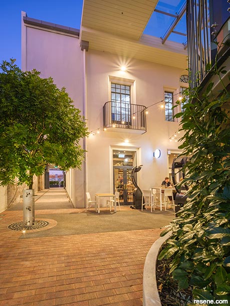
“The Municipal Building was built for the community and it’s an important part of the shared memory of Hastings. It is amazing to see it strengthened both literally and in terms of the role it plays in the life of the city. Our concept began with a story of light: to bring back the light and energy of the community. Recovering its lightness is such a great outcome. Reinstating lightwells has allowed natural light to welcome you in and through the building, and to connect to the wonderful Opera Lane. Being able to see through the building now, with natural light on both sides, has really made the building more accessible and easier to navigate. The project has made it an inviting place to visit and use.”
Did you know? Resene developed a set of colour guidelines in conjunction with leading conservation architect Ian Bowman which reflect various historical periods, culminating in the creation of the Resene Heritage colour chart. For those wishing to recreate historically-accurate colour schemes from an earlier era, it's an ideal place to start. Order a chart free online at www.resene.com/specifierorder.
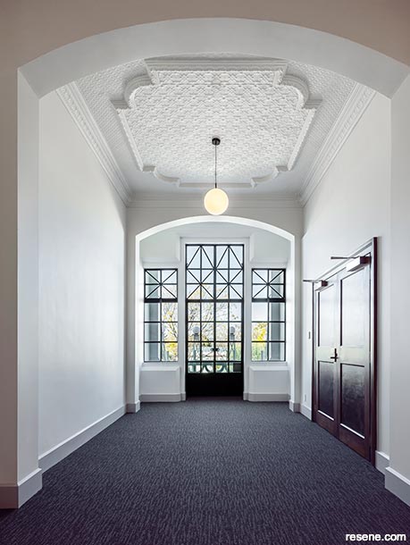
Jane complimented the skilled painting of the new and historic materials and decorative details, including the original fibrous plaster detailing, pressed metal ceilings and joinery, revealing the beauty of these elements. It was Gemco Construction who completed both the build and painting on the project, and Construction Manager Eddie Holmes believes it was perhaps the most challenging but also the most rewarding job of his career.
“There were an awful lot of challenges,” he says. “Logistics are always a big one, because you’re working within the confines of a building with very small spaces and having to load in a lot of steel and reinforcing concrete – and also having to get in there to physically box in the formwork. With this type of work, we sometimes have to do invasive exploration to see what the structure is actually comprised of so that the strengthening can be done – but it has to be done in such a way to disguise it and fit in with the style of the original architecture. Of course, it also creates an awful amount of noise and dust and dampness, which makes for a less than ideal environment for the workers. When you’re doing things so carefully, the duration of the project ends up being quite long and those are difficult conditions to be in day in and day out for the better part of three years.
“Because the interior plaster systems were failing in the areas where we hadn’t poured the new structure, the old paint was falling off, so we had to effectively go back to brick and start again in order to paint it. It was a huge job, but it all went really well. There were also some very intricate pressed metal ceilings and cornices that had to be rebuilt because of water damage over the years. It was very, very challenging to get it back to a place where we could apply the new paint system. Resene guided us on what products to use to fill in the chips, and I’m just so impressed with how the pressed ceiling and cornices came up. Because they don’t make the same ones now as they did back then, we had to take down some sections, make moulds of them and recast them – but you wouldn’t even know it.”
Despite the outbreak of a global pandemic during construction, Eddie felt the timing of one of New Zealand’s stricter Covid-19 lockdowns offered at least some positive benefits. “The lockdown was a fantastic time to give the guys a break, but then we also had an uninterrupted period where we were able to go back to work before others were and that made some things easier. And because we use a lot of commercial products, we weren’t up against the same types of shortages that residential projects were because the special runs we needed were still available. We were able to pre-order and adjust our plans accordingly.”
For Eddie, one of the best outcomes was in the Assembly Ballroom. “The original building was built in 1916, and then in 1924 they added a dining room on. In doing so, they blocked all the windows and doors down one side of the ballroom and it made it very unbalanced and a lot darker. We demolished the dining room and put steel doors and windows in to match and it just looks brilliant in there now. There was only about eight years when people could enjoy that character in there and now we’ve just finally been able to put it back.
“It was fantastic, particularly on the opening day – just like seeing the Opera House coming back to life again. To see it now, it’s probably back up to the wow factor of the day they opened it over a hundred years ago. It looks really, really smart now and it’s great seeing it pumping with people.”
top tip Lower sheen finishes, like Resene Lumbersider Low Sheen outside and Resene SpaceCote Low Sheen and Resene SpaceCote Flat inside, are sympathetic to old, weathered surfaces and help with disguising surface imperfections.
Hastings District Council Arts and Culture Manager Megan Peacock-Coyle shares many of the design and build team’s sentiments. “We have had such positive feedback from the community and had approximately 4000 people through on our open days when we first opened,” she says. “My favourite outcome is definitely the way the building has opened up so that light flows through, from top to bottom and from street to laneway. The high ceilings create and enhance the grandeur of the beautiful building and allow a spacious and relaxed journey throughout all the spaces. The layout has also prompted our community to explore the building and laneway and to move in and through the tenancies with ease.”
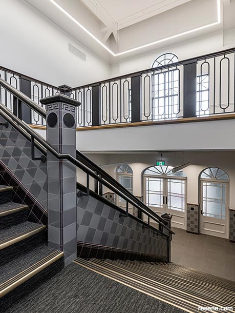
Megan also feels the Resene hues chosen for the interior and exterior of the building greatly enhance the finished effect. “The colour scheme is beautiful without being obvious, it ensures the building maintains its heritage and complements the stairs and balconies. The choices made were very considered; it is subtle but also creates a feeling you are in a majestic building.
“It definitely ‘took a village’ to complete this project and it was exciting to work with the project team on all the elements of the build. Being involved on a project this big was an adventure and allowed many learning opportunities. The most important aspect of our role, as the operational team at Toitoi, was to understand all the reasoning behind choices being made so that we were able to engage, enhance and complement them as we added our final touches. It was a real pleasure to work with Matthews & Matthews Architects on this project. They were incredibly approachable, creative and helpful, and now we have such an amazing result.”
› To learn more about the Hastings Municipal Building and the other components of the Toitoi – Hawke's Bay Arts & Events Centre project, visit www.toitoivenues.co.nz and www.hastingsdc.govt.nz.

Architectural specification, interior design and colour selection: Matthews & Matthews Architects.
Build and painting: Gemco Construction.
Images: Simon Cartwright and Andrew Caldwell.
This is a magazine created for the industry, by the industry and with the industry – and a publication like this is only possible because of New Zealand and Australia's remarkably talented and loyal Resene specifiers and users.
If you have a project finished in Resene paints, wood stains or coatings, whether it is strikingly colourful, beautifully tonal, a haven of natural stained and clear finishes, wonderfully unique or anything in between, we'd love to see it and have the opportunity to showcase it. Submit your projects online or email editor@blackwhitemag.com. You're welcome to share as many projects as you would like, whenever it suits. We look forward to seeing what you've been busy creating.
Earn CPD reading this magazine – If you're a specifier, earn ADNZ or NZRAB CPD points by reading BlackWhite magazine. Once you've read an issue request your CPD points via the CPD portal for ADNZ (for NZ architectural designers) or NZRAB (for NZ architects).