From BlackWhite magazine - issue 01, retail therapy
Colour and creativity are key to keeping customers coming back for more.
The advent and popularity of online shopping has had a monumental impact on our lives and the way that we purchase the items we need – and often many we don’t.
But Australasia is uniquely placed. Due to the logistical complications of our geographic location, we are underserved by some of the online shopping titans that hold a greater market share in other parts of the world. This offers a rare advantage to our homegrown brands and local shops to step up and fill that gap.
Driven by psychological and behavioural science, designing a retail space is as much an aesthetic exercise as it is a marketing one. While customer service, quality products and ethics all undoubtably contribute to brand reputation, when it comes to what we consider to be our favourite retail brand, the physical customer experience of shopping is a key factor in why we – quite literally – buy into it.
In order for our clients’ businesses to continue to thrive, it’s important to understand all the nuanced pieces of the puzzle that not only get people in the door, but keep them coming back for more – especially since so many of them are embedded into the design and decorating phases.
While getting customers to stay in a shop long enough to make a purchase is a challenge in and of itself, the other half the battle is coaxing them to enter it in the first place. From a simplistic point of view, customers visit a retailer to upgrade some aspect of their lives. There is a problem that needs resolving or a need to be fulfilled. But what makes them choose to enter one store over another? More often than not, it’s because they feel that the visual merchandising represents who they are – or who they aspire to be.
A savvy retail designer puts themselves in the target customer’s shoes to discover their motivations. What will motivate a customer differs by age group, lifestyle, income bracket, education level and more. But whoever they are, to some extent, they’ll want to be dazzled.
This ‘persona’ can be leveraged throughout the design process as you create a story from the front door right through to the back wall, with a strong and continuous concept from the welcome to the farewell.
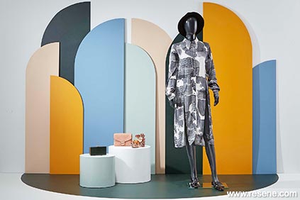
One of the primary ways to grab a potential customer’s attention is with the first interface that they’ll encounter: the window display. The way in which products are presented and grouped together here can put a customer’s imagination to work and sets the scene for what else can be expected beyond the threshold.
Consider what implements shop owners are going to need to make the most of their displays, both at the front of the store and throughout. Just like how a mix of shelving and racks is useful for housing the bulk of the merchandise, creating a series of modular plinths and backdrops that are both easy to stow away and to move about will help clients easily showcase different types of items. Adding lockable castors on the bases of heavy displays is not only a spine saving measure, it’ll make regularly rearranging the store layout a breeze.
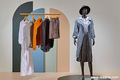
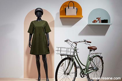
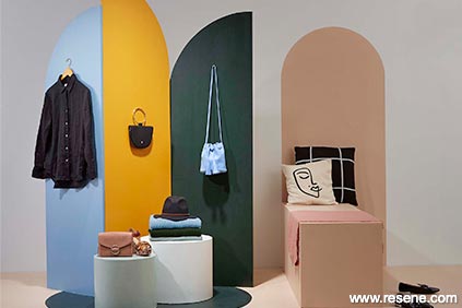
Colour is arguably the strongest tool at a retailer’s disposal when it comes to catching customer attention. While well-outfitted mannequins can be effective at drawing the eye, graphic backgrounds are what gives displays action and ties it all together.
In a high-wearing commercial setting like a retail store, paint is an affordable and amazingly effective means to keep it looking fresh, clean and current. There are very few exceptions to what can’t be painted – it’s usually just a matter of doing the right prep and choosing the right products. Plus, the hues chosen will help to create the right level of emotion or drama to suit the product offerings.
“The colour selection within a retail setting really has the ability to improve customer experience and mood,” says Rachel Martin of Bubble Interiors. “Certain colours will create a calm atmosphere while others can be energising.”
“Be strategic when using reds in a retail setting as this is a colour that makes people feel energised and restless. While it’s an excellent choice for fast food settings, which want to keep people moving for a fast turnover, it’s not a colour you’d want to use in large quantities if you want to encourage customers to stay and browse,” she says.
Trends in decorating, colour and finishes often stem from fashion, so it’s smart to look to the runways for inspiration if you’re looking for that cutting edge vibe. But another approach is to create a unique experience through a theme that connects with the brand.
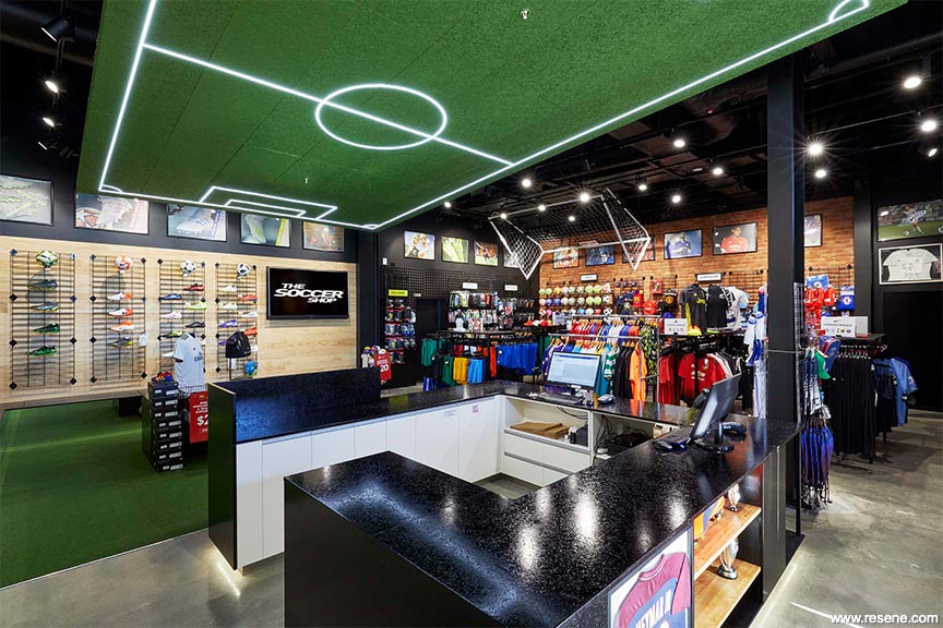
“The aesthetic our team created for The Soccer Shop (pictured opposite) totally works with their product range and for their customers to create the energy of a big soccer game.”
For walls, Resene SpaceCote Low Sheen is a durable finish that can be wiped clean of everyday fingerprints and smudges. For most furniture, joinery, displays, backgrounds, trims, mannequins, racks, hangers and the like, Resene Lustacryl semi-gloss or Resene Enamacryl gloss are go-to hardwearing options. But for especially high-wearing furniture, such as the main counter, Resene AquaLAQ is recommended. It’s a full system especially designed for cabinetry, furniture and joinery, from sealer options to colour coat to clear coat finish options, including a complete waterborne system of sealer, colour coat and Environmental Choice approved clear coat.
When repainting a store, choose Resene low VOC finishes to minimise paint odours and disruption. Selecting the right products means a store can have areas repainted overnight and be open for business the next day.
Top tip: Consider the range of products that will be on offer and choose colours that will work to enhance and hero them.
Because the walls of many retail settings are often stocked with product, the ceiling can be a prominent opportunity to make a statement. Instead of white, try one or more colours that connect with your client’s brand. Or try creating a subtle pattern by using the same hue in two different sheens, such as a combination of matt and gloss.
And don’t overlook the hardest working surface in the shop: the floor. Resene Walk-on is a satin general purpose flooring and paving paint made with tough acrylic resins to give maximum durability and abrasion resistance in a single pack finish. It’s ideal for use on floors and steps, including concrete and timber. Where even higher performance is preferred, go for a Resene Uracryl engineered coating for added durability.
While a single colour is a great pick-me-up, look for ways to think outside the box by painting shapes, patterns or directional lines to influence traffic flow and draw even more attention to displays.
What customers see, smell, feel and hear will impact their direct perception of a retailer. Although visual merchandising focuses heavily on aesthetics and what the eyes see – hence its name – don’t overlook the opportunity to create a more immersive experience. Customers browsing products online can only observe with their eyes. But when they enter a store, they engage with all five senses.
Sight – Use visual cues like lighting, colour and balance to direct customer attention to specific products and displays.
Hearing – Music affects how customers interact in and with a store. A playlist with a slower, softer beat will lessen customer pace as they move around the shop floor.
Touch – In-store customers have the ability to touch and feel textures, so allow for easily reached locations in the design to encourage a tactile experience.
Smell – This sense is strongly associated with memory and can allow connection with shoppers on an emotional level. There are even companies that engineer scents to use in their retail locations to put customers in the right frame of mind to spend.
Taste – If food or drink products are on offer, design in a sample table space for seasonal favourites to tempt trial and purchase.
Look for ways to encourage customers to interact physically with the store and displays. Whether it’s allowing for an area to try out a product or an interactive space for kids to see how high they can jump, engaged shoppers are more likely to spend more time in store and return for further visits.
Top tip: Eliminate hazards to customers by removing opportunities for slips, trips and bumps right from the design phase. This could include rounding the corners of shop furniture, or the type of finish you choose for the floor. High-polish tiles might look pretty, but they’re a nightmare to navigate while wearing high heels.
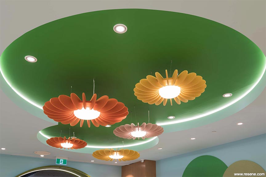
Lighting drastically affects the feeling of space and plays a pivotal role in communicating the vibe and energy of a store. This is something that will vary greatly depending on your client’s target customers. For instance, a children’s toy store should feel warm and friendly while you might be looking for sultry drama in a high-end furniture store or a perfumery. Ensure ambient lighting gives off enough lumens for products to be seen properly, but avoid creating too much brightness or glare. And, look to bulbs with the right ‘temperature’ and colour for the mood you’re trying to evoke.
Track lighting is one of a visual merchandiser’s best friends. It’s extremely useful and adaptable as it can be repointed and manipulated over and over again as displays are refreshed, so be sure to incorporate it in areas where your client will be building product displays, storefront windows and outward facing shelves or racks.
Keep in mind that the lighting design and paint sheen and finish choices should go hand-in-hand. Picking the right combination can not only help eliminate glare but also minimise the appearance of marks and minor damage when they inevitably occur.
The gloss levels you choose for the paint will impact on how the colour appears in certain light. The sheen or gloss level of the paints you specify is essentially an aesthetic attribute, but it comes with secondary technical implications. As a rule of thumb, within the same generic type of paint, glossier products will have more durability than their flatter counterparts. The vast majority of paint binders are inherently somewhat glossy and uniform reduction of gloss requires the precise disturbance of the surface of the film, so as to diffuse the incidental light on it. By this definition flat paints are always rougher than glossier paints, even though this increased roughness can be on a microscopic scale. Nonetheless this roughness and the way in which it is achieved affects the cleanability of the surface, the durability of the surface and the mechanical strength of that surface.
The higher the gloss level, the higher the reflectance and the greater the risk of glare. Where possible, avoid using semi-gloss or gloss sheens for walls and ceilings as they will highlight surface imperfections and can appear over bright. By comparison, low sheen, matt and flat paints diffuse the light that they reflect back, minimising the appearance of surface imperfections, while the lower sheen level also makes them more comfortable on the eye. Resene SpaceCote Low Sheen waterborne enamel is an ideal choice for walls, as it has minimal reflectance yet it is durable enough to withstand regular cleaning. For ceilings, try Resene SpaceCote Flat waterborne flat. Both are Environmental Choice approved.
The same applies to clear finishes on timber and concrete – where possible opt for a satin, low sheen or flat finish to minimise glare, except for flooring and trims and joinery where a higher sheen is recommended for added durability. For wooden floors look to Resene Polythane for the most durable option or Resene Qristal ClearFloor for a waterborne alternative or where a lower odour option is required.
The gloss level will also affect how the colour looks – the same colour in a glossy finish will look cleaner and brighter than in a matt finish, which will tend to look more muted and weathered as the light is more diffused. If using two different materials side by side it is often best to choose complementary colours rather than matching hues as the different gloss levels of each means even perfectly matched colours can be perceived differently.
Top tip: If you’re struggling with creating a visual hierarchy, try the pyramid principle, which makes items look like they are cascading in the line of vision.
By building displays from the ground up, there’ll be room for the eye to wander and pique interest. Contrasting heights and depths grab customer interest, and varying the heights of racks and displays can fuel interaction between shoppers and products. If your client will have products where they’ll want to encourage touch as a driver of purchase, such as some particularly buttery cashmere sweaters, don’t forget to be cognisant of designing displays at ‘human height’ – so not too high or too low for your average customer to reach comfortably. Adding tables at hip level means they should be accessible to everyone when they’re fanned out on top.
However, it’s worth noting that height can also psychologically communicate value. Having baskets on the floor filled with items that are easy to sort through generally denotes a lower price point and can be a strategy to move sale merchandise quickly. Elevating pricier products with higher shelving adds to the perception that they are ‘aspirational’ items.
Designing displays and counters that break down the barrier between employees and customers can encourage more human interactions. For items that need to be locked to prevent theft, round, glass waist-high jewellery cases, for instance, are an update from the old idea of manned counters that allow employees to easily sell side by side with their customer while allowing the merchandise to be viewed from all angles.
Signage doesn’t just inform consumers of sales and promotions, it can also direct customers to different areas of the store. Consider the desired customer journey then support with signage. These should be easy to read and complement the store’s theme.
Paint and colour can also be handy tools to help with customer wayfinding, especially in larger stores. Using highlight colours on feature areas, signage and as small repeated colour touches to denote different departments and merchandise helps shoppers find their way. This could be by painting guidelines on walls or floors, colour coded shelving or racks or painting entire sections of the floor or walls to delineate specific areas.
Shoppers often come into stores with someone else, but their partner isn’t always there to shop too. The more uncomfortable their companion gets, the less time the shopper will devote to browsing.
By giving shopping partners a place to relax, you’re sure to increase everyone’s customer service experience. Allow for somewhere to sit, whether it be a seat, a bench or a sofa – especially near fitting rooms or sample browsing areas.
One of the most valuable contemporary visual merchandising tips is to make a store ready for social sharing. Instagram, in particular, is one of the strongest visual tools out there for retailers to get their brand message further and sell their shop as a must-visit destination. Encourage shoppers to post photos to Instagram by incorporating ‘Instagrammable walls’ into the design and décor that can be posed in front of and promote the use of brand hashtags.
Resene FX Blackboard Paint, Resene FX Chalkboard Paint and Resene SpaceCote Low Sheen all work as a chalkboard – simply wipe them clean with a damp cloth. Or use Resene FX Write-on Wall Paint to turn a painted wall or surface into a whiteboard. Use them to create changeable signage or communicate features or specials to customers.
Paint two coats of Resene FX Magnetic Magic beneath your chosen topcoats and it will be strong enough to hold strong magnets. Choose Resene SpaceCote Low Sheen, Resene FX Blackboard Paint or Resene FX Chalkboard Paint for topcoating and it will double as a magnetic chalkboard!
For a rustic look on furniture and fixtures, try matt Karen Walker Chalk Colour from Resene ColorShops and finish with Karen Walker Soft Wax or Vintage Wax.
Try Resene FX Faux Rust Effect to create a rust style effect for visual interest. Once applied, it looks like rust – a look that will continue to develop as the coating ages. Leave it as is or protect it with a clear finish of diluted Resene Waterborne Aquapel. It’s best used in non-contact areas.
This is a magazine created for the industry, by the industry and with the industry – and a publication like this is only possible because of New Zealand and Australia's remarkably talented and loyal Resene specifiers and users.
If you have a project finished in Resene paints, wood stains or coatings, whether it is strikingly colourful, beautifully tonal, a haven of natural stained and clear finishes, wonderfully unique or anything in between, we'd love to see it and have the opportunity to showcase it. Submit your projects online or email editor@blackwhitemag.com. You're welcome to share as many projects as you would like, whenever it suits. We look forward to seeing what you've been busy creating.
Earn CPD reading this magazine – If you're a specifier, earn ADNZ or NZRAB CPD points by reading BlackWhite magazine. Once you've read an issue request your CPD points via the CPD portal for ADNZ (for NZ architectural designers) or NZRAB (for NZ architects).
![]() Get inspired ! Subscribe
Get inspired ! Subscribe ![]() Get saving ! Apply for a DIY card
Get saving ! Apply for a DIY card
![]()
Can't find what you're looking for? Ask us!
Company profile | Terms | Privacy policy | Quality and environmental policy | Health and safety policy
Colours shown on this website are a representation only. Please refer to the actual paint or product sample. Resene colour charts, testpots and samples are available for ordering online. See measurements/conversions for more details on how electronic colour values are achieved.
What's new | Specifiers | Painters | DIYers | Artists | Kids | Sitemap | Home | TOP ⇧