From the Resene specifier blog
While many factors influence a consumer's decision, a significant proportion can be attributed to visual cues, the most persuasive being colour.
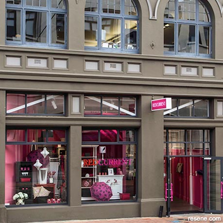
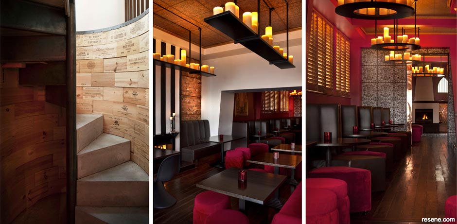
To view more of this project see "Redcurrent, Wellington."
For retailers, shopping is the art of persuasion, and colour is a crucial factor. It can influence our emotions. It defines a product, and it can define your retail space. Most significantly, colour is the first thing we notice. Look for an Animates pet store, for instance, and what's the first thing you see? Bright yellow. How about a The Warehouse store? You can spot the bright red branding a mile off.
While many factors influence a consumer's decision, a significant proportion can be attributed to visual cues, the most persuasive being colour.
"Our brain registers colour first, then words and shapes," says colour psychology expert Karen Haller. "Customers want to emotionally engage and connect with a brand and the simplest way to do this is through colour, as it's colour that triggers our emotional responses."
Research backs that up. A study conducted by Color Communications, Inc. (CCI) revealed that "people make a subconscious judgment about a person, environment or product within 90 seconds of initial viewing and that between 62 percent and 90 percent of that assessment is based on colour alone".
Simply put, colour can fuel a company's growth.
"When a potential buyer is in your workspace or goes on your website, you have the best chance of making a sale," says Karen. "You can use colour to reinforce your brand's authentic personality and values in alignment with your brand message and make that sale even easier."
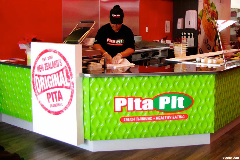
Major brands use their brand colours to engage with their customer's emotions and encourage them to buy. Think of food outlets. Resene colour consultant Jill Marsh says most food outlets stand out. "You tend to find bright colour associated with food outlets," she says. "You've got red at McDonalds, red with Kentucky Fried Chicken and red with Wendy's. You've got red with everything because it's a great eating colour."
Red can also create a sense of urgency, which is why it's often seen in clearance sales. Blue, on the other hand, evokes calmness, but it also instills a sense of trust and security, which is why banks frequently use it.
Purple is a colour that denotes luxury so it might be used with high-end products. But it's also associated with wisdom, independence and creativity – it's a great colour for artistic and creative businesses.
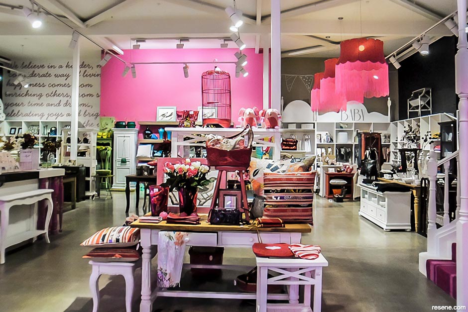
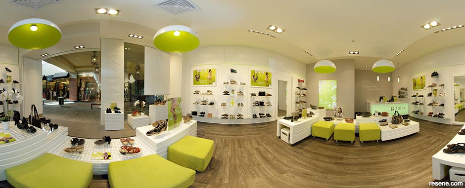
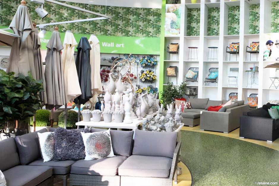
Pink is romantic and feminine so its often used to promote girls' and women's products, and green is one of the easiest colours for the eyes to process so it's often used in stores to relax.
Dark colours provide a moody atmosphere, and a shop outfitted with lots of glass can evoke elegance.
"Jewellery shops can be moody," says Jill. "Michael Hill Jeweller is moody; it has deeper colours. It's got that luxurious feel to it. But if you go into some of the other jewellery places like Stewart Dawsons and Pascoes, everything is glass."
Colour, then, can be used as a powerful design tool. When working on retail spaces, Karen suggests creating an interior design scheme that incorporates both your business brand personality and colours to create the right mood and brand identity throughout. And be consistent.
"For example, walk into any of the major mobile phone stores and you are instantly taking in their brand colours whether you do it consciously or not. Vodafone's red. Imagine the confusion if Vodafone decided to design their stores using yellow or green. You would likely walk out and check the signage thinking you had walked into the wrong store. That kind of mistake could potentially lose them customers over something as simple as not associating their store colour to their brand identity – clearly not a clever business decision."
Even if you are a small business owner, working out of a shared space, or you have a stand at a trade event, you should think of creative ways to incorporate your business brand colours into the space to create that subconscious connection in balance and proportion to the space.
"What you are always aiming to achieve is engaging your customers' emotions in a positive way," says Karen. "Colour is a way to influence behaviour. If you are aiming to reinforce your brand message, brand recognition, then using your brand colours can help reinforce this. If you are wanting to create a particular mood, feeling, influence behaviour, then choose the colours, tones and proportions that will create this response (in the great majority of people)."
Something like soft, gentle greens and blues can be used to help give a calming effect, for example, while vibrant reds and yellows can be used to attract attention.
But too much red may agitate shoppers. Bright accents should typically account for no more than 20 per cent of a retail space's overall colour scheme.
Says Jill: "One wall at the back of a store can attract your attention and draw you in. Look at colours from The Range fashion colours palette, like the bright bold blue of Resene Resolution Blue or the striking look-at-me bright green Resene Kakapo. For something more restful there are fresh mint and airy greens such as Resene Kandinsky and Resene Secrets."
A popular red is Resene Pohutukawa, a spicy rich red.
Other ways to introduce colour is through uniforms and work apparel.
"Using your branding colours in your staff work wear is an effective way to further market your brand and to install a sense of pride and working together as a team, a sense of belonging," says Karen.
Conversely, many smaller retail stores opt for a neutral interior, which can work well, too.
"That's because the product they are selling has lots of colour," says Jill. "Very few retail places have bland products. Everything has colourful packaging, so they stand out."
Whites and off-whites are largely used, in Jill's experience, as a backdrop to the products themselves.
"Resene Half Merino, for example. It's got quite a nice warm glow to it," says Jill. "It's a really nice white but it's not cold, which, in cooler areas, is important. Another lovely colour we did in a souvenir store was Resene Quarter Truffle, which is a very soft oyster beige. It was a lovely one to set off New Zealand souvenirs."
In retail areas, says Jill, you want the product to stand out rather than the surroundings, though colour could be used as a tool to emphasise certain areas.
Four Square supermarkets across the country are starting to tone down their bright green colours to a more neutral colour, Resene Quarter Talisman, with black highlights – black poles, black windows and black fascias, etc. It gives them a more sophisticated, modern edge and a complete change.
The upshot? Colours are extremely important in the makeup of retail spaces, but be aware that they can either attract or repel customers.
"Think of colour as a subliminal language, another way to communicate and to attract your ideal clients," says Karen. "Used to their full effect, your branding colours will give you the competitive edge, elicit the right emotional response from your prospects, and significantly increase your sales."
› Karen Haller is a colour psychology expert working in branding and taking that into business interiors. She teaches interior designers and design professionals globally on how to apply colour psychology into their daily design projects. www.karenhaller.co.uk; www.colour-training.com.
September 10, 2013
Visit your local Resene ColorShop for expert advice and all the products and accessories you need to make the most of your home.
Resene is recognised as an innovator in colour and a manufacturer of quality paints. Resene combines extensive industry experience and expertise to support the delivery to property owners, managers and specifiers outstanding, cost-effective finishes and protection on their decorating projects.
Order A4 swatches | Order colour charts | Request a Rep visit | Ask a Paint Expert | Specifier and project services
Resene's specifier blog
Paint your projects beautiful. Discover the latest decorating trends, tips and colour news! Keep up to date with the latest industry news and research...
![]()
Previous «
Three tips for setting up your showroom window
![]()
Blog home
View the latest trends, tips and specifier news
![]()
» Next
How to tell a client something can’t be done