From the Resene decorating blog
At the beginning of December, the Pantone Color Institute announced Classic Blue (specifically, Pantone 19-4052) to be the Color of the Year for 2020, heralding us into a new decade of design.
Blue is one of those hues that never ceases to be popular. In fact, it’s the most universally loved colour. In surveys, blue comes out ahead of every other colour in every part of the world, transcending geographic location, gender and age. Between many demographics that are often divided, blue unites.
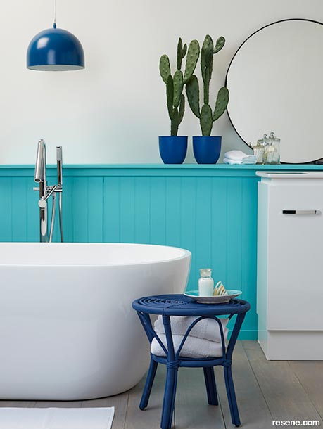
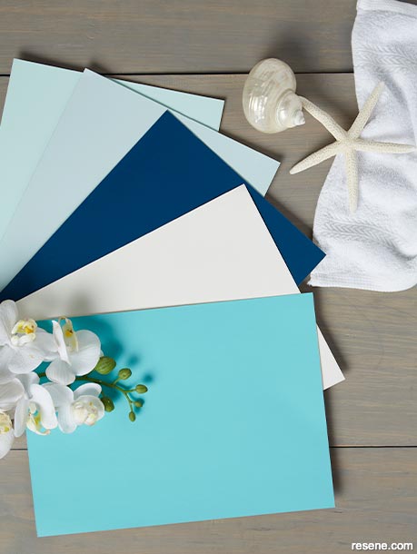
“We are living in a time that requires trust and faith,” says Leatrice Eiserman, Executive Director for the Pantone Color Institute. “It is this kind of consistency and confidence that is expressed by Classic Blue, a solid and dependable blue hue we can always rely on.”
“Imbued with deep resonance, Classic Blue provides an anchoring foundation. A boundless blue evocative of the vast and infinite sky, Classic Blue encourages us to look beyond the obvious to expand our thinking; challenging us to think more deeply, increase our perspective an open the flow of communication.”
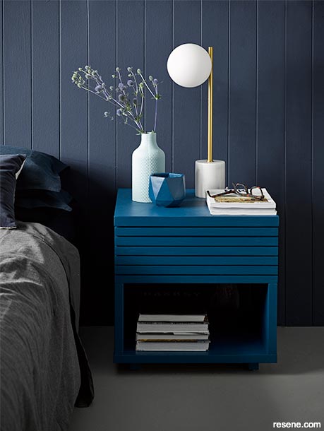
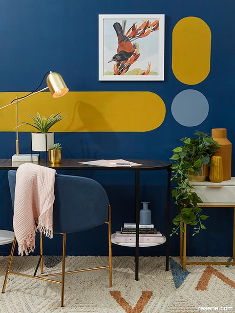
Instilling calm, confidence and connection, Pantone says this enduring blue hue highlights our desire for a dependable and stable foundation on which to build as we cross the threshold into a new era.
For over 20 years, Pantone’s Color of the Year has influenced design decisions across a wide range of industries, including fashion, home furnishings, industrial design, product packaging and graphic design. However, being an American-based company, their forecast doesn’t necessary take into account what’s trending in other regions. While we might all agree that yes, Classic Blue is a beautiful colour, the trend might end up translating into one or more different variations locally.
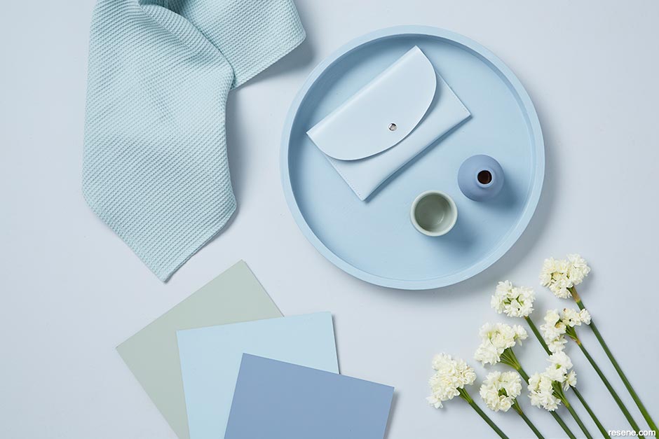
Laura Lynn Johnston, Editor of habitat by Resene magazine, is also an accredited interior designer and graphic designer. Together with Resene, she helps to examine evolving and emerging trends and forecasts what are most likely to be the next big colours in our part of the world to help homeowners who find themselves in a colour conundrum.
“The harsh natural light in New Zealand and Australia really has quite a significant impact on the colours that become popular regionally. We tend to choose dustier shades of colours that are popular in other parts of the world since the sun can cause hues that are more vibrant or saturated to get washed out anyways. Coastal and denim blues – especially those with more grey in them, such as Resene Coast, Resene Bunting and Resene New Denim Blue – are really the ‘Classic Blues’ here and are shades that will continue to be hugely popular here heading into 2020,” she says. “But that doesn’t mean that you can’t combine them with a closer match to the popular Pantone version.”
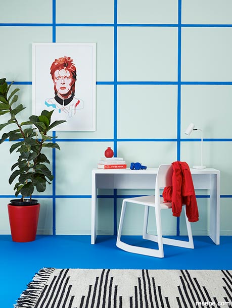
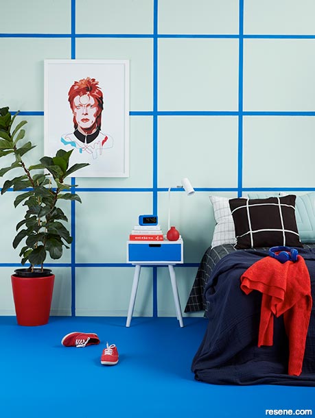
Shades like Resene Torea Bay, Resene Decadence, Resene Resolution Blue and Resene Wet N Wild all capture the spirit of the colour, though Laura Lynn says they’re not typically hues that you’re going to see on walls from tip to toe – at least not in our part of the world.
“These shades make excellent accent colours, especially when used on key pieces of furniture such as a sideboard or coffee table. The beauty of paint is that it can always be quickly and easily painted over as trends or tastes change, whereas investment pieces like a sofa or armchair should be in a colour you really truly love rather than the flavour of the month.”
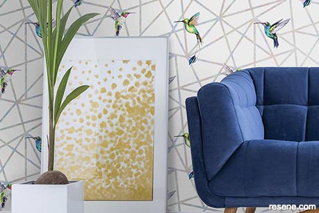
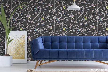
She says these Classic Blue-like hues also lend themselves well to being blended with small pops of brights. “Start with a classic warm grey on your walls like Resene Quarter Truffle then paint Resene Torea Bay on a side table, find a couple cushions to match, and balan ce it out with just a touch of tropical orange like Resene Chilean Fire. Or swap Resene Chilean Fire for a vibrant lime like Resene Sushi or Resene Lima.”
“Classic shades of blue always pair well with another classic colour: red. Look to timeless options like Resene Raging Bull, Resene Jalapeno or Resene Dynamite.”
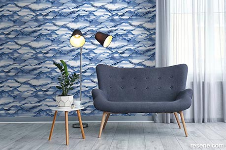
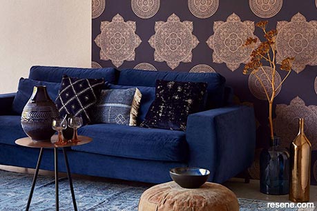
Other new hues that Laura Lynn says have seen a sharp rise in popularity are soft grey greens with a hint of blue such as Resene Green Meets Blue and its deeper darker cousin Resene Fast Forward. These shades blend beautifully with another ‘it’ colour that’s been starting to pop up in interiors: orange.
“Bitter orange hues like Resene Smoke Tree, Resene Moroccan Spice and Resene Ayers Rock are well poised to be the next big accent colour. You’ll mostly find them as accent colours, at least for the time being, so use them on accessories like trays and vases whereas Resene Green Meets Blue and Resene Fast Forward are both gorgeously decadent choices for your walls.”
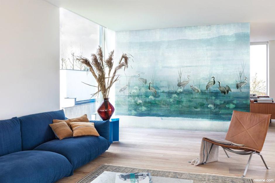
But not matter what trends are in the forecast, Laura Lynn says you should always go for what you love when decorating your home.
“Choose what speaks to you – that’s the real key to creating a look with staying power. We worry too much about what other people think about our homes when we should really just be creating spaces that we love to spend time in.”



December 08, 2019
For more trend-focused tips, pick up a copy of the habitat plus – decorating and colour trends from your local Resene ColorShop or reseller or view it online. It’s packed full of ideas for how you can incorporate today’s fashionable colours into your home.
Book a colour consult | Ask a Colour Expert | Ask a Paint Expert
Resene's decorating blog
Paint your home beautiful! Discover the latest decorating trends, tips and colour news.
![]()
Previous «
Neutrals with soul
![]()
Blog home
View the latest trends, tips and news
![]()
» Next
Curated collections need not come at a huge cost