From the Resene decorating blog
There are plenty of “lilac” conversations being had in paint shops, design studios, and fashion outlets and lilac is getting a mention in media articles and blogs all over the place too.
On Stuff recently, we read that “millennial pink and blush have had a long reign as favourites in interiors and fashion, but new trends are showing a phase out of pink, and the introduction of lilac and lavender”.
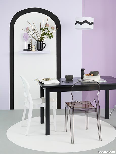
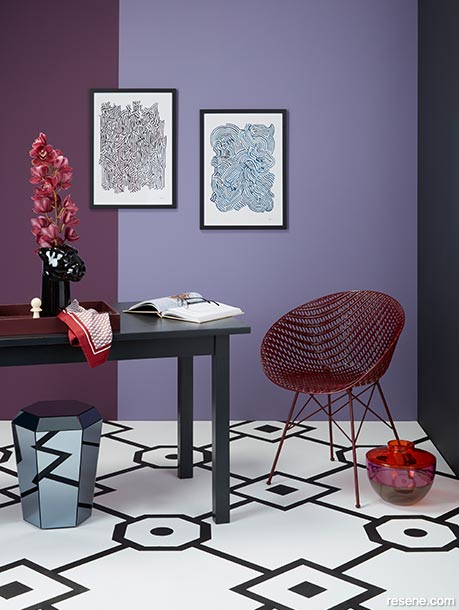
A Nood blog post, while concentrating on green, also mentions lilac. It tells us, “the greenery trend is still going very strong and can be seen replicated through prints, fabrics and décor. The green of Resene Mother Nature, for example, is a great backdrop for fresh green leaves, sweet lilacs and mustard golds.”
Resene Marketing Manager Karen Warman says such articles and blogs confirm what Resene has noticed – soft purple is indeed ‘in’. The colour of the moment is morphing from dusky peach and nudes, to soft fresh lilacs, she says.
"Lilac has a fresher vibe, whether it's as an icy pastel or as a greyed silvery lavender. It's a natural next step in our love affair with complex pastels and is surprisingly adaptable as an interior shade."
So, how do you use it in your home? Most often as an accent colour. As with blush, it's easily combined with toned-down greens, greys or whites.
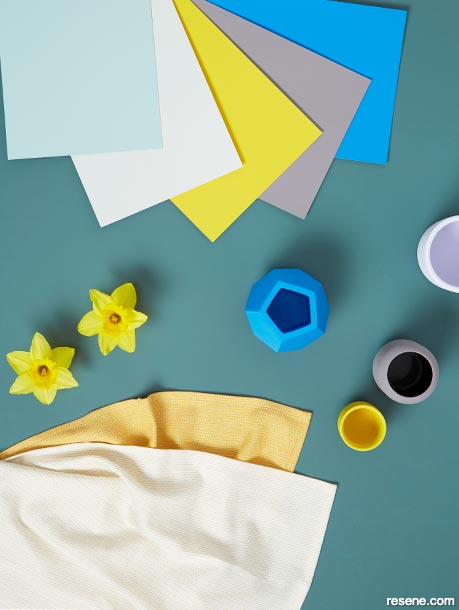
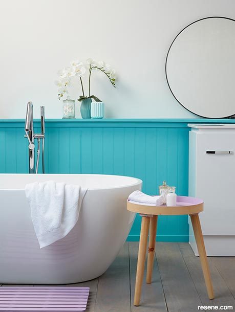
"You'll see it mixed with soft greens and grey foliage, and it goes well with both cool and warm whites, as well as greys and greige," she says.
Top New Zealand stylists confirm lilac hues are hot.
Miss Lolo Director Tamzyn Adding says it’s been a while since any enthusiastic chatter has been held around the colour lilac. But it’s back, and its comeback hasn’t been quiet.
The furniture designer says Miss Lolo has recently collaborated with Resene to create a new paint accent colour called Sugarplum Fairy. It’s Miss Lolo’s own spin on lilac and purple and is described as a soft hue of lilac, which accompanies punchy plums, and even deep indigo perfectly. Miss Lolo has been involved in the creation of other accent colours in shades of purple but this is the only lilac one.
The reaction from the public?
“It’s our most popular accent colour to date, by far. I think it’s because it is so unexpected.
“Prior to this, the closest in popularity with our accent colours recently has been Raspberry Beret – an intense, deep aubergine hue,” Tamzyn says.
She says lilac was much celebrated in the 70s – but it then went out of vogue … for a long time.
“I wanted to bring it back as it’s so super cool. There are other pastels everywhere like baby pinks and blues and I wanted to bring it in as it can be styled in a very contemporary fashion. The colour is now contemporary. It’s done the whole cycle and come back.”
There’s no doubt, she says, that purples will replace pinks in popularity this year.
"Whether it's in the retro revival of lilac hues, or in the deep aubergine tones, this is one colour that going to make a big impact over the coming 12 months.
“Its subtle calming qualities make it a bold yet beautiful choice particularly for character homes. Use it with wood paneling details or take the colour contemporary by using it with any of the new, fun paint techniques to really create an impact with a feature wall."
Sugarplum Fairy, for example, looks beautiful above a dado line with white underneath, she says.
“We recommend it as an accent colour – it would be pretty intense covering a whole room. It – and other shades of lilac – can be used in a clever way. It could be a fantastic feature in a child’s bedroom, or in a striking bathroom, for example. Marry it up with other shades of purple, or wallpaper,” Tamzyn advises.
Shades of lilac attracting interest at Resene ColorShops include Resene Mozart, a feminine warm mauve, and Resene Alaska, a cool, urbane and sophisticated lilac grey-blue.
Resene Whimsical gets the nod of approval from Stylist Kate Alexander.
“My current favourite colours for laid-back yet sophisticated spaces are the pairing of crisp white with almost-purple greys – the new colours Resene Whimsical and Resene Slipstream are perfect for this look,” she shares.
Other stylists say they’ve landed on lilac because of its versatility. It’s a shade they feel can be used in all seasons and it has wide appeal.
Resene’s Waikato colour consultant Christine Hodges says browner pinks with purply undertones seem to be appealing to her customers. Resene RSVP and Resene Sixth Sense, for example still have the pink tones but they’re moving into the lavender spectrum.
Resene Sixth Sense looks gorgeous, she thinks, with Resene Rocky Mountain, a warm grey with a purply brown undertone, and with Resene Purple Rain, a deep true purple. It also works beautifully with blues such as Resene Liberty, Resene Raindance and Resene Lazy River.
“Let nature be your guide. Look at the colours in a paua shell, for example. Nature often has the answer,” Christine says.
A mauver shade, Resene Memory Lane, is also creating interest – working well with blues and with the redder mauve hues of Resene RSVP. For a bright palette, lilac paint colours can be contrasted with colours like orange, yellow, olive green and gray. Think of the flower world, and you will find examples of those colour combinations, Christine says.
She recommends lilac shades as feature colours in bedrooms. Many people find lilac restful, elegant and soothing as an accent colour. A recent client opted to marry it up with wallpaper for her spare bedroom.
It’s a proud feature wall colour in at least one Waikato kitchen that Christine knows of.
But, lilac shouldn’t be limited to one specific room, colour enthusiasts say.
It’s out there and ready to be celebrated.





September 12, 2019
Visit your local Resene ColorShop for more colour ideas and all the expert advice and products you need for a superb finish on all your decorating projects.
Book a colour consult | Ask a Colour Expert | Ask a Paint Expert
Resene's decorating blog
Paint your home beautiful! Discover the latest decorating trends, tips and colour news.
![]()
Previous «
Dive into deep blue sea
![]()
Blog home
View the latest trends, tips and news
![]()
» Next
How to make small spaces look bigger than they are