From the Resene decorating blog
Whether you go big with brave brights or more subdued with toned down shades, yellow is a sure-fire way to make a big impact and freshen up your home.
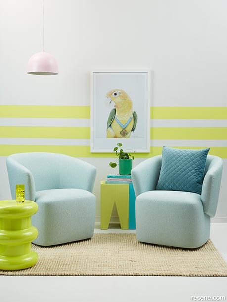
Pops of yellow completely define this retro throwback lounge by Kate Alexander. Canary yellow like the stripes on this Resene Alabaster wall in Resene Honeysuckle have an undeniably 80s feel when combined with electric aqua like Resene Yes Please, pop pink like Resene Princess, Kelly green like Resene Away We Go and bright white floors in Resene Alabaster. Project by Kate Alexander, image by Bryce Carleton.
Move over Millennial pink – the hot new colour of summer, bold and cheery Gen Z yellow, is adding a refreshing burst of brightness to our homes. With its lively sunshine hues, Gen Z yellow is a ray of optimism and positivity in a world that is increasingly challenging. No colour expresses hope and reassurance more than yellow, according to Pantone colour forecasters.
What first appeared on the catwalk and in shop windows is now becoming popular on our walls and in interior textiles and accessories. The actual Gen Z shade is somewhere between marigold and French mustard, but as it gains popularity, the colour yellow is stealing the spotlight in every shade from lemon and primrose to earthy ochre and rich deep mustards, even a vibrant marigold.
And wouldn’t you know it, metallics have begun switching from rose gold and copper – which paired so well with Millennial pink – to brass and yellow hued golds.
Interior designer Juliet Coleman says that while it’s been very much a neutral palette for some time, it’s nice that we’re starting to have more colour inside.
“Yellows are definitely coming through because they complement other colours. It’s such a lovely, warm vibrant hue that goes well with so many different shades. They pair with cooler greys and earthy tones, for example, but you have to use it quite carefully. Finding the right tone and sheen to suit your room is important.”
“You also need to consider the effect of lighting,” she says. “Mattes are easier to work with than high gloss yellows, which can be a little overwhelming in some spaces.”
Another aspect that might influence your choices is the different meanings that different cultures attribute to yellow. In some countries, yellow means peace. In Japan, yellow stands for courage. But in Egypt, yellow is worn to signify the dead at funerals.
The strident yellow tones of the wattle tree are seen everywhere in Australia, as it is their national flower. It seems no coincidence that Australians have enthusiastically embraced the trend towards yellow, even the stronger mustard tones.
“It’s possibly something to do with their strong light and the arid landscape, not like the milder New Zealand, where we see fresher yellows and yellows in smaller quantities.”
“It’s a natural colour,” says Emma Wallace of Emma Wallace Design. “And everything in interior design is going back to nature right now. Yellow has connotations of sunshine and brightness. But, remember it can also be quite cold. A pale buttery yellow was paired with blue in kitchens and bathrooms in the 1990s. That is not a look we’re returning to.”
Yellow is notoriously tricky to use in large doses. It’s how you use it and what you blend it with that matters. Break it up with an interplay of contrast, texture and pattern.
It’s also true that yellow brings out the best in other colours. If you’re tired of a neutral scheme, what better way to relieve the boredom with a corn coloured cushion, art, picture frame or throw?

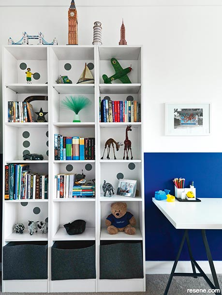
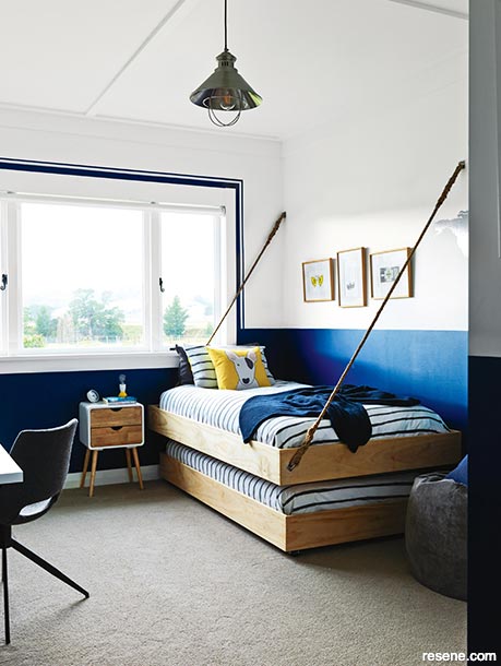
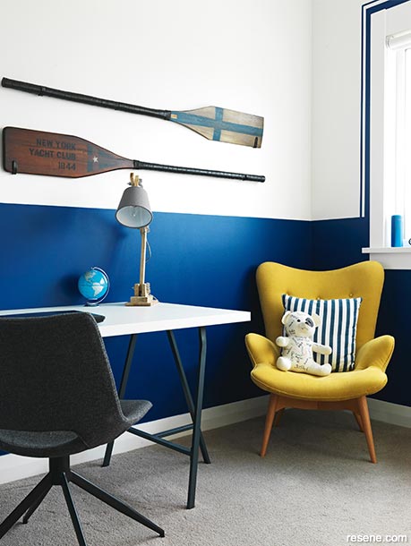
You don’t have to cover all the walls in one colour, either. Juliet recently created a striking scheme in a boy’s room where the walls are painted inky blue to a line about waist height with white above. For a lemon twist, cushions accessorise stripy blue and white duvets and a yellow cushion provides contrast in the corner.
For a warm sophisticated scheme that will enliven the never-ending darkness of winter, Juliet says the contrast of bright yellow, mustard or ochre with ashen greys like Resene Grey Area or Resene Double Ash and midnight blues like Resene Indian Ink works well.
“Black and yellow are an even stronger combination but is equally successful. It’s a dramatic look,” she says. To get the look, Juliet suggests trying a moody black wallpaper – something with a sheen or even glitter – with a glossy black architrave in Resene Noir. Pair it with yellow chairs in Resene Thumbs Up, a black table in Resene Charcoal and perhaps a bright yellow vase in Resene Turbo.
A touch of blue adds a warm finish to yellow. Try blues that have yellow or green undertones like Resene Bismark, Resene Wishing Well or Resene Fast Forward and combine them with darker stained timber like Resene Colorwood Tiri or Resene Colorwood Jarrah. Or, try an ochre yellow like Resene Influential or a mustard like Resene Cleopatra paired with forest green like Resene Mother Nature or Resene Permanent Green, neutral timber in Resene Colorwood Whitewash or Resene Colorwood Natural and some potted plants to liven up the space.
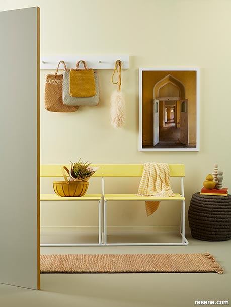
A single pale yellow focal point, like the window frame of a kitchen or a rug, can transform a minimalist all-white or a monochromatic interior. In this entryway, stylist Kate Alexander painted the edge of this Resene Quarter Pearl Lusta door in Resene Influential as a happy surprise for those who enter. The reclaimed vintage bench was also freshened up with seats in Resene Chorus Line and legs in Resene Quarter Pearl Lusta, and the yellowy tones of the walls in Resene Moonlight and floors in Resene Grey Olive provide added warmth to create a welcoming space. Project by Kate Alexander, image by Bryce Carleton.
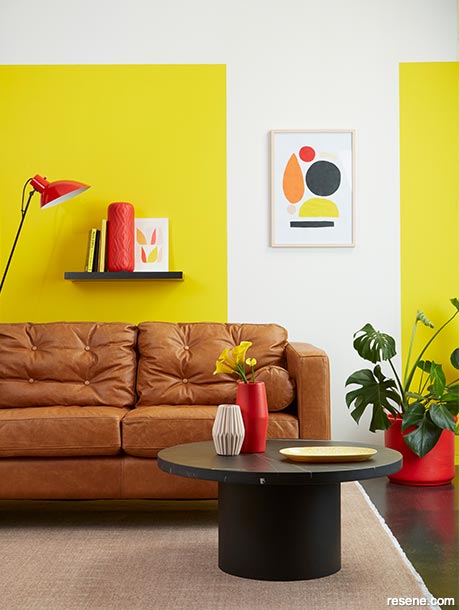
These Resene Black White walls have been completely recharged with a couple of blocks of Resene Turbo and a few splashes of Resene Roadster and Resene Party Zone accessories. But it’s not just the high energy colours that make this mid-mod room shine – it’s also the repetition of shapes and finishes. The floating shelf and flooring have been coated in high gloss Resene Noir to play off the marble coffee table, and the round circles appearing in the artwork, plant pots, table, tray and cushions bring it all together. Project by Kate Alexander, image by Bryce Carleton.
If you want to brighten a room with a playful Mexican look, be brave with orangey yellow like Resene I Dare You on the walls and fabrics and furniture in vivid red similar to Resene Smoulder or turquoise like Resene She’ll Be Right. It can look stunning balanced by doses of crisp white like Resene Double Alabaster and an absolute black like Resene Blackout.
“It’s difficult to combine yellow with other bright primary tones and make them work,” admits Juliet, “You have to get the right tones.” She recommends going for a deep rust red, like Resene Raging Bull or Resene Dynamite, paired with a warm yellow, like Resene Chorus Line.
Fresher lemon yellows Resene Wild Thing tend to be cooler and work well as a backdrop to schemes that pair shades of white like Resene Merino or Resene Sea Fog with splashes of hot pink like Resene Pink Ribbon or Resene Irresistible. As an alternative, try a teal like Resene Yowza.
“A cooler canary yellow like Resene Honeysuckle or fresh lime yellow paired with crisp white and soft bluish greys or Resene Duck Egg Blue looks almost Scandi married with pale timber tones,” says Juliet. Cool and calming, this is a great scheme to deflect the light on the brighter northern side of a home. Remember the amount of light pouring into a room can have quite an impact on your scheme. If the room is on the darker side of the house, choose warmer tones.
Because it’s so bright, yellow makes an impact, even when used in small doses. Yellow accessories are eye catching enough to completely change the look of a room. “Give a room a bit of a twist,” says Juliet “with just a touch of yellow to make it pop without overtaking the space. It might be an artwork, a cushion, a beanbag, even drawer handles or hooks on the wall.”
Otherwise neutral palettes can be effectively brightened by yellow accents, says Emma. “Vibrant yellow can do wonders to enliven the cool clinical surfaces of dark industrial-style interiors, like those in converted warehouses.” She notes that yellow is an ideal colour for warming up those grey toned man-made finishes that can feel inherently cold by nature.
“Although it’s usually used as an accent, it is particularly effective in bringing warmth to powder-coated metal, stainless steel and polished concrete. It brings warmth, even on the dullest days.”


March 18, 2019
Visit your local Resene ColorShop for more colour ideas and all the expert advice and products you need for a superb finish on all your decorating projects.
Book a colour consult | Ask a Colour Expert | Ask a Paint Expert
Resene's decorating blog
Paint your home beautiful! Discover the latest decorating trends, tips and colour news.
![]()
Previous «
Break away from boring
![]()
Blog home
View the latest trends, tips and news
![]()
» Next
Turning a feature wall into a feature room