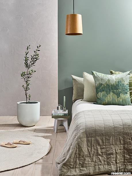
To view more of this article see "Natural Healing"
The first question I'm nearly always asked is 'How do you name colours?' followed shortly thereafter by 'How do you know which colours are trendy?' And while the trends have moved on year by year, the same two questions continue to pop up reinforcing our ongoing fascination with colour.
Colour trends are loosely the rules of current fashion that determine the main colours that will appear in fashion, cars, decorating and the like enabling manufacturers to focus on a smaller range of colours rather than attempting the impossible of covering off all colours in all styles and sizes. However the need for personalisation and colour trends are a somewhat uneasy combination because by definition if everyone follows the colour trends precisely then individual uniqueness will be lost. It's a balancing act – one that designers tend to manage well but home decorators can struggle with, which is why we are seeing the increasing reliance on colour consultants for residential projects.
Resene develops its colour trends based on a variety of information including colour trends reports from international colour forecasting groups combining these with trends in international magazine layouts, international fashion and tailoring this wealth of information with our experience as to what colours suit the local market based on previous colour introductions and use. Typically we find that the European market will have a stronger focus on sweeter, warmer colours such as pinks and purples and less focus on the natural hues. In contrast, the New Zealand environment sees a more dominating use of blues and greens reflecting our nature and coast while the Australian environment sees a more dominating use of hot dusty hues with oranges and yellows. These differences reinforce the importance of filtering international trend information to ensure the resulting palette fits with local tastes. Local colour trends information is not used in our colour trends forecasts as these tend to focus on what is already here rather than what exciting things are still around the corner.
When developing The Range fandecks we sometimes find the line between showcasing the upcoming trends and forming the upcoming trends is blurred... by selecting a few colours from an infinite range available we are essentially narrowing trend choices to those colours. The optimist might say that these colours then become popular because they are truly in fashion, while the pessimist might say they are the colour trends purely because that was all that was offered. In reality they are probably both right.
As a paint manufacturer we are luckier than most when it comes to showcasing colour trends – with thousands of colours in our Total Colour System palette, selecting up to 200 hues based on their current fashion rating rather than their ability to generate significant ongoing sales is easily done. Not so for the manufacturers of more enduring products who must commit to a smaller range of colours and ensure each stands alone as a sales performer. Typically this forces their selections back into safer, more classic choices that can be accented by the brighter hues of the more changeable decorating materials such as paint.
Perhaps the most difficult part is not determining the trends but determining the timing of when that specific trend will emerge, peak and wane and then co-ordinating that colour life cycle with our colour development to ensure we have the colour when it is inbound rather than outbound. With communication making the information world a smaller place, the speed of change is ever increasing, making the timing of changes ever more critical to having the right trends available at the right time.
And as for those colour names? You'd be surprised at how quick 100 colours can be named when you have good sunlight, a combination of minds, a huge long list of options collected over time and a sense of humour. And the hardest colours to name? No it's not the whites and neutrals – every year, it's the greens.
July 16, 2013
Visit your local Resene ColorShop for expert advice and all the products and accessories you need to make the most of your home.
Book a colour consult | Ask a Colour Expert | Ask a Paint Expert
Resene's decorating blog
Paint your home beautiful! Discover the latest decorating trends, tips and colour news.
![]()
Previous «
Resene backyard
![]()
Blog home
View the latest trends, tips and news
![]()
» Next
50 shades of grey Resene style