From the Resene decorating blog
Learn how to incorporate Pantone’s 2016 Colours of the Year with Resene.
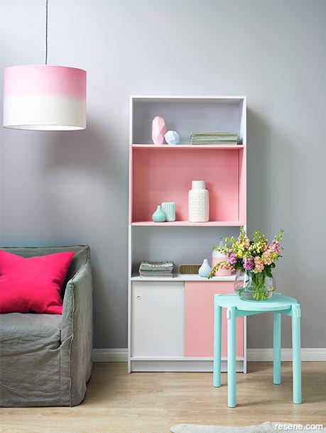
To view more of this project see "History lesson"
For the first time ever, Pantone has chosen a duo-blend of two colours as the 2016 Colour of the Year. What's hot right now, is Rose Quartz, a soft blush of pink, and Serenity, a periwinkle pale blue.
Leatrice Eiseman, executive director of the Pantone Colour Institute, explains that it's an "inherent balance between a warmer embracing rose and the cooler tranquil blue".
While this may just look like a pastel hue of blue or pink, the colours were also chosen partly due to the blurring of gender associations of certain shades. These colours have also been very specifically selected, with Rose Quartz reflecting a slight tinge of peach tones while Serenity just edges on the border close to purple.
A pink, such as Resene Sweet Spot, or a blue, such as Resene Zephyr, reflects the two colours perfectly.
If you want your home interior design to reflect these trendy shades, then you need to be careful to sustain a nice balance of pale and dark colours, as well as the two colours themselves – you don't want there to be an excess of pastel power, with pinks and blues bouncing off each other.
So, how exactly are you supposed to incorporate the current Colour of the Year into your home design? Luckily for you, we've found out how to create the perfect harmony of colours to inspire some home decorating ideas.
Pink may not be your first colour of choice, but it can really brighten up a dark room. This is especially effective if you have darker neutral-toned furniture. Pairing a soft pink tone with greys of multiple shades really gives your room an edgy but chic atmosphere. It'll add a slight blush of colour across achromatic hues.
A few other options of pink are:
As pale blue is a versatile colour, suitable for all genders, you could adopt the tips above but supplement pink with blue instead. However, as blue hosts cooler tones than pink, you really want to be careful to avoid colours looking too uninviting. Try lighter brown-greys and whites to balance out the cool tones.
A few ideas to go along with Resene Zephyr are:
If you're fond of medium or dusty greys, then choose a lighter hue of blue. Resene Rolling Fog takes a step towards purple while allowing you to adopt darker complementary colours.
Another option is to add some texture alongside this creamy blue. Resene Colorwood Whitewash offers a finish that is always on trend and modern. Or how about metallic Resene Scotty Silver to contribute an interesting sheen? Use these for a feature wall, balanced with solid colours, or even try a fresh coat of paint on a few old vases.
Of course, you want to follow the current trends. However, you don't want your home to be reminiscent of a child's bedroom, where clashes of brights or pastels are welcome. If you want to use these colours of the year, you need to balance them out, so perhaps consider picking one for a certain room and another for a different room. That way, you can still incorporate both, but segregate them so as to not overwhelm your senses.
January 14, 2016
Visit your local Resene ColorShop for expert advice and all the products and accessories you need to make the most of your home.
Book a colour consult | Ask a Colour Expert | Ask a Paint Expert
Resene's decorating blog
Paint your home beautiful! Discover the latest decorating trends, tips and colour news.
![]()
Previous «
Survey finds what people value most in a ‘perfect home’
![]()
Blog home
View the latest trends, tips and news
![]()
» Next
How to make a small kitchen appear larger with Resene paints
![]() Get inspired ! Subscribe
Get inspired ! Subscribe ![]() Get saving ! Apply for a DIY card
Get saving ! Apply for a DIY card
![]()
Can't find what you're looking for? Ask us!
Company profile | Terms | Privacy policy | Quality and environmental policy | Health and safety policy
Colours shown on this website are a representation only. Please refer to the actual paint or product sample. Resene colour charts, testpots and samples are available for ordering online. See measurements/conversions for more details on how electronic colour values are achieved.
What's new | Specifiers | Painters | DIYers | Artists | Kids | Sitemap | Home | TOP ⇧