From BlackWhite magazine - issue 05, blue sky
Varna Berriman challenges the assisted living status quo in favour of more colourful and compelling alternatives.

Varna Berriman
Many people often take their physical abilities for granted, not realising how many barriers exist in everyday life for those who move, see, hear and process thoughts differently. It’s also a common assumption that differently-abled individuals make up but a small fraction of the population. However, statistics show that one in four people in New Zealand and at least one in six people in Australia have a long-term impairment.
“Impairments are not selective to race, gender, sexual orientation, age, ethnicity, region, health or partnership and they do not share a common religion, political belief or social class,” says graduate architect Varna Berriman. “Despite this, architecture continues to marginalise people with impairments through a medicalised model of segregation and control that highlights the user’s medical diagnosis before their humanity.”
Her thesis looks at how marginalisation towards people with impairments presents itself in the built world through the current standardised building regulations of accessibility. In turn, Varna developed design strategies which diverge from the medicalised and overprotective architecture that does little to comfort or inspire. She hopes that her explorations will empower others to redefine the oppressive fixed identification of ‘disability’ and instead give users the freedom to define their multifaceted identities on their own terms.
Varna recently completed her master’s degree at Victoria University of Wellington and the subject of her thesis was inspired by her connection to the medical industry. “I am the first person in my family to step into the field of architecture,” she says. “However, most of my family works within the healthcare industry in some capacity. It has been really incredible to forge my own way while also having a connection to my family through the work I do. While studying, I also worked as a support worker – primarily for people with disabilities, but also in retirement homes and in other healthcare facilities. This is where the underlying motivation for my thesis emerged. I plan to continue to specialise in healthcare design, as this is where my passion is.”
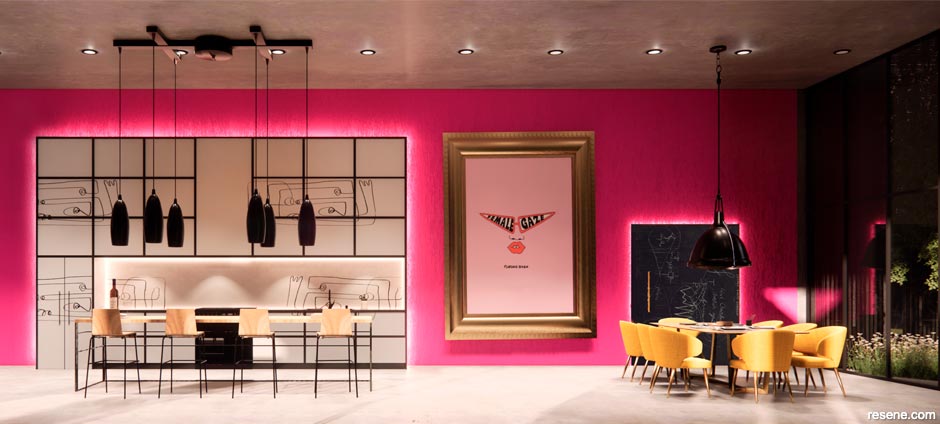
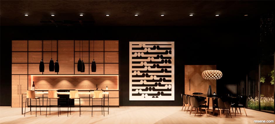
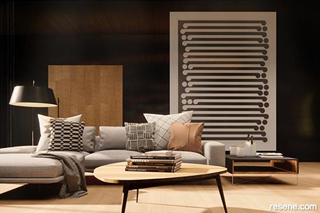
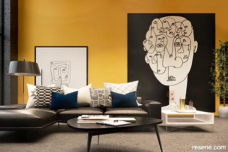
As a solution to the dullness and sterility that the design of many assisted living spaces suffer from, Varna investigated the interplay between colour and space and how the two might alter user perceptions of their built environment in a way that celebrates their individuality. Her palettes are a sharp departure from typical healthcare architecture and instead investigate how colour interacts with the subconscious while also acknowledging that its perception is subjective and personal.
Varna admits that, initially, she instinctually wanted to create a cohesive and controlled flow of colour before recognising that this would give little attention to how colour could be used to impact each user’s expression of identity. Instead, her critical examination of these impulses exposed that colour selection could be a physical manifestation of the medical model, ascribing a fixed medicalised identity to those living with impairments.
For her investigations, Varna chose to explore what could be achieved through Resene’s colour offerings. “Resene is a really incredible New Zealand family-owned business,” she says. “They have such an extensive range of colours, which makes it so exciting to explore and imagine endless colour arrangements. The incorporation of te reo Māori in the naming of certain colours has also been a heartfelt reminder of home in New Zealand when using the colour ranges while I’ve been working overseas in Australia.
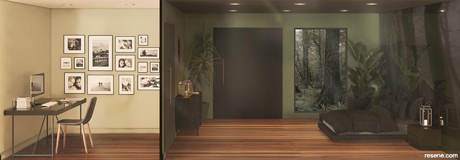
“Choosing the specific colours for my project was an amazing and fun process,” explains Varna. “Many of the conceptual designs in my thesis were based on the colour preferences of my real-life clients. For example, one colour palette was rooted in a client’s preferred shade of pink, inspired by a favourite jumper they wore almost every day. I was able to take a photograph of the jumper and load it into one of the free online colour selection tools on Resene’s website and easily find the closest Resene paint colour to match it.”
Through the course of the project, Varna reached a number of realisations. “Often, design choices in the area of public healthcare are primarily supported by both medical and economic evidence. This study resists the urge for the architect, as the designer, to be in control of the colours in a space or be seduced by the colours that are ‘on trend’. Instead, it allows the users to participate and envisage where and how they will experience the built environment through colour, tapping into their imagination, creativity and autonomy. The research of my thesis asserts that the more control we offer people over the colour of their surroundings, the more we can design architecture that speaks to the unique person rather than an imposed identity. Colour really is a powerful and often overlooked tool to humanise clinical environments.”
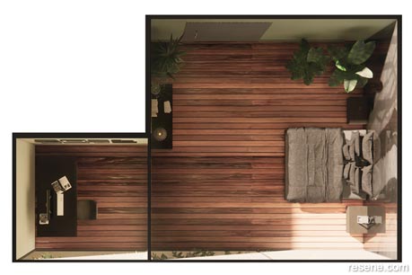
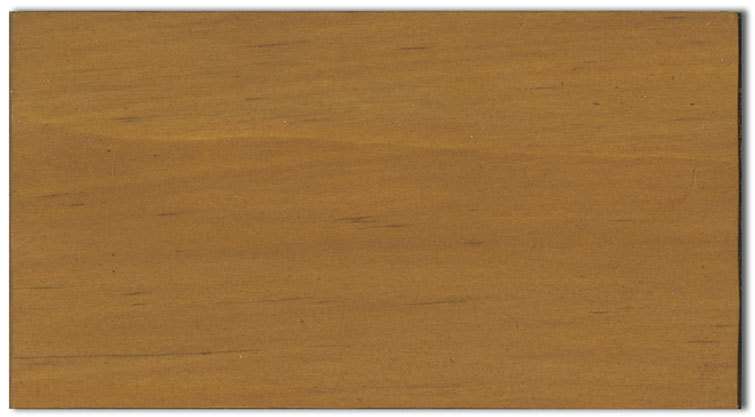
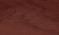
Today, Varna works at Architecture & Access as a specialist consultant for built environments to create safe and accessible community facilities, workplaces and homes for people with disabilities. She continues to look for surfaces that can be painted or stained with Resene products to better enhance her clients’ spaces. “The ability that Resene Colorwood and Resene Woodsman have to transform and enhance the colour and texture of timber inspired me to embrace the rustic charm and warmth of wood in my latest design projects. A façade, for instance, may have timber stained with Resene Woodsman Heartwood to bring out the wood’s unique grain, which could be further enhanced through accenting with the charcoal black of Resene Bokara Grey. Resene Seaweed, a bitter olive brown, is another one of my personal favourites. Combined with tan and brown furnishings, this would make for a warm and calming living area.”
We can’t wait to see the ripples Varna is able to make through her important and inspiring work in an area that’s ripe for change.

This is a magazine created for the industry, by the industry and with the industry – and a publication like this is only possible because of New Zealand and Australia's remarkably talented and loyal Resene specifiers and users.
If you have a project finished in Resene paints, wood stains or coatings, whether it is strikingly colourful, beautifully tonal, a haven of natural stained and clear finishes, wonderfully unique or anything in between, we'd love to see it and have the opportunity to showcase it. Submit your projects online or email editor@blackwhitemag.com. You're welcome to share as many projects as you would like, whenever it suits. We look forward to seeing what you've been busy creating.
Earn CPD reading this magazine – If you're a specifier, earn ADNZ or NZRAB CPD points by reading BlackWhite magazine. Once you've read an issue request your CPD points via the CPD portal for ADNZ (for NZ architectural designers) or NZRAB (for NZ architects).
![]() Get inspired ! Subscribe
Get inspired ! Subscribe ![]() Get saving ! Apply for a DIY card
Get saving ! Apply for a DIY card
![]()
Can't find what you're looking for? Ask us!
Company profile | Terms | Privacy policy | Quality and environmental policy | Health and safety policy
Colours shown on this website are a representation only. Please refer to the actual paint or product sample. Resene colour charts, testpots and samples are available for ordering online. See measurements/conversions for more details on how electronic colour values are achieved.
What's new | Specifiers | Painters | DIYers | Artists | Kids | Sitemap | Home | TOP ⇧