From BlackWhite magazine - issue 05, capture
A snapshot of today’s top colour and design trends.
The return of red has been a long time coming and the popularity of rich brick, carmine and vermillion reds is rising rapidly. However, designers are using what can sometimes be an aggressive hue in new, unexpected ways. The strength of an earthy ‘iron’ red like Resene Lonestar can be softened by a petal pink like Resene Sakura and a hint of mauve like Resene Tom Tom to bring about a sense of rosy optimism. But what is typically a feminine combination has been further offset by details in salted caramel, aquatic blues and creamy whites, bringing a sense of balance to the colours and vibe of this bedroom.
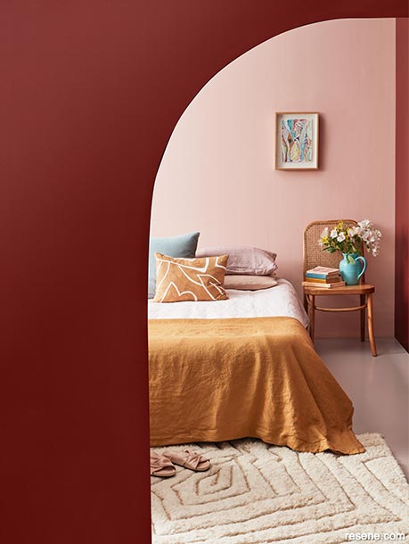
Back wall in Resene Sakura, curved wall and right wall in Resene Lonestar, floor in Resene Tom Tom, jug vase in Resene Fountain Blue and books in Resene Fountain Blue and Resene Hot Toddy. Chair from Cintesi, bedlinen from Foxtrot Home, rug and cushions from Mulberi, artwork by Carmel Van Der Hoeven.
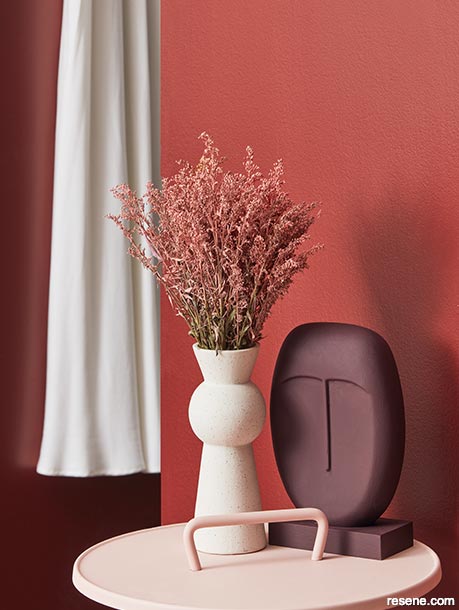
While purple can be a polarising colour, designers are in agreement that deep aubergine and plum are in.
Walls in Resene Lonestar, vase in Resene Tom Tom and sculpture in Resene Aubergine.
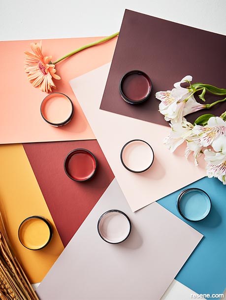
The popularity of pink shows no signs of slowing down. Though greens have been its most common colour companion, today’s pinks are being blended with other upward trending hues like aqua blues, carmine reds, golden yellows and aubergine purples.
Resene testpots and A4 drawdown paint swatches in (clockwise from top right) Resene Aubergine, Resene Sakura, Resene Fountain Blue, Resene Tom Tom, Resene Hot Toddy, Resene Lonestar and Resene Japonica.
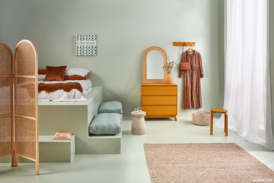
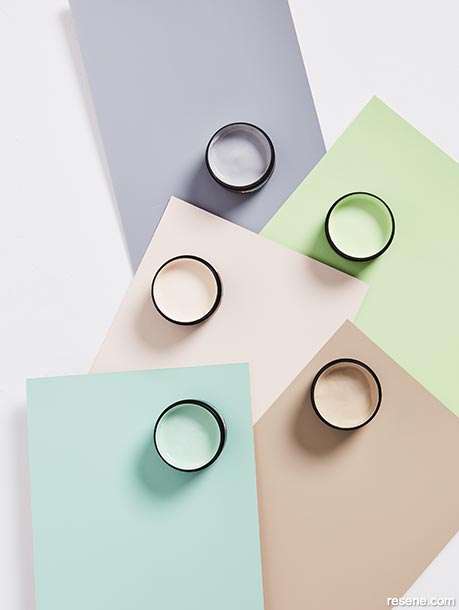
The use of pale pastels continues to offer the softness we crave in order to cope with the realities of a harsh world.
Resene testpots and A4 drawdown paint swatches in (clockwise from top left) Resene Half Scarpa Flow, Resene Anise, Resene Pale Oyster, Resene Summer Green and Resene Half Sour Dough.
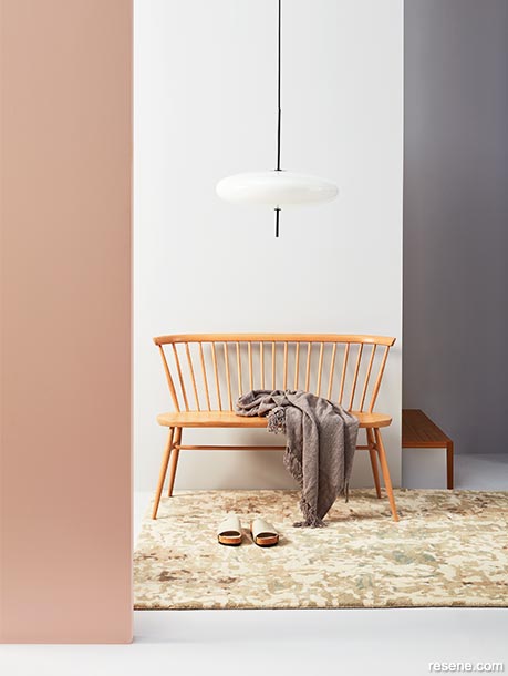
While the popularity of grey is waning, today’s variations have far more character than the typical flat, one-dimensional greys used in years past. Those with a slight violet undertone are far more interesting and less sterile. Plus, they blend well with popular rosy pinks, blush beiges and warm wood tones. Back walls and floor in Resene In The Mauve, left wall in Resene Dust Storm and timber steps stained in Resene Colorwood Dark Oak. Bench and pendant lamp from Good Form, rug and throw from Baya.


Projects: Amber Armitage
Images:
Wendy Fenwick
This is a magazine created for the industry, by the industry and with the industry – and a publication like this is only possible because of New Zealand and Australia's remarkably talented and loyal Resene specifiers and users.
If you have a project finished in Resene paints, wood stains or coatings, whether it is strikingly colourful, beautifully tonal, a haven of natural stained and clear finishes, wonderfully unique or anything in between, we'd love to see it and have the opportunity to showcase it. Submit your projects online or email editor@blackwhitemag.com. You're welcome to share as many projects as you would like, whenever it suits. We look forward to seeing what you've been busy creating.
Earn CPD reading this magazine – If you're a specifier, earn ADNZ or NZRAB CPD points by reading BlackWhite magazine. Once you've read an issue request your CPD points via the CPD portal for ADNZ (for NZ architectural designers) or NZRAB (for NZ architects).