From the Resene colour choices booklet
Light, stimulating the retina of the eye, is what creates our perception of colour.
Without light there is no colour, and light reflects how we see colour. Because colour is so powerful we tend to look for rules for its use, but there are no hard and fast rules. How you use colour is a very individual and creative choice, but understanding how colour works will help you use it more effectively.
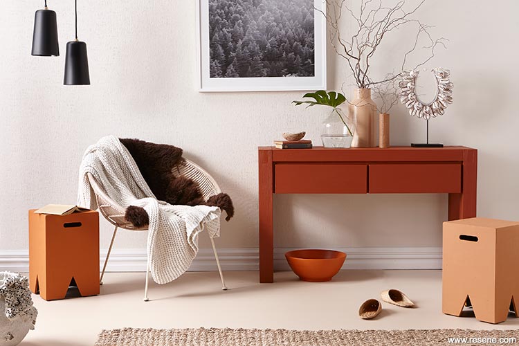
The walls are papered in design RD3360 from the Resene Wallpaper Anaglypta Collection, then painted in Resene Albescent White. The floor is Resene Double Biscotti, the sideboard is Resene Desperado, the peg stools are Resene
Rumour Has It and Resene Entourage, the bowl on the floor is Resene Ayers Rock and the vases are Resene Calibre and Resene On Track.
Hue: Hue is pure colour – any primary, secondary or tertiary colour that is unmixed with black or white. It can be another name for colour.
Intensity: This is the brightness or dullness of colours. Less intense colours (blue) have a calmer effect and are easier to live with than the more intense colours (red). Intense colours are often used as highlights and contrast.
Light reflectance value: This is the degree of lightness or darkness of a tint, shade or tone. White has the highest light reflectance value and black the lowest.
Shade: A shade is the pure colour (hue) with black added. This new colour has a lower light reflectance value (is darker) than the original hue.
Tint: A tint is the pure colour (hue) with white added. This new colour has a higher light reflectance value (is lighter) than the original hue.
Tone: This is pure colour (hue) with grey added. This new colour is a softer variation of the original.
Cool – Blues and greens can introduce a cool mood into a room. The level of coolness will depend on the intensity of the colours. Cool colours may also be used to change the appearance of a room, pushing back walls and furnishings and making the room appear more spacious. They look best in a room with a sunny exposure, where the colours counteract some of the strength of the direct sun. They should be avoided in shaded rooms.
Warm – Warm colours, such as red and apricot, have an opposite effect, closing in the walls of a room. If the room is large, its dimensions seem decreased. Warm colours look their best in a not so bright room with southern light, so that the bright effect of the sunny colours is not too overbearing
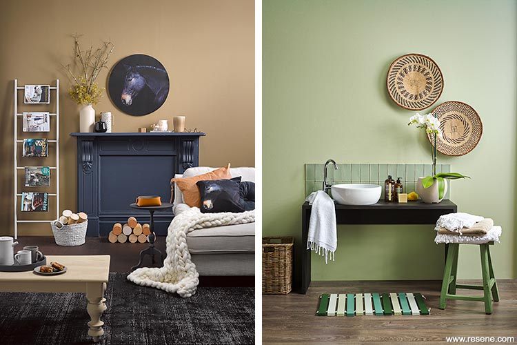
Left: Walls in Resene Road Trip (try Resene Cement for another option), floor in Resene Colorwood Bark wood stain, fireplace in Resene Dark Side (try Resene Indian Ink for another option), ladder, basket and picture frame in Resene Truffle, side table and round tray in Resene Gumboot, coffee table in Resene Castaway on Resene FX Crackle Glaze, tall vase in Resene Castaway and logs in Resene Calibre, Resene Castaway, Resene Entourage and Resene Alpaca. Right: Walls in Resene Coriander, vanity in Resene Colorwood Black Pepper wood stain, floor in Resene Colorwood Walnut wood stain, stool in Resene Paddock, and slatted bathmat in Resene Seaweed, Resene Scaramanga, Resene Secrets and Resene Coriander.
Nature conditions us to expect balance and harmony. It offers us guidelines for the use of colour and provides us with some basic principles.
| The darkest value at our feet | e.g. forest floor |
| The medium level at eye level | e.g. tree trunks |
| The lightest value above us | e.g. sky |
Consider carefully before deviating from these natural guidelines. Use the most intense hues and values in areas occupied for short periods of time, such as formal dining rooms, hallways, staff lunchrooms, laundries and entrances. Avoid monotony and treat the eye and psyche to at least a moderate variety. Visual stimulus or relief is vital. Harmonious colour selections are created by a pleasing relationship of the three dimensions of colour: hue, intensity and value.
Most colour schemes are improved by the addition of accents, the final touches that can make a room come to life. Avoid using the same accent colour in too many places or too many accent colours in one room – sometimes subtlety gives the best result.
Using correct proportions of colour ensures that your scheme will be aesthetically pleasing. A touch of contrasting colour may be lively and exciting but too much can become uncomfortable. On the other hand, too much moderation produces dullness. Personal taste and preferences are the most important considerations in choosing a colour scheme.
Think of colour as a chameleon:
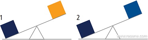
When a colour dominates its immediate surroundings in terms of hue, intensity or value, it may create imbalance. If we visualise colour in terms of weight, we can readily imagine that an area of dominant colour is ‘heavier’ than an equal area of subordinate colour. In developing a balanced colour scheme, it is important to take into account the ‘weight’ of each colour.
These two colours (1) have the same intensity, but the blue colour is darker in value. Even if equal areas of both colours are used, blue will be dominant.
If two colours have the same value (2), they may still be unbalanced if there is a difference in intensity of colour. Here the darker colour dominates.
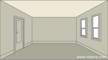
Use colour to create an illusion. Colour can highlight the good features of a room and camouflage defects. Different colours affect the way we view a room. Warm colours, such as yellows and reds, tend to advance and make the walls seem closer. They are therefore a good choice for large, uninviting rooms you want to make more intimate and welcoming. Cool colours, such as greens and blues, tend to recede and make the walls seem further away. This makes them a good choice for small, narrow rooms that you want to seem more spacious.
The way you combine colours can also significantly alter your perception of a room.
For example...
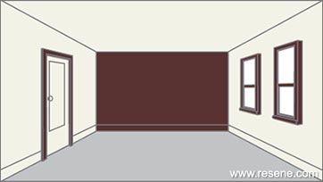
Use a strong colour on the lower part of the walls, from picture rail down, and a lighter colour above and over the ceiling. This will make the room appear more enclosed.
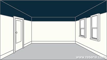
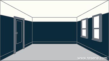
Lower a ceiling visually by painting the ceiling and the walls above the picture rail in a deep tone. Paint the walls, from the picture rail down, a light colour.
A dark colour on ceiling and walls down to dado height, with a lighter colour on the lower part of the walls to match the floor, changes a room’s proportions.
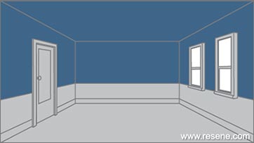
To give the feeling of airiness and space, paint the walls to match the floor and use pale, cool colours.
Make a room look wider by painting the floor and ceiling in a similar colour and the walls in a lighter colour.
A warm, deep colour on short end walls with a lighter colour on the adjoining longer walls will help make a long, narrow room appear more evenly proportioned.
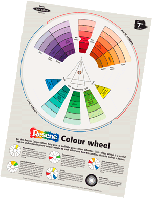
The best way to create colour harmony is with a colour wheel. The wheel was developed from the colour spectrum and helps decorators and designers co-ordinate colour and develop different types of schemes. The twelve hue wheel is divided into the three colour areas below:
1. Primary colours
2. Secondary colours
3. Tertiary colours
Monochromatic
A one-colour scheme can incorporate several values of that colour to keep it from looking monotonous. Various textures can help enhance the single colour scheme.
Related/analogous
This scheme uses three to five colours and includes one of the three primary colours. The related/analogous colours are the colour segments showing on either side of the primary colour. Varying the value and intensity of the colours is beneficial.
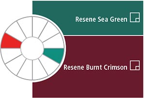
Complementary
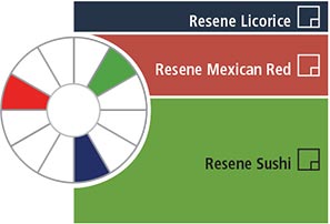
These schemes use colours that are opposite each other on the wheel, such as blue green and red orange. The result is usually vibrant and lively. It works best if one colour dominates and the other serves as contrast.
Triadic
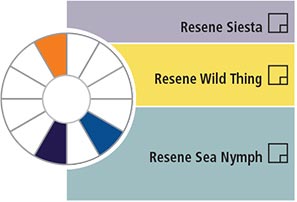
This scheme uses three colours that are equidistant on the colour wheel, such as red orange, yellow green and blue violet. One colour can be used as the dominant colour and the other two as accents.
Split complementary
This scheme is one that uses any colour from the colour wheel in combination with the two colours that are directly on either side of the colour opposite the one chosen, such as blue and violet with yellow orange.
Achromatic
These are colours in the white through to black range. Achromatic schemes are restrained and sophisticated.
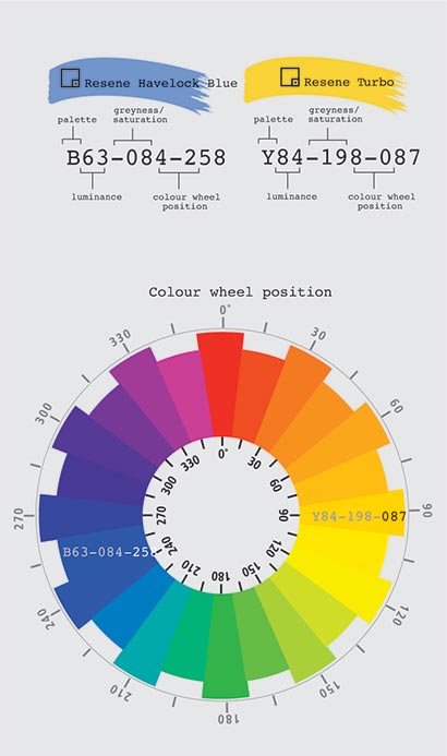
The Resene Total Colour System codes follow a format of B63-084-258, enabling specifiers and decorators to make direct comparisons on three attributes between multiple colours. The first letter or letters tells you what colour group the colour is from:
| B | = Blue | O | = Orange |
| BR | = Brown | R | = Red |
| G | = Green | V | = Violet |
| M | = Metallics | Y | = Yellow |
| N | = Neutral |
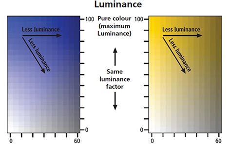
The first digits denote the colour’s luminance, with 0 being approximately black and 100 being approximately white.
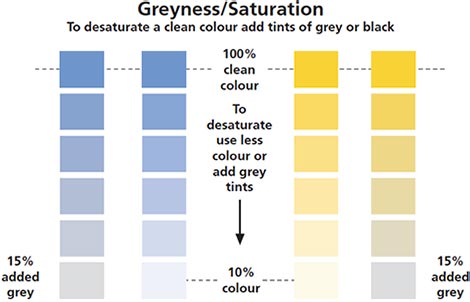
The second set of digits denotes the saturation of the colour or how far from grey the colour is. That is, the lower the number the more grey in the colour, the higher the number the cleaner the colour is. For example, Resene Black (black) has a value of 000 while Resene Turbo Y84-198-087 (bright yellow) has a value of 198.
The last set of digits tells you where the colour sits on a wheel of colour of 0 to 360 degrees. This allows you to place multiple colours into a sequence and determine the relative positioning of colours.
By comparing multiple colours using the Resene Total Colour System codes you can establish whether a colour is greyer or cleaner, brighter or darker and where they sit on a colour wheel.
| R | (Red) | = 357-39 inclusive |
| O | (Orange) | = 40-69 inclusive |
| Y | (Yellow) | = 70-90 inclusive |
| G | (Green) | = 91-204 inclusive |
| B | (Blue) | = 205-284 inclusive |
| V | (Violet) | = 285-356 inclusive |
| N | (Neutral) | = Saturation of 0-8 |
| BR | (Brown) | = Luminance of 0-39, saturation of 4-10 or luminance of 40-80, saturation of 4-25 |
| M | (Metallic) | = Colours derived from metallic tones |
Luminance is a brightness measure and describes the amount of light that is reflected from a flat, painted surface. Luminance is an indicator of how bright the paint will appear. Luminance decreases when adding grey or black paint to either a pure colour or lighter hues of a colour.
Saturation means purity and refers to the intensity of a specific hue (colour). It is based on the colour’s purity; a highly saturated hue has a vivid, intense colour, while a less saturated hue appears more muted and grey. With no saturation at all, the hue becomes a shade of grey.
The purest colour is achieved by using clean undiluted colour. If the intensity drops the saturation also drops.
To desaturate a colour in a paint system you can add tints of white, grey, black or the hue’s complementary (opposite) colour.
The Resene Total Colour System provides a huge variety of colours available in different gloss levels to suit all applications.
Gloss paints have a highly reflective smooth surface and are easier to clean than paints with less surface smoothness.
They are ideal for areas exposed to heavy traffic or heavy use, especially where fingerprints, grease or grime are common. Colours tinted into high gloss paints appear cleaner and more intense than colours tinted into flat paints. Due to their highly reflective appearance, gloss paints tend to highlight surface imperfections. If the surface to be painted is marred or irregular, it is best to select a paint with less sheen.
Full gloss 85-100%, gloss 60-84%: Resene Hi-Glo, Resene Enamacryl, Resene Super Gloss.
Semi-gloss paints have a slightly glossy appearance that is not as highly reflective as that of gloss paints. These types of finishes offer good stain resistance and are easy to clean. Paints with a semi-gloss appearance are excellent for use on many of the same areas as gloss paints. They are ideal for walls and woodwork that is subject to wear and on weatherboards and exterior cementitious surfaces.
Semi-gloss 31-59%: Resene Sonyx 101, Resene Lustacryl, Resene Lusta-Glo.
Satin paints tend to impart more warmth and depth to surfaces than do flat paints. They are more stain resistant than flat paints, but less stain resistant than semi-gloss and gloss paints. 20-30% gloss.
Low sheen paints are the most popular finish for interior broadwall areas and an ideal choice where some sheen is desired and good cleaning properties are necessary, such as in living areas, hallways, bedrooms and playrooms. Occasionally, these types of paints are used for ceilings, however, their slight sheen will tend to highlight surface imperfections. Outside low sheen finishes are most commonly used over timber, concrete and plaster surfaces.
Low sheen 3-19% gloss: Resene SpaceCote Low Sheen, Resene Zylone Sheen, Resene Lumbersider, Resene X-200.
Flat paints diffuse light, so they tend to conceal surface imperfections better than paints with higher sheen levels making them a good choice for general use on walls and ceilings, especially those that are dented or rough. Colours appear muddied and darker in a flat finish than in a glossier finish. ‘Flat’ finishes have a micro rough texture that may trap dirt and make cleaning more difficult than higher sheen paints. It is wise to use flat paints only in areas that do not tend to get dirty.
Flat/matt less than 2%: Resene SpaceCote Flat, Resene Ceiling Paint.
When choosing neutrals, one quick way to create a colour scheme is to choose strengths of the same colour, such as full strength on the walls, double strength on the doors (helps to hide fingermarks) and eighth or quarter strength on the ceiling. Vary the sheen level surface to surface to accentuate the colour differences. Try Resene SpaceCote Low Sheen on walls, Resene Lustacryl semi-gloss waterborne enamel on trims and joinery and Resene SpaceCote Flat on ceilings.
Like gloss level, the colour paint you choose to use will also show surface defects to varying degrees. Darker colours accentuate surface imperfections, while lighter colours soften the effects of any surface irregularities by absorbing less light.
This doesn’t mean you can’t use gloss paints and dark colours inside... however if you wish to use either you will need to take extra care to ensure wall surfaces are smooth and well prepared to minimise the appearance of surface imperfections. Use Resene Broadwall Surface Prep & Seal over new paperfaced plasterboard to provide a smooth surface ready for painting. If you plan to use dark colours, use a flat or low sheen paint. If you would like a gloss finish, consider using a light colour to minimise the appearance of surface defects
▸ Download a PDF of this article
Resene colour choices booklet
Choose colour with confidence and creativity
![]() Get inspired ! Subscribe
Get inspired ! Subscribe ![]() Get saving ! Apply for a DIY card
Get saving ! Apply for a DIY card
![]()
Can't find what you're looking for? Ask us!
Company profile | Terms | Privacy policy | Quality and environmental policy | Health and safety policy
Colours shown on this website are a representation only. Please refer to the actual paint or product sample. Resene colour charts, testpots and samples are available for ordering online. See measurements/conversions for more details on how electronic colour values are achieved.
What's new | Specifiers | Painters | DIYers | Artists | Kids | Sitemap | Home | TOP ⇧