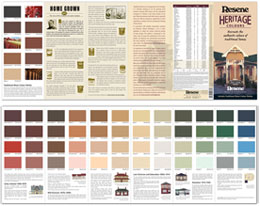
Regional and special colour palettes
Recreate the authentic colours of traditional homes
Traditional homes are an integral part of our heritage. It is therefore pleasing to see the growing trend towards restoring older homes and the subsequent resurgence of interest in the house colours of our past. Many homeowners with older houses, especially those pre-1940 are striving for authenticity in colour repainting to enhance the true architectural heritage of their homes.
In association with leading conservation architect Ian Bowman, Resene have developed a set of colour guidelines that reflect the various historical periods of home design.
It is important to note that the range of colours used in the past was somewhat limited and changes between periods were gradual. Not every early homeowner may wish to recreate the exact colour shades of another era, but for those who do, this is an ideal starting point.
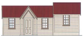
The use of imported paints or homemade limewashes with one or two-toned colour schemes typified this period.
Ochres, umbers, creams and fawns were widely used colours for limewashes on cob and earth buildings. The same range of paint colours, including light yellows, were common with domestic timber buildings that were designed to imitate stone. Although white was not common, it was used for window sashes on the simplest buildings.

Early Colonial home (A)
Early Colonial home (B)
Corrugated steel roofs were either left unpainted or painted in dark reds. Natural roofing materials such as slates and shingles were not painted.
Wallpaper was introduced towards the end of the period and became popular. White or coloured whitewash was common for smaller houses, while plain paint or wallpaper colours such as soft grey blues, Mid Green, crimsons, reds and lighter shades of these were popular, together with whites and creams. Timber ceilings, architraves and skirtings were varnished with kauri gum.
Colours used: Photo A - Resene Butter complemented by Resene Stack and Resene Slate Brown. Photo B - Resene Merino complemented by Resene Nelson Red and Resene Slate Brown.
The same earthy colours were used as in the earlier period but a darker range of tones was introduced. Weatherboard colours were Buff, Dark Buff or Drab, while trim, if picked out, was several shades darker. The sashes and doors were very dark reds, browns, greens or olive greens.
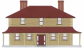
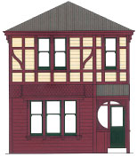
Mid Victorian home (A)
Mid Victorian home (B)
Roofs were painted the same dark reds as in the earlier period but dark greens and greys were added. Striped veranda roofing was common with the darker colours alternating with creams.
Inside, colours for all wall and ceiling surfaces and materials were carefully chosen to harmonise with each other, with common colours including crimsons, buffs, blues, greys, browns, reds, tans, olives, terracottas, greens, roses and golds.
Usually architraves, skirtings, doors, window sashes and decorative timberwork were all varnished or, later in the period, doors, architraves and skirtings were black japanned. Painted plaster ceilings and decorations became popular towards the end of the century. The kitchen was likely to have had painted tongue and grooved match lining of whites and creams..
Colours used: Photo A - Resene Buff complemented by Resene Nelson Red and Resene Butter. Photo B - Resene Burnt Sienna complemented by Resene Dark Crimson, Resene Soapstone and Resene Earth Green.
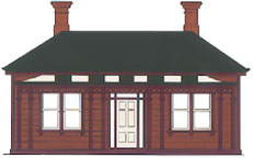
The most commonly used dark colours remained the dark greens and reds and maroons with dark browns also used. Light colours were creams, fawns, drabs, dark pinks, buffs, pale greens and greys.
Late Victorian, Edwardian home (A)
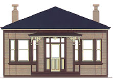
Late Victorian, Edwardian home (B)
Simpler homes retained the three colour palette with light weatherboards, dark trim and a different dark colour for the window sashes and doors. The alternative scheme used the same range of colours but the weatherboards could be a dark colour and the trim a light colour.
The complex, detailed styles usually picked out trim and framing elements. Veranda posts had brackets and mouldings of opposite colours to posts, finials were an opposite colour to their brackets, doors had the panels a lighter colour than the styles and rails, and gable framework was an opposite colour to the filigree detail between.
The same colours were used on roofs as in the earlier period.
Interior colour schemes were less bright with more colours used which were delicate and mounted. Colours included soft pinks, soft greens, light and dark grey, blues, yellows and detail sometimes picked out in gold.
Colours used: Photo A - Resene Burnt Sienna complemented by Resene Rich Cream, Resene Stack and Resene Green Ivy. Photo B - Resene Slate Brown complemented by Resene Brown Pod, Resene Blue Night and Resene Butter.
This period saw a greater range of style and use of colour than ever before. The Californian bungalow became the most popular style for housing, using pale colours such as off whites, buffs and creams for the body of the house and dark greens, dark reds and even blacks for trim and shingles under the gables and bay windows.
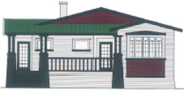
Californian bungalow(A)
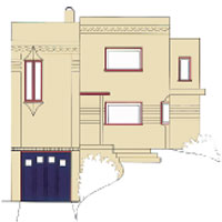
Art Deco home (B)
An alternative was for the entire house to be painted or stained black.
The Art Deco and Moderne styles from 1925 to the late 40s used paler colours such as off whites, pale greens, pale pinks, and light browns. Details were picked out, often in contrasting colours such as Mid Green and Melon Orange or Mid Green and Blue Night, Green Fields and Cobalt Blue. Window frames and sashes would be a light colour, while doors would often be a dark colour such as blue or green.
Interior colours in this period were paler even than the previous period with pastels being common. A greater complexity of interior colour was introduced with stained glass and lead light windows.
Colours used: Photo A - Resene Soapstone complemented by Resene Kaitoke Green, Resene Dark Crimson and Resene Stack. Photo B - Resene Colonial White, Resene Blue Night and Resene Burn Sienna.
The Resene Heritage Colour Charts was prepared in the early 1990's with the assistance of Ian Bowman, a leading New Zealand conservation architect. The colour chart was based on:
Research of paint actual colours using in situ, or thin section samples under a microscope;
Australian, American and UK historic and recent heritage colour charts;
Originals and facsimiles of painters guides;
Historical research into the Nelson paint company;
Literature searches into paint analysis (especially APT), traditional paint colours, painter's guides, colour mixing etc;
Oral histories from painters.
Since then, Ian has undertaken paint analysis on a great number of buildings and many of the buildings listed below have been analysed since the Colour Chart was produced. This has reinforced that the colours on the Chart, based more on academic research than practical discoveries, were accurate and authentic heritage colours.
See a full list of the paint colours and an example of where they have been used in actual buildings.
See the Resene Heritage colour chart for a range of heritage hues - order your copy online.
Virtually paint your home with Resene Heritage colours with Resene EzyPaint virtual painting software. Resene EzyPaint virtual painting software allows you to electronically paint images using a wide range of Resene colours. It is available as a free download from this website.
![]() Get inspired ! Subscribe
Get inspired ! Subscribe ![]() Get saving ! Apply for a DIY card
Get saving ! Apply for a DIY card
![]()
Can't find what you're looking for? Ask us!
Company profile | Terms | Privacy policy | Quality and environmental policy | Health and safety policy
Colours shown on this website are a representation only. Please refer to the actual paint or product sample. Resene colour charts, testpots and samples are available for ordering online. See measurements/conversions for more details on how electronic colour values are achieved.
What's new | Specifiers | Painters | DIYers | Artists | Kids | Sitemap | Home | TOP ⇧