Akoranga Drive
The YMCA North Shore needed an upgrade that would communicate, connect and cater for all levels and ages of the community.
The YMCA North Shore is a time-honoured organisation that required rebranding and a new message sent out to the community. This message incorporated that it was not 'just a gym' but an organisation that catered for the community. It needed an upgrade that would communicate, connect and cater for all levels and ages of the community from very young to the senior age group.
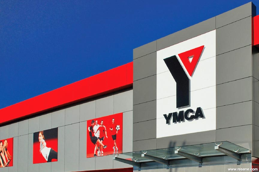
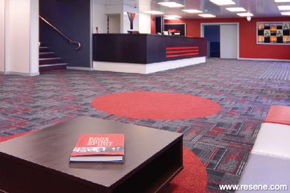
The branding of the core values of Caring, Honesty, Respect and Responsibility were to be shown in the design, and the new logo colours that were updated from blue and red, to black and red needed to be carried throughout the organisation.
The upgrade required all finishes, products and colours to be specified and it required all cabinetry, reception desks and kitchens to be designed. Everything needed to be durable and hardwearing. But it also required many months of research into the needs of the community, and how the envelope of the building that was available, could be transformed into contemporary spaces to cater for those community needs with at least a 15 year future proofed view. It was to attract new membership, grow, and retain members. The finished building was to be contemporary, have energy, and stand out in the community.
We conducted many hours of research into trends within fitness centres overseas, and analysis of community demographics, provided the foundation for the aesthetic and spatial design direction for the upgrade for the YMCA North Shore. We looked at the physical, social and the spiritual environment, which indicated a need to have community spaces connecting. We looked at how the community is evolving and how the organisation needs to encompass the whole picture, not just the physical aspects. We found LOHAS consumers (lifestyle of health and sustainability) a growing sector of the community.
The top level of the exterior of the building was reclad in Symonite to give it a clean lined look, and the lower levels were painted in Resene Detroit, with an accent of Resene Bullseye to create the backdrop of the colour scheme. Imagery was set against this to portray the activity that happened with in the building. The new logo colours and branding were shown clearly on the exterior and new wing wall that was built.
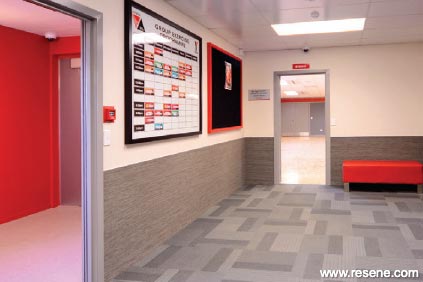
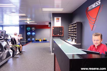
We found through our research that sections of the community were becoming increasingly isolated. The reception and waiting lobby was opened up to include areas for communication and connection. Social nodes and spaces were placed throughout the building, delineated through the use of colour and flooring.
Paint colours that were used in the lower level were Resene Albescent White, Resene Half Stack, Resene Half Foundry and Resene Dynamite. Signage and graphics played an important part of the communication and created energy and movement. During our research, we found that social relevance would give the connection that would make the YMCA become a part of the member's lives. This would be the key to membership retention as well. We aimed to develop and strengthen member to staff interaction. Offices with large windows, and reception areas were kept open, viewable from many aspects.
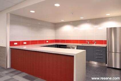
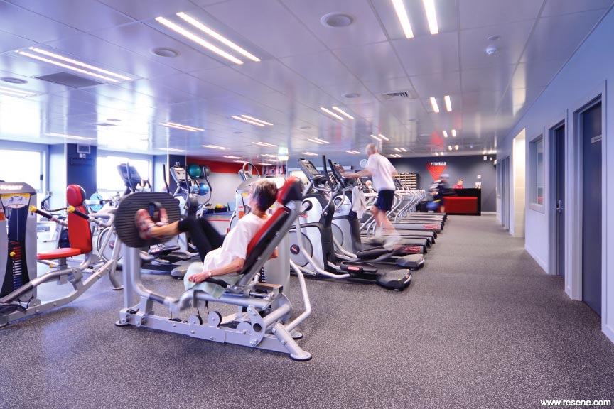
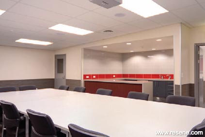
There was equal importance placed on fitness, socialisation and relaxation. The Body, Mind, Spirit reflects this philosophy. A new mezzanine floored was built on the third level to incorporate an aerobic room with state of the art lighting and sound systems, a meeting room, which could be hired out to the community, or utilised as a boardroom for meetings. Resene Afterburner, and Resene Eighth Masala were used in the Aerobics room, with a variety of finishes suitable for wall protection. Resene Albescent white was the connecting colour throughout the building.
The new fitness rooms were to have new window joinery, which created more daylight and opened up the space to connect with the outside. The community could see clearly when they drove past that there was activity happening within the building. A stronger more energetic red, Resene Jalapeno, was introduced here to give more physical energy to this space. This was combined with Resene Half Stack and Resene Half Foundry to take the colour scheme through.
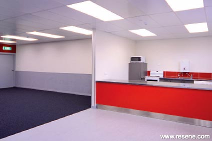
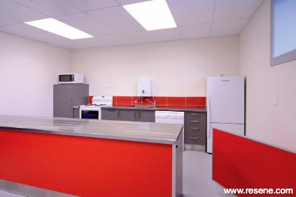
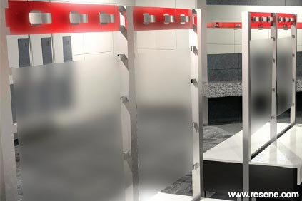
New members change rooms were accessible from this level, and presented high quality areas to shower and change. With many other areas refurbished, including staff rooms, wheelchair accessible bathrooms, squash courts, meeting rooms, viewing areas, a gymnasium, and seating areas, the last phase of the upgrade included the new dojo rooms, and public change room. These were also used for children's activities and needed to have a functional kitchenette for activity based groups.
The colour scheme was continued through to give a cohesive design to the whole building.
Colours used: Resene Afterburner, Resene Albescent White, Resene Bullseye, Resene Detroit, Resene Dynamite, Resene Eighth Masala, Resene Half Foundry, Resene Half Stack, Resene Jalapeno, Resene Milk White, Resene Quarter Delta, Resene Quarter Masala.
Colour Selection and Interior Design: Amanda Neill, Designworx
Photographer: Nathan Coppens, First Light Photography
Project: Resene Total Colour Awards 2011
Resene case studies/awards project gallery
View case studies that have used Resene products including many from our Resene Total Colour Awards. We hope these projects provide inspiration for decorating projects of your own... view projects
Total Colour Award winners:
2023 |
2022 |
2021 |
2020 |
2019 |
2018 |
2017 |
2016 |
2015 |
2014 |
2013 |
2012 |
2011 |
2010 |
Entry info
Latest projects | Project archive | Resene news archive | Colour chart archive
![]()
![]() Get inspired ! Subscribe
Get inspired ! Subscribe ![]() Get saving ! Apply for a DIY card
Get saving ! Apply for a DIY card
![]()
Can't find what you're looking for? Ask us!
Company profile | Terms | Privacy policy | Quality and environmental policy | Health and safety policy
Colours shown on this website are a representation only. Please refer to the actual paint or product sample. Resene colour charts, testpots and samples are available for ordering online. See measurements/conversions for more details on how electronic colour values are achieved.
What's new | Specifiers | Painters | DIYers | Artists | Kids | Sitemap | Home | TOP ⇧