Turangi
The property was renovated from a house and double garage into three separate apartments for the holiday market, catering to fishermen and skiers who love the Turangi area.
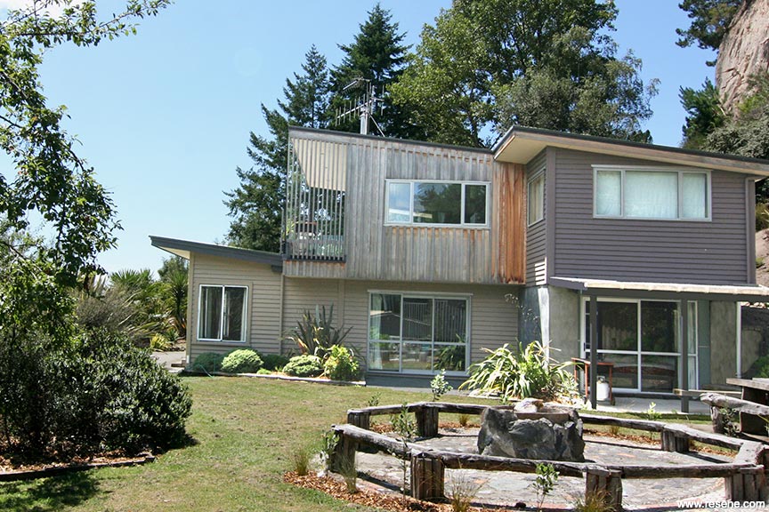
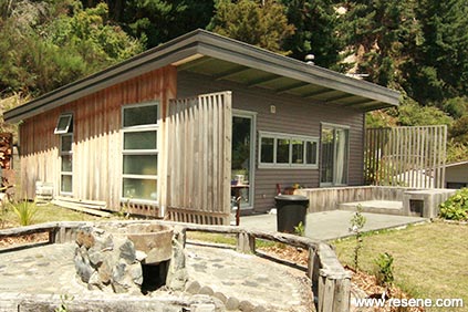
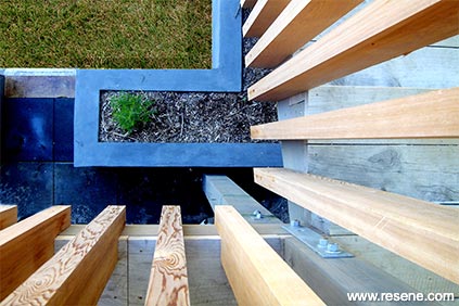
The exterior has various details in relief, the chosen colours are designed to emphasise each change in surface, from weatherboard, to titan board to cedar.
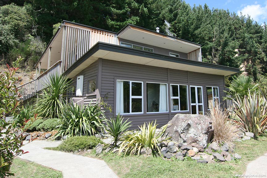
The Resene colours were decided on for their connection to the surrounding colours of the Central North Island landscape and Turangi’s mix of beautiful rivers and forest. Using Resene Conch against the Resene Half Felix and Resene Gargoyle gives a strong contrast which brings out the tones in each colour. The soffits are painted in Resene Stark White, lifting them and accenting the cedar.
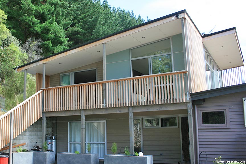
Each surface was considered an object, a charming connection between existing and new elements. The new was marked with titan board and cedar board and batten and the existing with the weatherboards. Each facet has an individual colour wrapped around it. The specific colour follows the entity around until a break in the surface, whether that be material or edge. Like a patchwork quilt, the colours bind together in distinction.
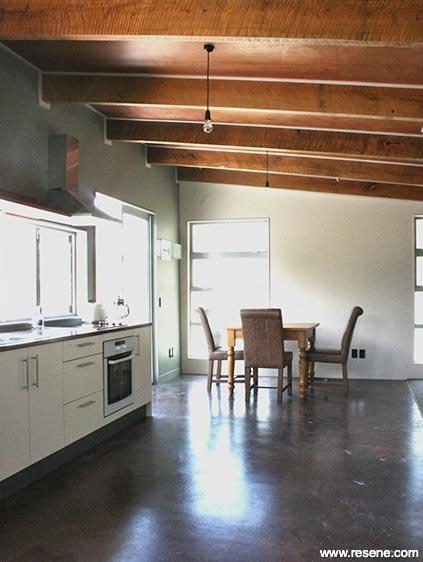
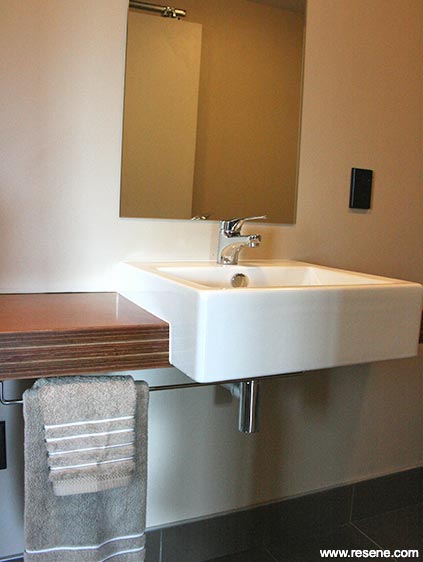
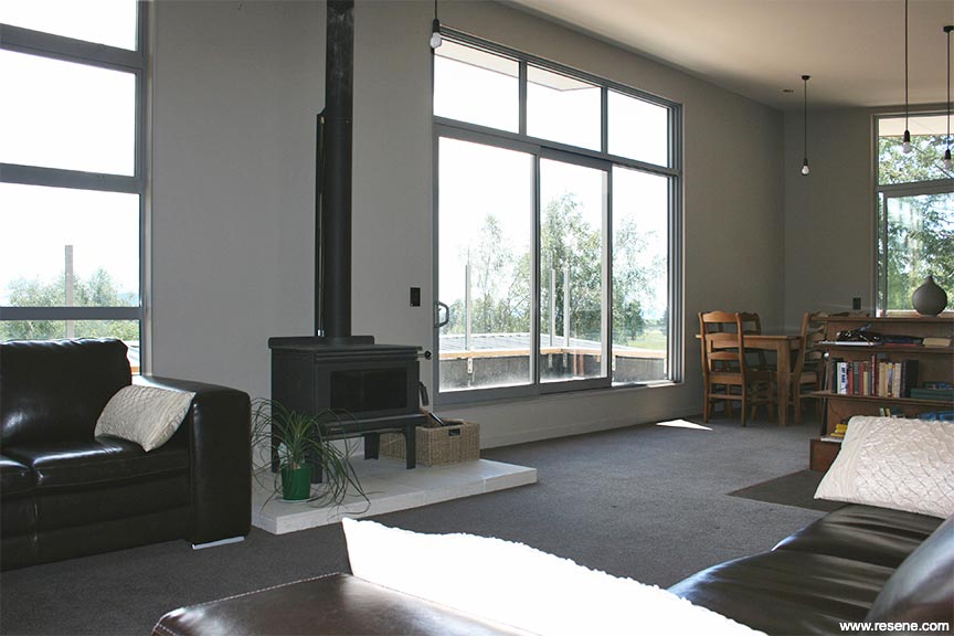
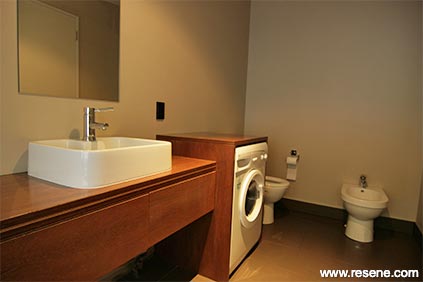
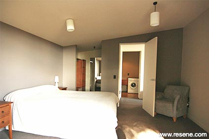
Each room of the interior has a different colour combination, creating a diverse experience within a harmony of the overall colour scheme. When all doors are open, each area works with the next, creating flow from room to room.
It was important to have synchronisation, choosing one colour, Resene Stark White for all the highlighted woodwork and Resene Bubble White for the ceilings, ties all the spaces together. The natural woodwork gives a strong contrast with any wall paint, maximising the tones of both the impact colours and the ‘white’. The colours were chosen for their ambience; they connect with the surrounding landscape of Turangi.
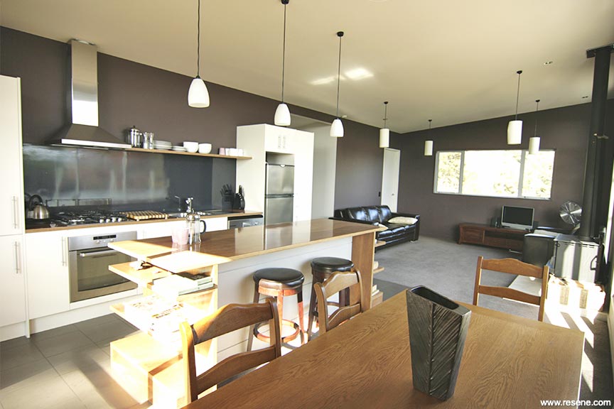
Impact and harmony are very important to create a statement. The impact is achieved by choosing very different colours, such as Resene Barista and Resene Napa, but similar tones. The dustiness of the colour creates the harmony. The position of these wall paints is also vital, the two contrasting colours must butt together at a point where the viewer will appreciate them at first glance on entering the space. For example, the opposite corner to the entrance of an area.
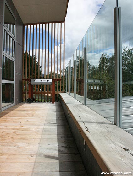
It is important to ensure the exterior colours of the property work well with the interior, without being identical. The viewer always reads a property as a whole, from outside in and from space to space. Cohesion is the key.
Colours used: (Apartment 1) Resene Bel Air, Resene Bubble White, Resene Buffalo, Resene Drought, Resene Gargoyle, Resene Half Oilskin, Resene Inside Back, Resene Napa, Resene Oilskin, Resene Rockbottom, Resene Stark White, Resene Stonewall (Apartment 2) Resene Barista, Resene Bubble White, Resene Copyrite, Resene Drought, Resene Half Oilskin, Resene Napa, Resene Stark White (Apartment 3) Resene Domino, Resene Drought, Resene Inside Back, Resene Stark White, Resene Xotic.
Products used: Resene SpaceCote Low Sheen, Resene SpaceCote Low Sheen Kitchen & Bathroom, Resene Lustacryl, Resene Ceiling Paint, Resene Uracryl.
Architectural Specifier: Nicola Habbitts & Mike Melville
Building Contractor: Daniel Melville
Colour Selection: Nicola Habbitts
Interior Designer: Nicola Habbitts
Painting Contractor: Robertson Painting & Daniel Melville
Photographer: Nicola Habbitts
Project: Resene Total Colour Awards 2010
Resene case studies/awards project gallery
View case studies that have used Resene products including many from our Resene Total Colour Awards. We hope these projects provide inspiration for decorating projects of your own... view projects
Total Colour Award winners:
2023 |
2022 |
2021 |
2020 |
2019 |
2018 |
2017 |
2016 |
2015 |
2014 |
2013 |
2012 |
2011 |
2010 |
Entry info
Latest projects | Project archive | Resene news archive | Colour chart archive
![]()
![]() Get inspired ! Subscribe
Get inspired ! Subscribe ![]() Get saving ! Apply for a DIY card
Get saving ! Apply for a DIY card
![]()
Can't find what you're looking for? Ask us!
Company profile | Terms | Privacy policy | Quality and environmental policy | Health and safety policy
Colours shown on this website are a representation only. Please refer to the actual paint or product sample. Resene colour charts, testpots and samples are available for ordering online. See measurements/conversions for more details on how electronic colour values are achieved.
What's new | Specifiers | Painters | DIYers | Artists | Kids | Sitemap | Home | TOP ⇧