Northcote
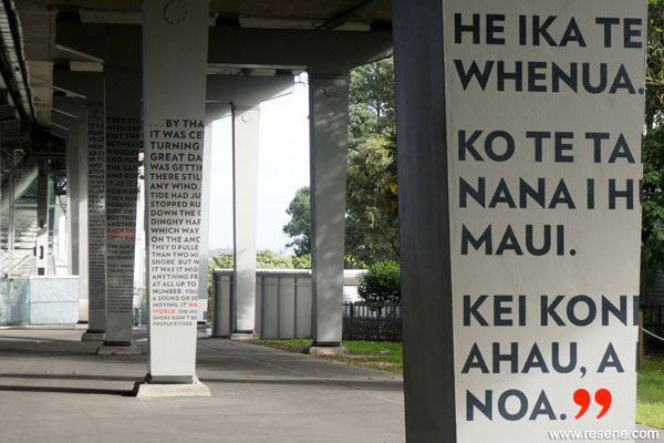
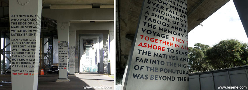
Excerpts of poetry and prose wrapped around eight of the eastern trestle legs of the west box girder beneath the Auckland Harbour Bridge.

There is a lot happening beneath the Auckland Harbour Bridge. On the north side, this place provides for many functions including public road access to local dwellings, underside bridge access for essential maintenance works to the structure, and public access to an important reserve area including Te Onewa Pa/Stokes Point. From this vantage point there are expansive views of the Waitemata Harbour framed by the bridge structure overhead; a place for celebration of the natural environment as well as cultural and engineering heritage. New Zealand Transport Agency (NZTA) is upgrading the area of Princes Street under the Bridge. The first stage of the upgrade project is complete, and included landscape improvements to the abutment area and new lighting to the bridge area. This stage also included painting of the ‘The Trestle Leg Series’: excerpts of poetry and prose wrapped around eight of the eastern trestle legs of the west box girder beneath the Auckland Harbour Bridge.
The project team identified the opportunity to celebrate a number of writers of national significance who have local connections to Auckland/Tamaki Makaurau and the North Shore. This is a unique opportunity to showcase important New Zealand literature in a publicly accessible location, adjacent to Te Onewa Pa/Stokes Point. The bold text graphics also create a visual connection through the underside of the bridge to the Pa site, reserve and the water. Cathy Challinor of Boffa Miskell led the NZTA project team in an intensive process of working with local iwi representatives and local literary experts including Dr Jack Ross to select the writers and literary excerpts. Permissions were obtained from the estates of the writers and visual artist and typographer Catherine Griffiths was commissioned to interpret these works onto the bridge columns.

Griffiths’ proposal was to render, onto the steel surfaces in the manner of painted lettering used on ships and bridges, the excerpts of poetry and prose presented in this three dimensional public space beneath the bridge. Lifted from the printed page, they are no longer works for intimate reading. Their re-presentation in the context of a spatial and built environment demands that they are engaged with physically, on a much enlarged scale. The extracts of poetry wrap themselves around the steel columns, the fixed line length determining the shape and form of each, requiring the reader to move with the work, to spend time with the words, the sounds they make, the meanings that are formed, to arrive at the work from any point, whether in full or part.
Specialist signage companies Signright and Designcraft were commissioned to install the work. This included creating templates based on the design to be used for masking the bridge columns and application of the painted lettering. They worked with Total Bridge Services, a joint venture between TBS, Opus and Fulton Hogan, to determine appropriate paint materials and methods of application. The ‘Trestle Leg Series’ work is applied to the steel ‘clip-on’ structures, which were an addition to the main bridge structure in 1969.
The paint system and application methods needed to be compatible with the specialist bridge steel coating system, including template application to ensure crispness of the lettering. The paint also needed to be extremely high performance to ensure longevity in a demanding environment that includes harsh marine conditions, public access and the demands of constant maintenance activities to the bridge structure. A Resene Uracryl 403 paint system was selected to achieve a good looking finish that would withstand this demanding environment. The gloss finish contrasts beautifully with the matt finish of the specialist bridge coating system, and allows the colours to take on new life in the reflected light. Resene Cinder from the BS5252 series was selected as the colour for the majority of the text, providing a contrast to the lighter grey of the structural steel. Resene Flame Red was selected as a highlight colour to emphasise a few words from each prose or poetry excerpt. The form of the words and the colours and texture of the work combine to create a visually strong work.
Architectural Specifier: Cathy Challinor, Boffa Miskell Ltd
Artist: Studio Catherine Griffiths
Building Contractor: Total Bridge Services
Client: New Zealand Transport Agency
Colour Selection: Cathy Challinor and Catherine Griffiths, Boffa Miskell Ltd
Painting Contractor: SignRight, Designcraft
Photographer: Catherine Griffiths
Winner: Resene Display + Product Colour Maestro Award Winner
Project: Resene Total Colour Awards 2012
Resene case studies/awards project gallery
View case studies that have used Resene products including many from our Resene Total Colour Awards. We hope these projects provide inspiration for decorating projects of your own... view projects
Total Colour Award winners:
2023 |
2022 |
2021 |
2020 |
2019 |
2018 |
2017 |
2016 |
2015 |
2014 |
2013 |
2012 |
2011 |
2010 |
Entry info
Latest projects | Project archive | Resene news archive | Colour chart archive