Thorndon, Wellington
Some of the key values evident in the architecture and colour scheme are: feminine, strong, respectful, elegant and welcoming.

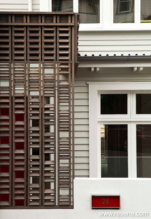
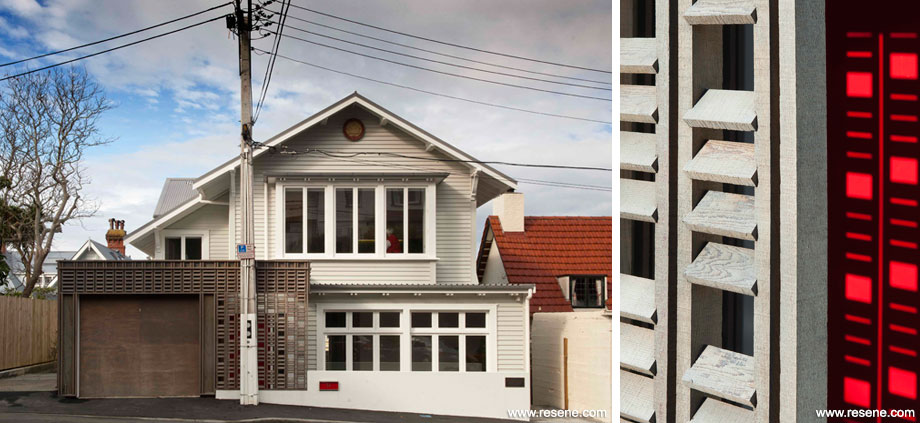
This house in a quiet residential street in Thorndon, has operated as the headquarters of the Maori Women’s Welfare League since the early 1960s. HMA were approached to refurbish and upgrade the building to meet the immediate and future needs of the organisation. The house was relocated on the site, the internal layout extensively altered, new additions added to the front/rear and a decorative timber screen draped along the street frontage to provide a metaphoric cloak that both welcomes and protects.
The original 1910 house was in an extremely tired state, for various reasons it had not been well maintained and the exterior paint work was peeled and flaking. Once these weathered coatings were fully stripped, the native timber weatherboards were in surprisingly good condition. Because the building is for a women’s organisation, we wanted a colour scheme that told a story about the building, its context and users. The final colour scheme reflects many of the values of the League and is respectful of its heritage precinct site. Some of the key values evident in the architecture and colour scheme are: feminine, strong, respectful, elegant and welcoming.
It was important not to overcomplicate the composition by introducing lots of different colours. Instead by restricting the painted colour palette to two colours, the shape, pattern and relief of the architectural features and forms are read clearly. The subtle green-grey tone of Resene Eighth Lemon Grass was the perfect colour to complement the exterior materials and gives the house a fresh and elegant look. The use of Resene Alabaster for windows, fascia and architectural details gives these elements a wonderful crispness.

The bright red door is in contrast to the restrained palette of the main house. This helps to signify the entry point and the colour plays dramatically with the fine detail of the adjacent timber cloak screen. The client was very particular about finding the right deep red (the red entry door featured in the original project brief). Resene’s extensive range of reds provided the perfect one with Resene Jalapeno. Plastered block planters are finished in Resene Lumbersider low sheen waterborne paint tinted to Resene Black White.
Because of the lack of a past maintenance regime, systems and materials needed to be robust and easily maintained. Resene Sonyx 101 semi-gloss waterborne paint was chosen for the main house and Resene Lustacryl semi-gloss waterborne enamel for the windows, fascia and trim. Because the colour scheme is fairly subtle, the differences in product sheen level helps to articulate the forms and detail.
The League now has a home they can be proud of; a building that is respectful of its heritage and surroundings; one that is strong yet welcoming; a building that will look good for years to come.
Architectural Specifier: Herriot + Melhuish Architecture Ltd
Building Contractor: Martin Goulden Builders
Colour Selection: Karl Wipatene and Stephanie Arland, Herriot + Melhuish Architecture Ltd
Painting Contractor: Paul Reddish Decorators Ltd
Photographer: Paul McCredie
Project: Resene Total Colour Awards 2012
Resene case studies/awards project gallery
View case studies that have used Resene products including many from our Resene Total Colour Awards. We hope these projects provide inspiration for decorating projects of your own... view projects
Total Colour Award winners:
2023 |
2022 |
2021 |
2020 |
2019 |
2018 |
2017 |
2016 |
2015 |
2014 |
2013 |
2012 |
2011 |
2010 |
Entry info
Latest projects | Project archive | Resene news archive | Colour chart archive